Colour Schemes - Evoke a summer feeling all year round

MOOD 1 - YELLOW

Can you think of another colour that communicates joy as effectively as yellow? It is the colour of optimism that the long summer hours bring. It makes us feel happy and energetic, like we’re bathed in sunlight.
Yellow is truly one of those colours that captures our attention and stimulates feelings of wellbeing. It’s also a surging trend within the interior design world. I think this is because we are all looking for a bit more brightness and optimism in our lives.
So with yellow we can capture that feeling of sunlight, inviting that ‘golden hour’ feeling into our own homes. Sunflowers. A lovely bowl of citrus on the counter-top. That summer gin and tonic. Yellow is a colour that has so many positive associations, especially at this time of year.
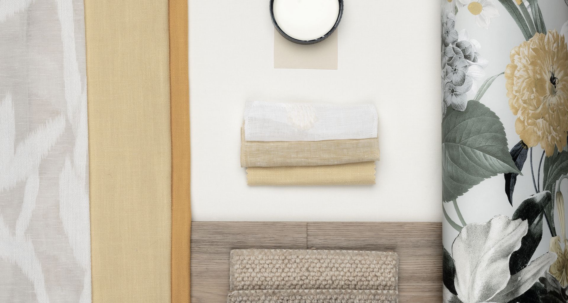
However, there are many more shades we can work with than just a sunny yellow. Tones of gold like Kyoto Ginger from James Dunlop, and Kodiak Straw from Warwick creates a rich and elegant atmosphere in any room. Layering these with neutrals like Gentle Cream from James Dunlop, Te Rapa from Dulux, or Club Botanique wallpaper from Aspiring Walls creates a harmonious space that glows with warmth.
If you’re not ready to paint the kitchen yellow, look to incorporate pattern and texture in barely there shades of yellow like James Dunlop’s Season Calm, that evokes dappled sunlight. Dulux’s Suede Effect in Pristine Sand has a lovely warm quality to it.
Upholstering furniture or cushions in Warwick’s Kodiak in Straw or Mustard give pops of optimism to a living space that may have become a bit tired over the winter.
Yellow doesn’t have to be used in a very obvious way. If you’re not ready to commit to a full yellow explosion, then hints of pattern within a wallpaper like Graham and Brown’s Flora Sky could be a great gateway to let glimpses of sunlight into your rooms.
MOOD 2 - PINK

Pink is often not at the top of everyone’s list when redecorating, however it is a colour that works well in any space. It’s a very complex colour that shouldn’t be overlooked or disregarded. Well placed use of pink is the sign of a sophisticated design palate.
We all tend to have quite an emotional connection with pink. Whether that’s femininity or positivity, whimsy or joy. Historically pink has also been a masculine colour, and it’s very attractive to see men confidently wearing nice tones of pink.
The colour pink can also invoke a sense of wonder and memories of carefree days, transporting us to still summer sunsets where the clouds inspire with their patterns of pink.
It’s known to be one of the most flattering and soothing colours. Pink light on skin is an instant airbrush effect. Depending on the shade, pink can also be uplifting or calming. So bear this in mind when imagining the environment you intend to create and how bold you would like to go.
Don’t be afraid to play with tones and textures. For example, Heriot Pebble, Ahead Angora and Ahead Boudoir, all James Dunlop, work harmoniously together with texture and lustre. The iridescent quality of the Silk Texture Blush Wallpaper by Graham and Brown also adds a layer of luxe to small space. This could be a perfect application for a powder room.
Natural fibres like Warwick’s Calais Blossom in 100% linen mitigates some of the powder-puff polish that is often associated with pink to create a more relaxed effect. Developing more harmony between the masculine and feminine elements of pink, as well as enhancing its calming qualities.
Golden hues, chocolates and creams in Belgotex’ Matrix Acoustic Riviera Oak and Bremworth’s Thorndale Maverich and Clyde balance out the pinks to ground and give some dynamism to your space.
Summer is not just about sunlight and brightness but also about the earthy tones of the land. Brittle grass, dried flowers, golden plains and soft sand. These elements are undeniably relaxing and grounding, and beautiful to echo in our living spaces as we enter the cooler months ahead.
Article by:
Lou Stringer
Founder + Director, Said Studio.
@_saidstudio
saidstudio.co.nz