Colour Schemes - Two different looks for Autumn comfort
Autumn is a time of smoky hues and softer tones, diffused light and cooler temperatures. The perfect complement as the light fades, we look to warmer interiors. For these mood boards we start with a solid foundation of neutrals from which to build upon, forming two different, but equally inviting schemes.
It’s these feelings of comfort that we can bring into our homes in very simple ways. All of these textures interplay to create a nourishing environment that you want to settle into, cosy and calm. There are so many options within these mood boards to create a really richly layered and inviting environment.
These mood boards are extremely exciting because they showcase a new supplier with exclusive collections for Guthrie Bowron.
ILIV is one of the United Kingdom’s leading textiles suppliers. Their fabric designs encompass traditional motifs, stripes, embroideries, coordinating plains and much more. For example, the Sustainable Plains collection spans three hundred thoughtfully developed, textured fabrics across sixteen varying bases from corduroy to herringbone weaves using a variety of sustainable yarns including recycled polyester, bamboo viscose, BCI cotton and organic linen.
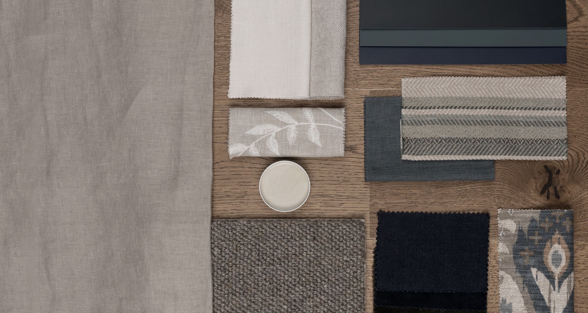
Mood 1 - Foundation

These foundation neutrals are rich without being too heavy, and set the scene for adding in layers of colour later on. Consider the natural grain of oak flooring from Nature’s Oak Matterhorn, warm paint in Dulux’s Sandfly Point 1/4, Warwick’s Calais, a lovely textured linen and fabrics from ILIV - Namaste Chalk, Vinery Stone and Seelay Porcelain.
These warm tones vary from cream to mushroom, and create a much softer atmosphere than stark whites.
It’s a very well balanced palette as it is. But depending on your personal aesthetic, you have the option to add enchanting jewel-toned greens and blues, or take a more soothing approach with dusky pinks and browns.
Mood 2 - Blues
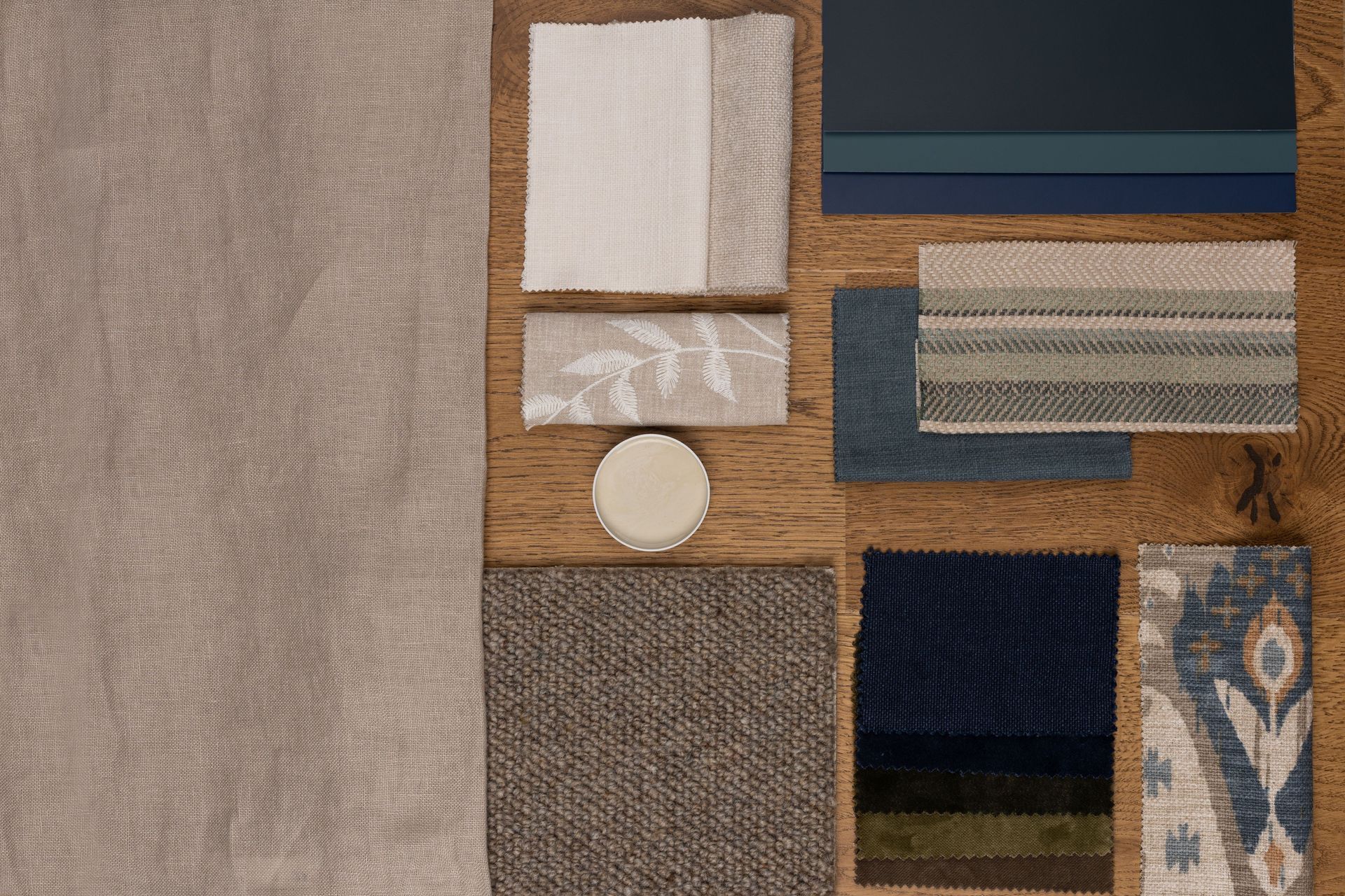
If we layer rich, jewel-like tones on top of the warm neutrals, we can create a sumptuous and decadent palette. Tones that are enchanting and invigorating.
We can use these tones in subtle touches to make our spaces more comforting. For example, the deep, dark hues in Dulux’s Kenepuru Sound, Karori and Browns Bay lend a sophisticated warmth.
Or we can use more astute layering to create an atmosphere of regal luxury.
The patterns of Indus Sage and Boho Tan in ILIV’s Kasbah collection are extravagant, but organic enough to sit seamlessly on top of our foundation neutrals.
Furthermore, velvets in these cooler months can really add lustre and excitement. You can use these to reupholster a sofa, a new cushion, or an armchair. Think of the pieces of furniture or objects that you seek out on a cold day to snuggle into. Warwick’s Mystere + Theodora ranges have a great spectrum of velvets to choose from, shown here are Taupe, Moss, Army and Ink.
There are endless options within this colour palette. We can use blue subtly or boldly. This mood board merely hints at the options to create an exciting and inviting environment.
Mood 2 - Pinks
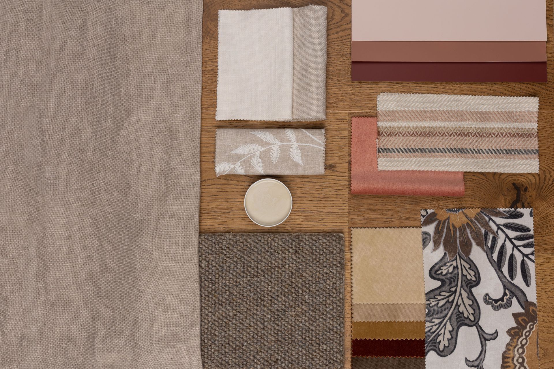
This mood board is composed of colours that are much more obviously “warm” – reds, pinks, ochres. They encourage us to cocoon inside where it’s warm and cosy.
They are obviously warm but pleasantly gentle. These tones don’t scream for attention like sunflower yellows and bright reds. Think dusty rose, rust, warm creams found in Warwick’s Mystere Butternut or Parchment, Theodora Brass or Copper. This is a palette that is more soft and nourishing, working beautifully with the neutral foundation.
The tactility of velvet really enhances that feeling of comfort we get when snuggling down into the sofa after a cold day. What could be more soothing than sinking into a velvet sofa in front of the fireplace with a glass of red wine?
If you are looking to incorporate pattern, there’s a beautiful piece from ILIV called Winter Fruits Amber. With chocolatey tones, ocres and golds, this is a brilliant option to use as curtains to get a bit of pattern and interest into the space if you have a lot of solid colours elsewhere. Because it’s quite a complex pattern, it’s best to apply it in a larger format. You really get the most impact out of a pattern like this when you can enjoy the full scale of it.
Finally, we have 3 Dulux paints in this mood board: Murray Red, Pohutu Geyser, Basic Coral. You could use these to introduce a bit of colour into your joinery, especially if you have some cabinets that are in need of a refresh.
Alternatively, you could really warm up the whole room by using these paints, making a space that is rich and enveloping.
Whichever palette we choose to amplify our space will add a sense of brightness and warmth that is so uplifting during these cooler months. These are materials that soothe and restore – sustaining us as we anticipate the blooming of spring.
Lou Stringer
Founder + Director, Said Studio.
@_saidstudio
saidstudio.co.nz