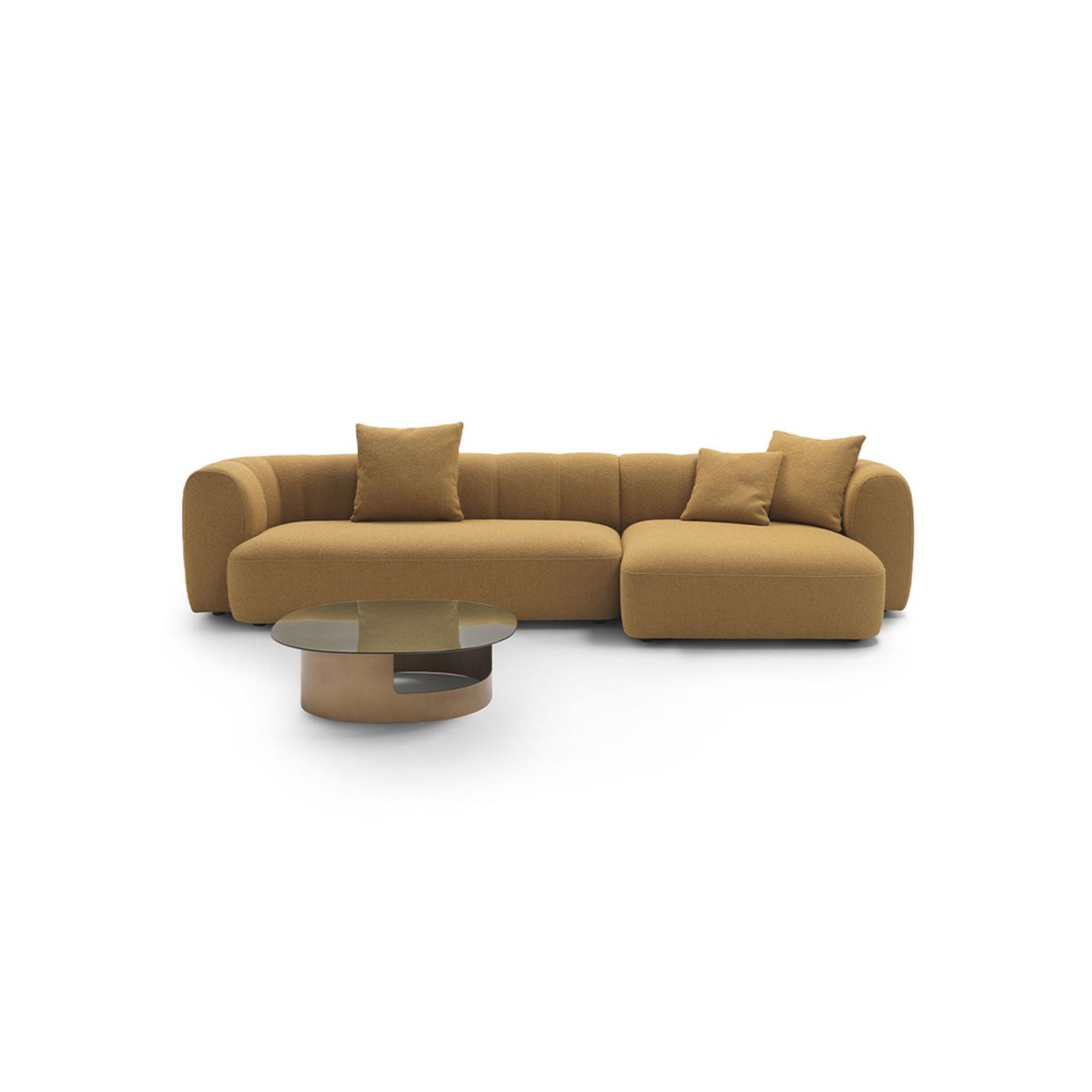
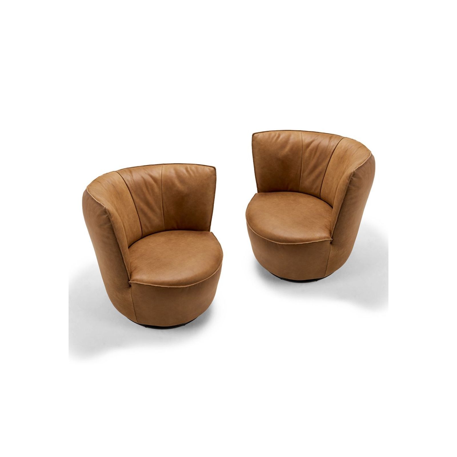
Pinterest Palette 2026

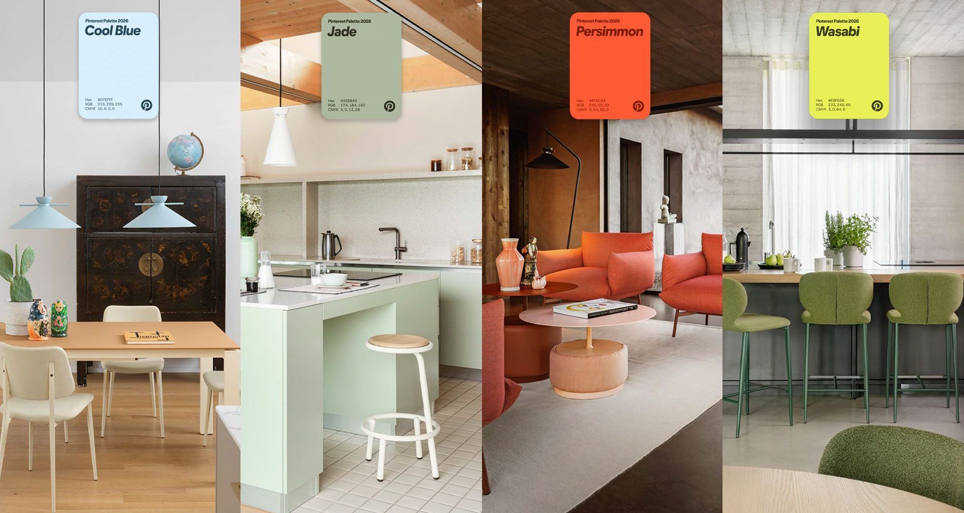
Every year, Pinterest identifies the colours people are actively planning their lives around. This year's palette is the perfect match for the clean lines and artisanal craftsmanship of our latest European arrivals.
From the sun-drenched streets of the Mediterranean to the minimalist studios of Scandinavia, we've curated a selection of designer pieces that bring these global trends directly to your home.
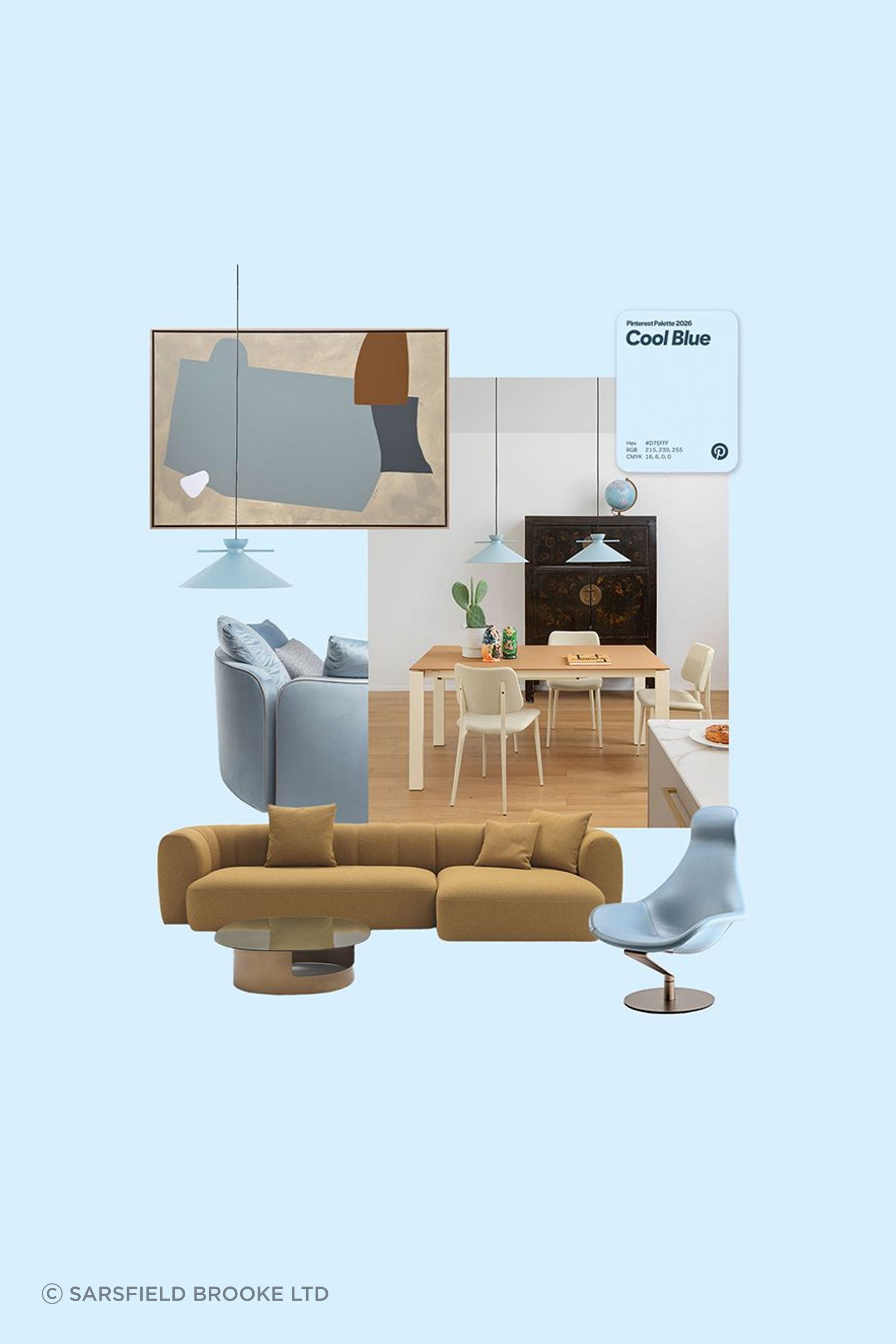

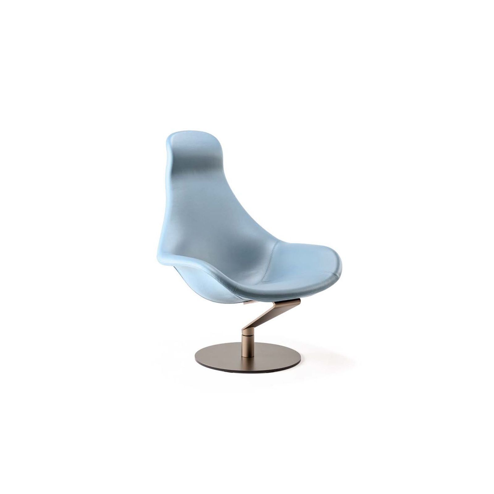
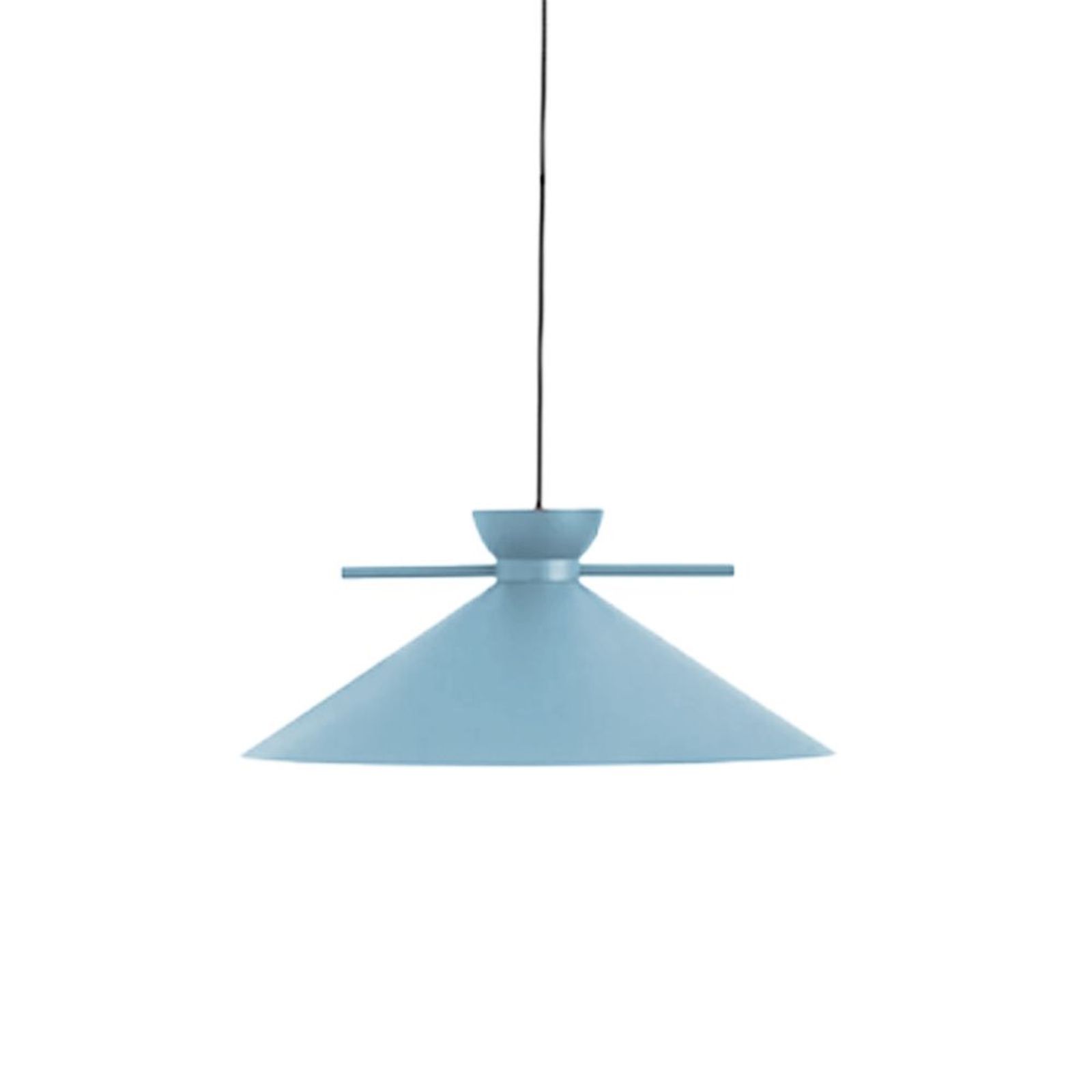
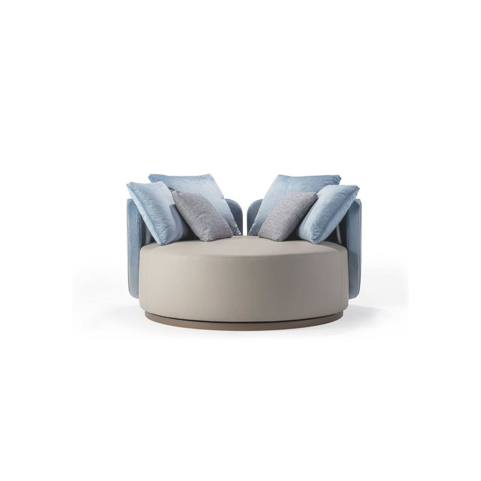
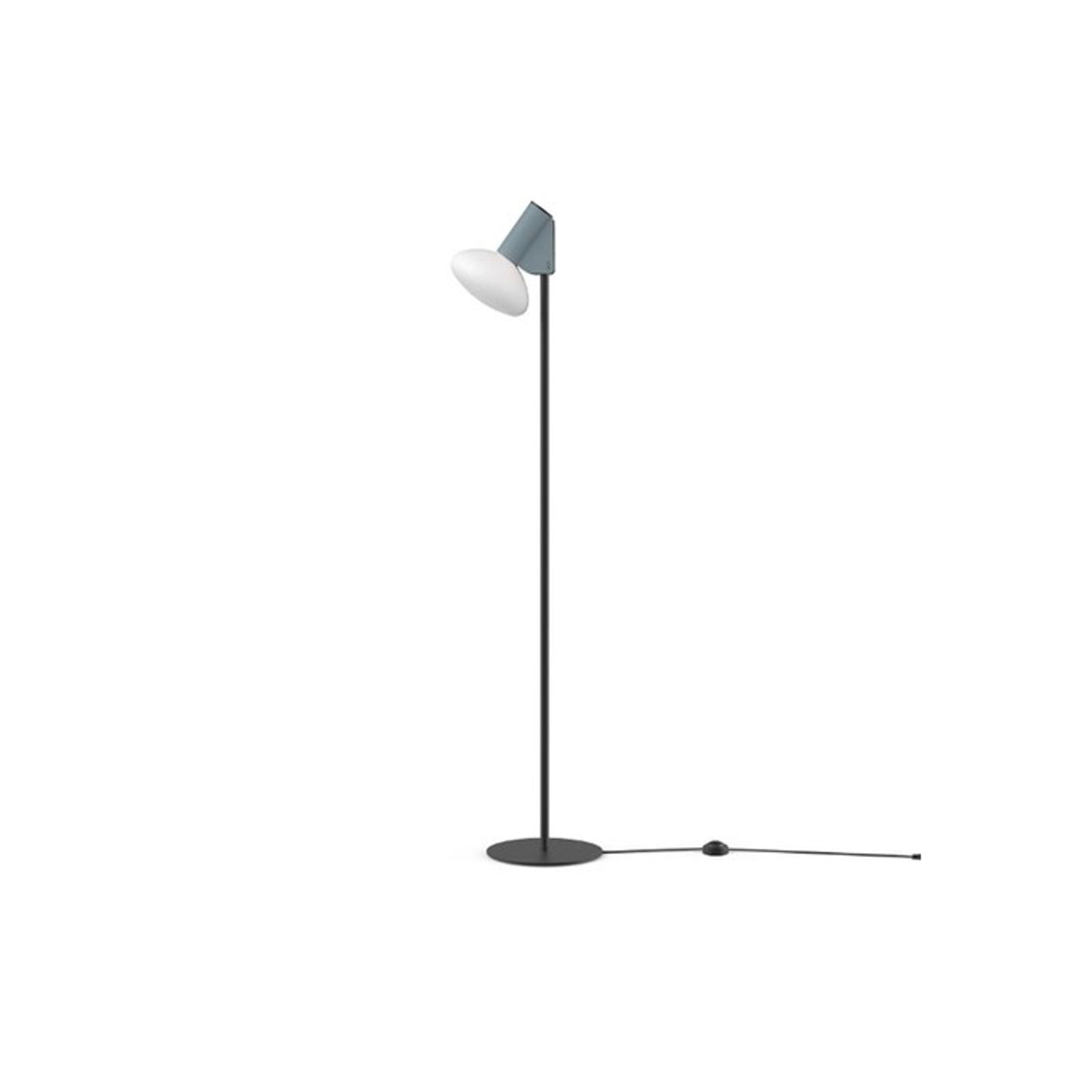
Pinterest Palette | COOL BLUE
Calm, considered, and quietly confident. This is the hue redefining calm interiors for 2026 – layered through sculptural seating, statement lighting, and refined detailing. Cool Blue doesn’t shout. It anchors.
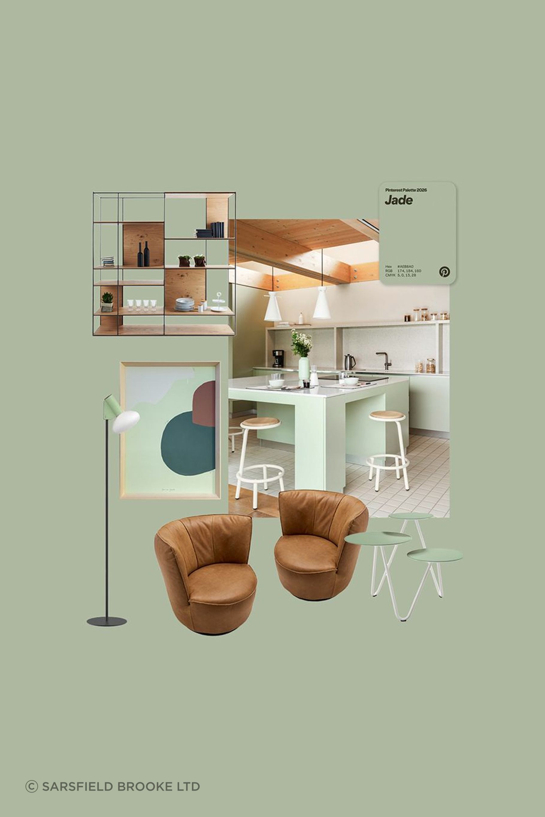
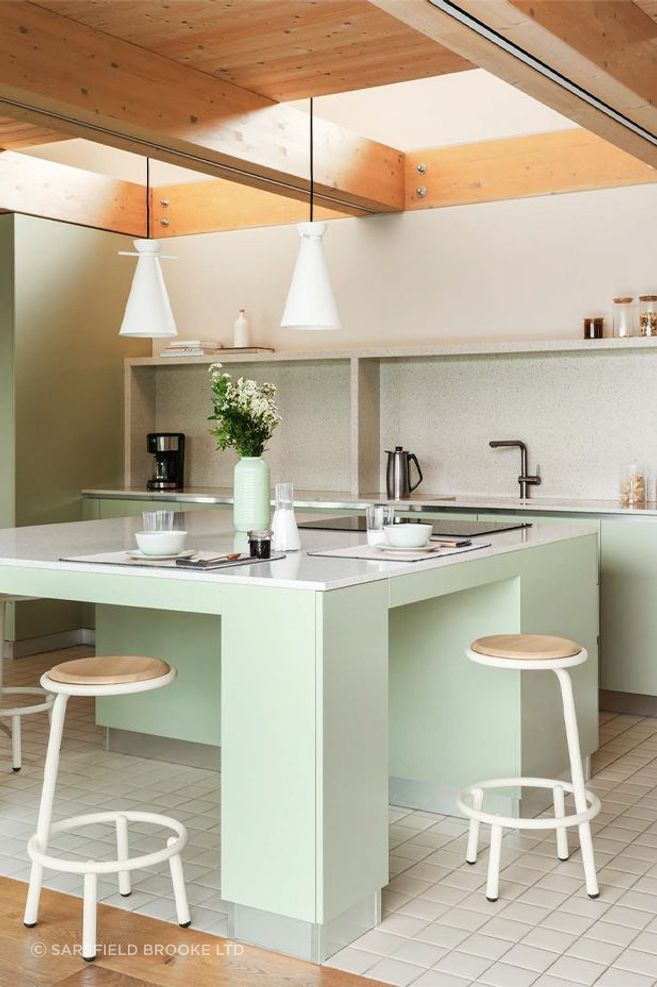
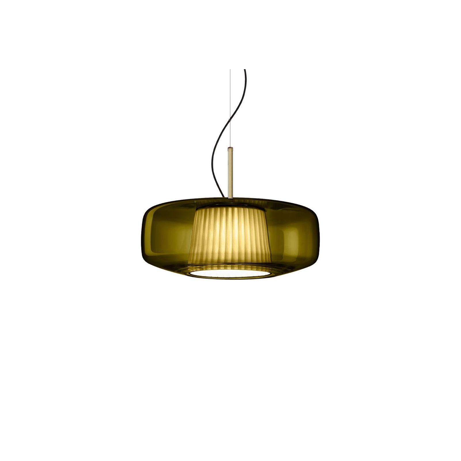
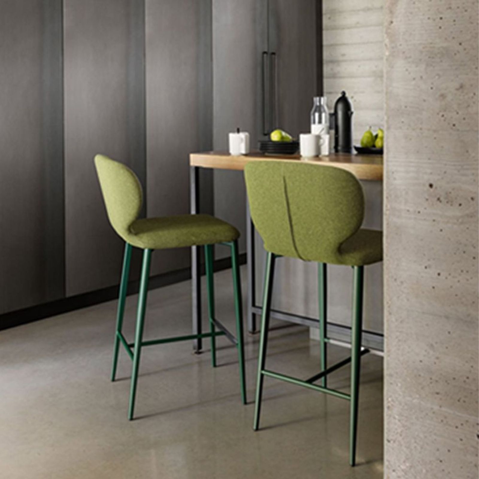
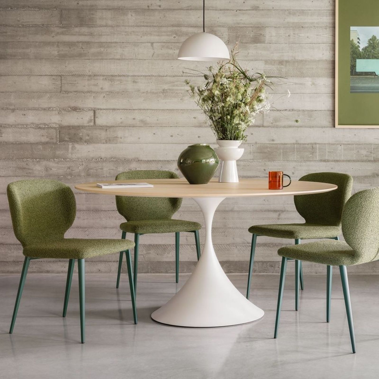
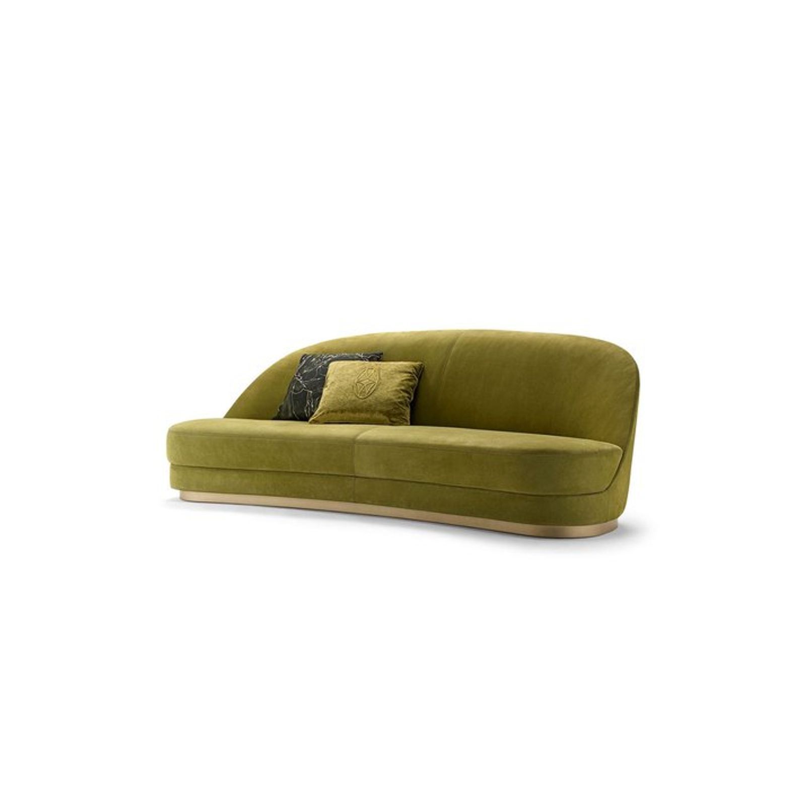
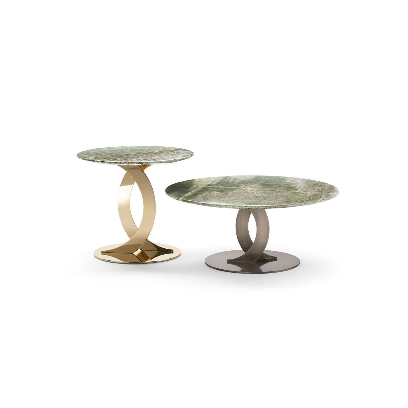
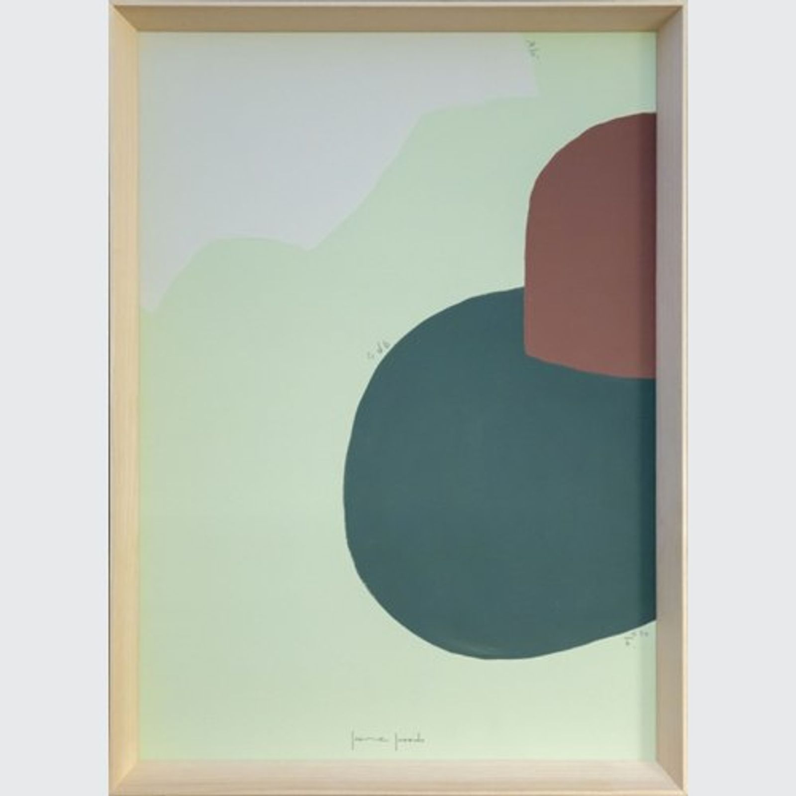
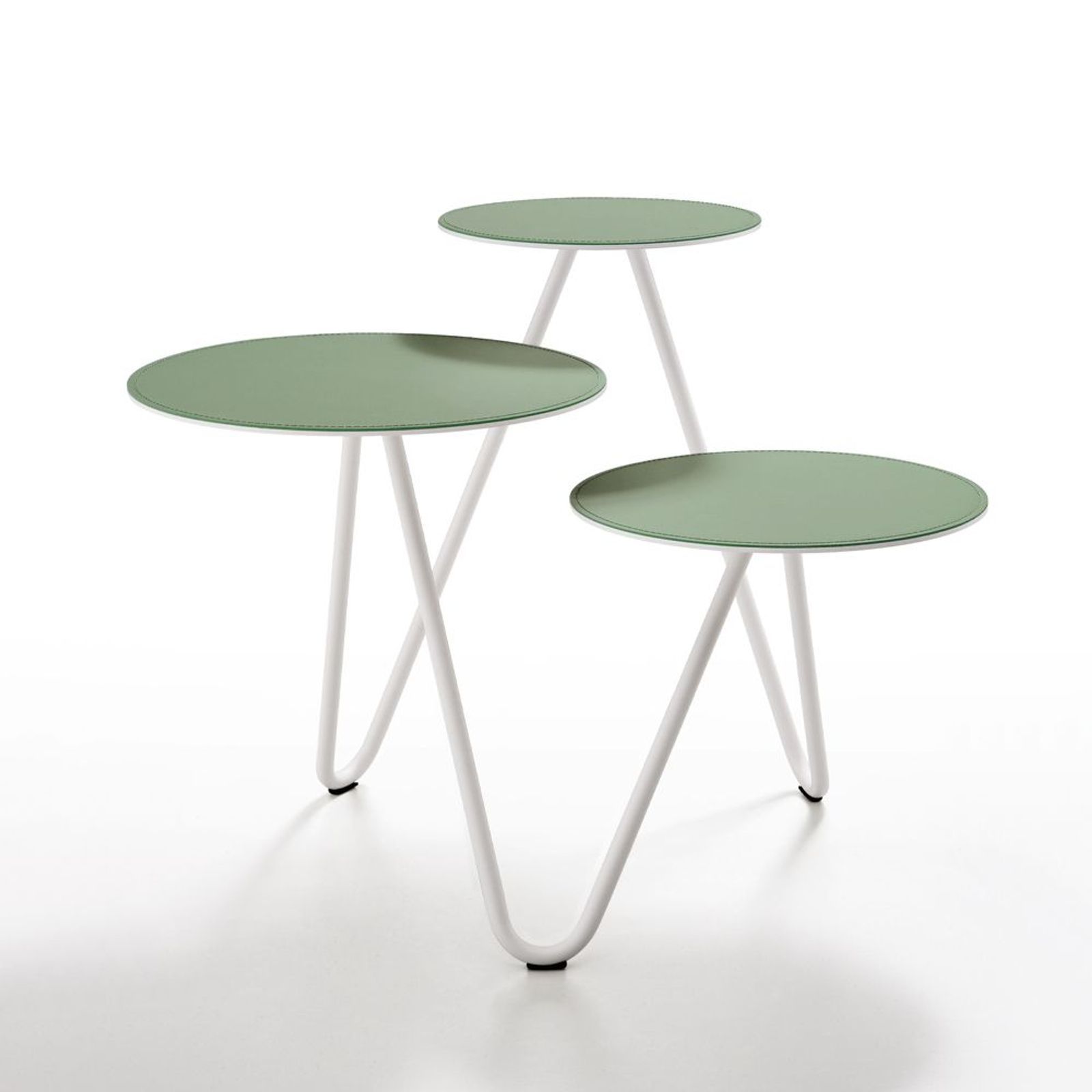
Pinterest Palette | JADE
Grounded green with quiet impact. Jade brings depth, softness, and a sense of balance to contemporary interiors - bold enough to be noticed, refined enough to last.
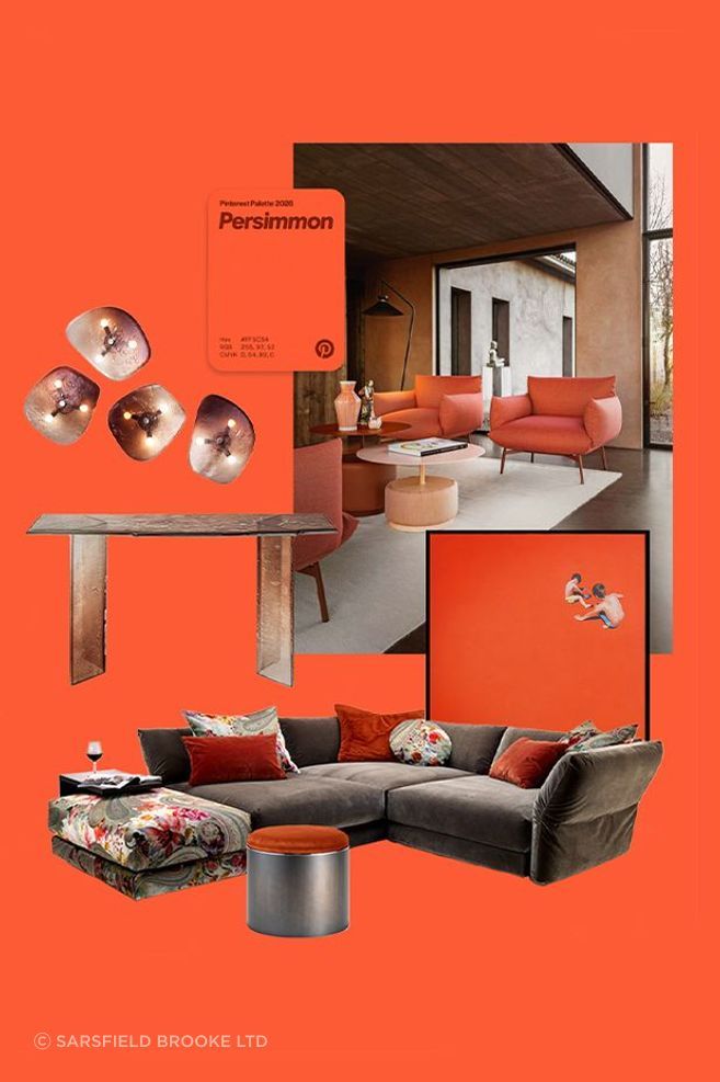

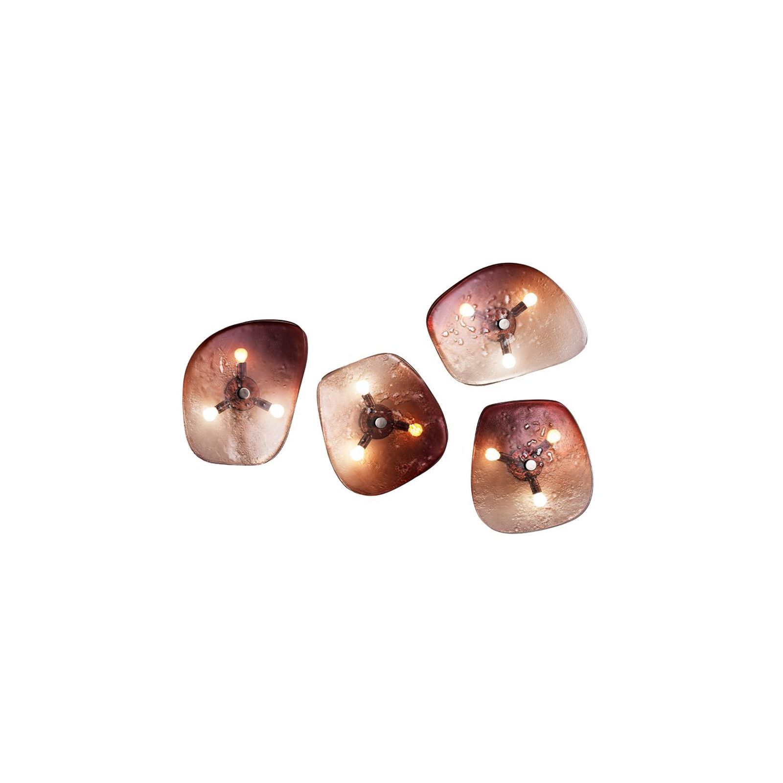
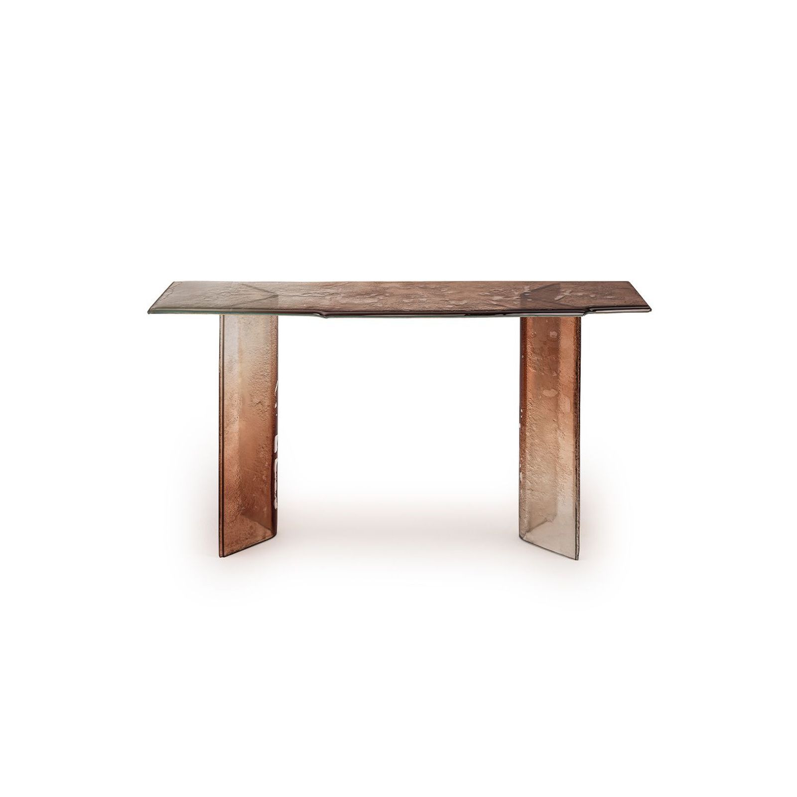
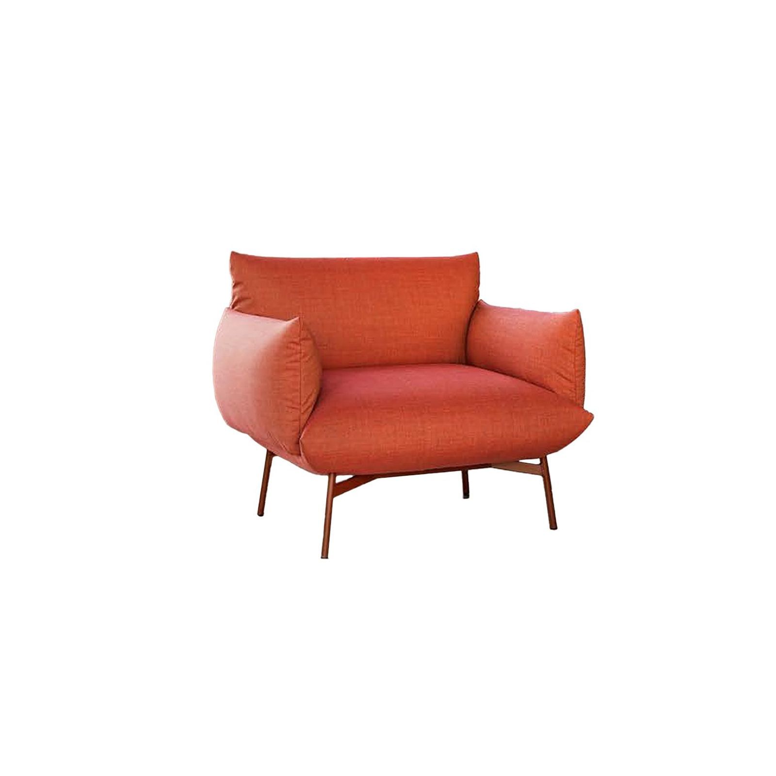
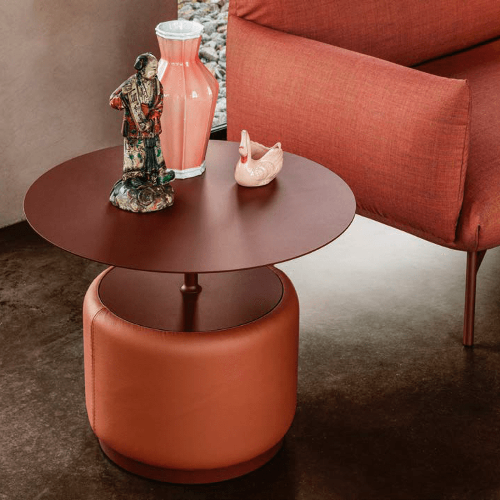
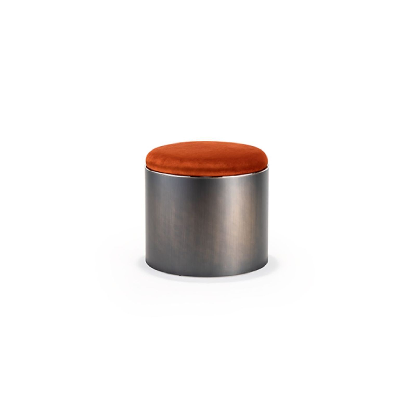
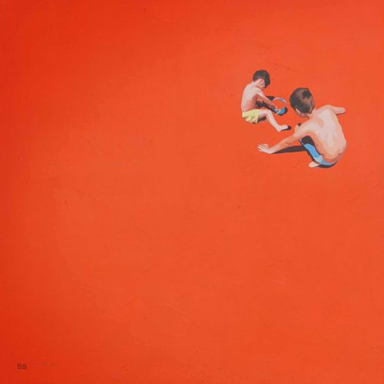
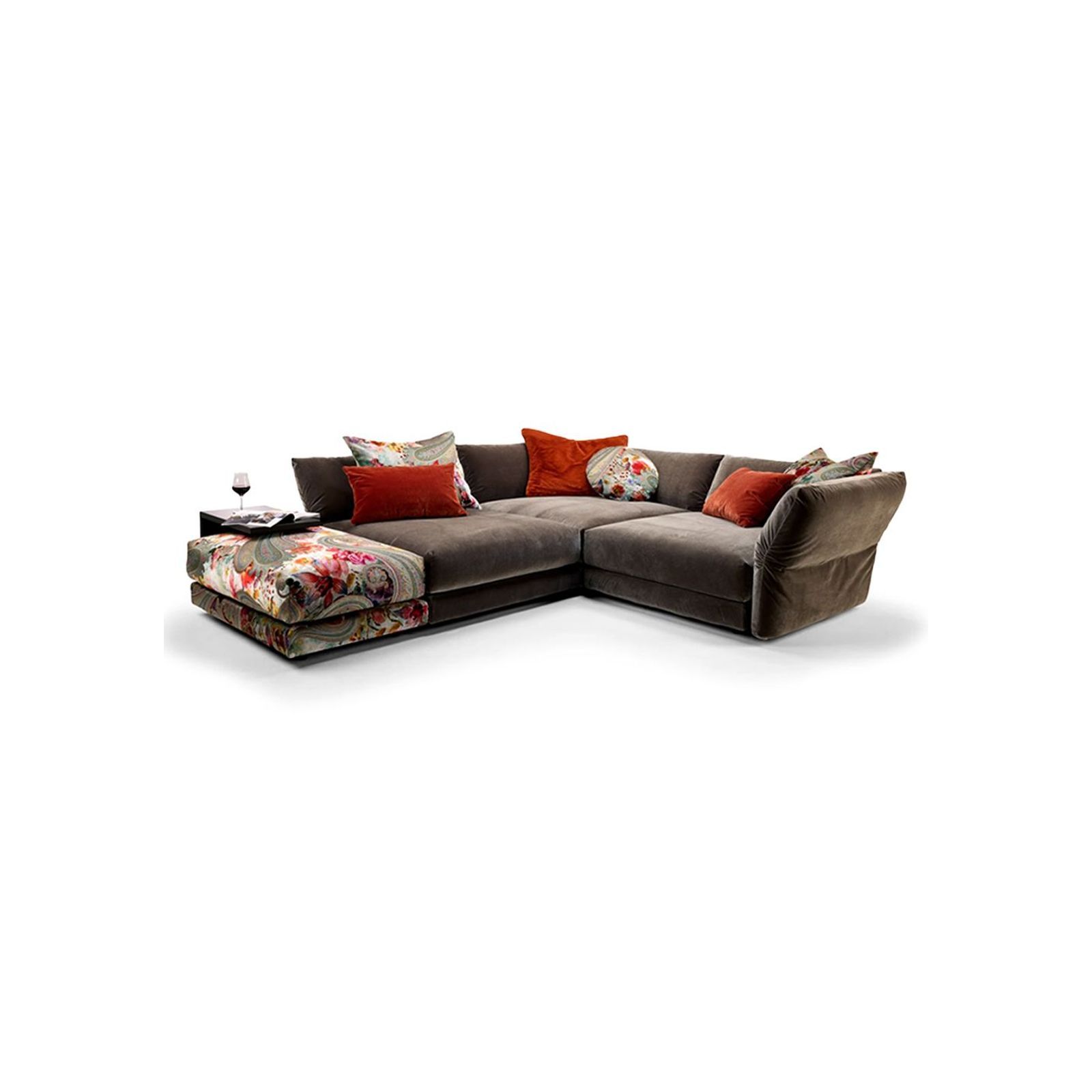
Pinterest Palette | PERSIMMON
A confident injection of warmth. Rich, energising, and confident, Persimmon transforms a space when paired with sculptural forms and tactile materials. A focal point that still feels considered.
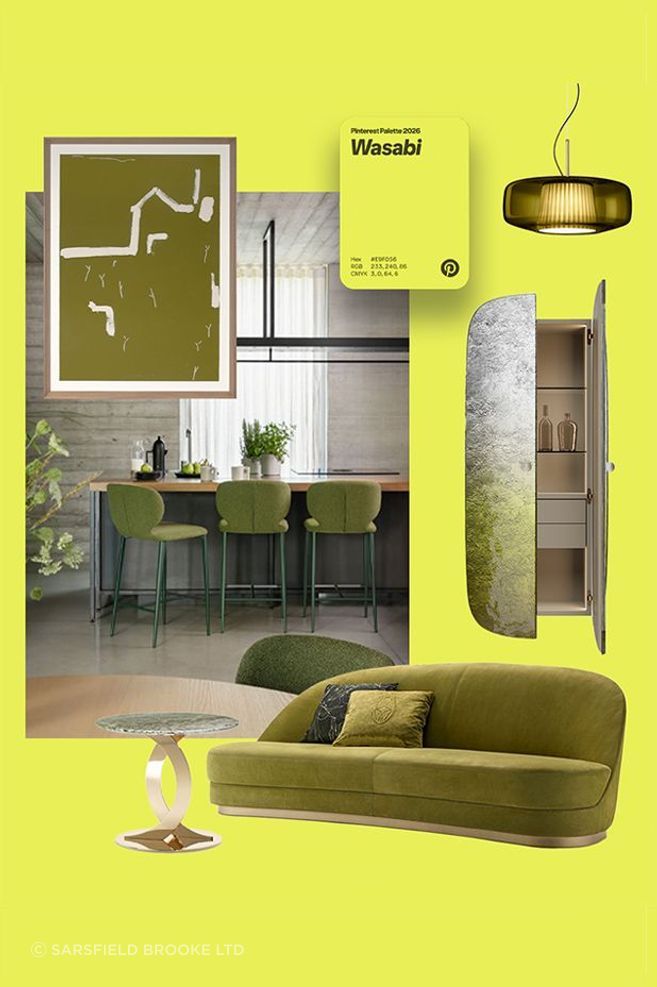

Pinterest Palette | WASABI
Fresh, unexpected, and sharply modern. A vibrant accent that instantly lifts a room - best used with precision through seating, cabinetry, or lighting that draws the eye.