Resene x ArchiPro 2021 Colour Forecast
Written by
10 February 2021
•
6 min read
At the end of 2020, we cast our net far and wide to our pool of talented ArchiPro design professionals to get their insight on what colours would dominate 2021. Our design experts answered the call en masse and the inaugural Resene x ArchiPro 2021 Colour Forecast was born.
Their entries resulted in a surprising array of hues, from an earthy marmalade to a deep, sooty charcoal. However, the results saw a common theme of nature-inspired shades, evoking a connected feeling after a turbulent 2020. ArchiPro head of design Mark Kiewiet attributes this to an overarching theme we’re seeing in interior and exterior spaces: biophilic design.
“Nature and design have always been intertwined, however, it’s no surprise that Covid-19 and the resulting global lockdowns have increased homeowners’ desire to connect to the natural environment.”
Both in our homes and workplaces we’re seeing a predilection for colours that reference and imitate nature. Resene colour consultant Chae Yun Christine Park says using biophilic colours helps to create a serene and grounding environment indoors, particularly important given people spent far more time at home than usual last year.
“We want to feel comfortable at home and bringing nature into the interior space helps us do that, particularly now that we can’t get out and travel. Seeing those natural colours in interior spaces helps us have that connection.”
Spending time in nature is well known to have healing properties, so incorporating timber, natural fibres and metals into the home or workplace is a great way to give you a boost.
The colours in this year’s forecast perfectly complement those natural materials, too, says Chae.
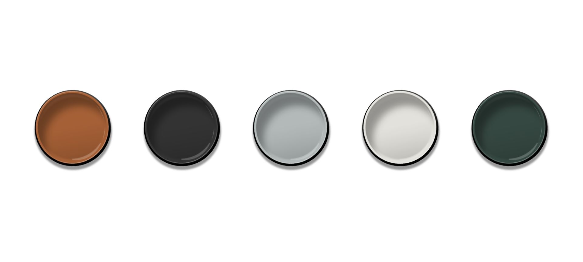
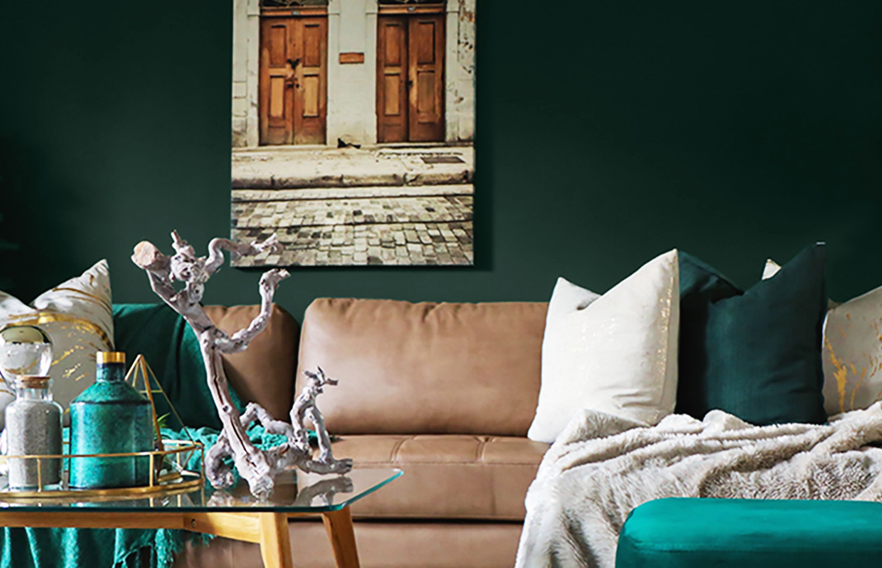
Best Living Room Colour: Resene Family Tree
MAC architecture director Jason Macquet
Jason sees a lot of clients going for darker, earthier colours in their living spaces and that’s why he picked Resene Family Tree as a standout colour.
“It creates a nice depth of colour that you can accent with brass, which we’re seeing a lot of at the moment.”
It’s an earthy green tone, which imitates nature and gives a sense of connection with outdoors, transcending that connection between interior and exterior.
“It’s pretty versatile,” says Jason. “I can see a room with all four walls done in that colour, but it’s important to temper it with contrasting furnishings.”
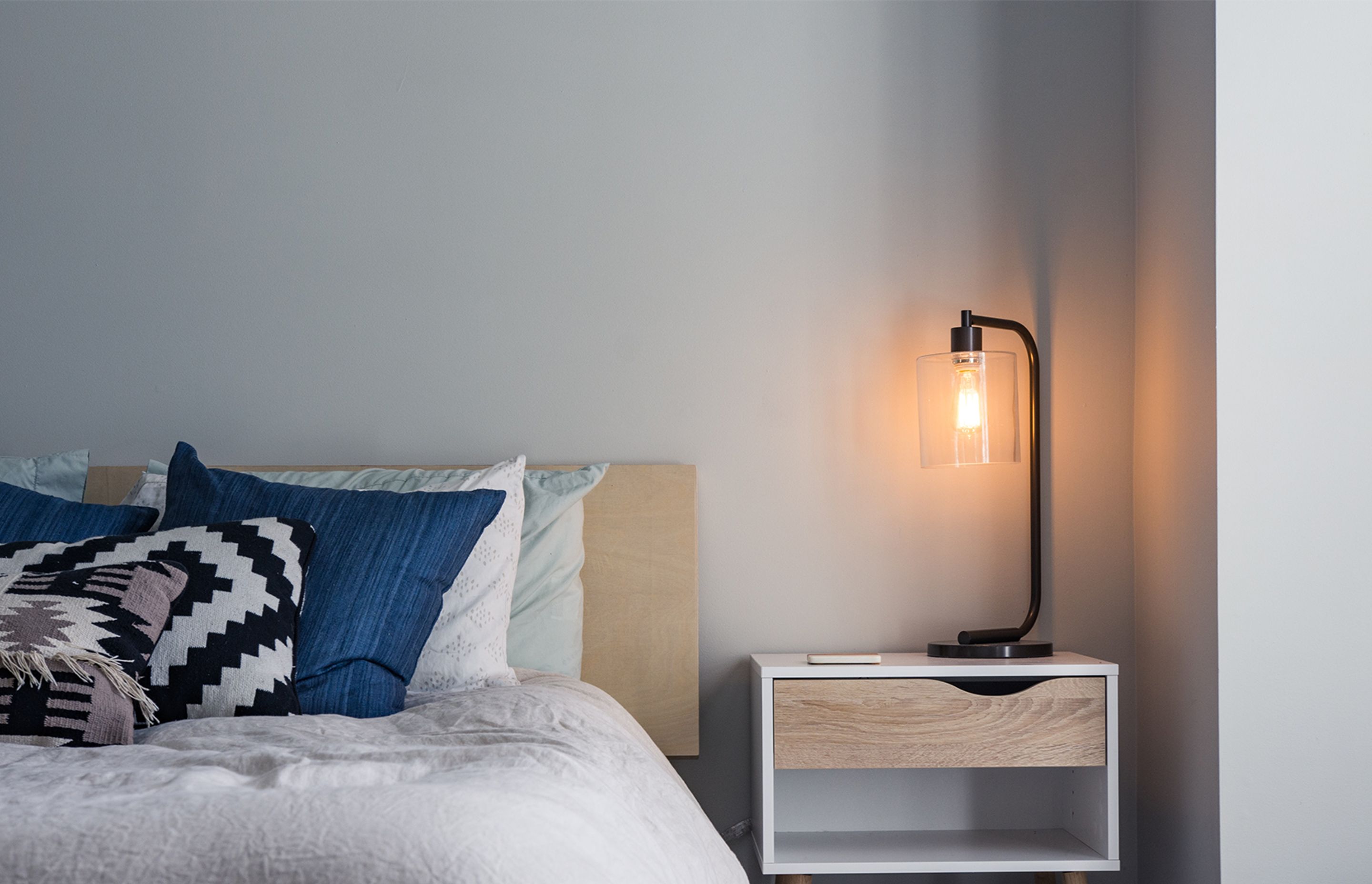
Best Bedroom Colour: Resene Duck Egg Blue
Tennent Brown Architects architectural graduate Robert Paulin
When you’re stuck inside a lot, or you work from home, it makes sense to surround yourself with soothing colours, and Resene Duck Egg Blue fits this bill nicely.
“The calming green-blue tone works particularly well in heritage styling,” says Robert. “It’s easy to pair with neutrals, timbers and white finishes.”
The dreamy blue has a calming quality, and is a departure from some of the bolder colours preferred in bedrooms in recent years.
“It’s neutral enough that you could use it for the whole room, or just on a feature wall – it’s not so intense that you couldn’t splash it around.”
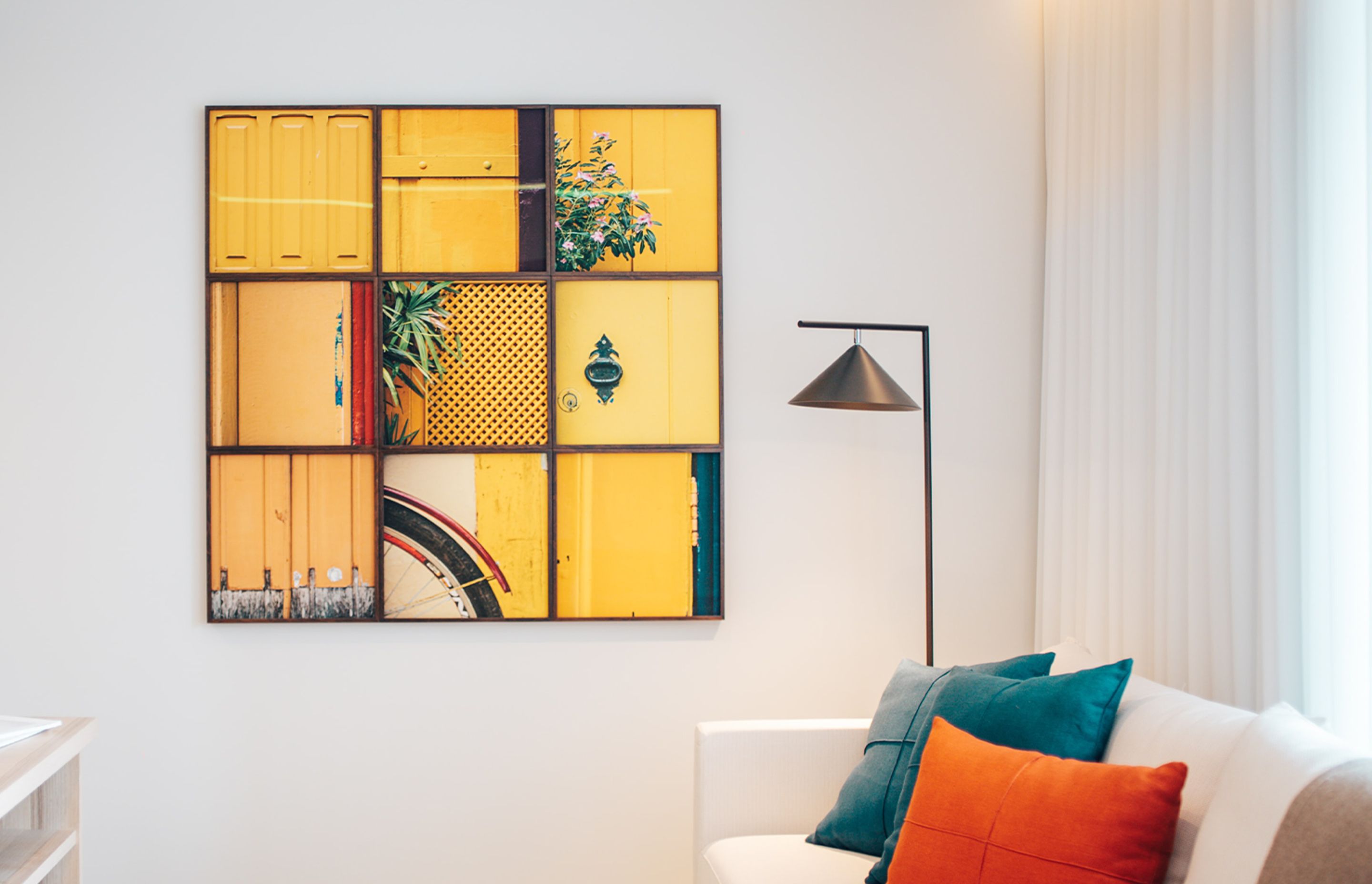
Best Neutral: Resene Elderflower
Green Room Studio director Samantha Elliot
Given that so many different types of timbers are being used in interiors currently, it’s imperative to have whites that work really well with them. Samantha says Resene Elderflower is a perfect contrast to all shades of timber.
“It’s a slight yellow-cream based white, with a bit of freshness to it. The reason why I like it is that there are a lot of grey-based and beige-based whites that are popular at the moment and this one has a softer tone to it.”
Samantha suggests contrasting it against other earthy-toned colours, such as Resene Peace, as the fresh base means it provides a counterpoint for yellow-based greens and dirtier timber tones.
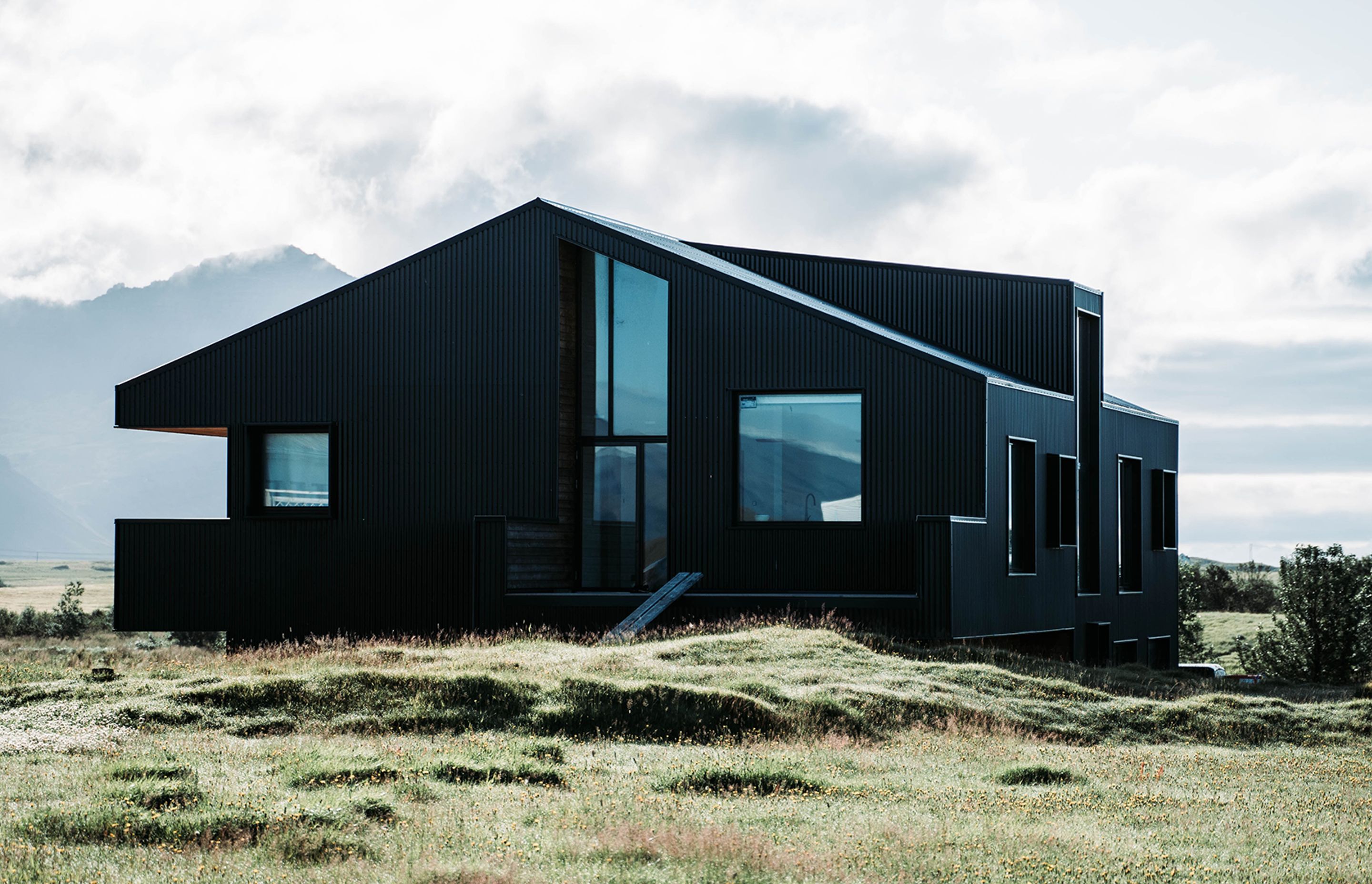
Best Exterior Colour: Resene Charcoal
SPACE Architecture director Tushka Glintmeyer
This year’s top exterior colour is a deep and recessive shade that creates a dramatic effect when used outdoors – both on walls and landscaping elements.
“It has that lovely recessive nature and it can work very well to blend a form or a building into its site,” says Tushka.
She uses it as an accent colour on landscaping elements in highly vegetated areas, rather than on exterior claddings. “It’s a nice backdrop and a nice feature, it works well with vegetation and gives it a bit of depth and drama.”
Wild Card: Resene Bi Hoki
Melanie Craig Design interior architect Melanie Craig
For those who grew up in the sixties and seventies, a splash of orange wasn’t an unusual sight in the home. But this year’s iteration, Resene Bi Hoki, reins in the retro factor and offers a more sophisticated twist.
“It’s like a deep marmalade orange – it’s got a glow to it,” says Melanie. “It’s earthy, but it adds a bit of spice!”
It also sits well in neutral interiors and contrast against timber, rather than playing up the yellow tones in it.
“You have to add a little bit of colour in these monochromatic spaces, adding a bit of that amber glow is a really nice way to do it.”

Be bold
This year’s top colour picks can work in both peaceful and energised spaces, says Chae.
Bi Hoki is a nice terracotta colour that takes its inspiration from Mother Earth and the soil; and Elderflower is a soft neutral that will work well in contrast with the other colours. Family Tree is a beige green and looks like it’s inspired by the deep forest and is quite nurturing; Duck Egg Blue has a hint of blue and grey - so it’s not departing from the greys and neutrals that New Zealanders love - but it’s perfect for when people aren’t brave enough to do a bold blue or green.
Regardless of whether you choose to add just a splash of Duck Egg Blue or a whole wall of Bi Hoki, this year’s top colour picks will leave you feeling serene and grounded.
This collaboration has been a great opportunity to harness the knowledge within our local ArchiPro design community and gain an understanding of the intrinsic relationship between colour and the effect it has on our mood the way we live in our spaces.
Look out for these colours appearing in projects throughout 2021.