Bold concepts
Written by
22 November 2018
•
6 min read
There is an enormous range of different types of cladding available today in various styles, colours and textures, giving designers the ability to experiment and create unique exteriors. ArchiPro talked with Christchurch architect Phil Redmond about the practice’s eye-catching claddings on several of their recent projects.
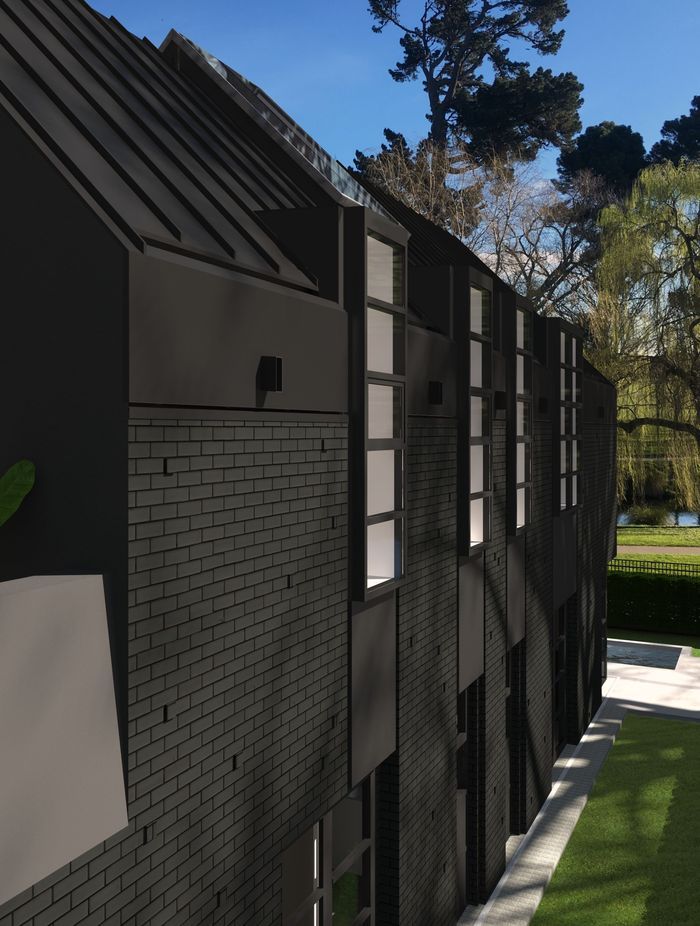
You've played with many different textures on the façades of your buildings, including 136 Moorhouse Ave and Rhodes House. What draws you to the use of these more unusual claddings?
At phil redmond architecture & urbanism our design ethos is very concept driven, so it really depends on the project. One may ask for a particular cladding to convey the concept and for others, the cladding may be secondary to the idea and it may just be selecting a textural or a colour finish.
When choosing unusual textures and colours for façades, what are some of the key points to consider?
Firstly, we look at how the materials fit with the idea behind the design – is the cladding or façade treatment a strong factor in the concept, or is it secondary? It’s important to consider the palette and the textures together and not think of them in isolation. Rough-cast stucco painted pink will look totally different to a float-finished plaster painted pink (we are still looking for a client to let us do a pink stucco wall!).
We then have samples done in the finished texture and colour, put the entire palette for the project together and refine it to make sure there’s not too much going on. We always consider how material junctions will work, how the materials will age or weather and their compatibility – not all materials are friends.
Finally, we talk to the cladding manufacturers and installers and get advice when documenting the project for building consent.
Please take us through the ideas behind and materials used in the façade design for the Moorhouse Avenue project.
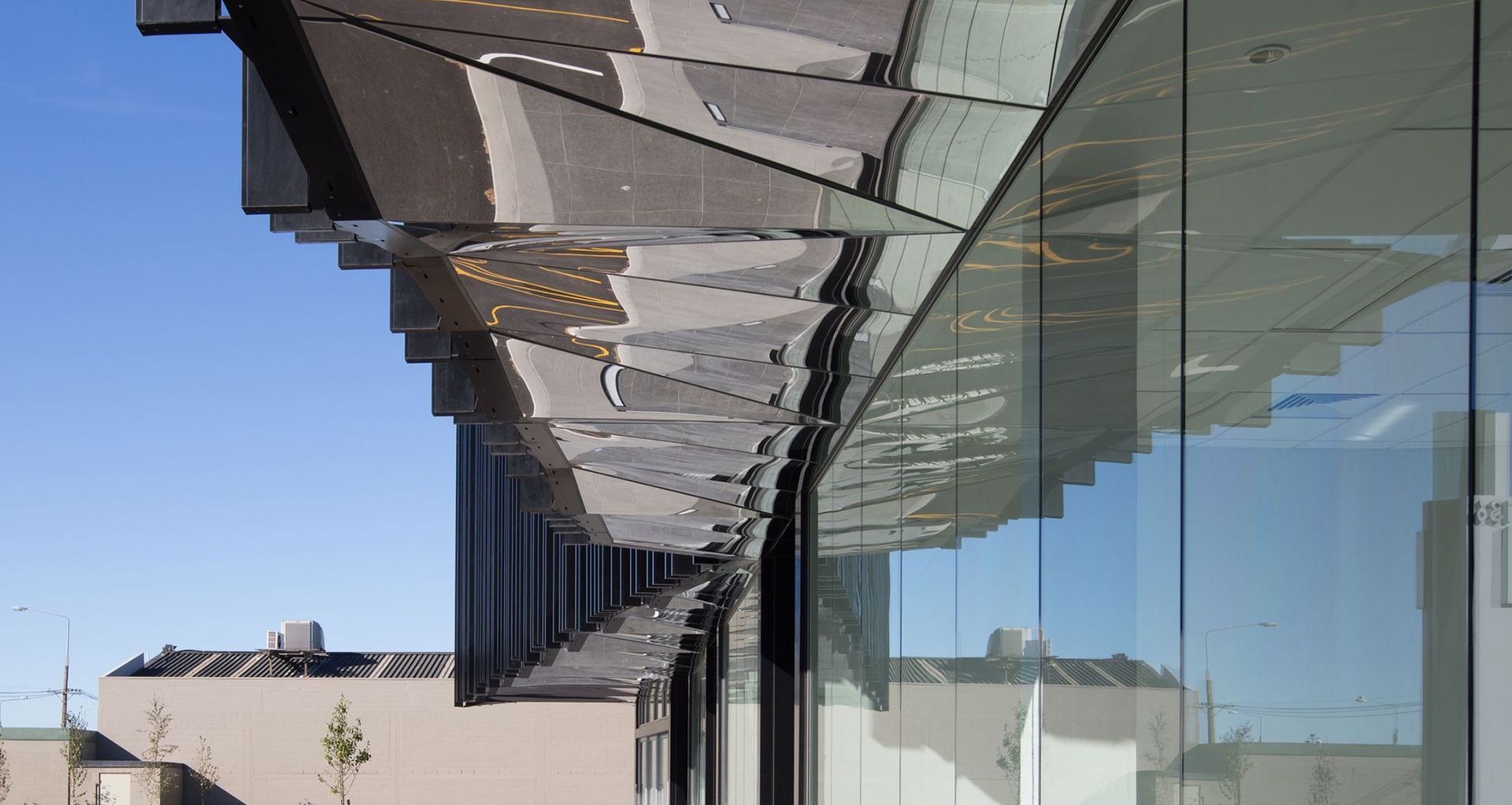
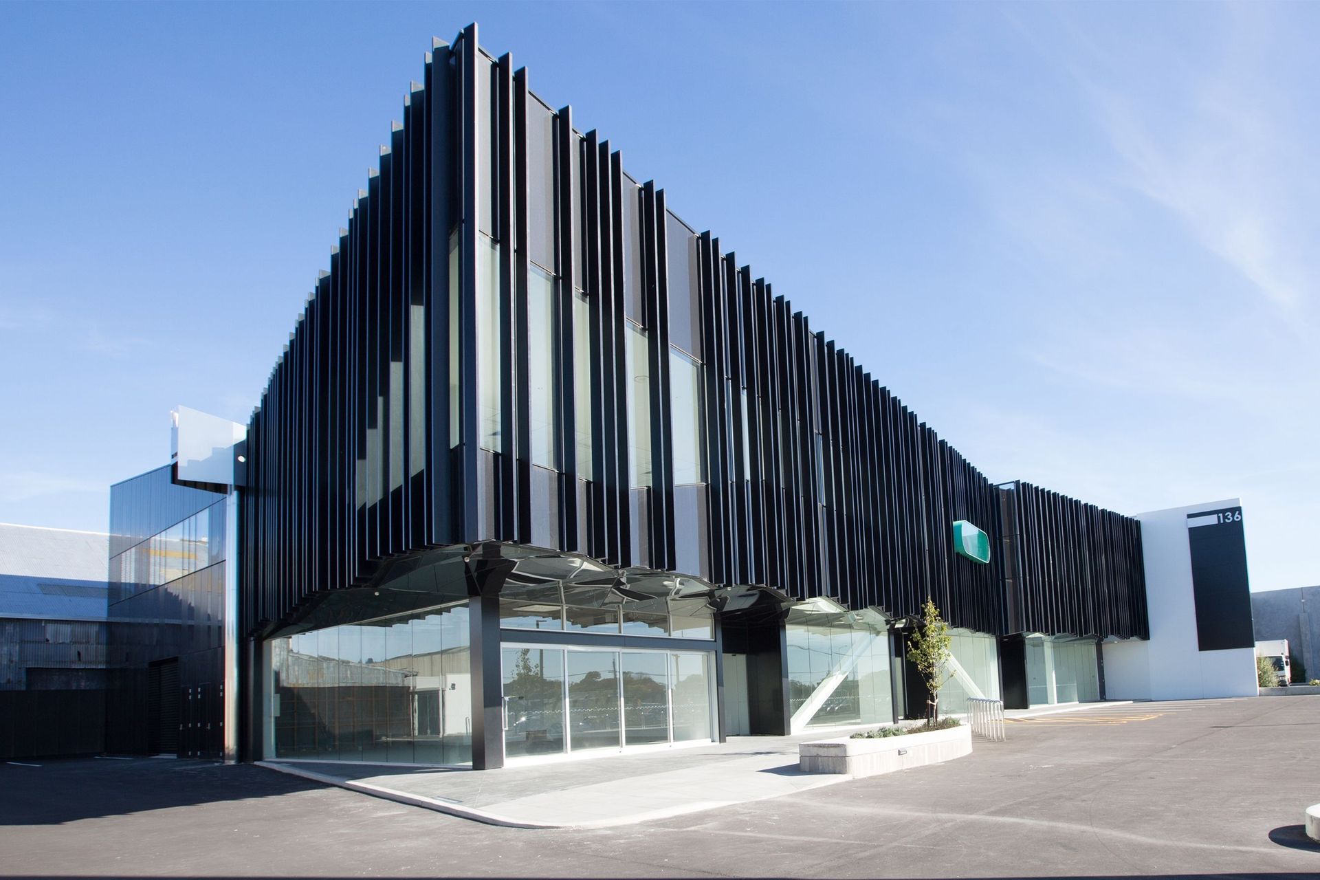
The idea behind the design was to create the building as a billboard, and to give the façade enough interest that it would capture the attention of passing motorists heading in both directions down Moorhouse Avenue, a major arterial on the fringe of the Christchurch CBD.
For the façade cladding and screening itself, we played with moiré effects – pattern disruption caused by overlaying of lines or grids. We ended up dulling this down a little, and focused on the idea of integrating hidden meaning into the façade fin layout.
When we demolished the site’s existing building, an old hand-painted sign, reading ‘The Farmers’ was revealed on the boundary wall of a shed. We thought that it would be great to archive the hidden sign into the new façade and ended up spelling out ‘Farmers’ in binary code.
We thought that it would be great to archive the hidden sign into the new façade and ended up spelling out ‘Farmers’ in binary code. We spaced the façade fins evenly across the building and then associated a 1 or a 0 to each fin. Where it was a 1, the fin was removed.
The material behind the fins is Alucobond panel in a metallic black reflective finish. This, in combination with the glazing, caused a subtle moiré effect with more shadows and reflections than originally intended.
The short façade to the eastern façade is mainly Alucobond panels, again gridded and broken by the ‘Farmers’ coding technique, but using Morse code. The result is an archived sign, re-archived within the new building’s façade, which acknowledges the original sign’s existence.
The final part of the façade is the mirror-finish stainless steel faceted soffit, referenced from Paul Pascoe’s Christchurch Airport domestic terminal, which was being demolished at the time.
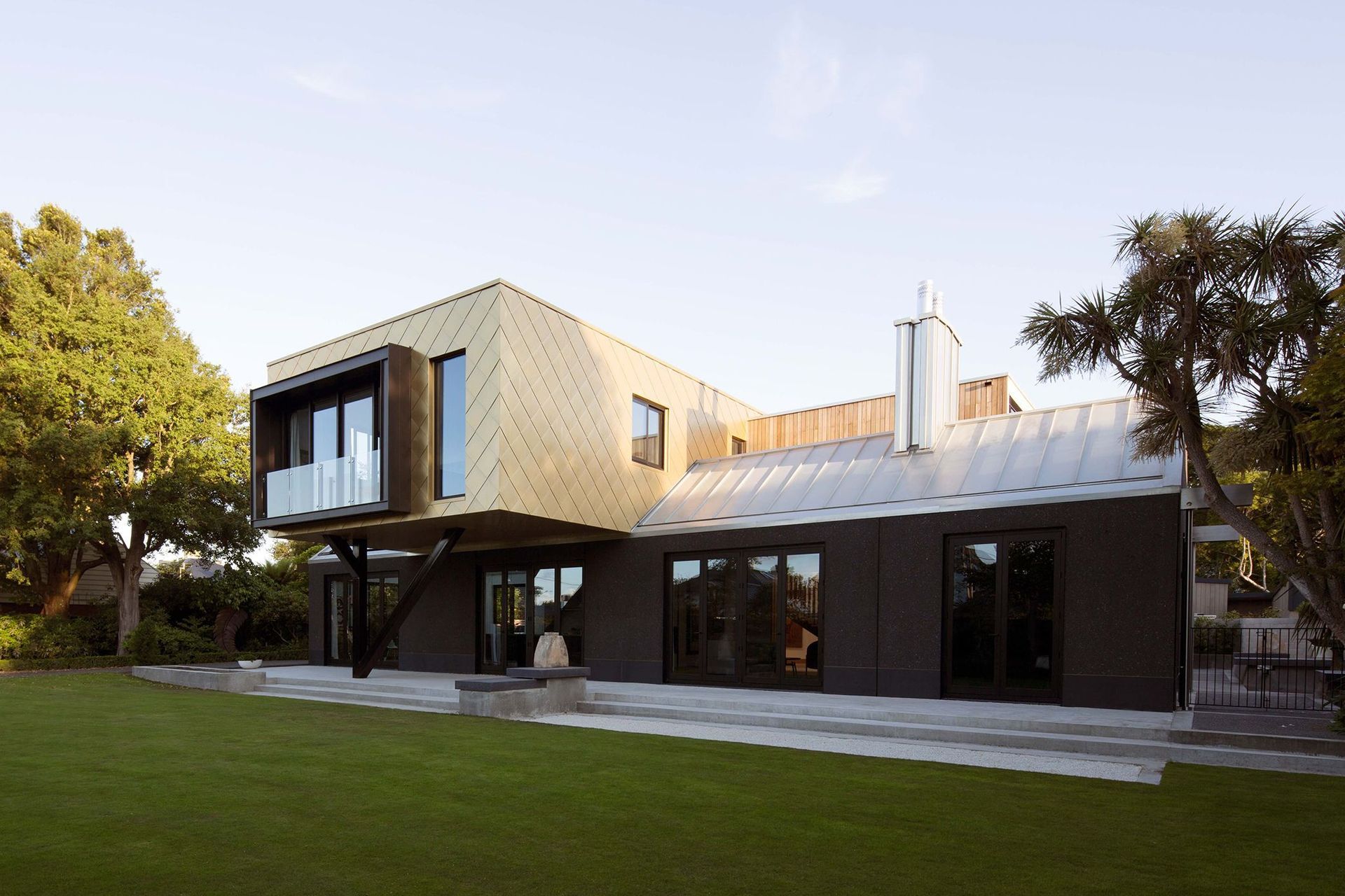
The use of the gold cladding on the Rhodes House is very unusual. How did this come about and what challenges were there with this design decision?
Rhodes House has a strong base concept of old and new. As a rebuild home resulting from the Christchurch earthquakes, there was a responsibility to design something as good or better than the previous building.
The concept was a ‘cabinet of curiosities’, which informed all the design decisions for the building. The project is loaded with references to architecture, art, family, Christchurch, etc.
Externally, we wanted to create a contrast between a traditional gable form and a sleek box: a type of jewellery box. We ran the idea of the gold shingles past the client and they were thrilled with the choice, slightly to our surprise!
The biggest challenges for the choice of the shingles was that they are actually made of copper, which can cause run off issues to different claddings. For this reason, the light grey roof to the concrete pavilions is copper too (Tecu Zinn).
What are some of your preferred materials and products for façades?
We like using materials that are true to themselves: honest materials. We are not keen on products that are portraying another material.
What are your thoughts on the use of eye-catching façades in urban areas, do they create too much 'noise' with other buildings very close by?
No, I don’t think so, it always depends on the quality of the design and the contextual relationship. Contrast between buildings can be good, as it can make the buildings in the streetscape read clearer and make them stand out for their own merits.
Do you think that Kiwi architecture is bold enough – or are architects here a little scared to create buildings with such distinctive, unusual façades?
It can be in some cases, we have a lot of similar response scenarios to physical context, which develops a local/New Zealand vernacular.
After studying at RMIT University and living in Melbourne, I enjoyed the city’s strong architectural discourse, there is a lot of experimentation and creative critique, something that is not as prevalent here in Christchurch. Hopefully, the city can become like this, I would love to see architects pushing bold concepts and producing projects with more rigour and intent.
Words by ArchiPro editor Amelia Melbourne-Hayward.