A world of colour
Written by
20 July 2020
•
6 min read
It is generally acknowledged that a healthy human eye can distinguish between 1 and 10 million colours, with most scholars putting the number at around seven million.
With such a colourful gamut available to us, it’s incredible to think that we may have a singular favourite or, even more astonishing, that there are a whole host of colours we are unable to naturally perceive—colours on the infrared and ultraviolet spectrums and the so called ‘forbidden colours’.
The science behind how we even perceive colours is quite complex, yet from the time we’re born we learn to categorise the world around us into a spoken language that strives to simplify everything into a shared understanding. That is why we use emotive language when we describe certain colours and why certain colours have been ascribed a universal meaning—red for stop and green for go, and so on.
Whether then, that our association with colour and certain emotive feelings is a learned behaviour doesn’t change the fact that it exists and that we can utilise those associations to set a ‘mood’ within our homes.
Resene colour consultant Angela Fell gives us an insight into how we interpret colour and how we can use it in our homes.
“Throughout the day we come into contact with thousands of subliminal messages that are colour coded to elicit a certain response in us. Just as Mother Nature uses certain colours to convey important messages, so too do advertisers and retail environments use colour to entice or enhance our moods in such a way as to make us spend more money—this is because the language of colour is more readily communicated to the brain than words or shapes.
“The colours red and orange, for example, tend to be uplifting and enervating, so you’ll see them used a lot around food outlets. Similarly, black is perceived to be high-end and so a lot of retailers will incorporate it into their showrooms to highlight their more high quality offerings.”
Moving beyond beige
“People want to use colour in their homes but tend to be wary about going too bold or making too much of a statement. A lot of that fear stems from those renovations shows on television that tend to promote neutrals over colour as the way forward. What people tend to overlook is that those shows are about getting a sale rather than creating a home that suits the individual.
“While neutrals are great, it can be very hard to create a mood or to tell a story with a lot of white. There’s a reason why people tend to refer to white as being ‘clinical’ and why it’s a very popular colour choice in kitchens,” says Angela.
When picking colours to define your home decor, Angela has a few suggestions to help get your started.
“Step one, if you haven’t already done so, is to determine your colour personality. Why is this important? Pinpointing your colour personality and decorating your home accordingly will make you feel comforted and satisfied. You can take Resene's colour me test to find out what your colour personality is.
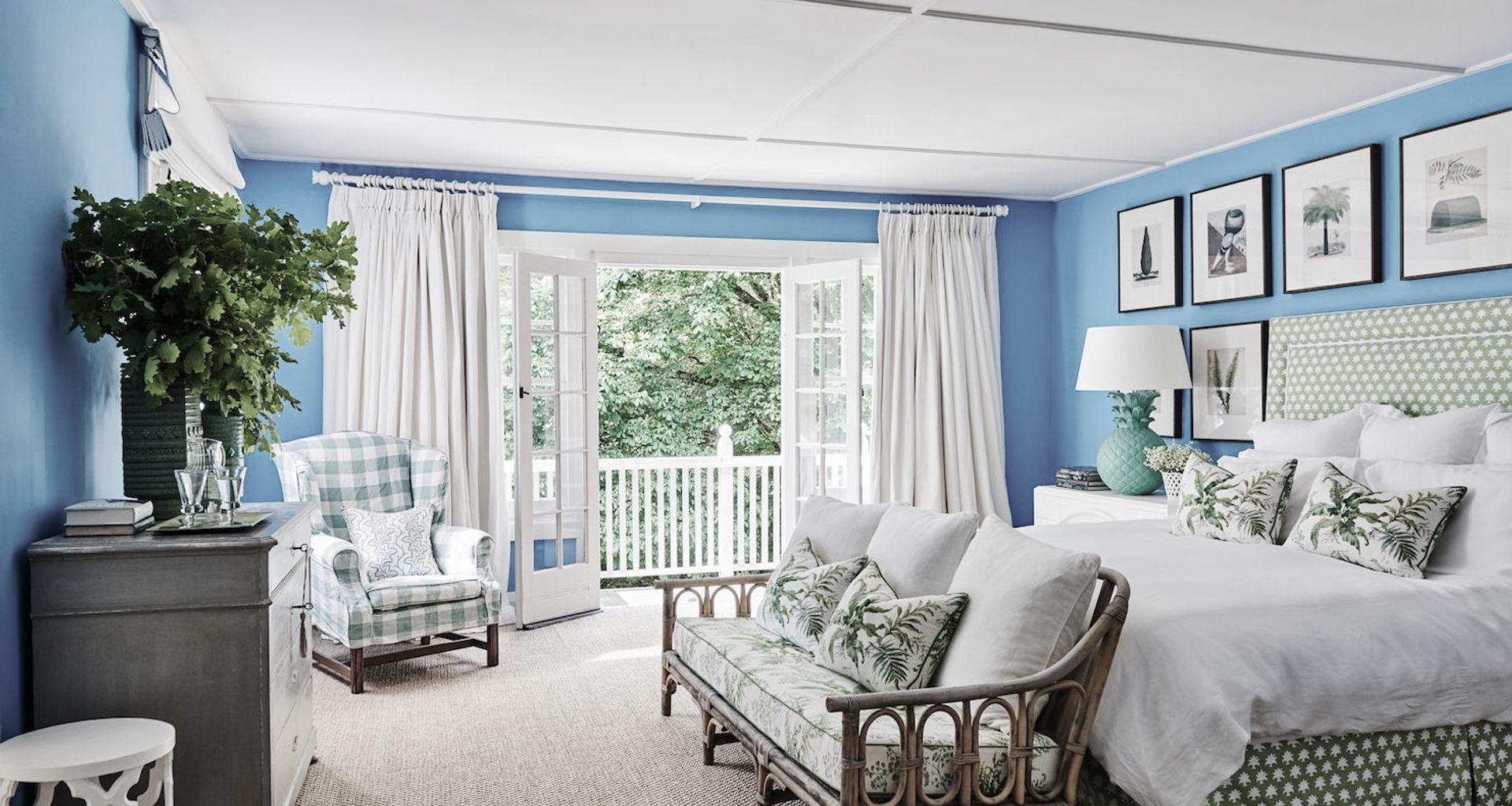
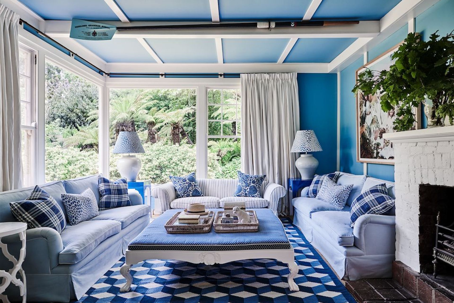
“The next step is to think about how you want your home and the individual rooms within it, to feel. For a calm and relaxing feel, analogous colours—those found together on the colour wheel—create a harmonious scheme. For a more lively and high-energy space, bright complementary colours—those found in opposing positions on the colour wheel—are best. If you want your home to impart a relaxing, modern and clean feel, a monochromatic theme—based around tones of the same colour—is a good choice.”
I like a certain colour and my partner likes another…
Having vastly different opinions about colour doesn’t have to be a barrier to decorating your home. The answer, says Angela, is about finding a common ground and building from there.
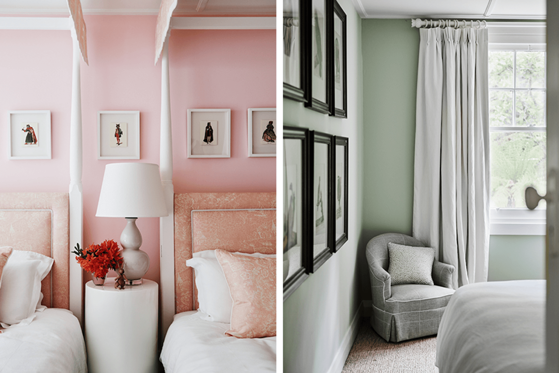
“Colour preference is such a subjective thing and based on our personal histories, so it’s not surprising that two people can have such different feelings for certain colours. It’s not all bad news though as darker tones tend to work well to bridge differences between individuals. Generally, colours have become ‘smokier’ or have hints of black in them, such as dusky pink, so finding a commonality is quite easy.
“There are two other really important elements to consider when working on an interior design scheme, they are: the material palette and lighting, both natural and artificial. We’re seeing a tendency towards a more masculine aesthetic at the moment, particularly in furniture design, which favours warm timbers and bronzes. Colours that sit well within this palette are browns, greens and pinks.
“Similarly, the industrial look is also still a popular choice with its use of steel and glass and black tones. A liberal use of luxurious fabrics and colours can really make a dynamic statement when teamed with an industrial style.”
Taking colour outside
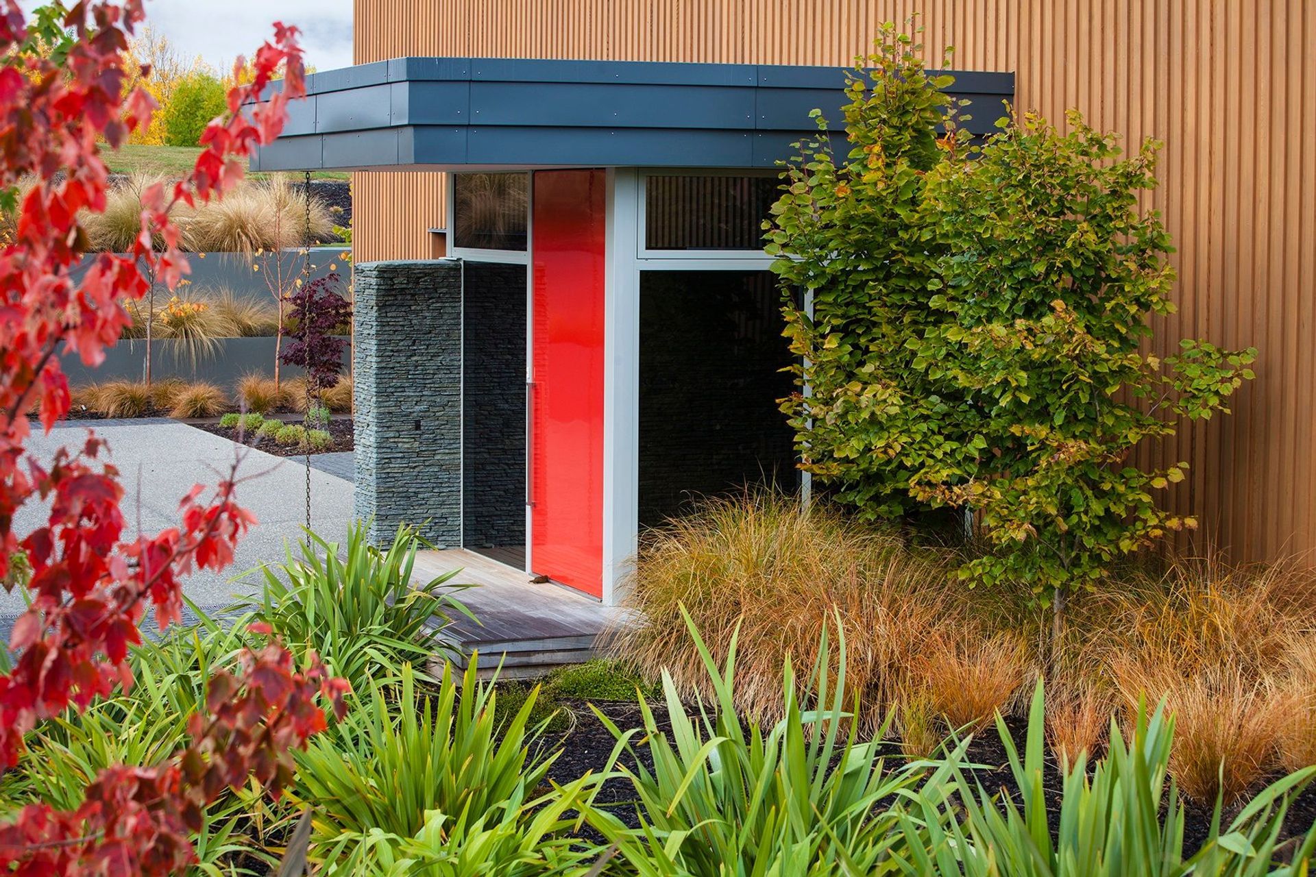
As anyone who lives in a heritage area can attest, choosing the right colour to paint the outside of your home can be a momentous—and council-mandated—decision. Even for those of us with more freedom of choice, getting the colour right can still be an issue and then there’s making sure to use the right type of paint.
“We’ve learnt so much in recent years about paint technology and the way in which colours tend to work externally,” says Angela. “The type of substrate is so important to choosing the right colour. Dark colours will naturally attract more heat and therefore should, ideally, be used in conjunction with non-timber claddings. Your Victorian-era villa will keep looking smarter for longer if you paint the weatherboards in lighter tones. That doesn’t mean you have to use white, lighter greys are a good alternative and show less dirt.
“Painting window frames, fretwork, balustrades and other architectural features in darker tones, as well as making a statement of the front door, are great ways of creating visual interest, as well as minimising ongoing maintenance.”
Taking sustainability into consideration, another trend that is becoming popular, says Angela, is the shift towards cool roofs. A cool roof is simply a roof that has been painted white or similar light shade. Again, because light colours reflect heat, cool roofs require less maintenance in terms of repainting but they also help reduce local air temperature, also known as the urban heat island effect.
“In order to help people learn more about paint technology and colour psychology, Resene has recently launched a webinar series that deals with a whole host of topics in these areas,”
Learn more about using colour in and around your home.