Painting with purpose
Written by
18 August 2020
•
4 min read
In 2016, New Zealand Police trialled a programme focusing on the causes of family harm and, following on from the success of that trial, rolled the programme out across the country.
Whangaia, which means ‘to foster’ or ‘to nourish’ in Te Reo Māori, is a concept that believes that through working together, we, as a community, can get to and address the underlying causes of family harm.
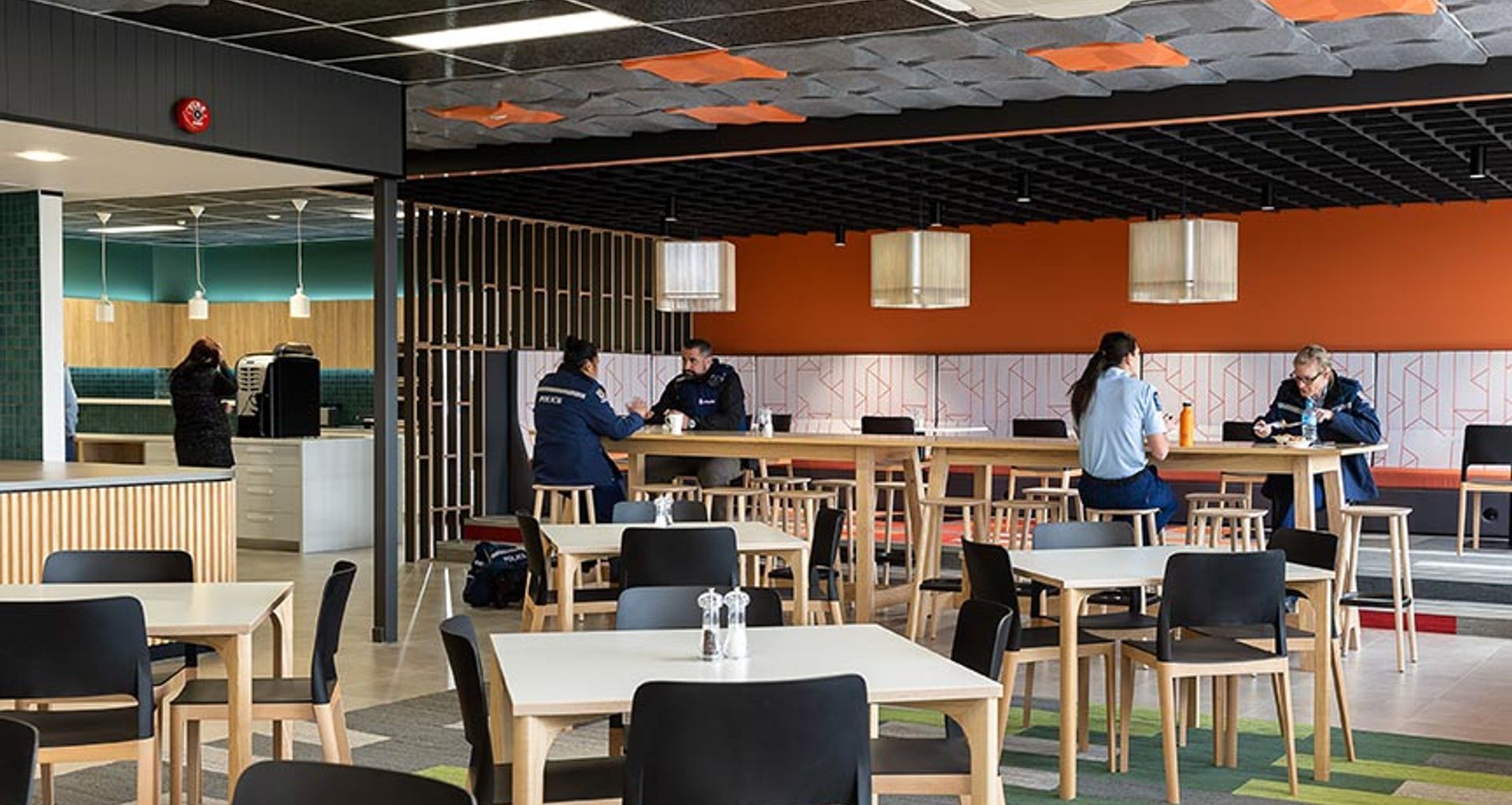
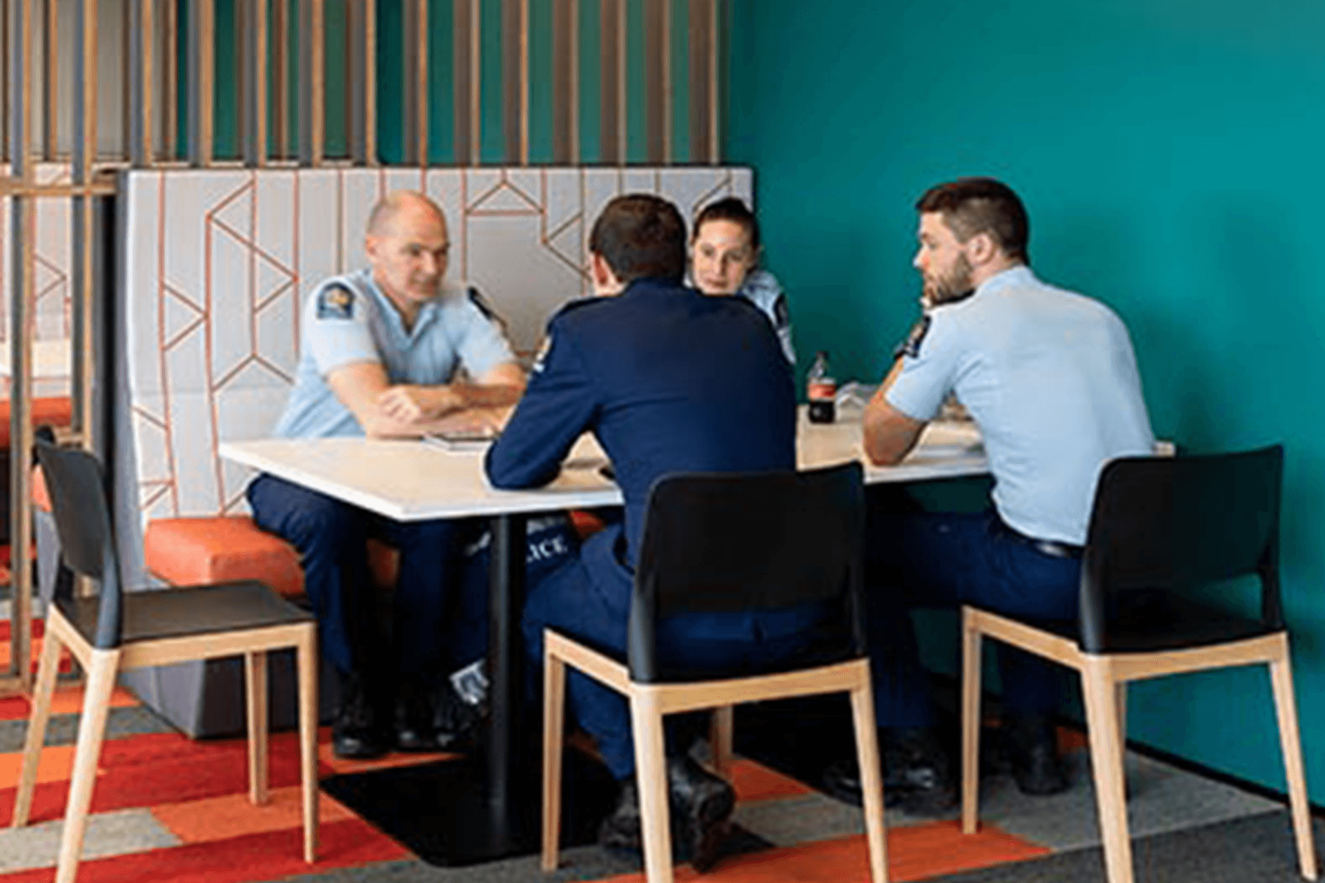
Located within Henderson Police Station, Whangaia Nga Pa Harakeke (WNPH) is a shared space between police, local iwi and other organisations. It is designed to be inclusive, open and collaborative—to reflect how the organisations will be working together to change the community, says Karen Warman, Resene Marketing Manager.
“GHDWoodhead Creativespaces was commissioned to refurbish two interconnected spaces—a break-out meeting area and the staff cafeteria—within the station so that they could act as a communal hub for the people and organisations who would be utilising them.
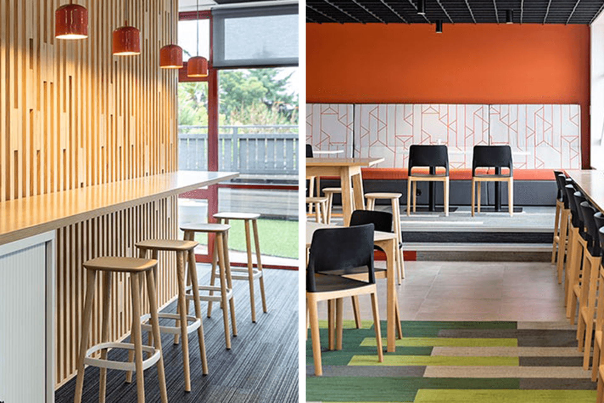
“The broader space has been reimagined to be warm and welcoming while achieving the flexibility and functions required by the WNPH team. Flexible workstations allow staff to work in an open-plan environment while giving them the freedom to choose their type of workspace and to be more mobile within the team. This functionality has been complemented by bright splashes of colour interspersed with timber screens, acoustic treatments and feature lighting.”
Karen says the refurbishment of the staff cafeteria was designed to reinvigorate and bring a sense of delight and joy to the ‘hub’ of the station.
“The existing space was uninspired, so colour was used as a hero on this project to bring the space to life. What was once a grungy area, has now become a fresh, light and vibrant space, featuring Resene Sea Green (clear blue green), Resene Periglacial Blue (icy blue), Resene Fuscous Grey (charcoal grey) and Resene Stromboli (soft deep green), with Resene Alabaster (blackened white) and Resene Ayers Rock (sunset orange) being used across both the café and the Whangaia.
“The rest of the Whangaia uses a flow of coastal tones with Resene Port Phillip (lichen grey green), Resene Streetwise (slate blue), Resene St Kilda (mineral blue) and Resene Quarter Mako (mid grey).”
The broader space has been reimagined to be warm and welcoming while achieving the flexibility and functions required by the WNPH teams.
Other architectural changes, such as enlarging and opening up the space out onto the refreshed outdoor terrace, have served to bring in lots of natural light and allow for future growth. Similarly, a variety of soft furniture and booths provide comfortable areas for informal meetings and team lunches alongside bar leaners, pod seating, café style tables and armchairs in a colourful palette to enliven the space.
“As you move around the space, there are new colour features and areas to discover with the palette of reds, oranges and greens devised to delineate different seating zones and to complement the existing ‘maroon red’ aluminium joinery that features heavily in the space,” says Karen.
“Where the ceiling is lowered to instill a sense of intimacy, the colour palette is warm to enhance the sense of enclosure and good feeling, with different furniture types selected to suit the mood of each zone.
“This project won the Resene Total Colour Commercial Interior Shared Space Colour Maestro Award. The judges said: ‘this project cleverly breaks down the barriers with colour, bringing the police and the community together in a positive environment where all are welcome. The palette deviates from the austerity and formality you might normally expect, using a careful mix of bold and softer hues. United by colour, this colour palette brings togetherness’.”