10 white kitchen designs that feel elegant and tactile
Written by
21 July 2022
•
5 min read
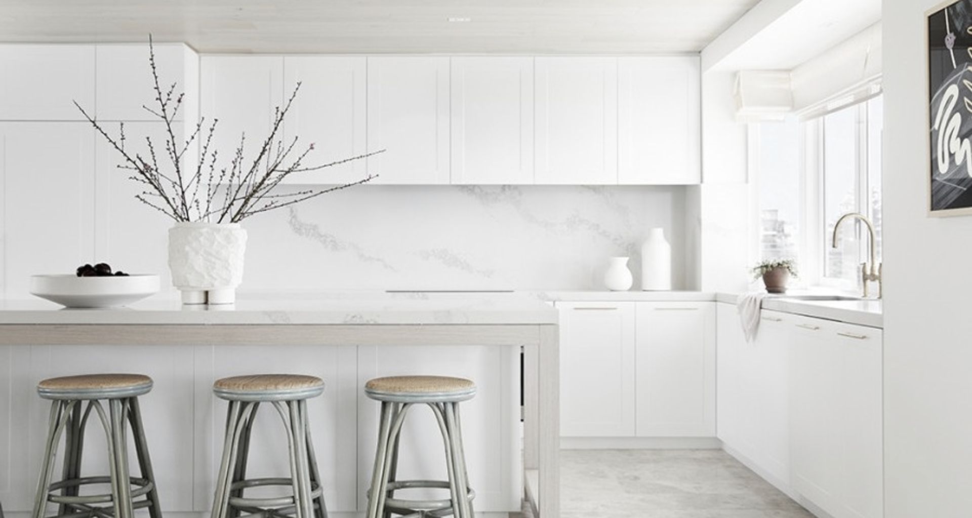
The kitchen is now a place where friends and family gather. The rise of open-plan living has thrown this busy room into the heart of the home, often positioning it between our living and dining areas. As such, kitchen design requires just as much thought and consideration as any other entertaining space frequented by guests. White kitchen designs have proven to be an enduring trend that fits seamlessly into almost any abode, so long as elements of depth, contrast and texture are integrated with care.
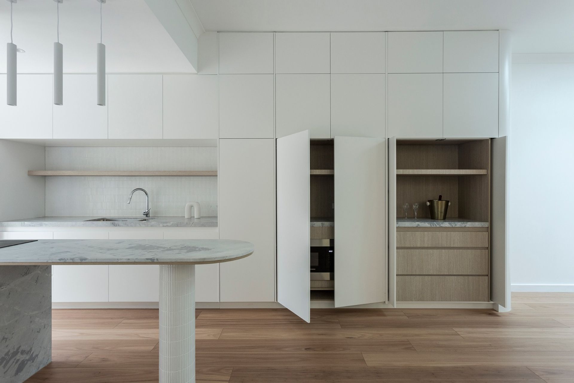
Sleek and minimal
Clever handle-free cabinetry that conceals all manner of appliances and workspaces is what sets this kitchen by SN Architects apart. The natural stone benchtop, timber flooring and KitKat tile splashback provide the texture this scheme needs to avoid being boring, while the stone-clad island bench with cylindrical tiled pedestal stands as a sculptural feature within the space, further emphasised by the zoning effect of the overhead pendant lights. The timber finish inside the cabinetry ties into the flooring, providing warmth.
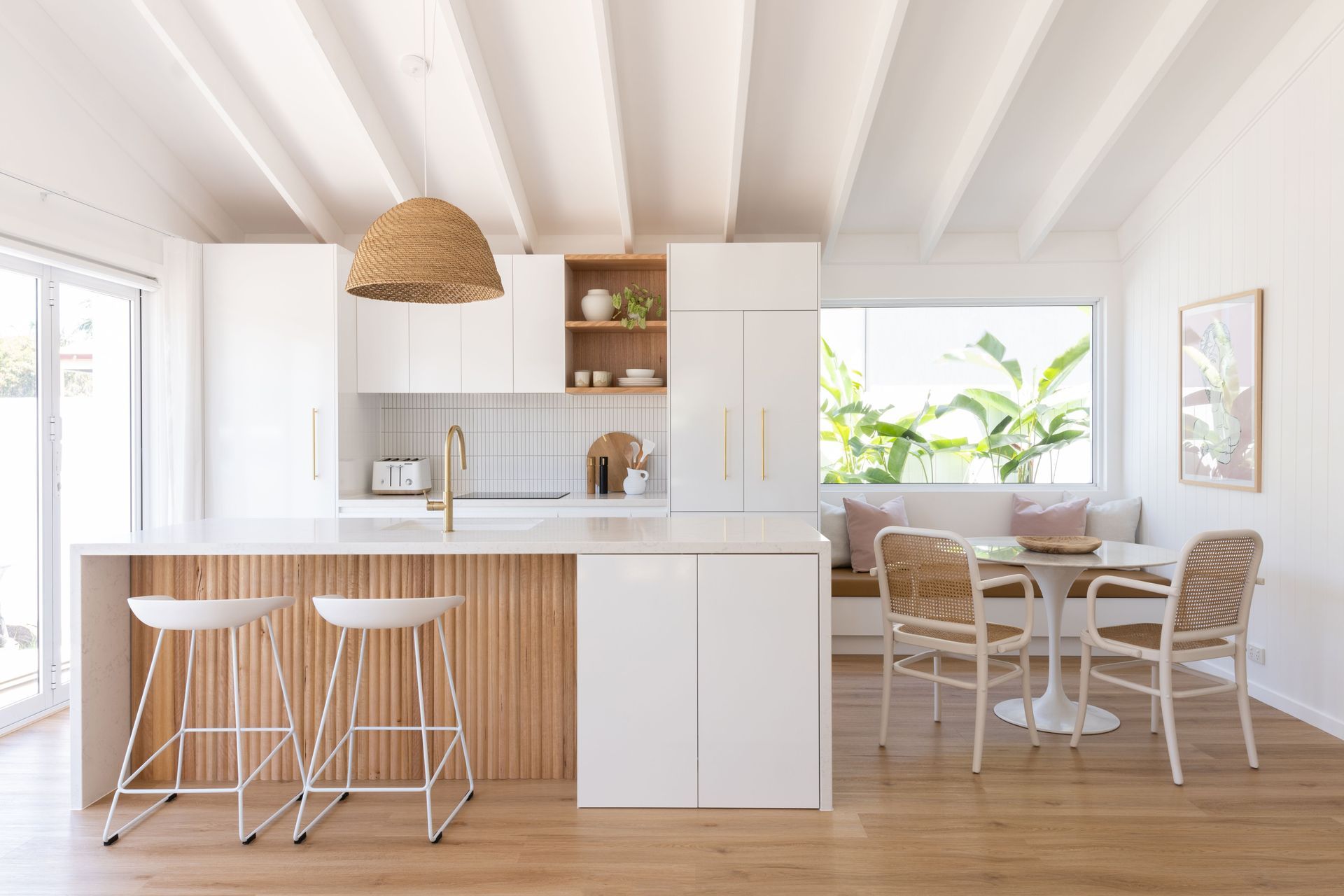
Light, bright and airy
Windows on two of the four walls of this kitchen, combined with an all-white palette, ensure this space is filled with natural light all day. Warmth and interest have been built with the strategic placement of the woven pendant, rippled timber cladding to the island and timber shelving, while the exposed ceiling beams create a sense of depth. The built-in bench seat to the right of the kitchen is a clever way to incorporate seating into a compact floorplan. The metallic hardware is a pretty finishing touch.
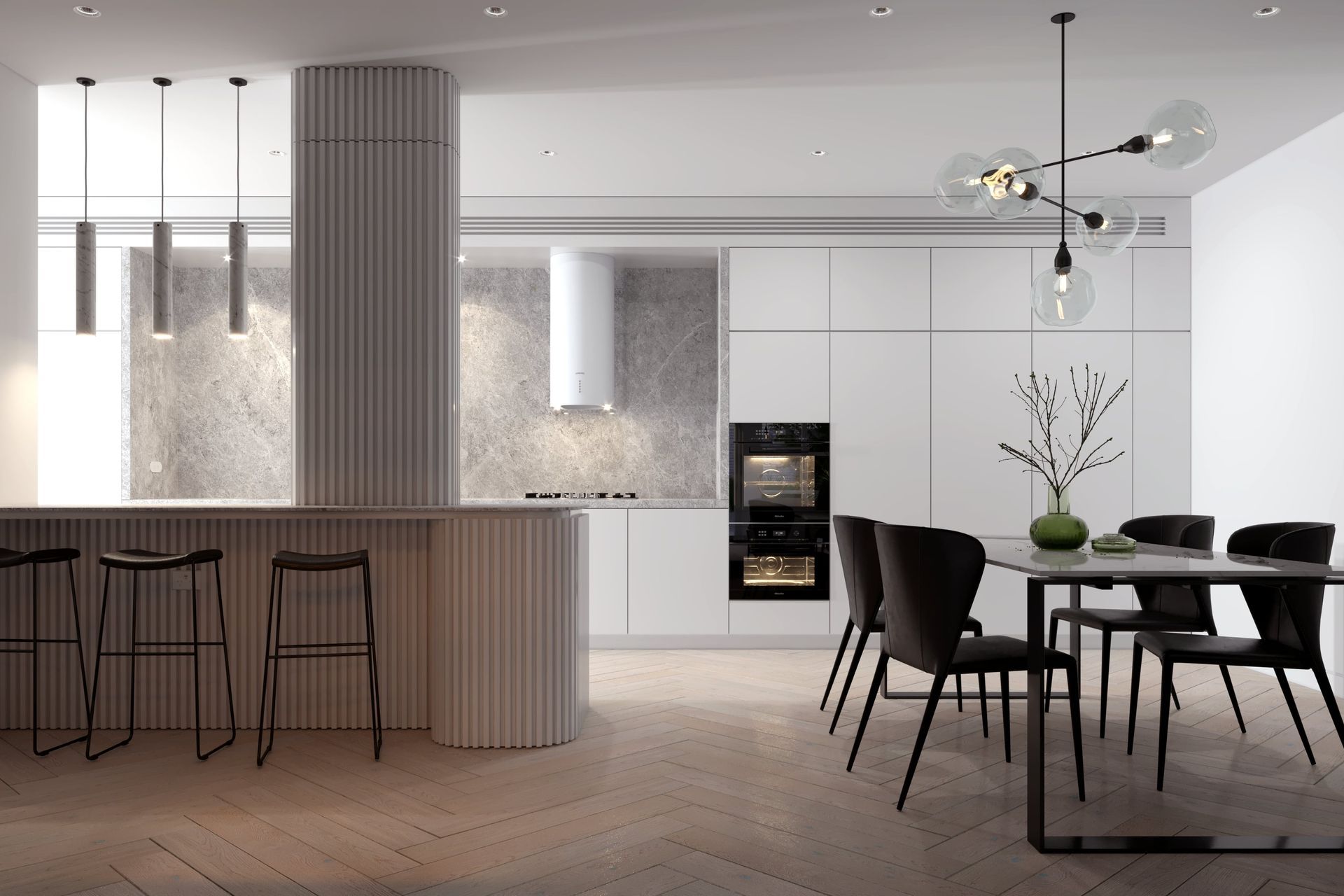
Premium and contemporary
Using a palette of just four key materials, the SN Architects team has created a soothing yet intriguing kitchen that feels clean-cut and luxurious. Herringbone flooring in a pale timber finish contrasts smoothly with the clean-cut design of the cabinetry, while the stone benchtops and textured island cladding create visual layers. The heavier nature of the black dining table, pendant light and bar stools ground the scheme.
New Scandinavian
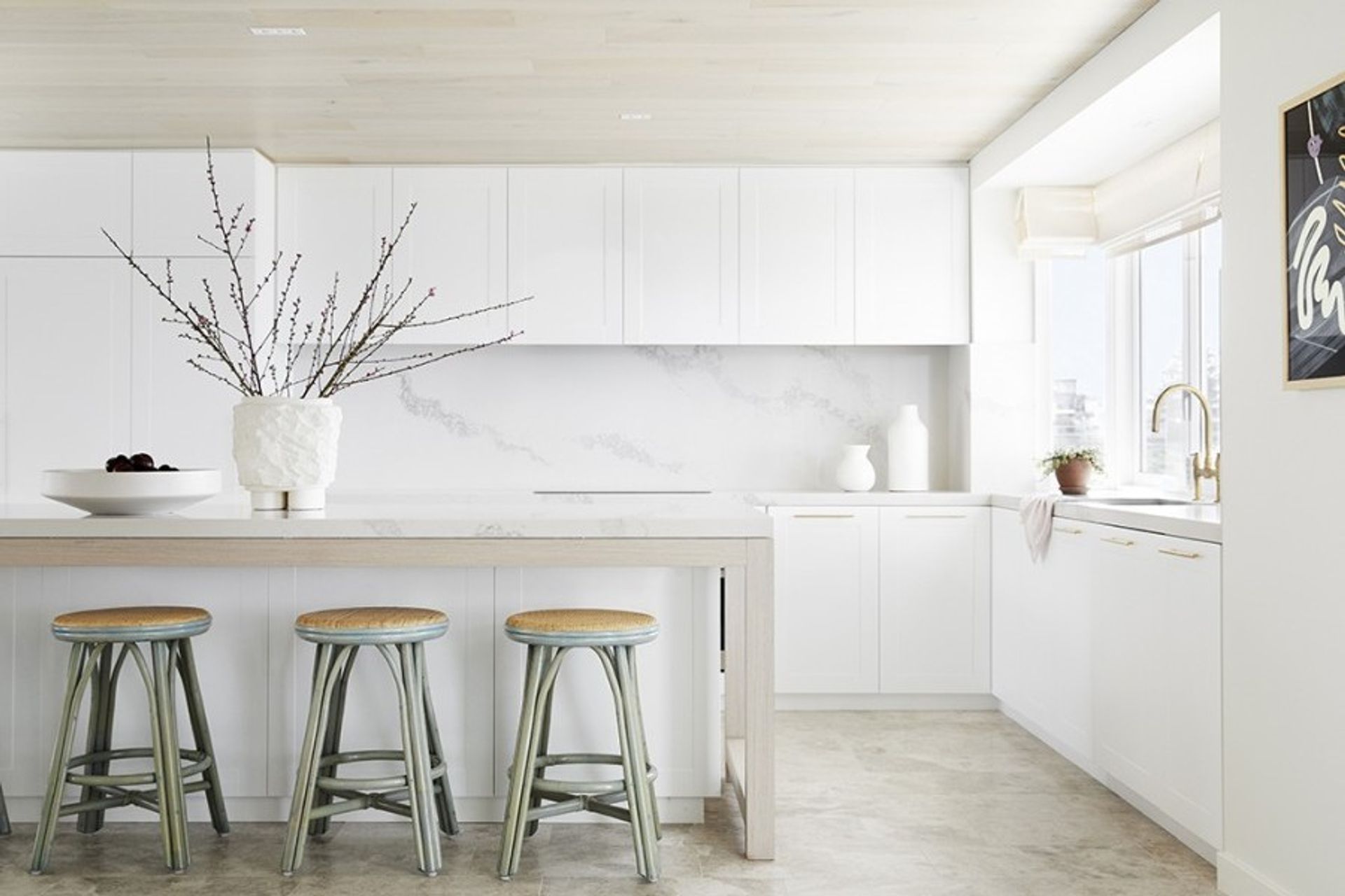
Features typically seen in Scandinavian design, such as simple shaker-style cabinetry, pale timber and natural stone, have been given an elevated twist in this kitchen by Horton & Co. The addition of bright white marble benchtops and splashback combined with the gold hardware and tapware is an acknowledgement of current trends, while the classic timber stools in a muted sage green supply a pop of colour and visual interest.
Hamptons style
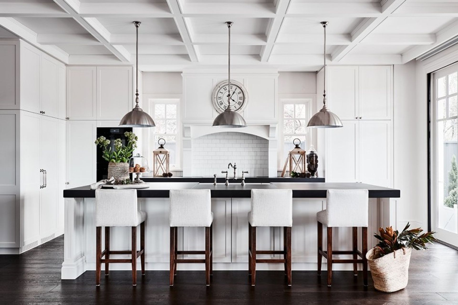
This white-washed kitchen is a culinary workroom any host would be delighted to share with guests. Shaker cabinetry, industrial lighting, classic linen bar stools and tapware in old-world styling cement this design solidly in the Hamptons category, while flooring and benchtops in such a dark hue create drama. The exposed ceiling beams, symmetrical placement of the windows and decorative tiling above the cooktop are what make this kitchen unique.
Making a statement
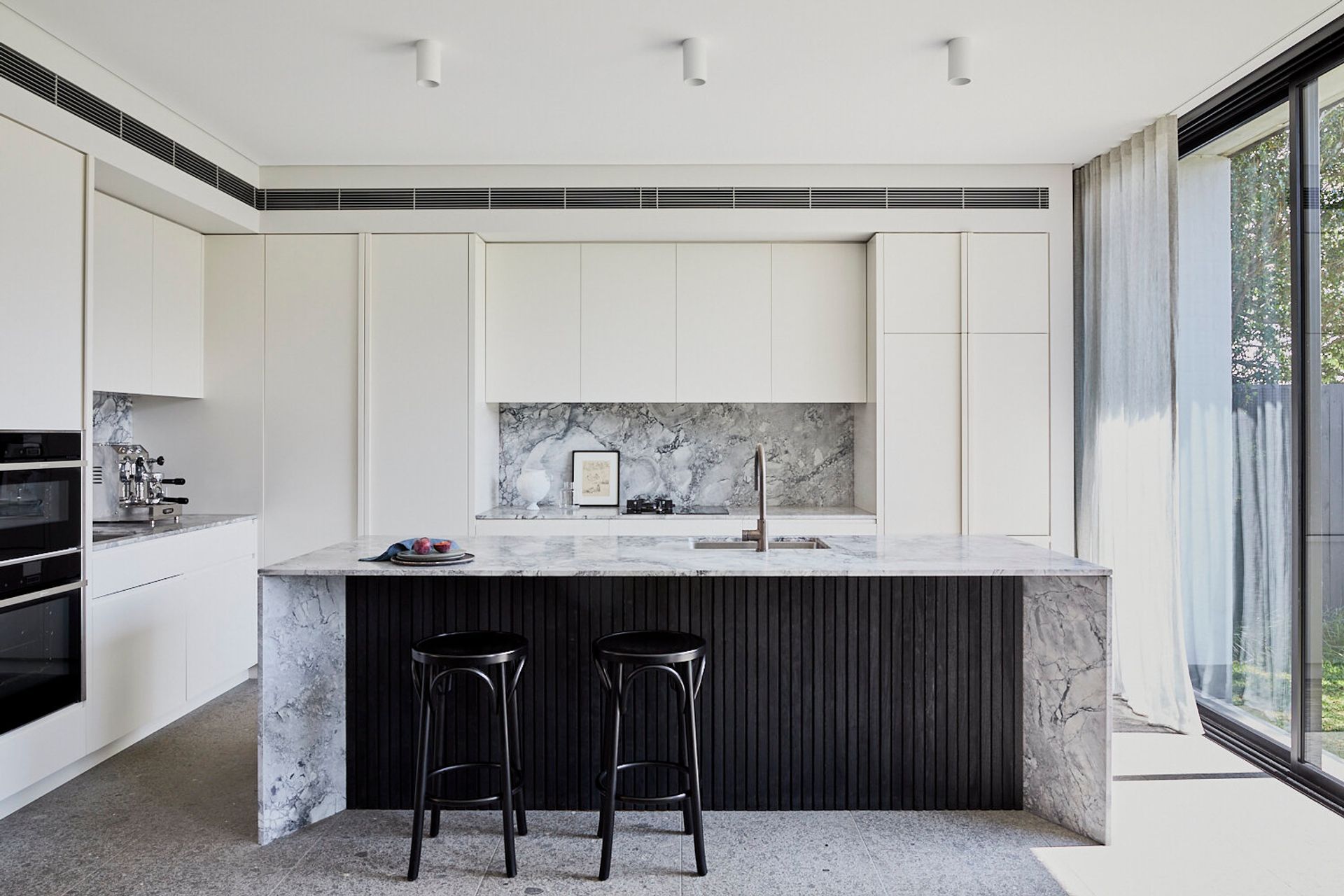
An all-white kitchen can get very boring, very quickly, which is why it’s so important to integrate statement design elements. Although the foundation of this kitchen by To The Mill is very simple and awash with white, the heavily veined marble and charred timber cladding create a ‘wow’ moment that instantly draws the eye. Large-format grey terrazzo flooring complements the scheme.
Multi-functional
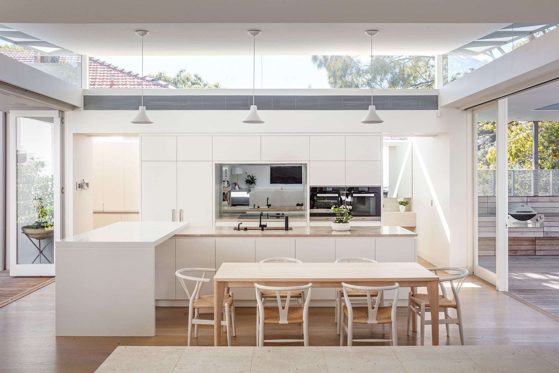
One of the more interesting features of this kitchen by Roth Architects is the white breakfast bar incorporated on the left-hand side of the island. Crafted to stand as an individual element, it provides extra workspace, seating and a place to serve dishes when entertaining. As this kitchen is almost entirely white, the beige of the benchtops, glossy white bar and black tapware serve as the only points of difference – a decision that has ensured what is a high-traffic area still feels calm and clutter-free.
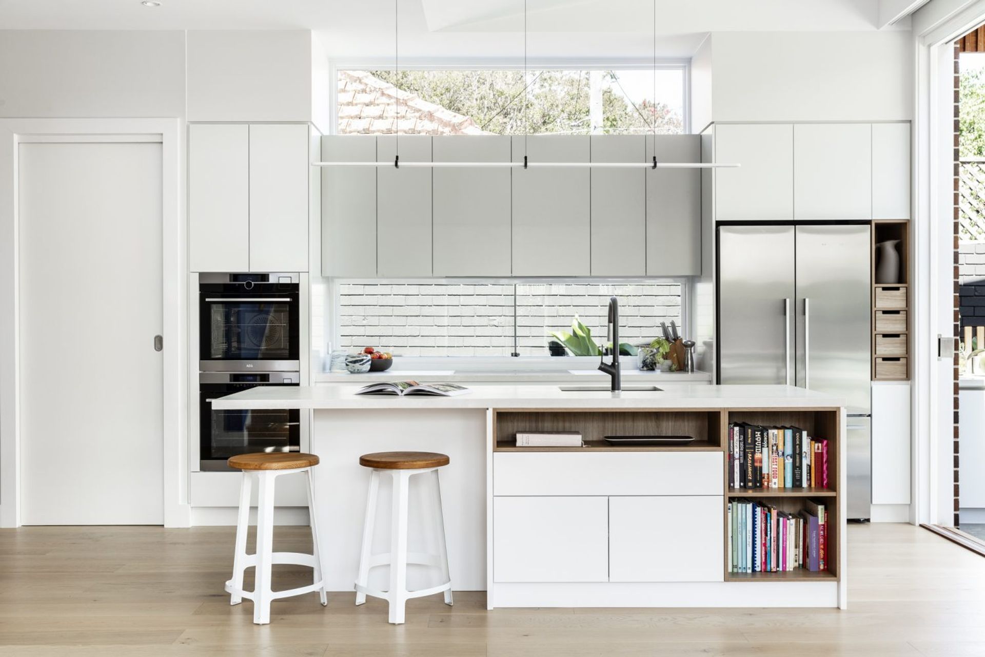
Clever and compact
Making the most of a small space is this white kitchen by Bijl Architecture. The island has been configured to accommodate not only a workspace and sink, but seating, storage and open-shelving for display – an inclusion that’s also been tucked alongside the refrigerator. Windows placed both above and below the centre overhead cabinetry allows natural light to flow freely through the space without sacrificing valuable storage opportunities.
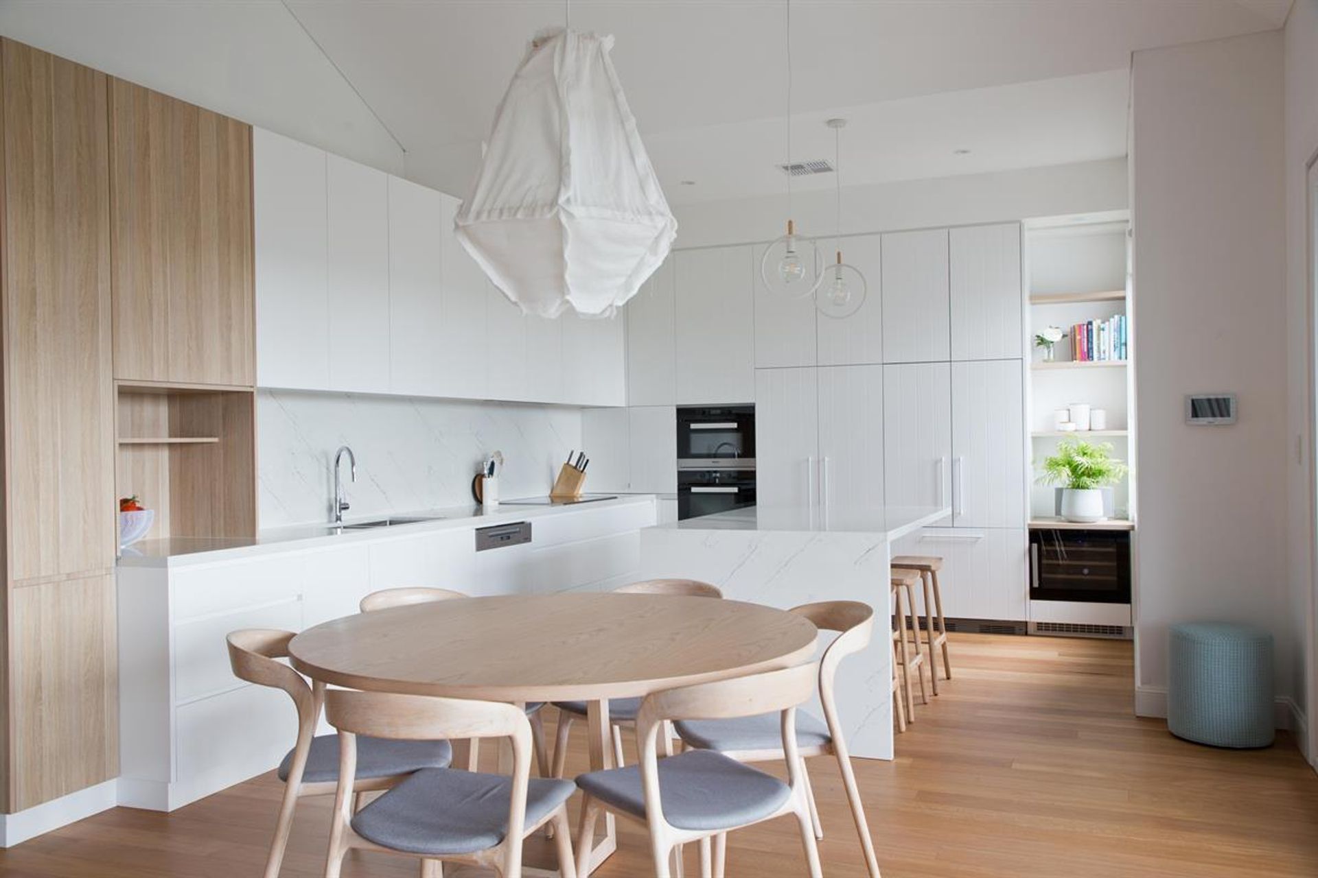
Clean and practical
The choice of lighting is important in this kitchen by Beecraft. Boasting high ceilings, the unusual choice of pendant lights draw the eye up, but never compete with the rest of the scheme thanks to the shared white palette. Open shelving provides the homeowners with ample opportunity to display beloved trinkets and treasures, while integrating appliances into the joinery keeps the room free from visual debris. The very subtle grain of the rear cabinet doors is a nice tactile element that plays well with the marble of the island, benchtop and splashback.
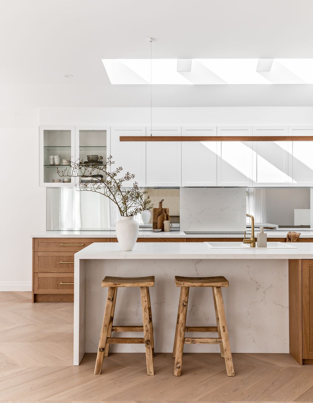
Warm and welcoming
Generous use of timber in any room will make the space feel warm and inviting, especially in the kitchen. Although the walls, ceiling and most of the joinery are entirely white in this project by TrueBuild Homes and Kate Lawrence Interiors, the purposeful use of richly hued timber joinery, gold tapware and handles really enhances the homeliness of this otherwise contemporary kitchen. Naturally, a marble with light veining is best suited to this scheme, so as not to stand at odds with the grain of the timber.
Wondering how to choose the right natural stone for your kitchen benchtops? Read our expert tips and advice from Gitani Stone.