Resene x ArchiPro 2022 Colour Forecast
Written by
04 February 2022
•
7 min read
Another year older and wiser, and many of us with another lockdown under our belt, once again design experts from around the country answered the call, telling us their picks for the trendiest colours for the coming year.
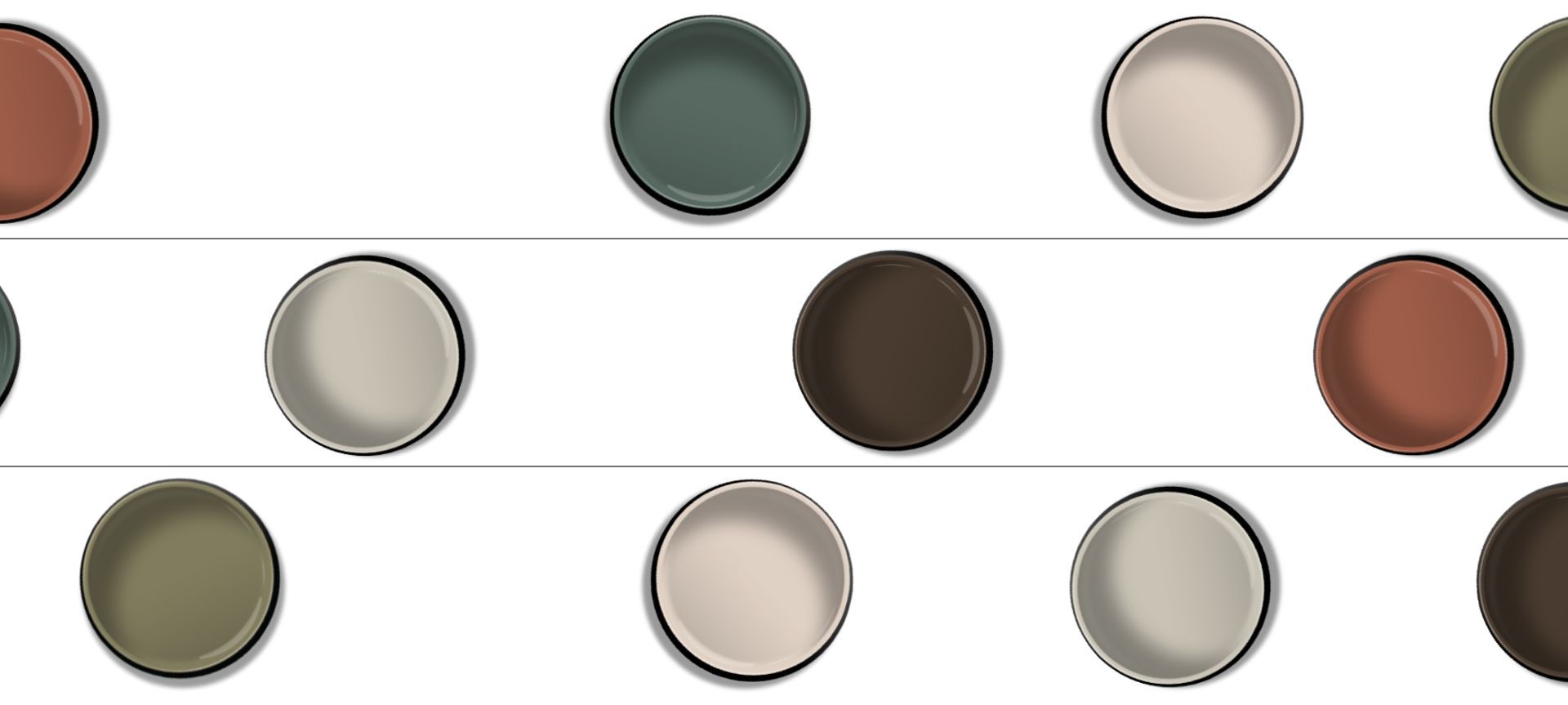
The selections, ranging across six distinct categories, reflect an earthy, natural tone, with a pool of darker hues affirming the recent shift away from simple neutrals to deeper colours.
Resene senior architectural representative Rebecca Long says that, just like last year, the context of living portions of our lives within lockdowns has informed this year’s trends.
“Looking at this year’s colours, I kept thinking of the word ‘grounded’,” says Rebecca. “The colours ground you with their depth, and the earthy tones take you out of ‘indoor world’ so many of us are used to, gravitating us a little bit more toward the natural, warmer colours.”
Warmth, in particular, seems to be another key theme in this year’s trends, Rebecca notes. While minimalist neutrals are still popular, she says people are beginning to want more personality and character in their spaces, craving the warmth it brings.
“And that’s when colour starts creeping back into homes.”
Here are the colours creeping onto the scene in 2022.
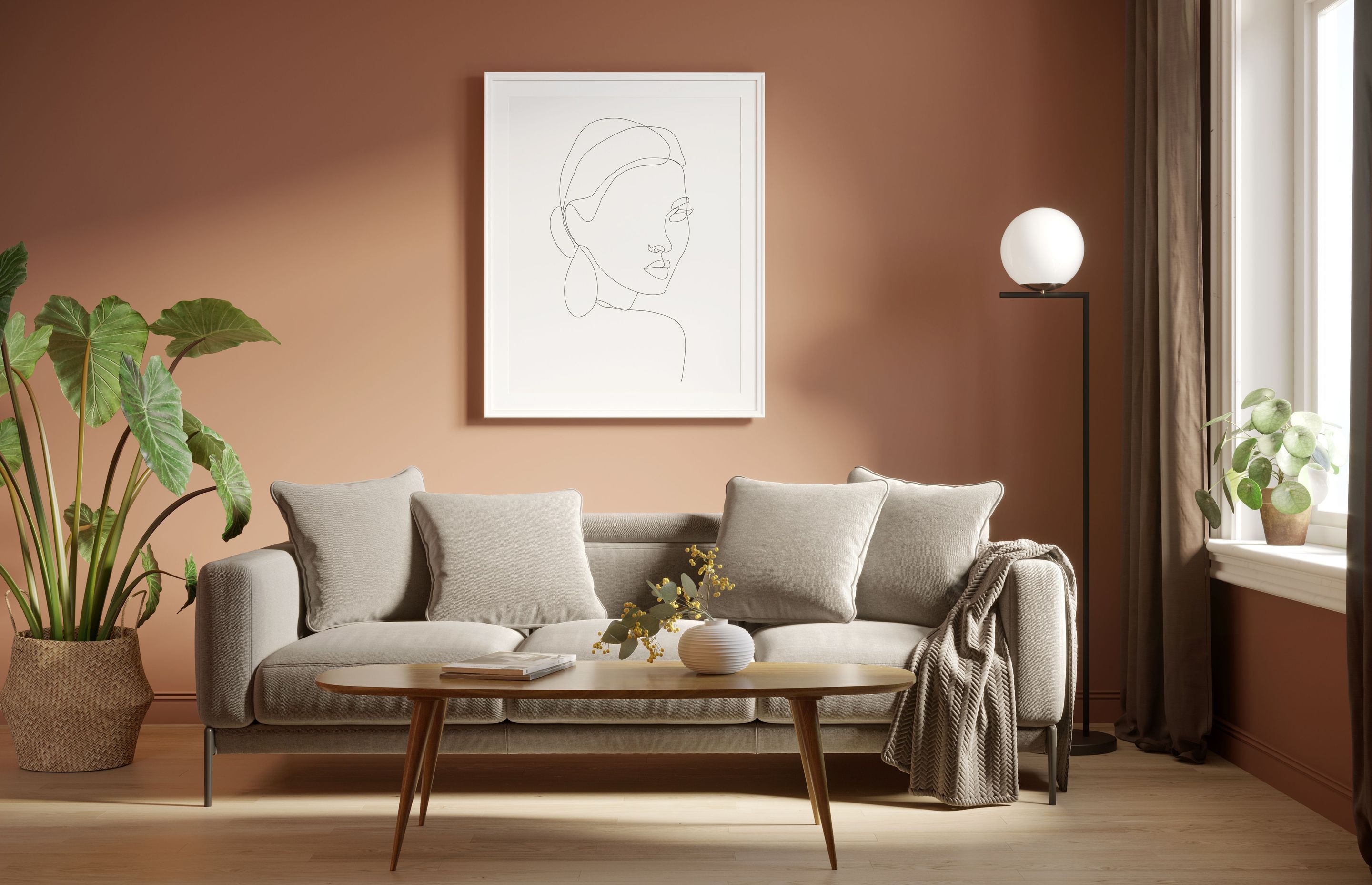
Best Living Room Colour: Resene Moccasin
First Light Studio registered architect Mitch Holden
The living room is not the same, functionally, as it used to be. Where, in years before, it was solely the place to relax and entertain, now it has turned into something much more flexible.
“The living room can be somewhere where you sit and work, it can be somewhere you share dinner,” says Mitch.
“And when you've got so many functions occurring in a space, it's important to have a relaxing environment. Having an earthy colour, like Moccasin, allows you to have furniture that is flexible and usable.”
It’s a hue that works well in both relaxing and working environments in that it acts as a backdrop to a place of calm. The colour also works well with different styles of furniture and other living room fixtures.
“Moccasin sits nicely with some of the beachy, tussocky wool carpets that we see people using, giving earthy and warm tones to these spaces," says Mitch. “It’s about complementing, not competing.”
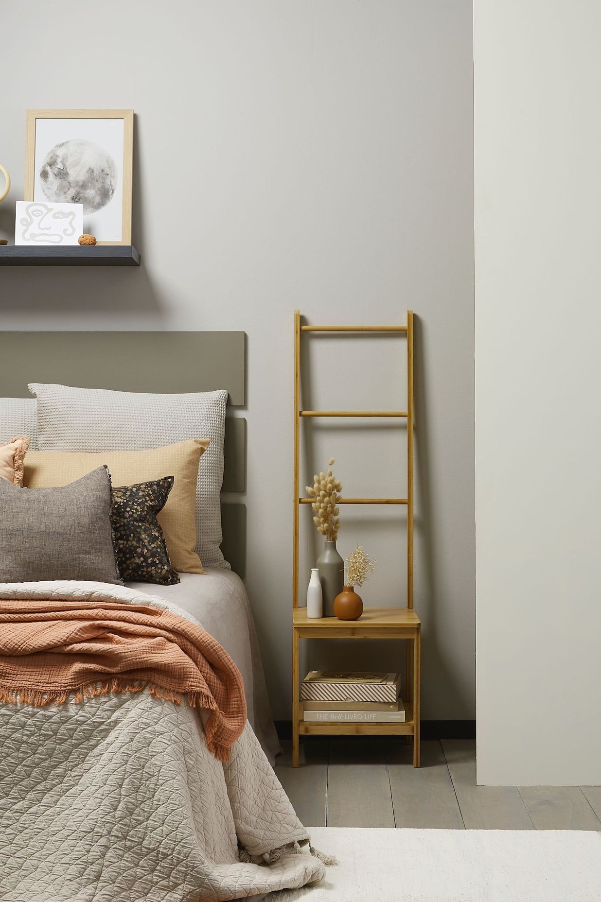
Best Bedroom Colour: Resene Despacito
TOA Architects associate Alena Milne
Bedrooms are often the space where different colour sensibilities converge. It’s a place of relaxation and intimacy, but it’s also one where individuals can broadcast their own personality and style.
Finding that balance while also allowing for other decor and furniture colours to flourish can be a difficult task, but Alena says Despacito does well in this regard.
“Its neutrality meshes with the linens and textural fabrics you’re seeing throughout interiors at the moment,” says Alena.
“But at the same time, it’s got a muted, earthy tone. It’s not a full beige, it’s not a full pink, and it's more interesting than the base whites that we're used to.”
Despacito’s muted tone, she says, suits the bedroom’s designation as a private space, removed from the hustle and bustle of everyday life.
“It also adds a softness to the textural sides of the interior, like linens and timbers, and this is complementary to these natural fibres.”
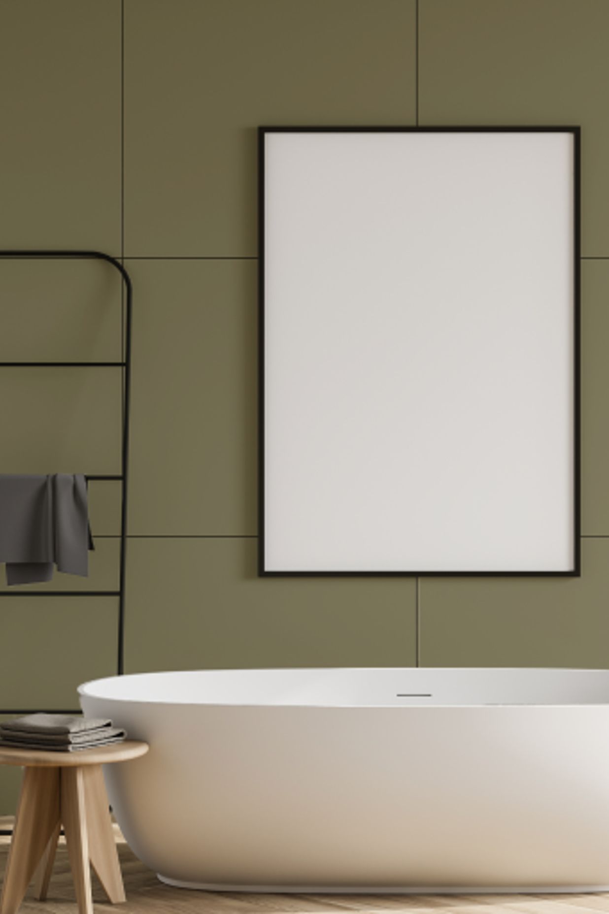
Best Bathroom Colour: Resene New Leaf
JK-W designer Eva Brichau
There is a general move away from clean whites in bathrooms, and darker colours are increasingly being used to introduce a bit more intimacy and personality to the space.
“People are wanting a little bit more drama in their bathrooms, while also keeping it subtle,” says Eva. “The green in New Leaf is a relaxing colour, but it also brings that cosiness and uniqueness to the space.”
She says that greens in bathrooms tend to work well, as they often complement popular finishes on bathroom fittings, like tapware and vanities.
“It’s a very flexible colour in the sense that it meshes well with a lot of finishes, as well as the whites in sanitaryware,” says Eva. “It’s a great way to step away from the classic white.”
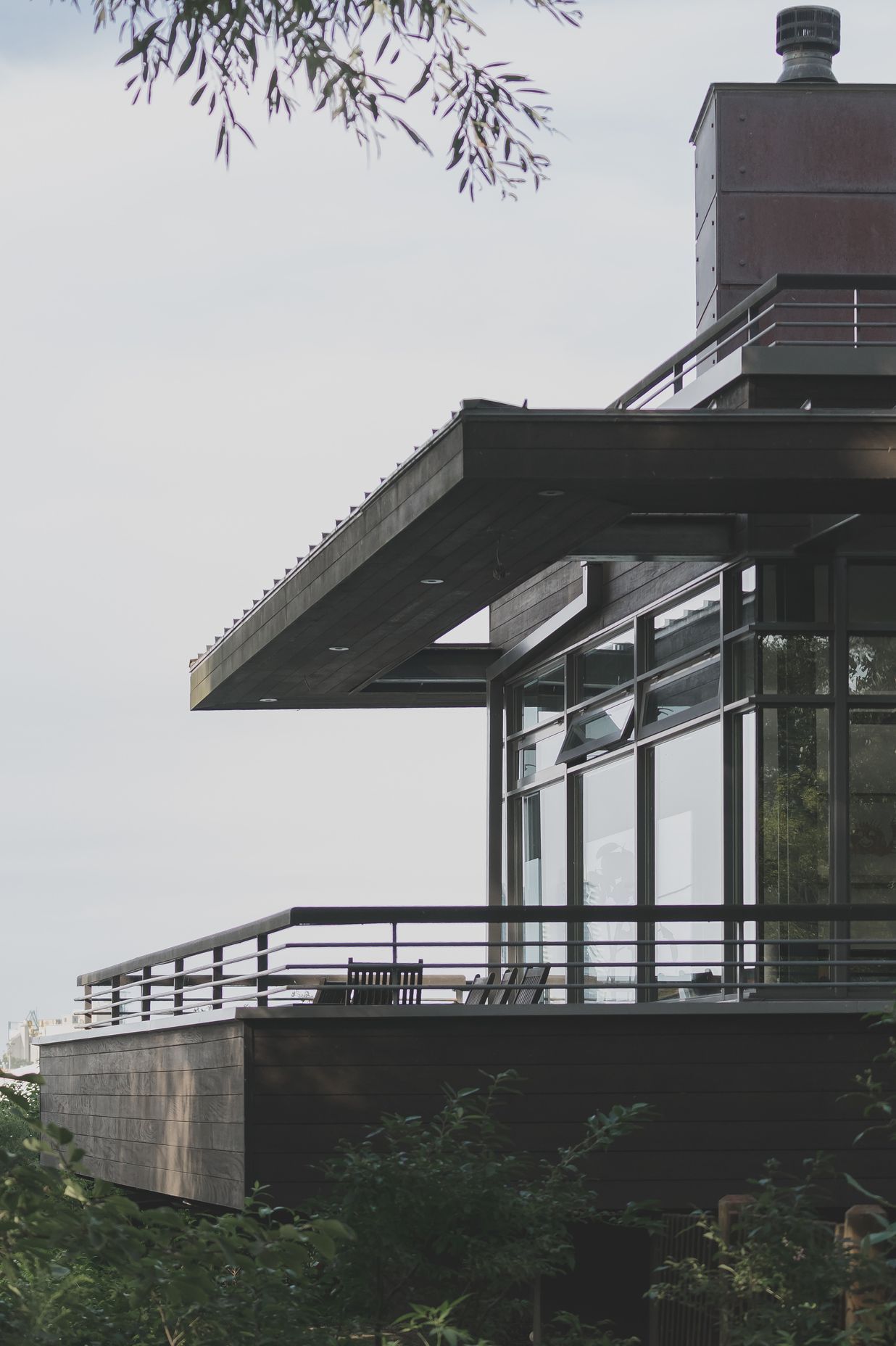
Best Exterior Colour: Resene Bronze
MAKE Architects architectural graduate Daniel Yip
Dark hues for exteriors have been on trend for years now, especially for homes in rural or remote areas: black as a neutral lets the building integrate itself more naturally into its surroundings.
But Daniel says that the lighter, rawer Bronze can help homes blend even better into the environment around them.
“It works well with a range of New Zealand landscapes: forested areas, coastal areas where it would complement sand. I can imagine this colour being used on a site with a lot of thick vegetation,” says Daniel. “It’s a more natural alternative to black.”
Daniel says that Bronze’s closer proximity to brown rather than black also helps it co-exist with popular cladding choices.
“It definitely complements cedar and larch cladding, which is what we use a lot.”
Best Neutral: Resene Triple White Pointer
Arthouse Architects registered architect Renee Williamson
There’s a reason why standard, classic whites — like Resene Alabaster or Black White — are the most popular choice when it comes to neutrals: it’s a way of future-proofing, and allows for an eventual introduction of colour in decor and furniture.
But Renee says it’s possible to achieve this with a neutral that has a bit more depth to it.
“The warmer, mushroomy undertone of Triple White Pointer satisfies the requirements of a neutral while also working well with popular colour combinations, like mustards and dark greens,” says Renee.
Renee says that she’s recently used the colour in two different settings, and has found that it presents differently depending on the amount of natural light in the room.
“I've had two bedrooms now painted this colour in different houses — the first one was a north facing room with a lot of warm decor, and it felt quite mushroomy and warm. But in the second, an east-facing room which is darker than the first, it feels very bright and more grey.”
Renee says Triple White Pointer is a great choice for those looking for a neutral that’s not pure white, but still makes accessories and furniture pop.
Wild Card: Resene Mother Nature
COMMON Architecture and Interior Design architectural designer Edd Coomber
Greens are making a splash in a big way. It’s at the centre of the slow gravitation towards tones that reflect the natural world, as many of us crave a deeper connection with the outdoors after bouts of lockdowns.
Mother Nature, as its name suggests, achieves this: it’s a mid toned green that balances the more extreme lighter and darker hues.
“It has a wider appeal as a green because it’s not so dark — it’s kind of an earthy sage,” says Edd. “It almost feels a bit textural — it’s not slick, it’s not shiny, it’s quite busy.”
And this, Edd says, makes it extremely versatile — it can be used in almost any part of the house.
“I would use it anywhere,” he says. “I would definitely use it in a living room, in a relaxed setting, and if you want a really moody bathroom, that would be amazing too.”

Don’t be afraid of the dark
After a period of minimalism, where crisp whites reigned supreme, colour is creeping back onto our walls.
We’re also experimenting more with darker, earthier tones, satisfying a need to both connect with nature and bring more warmth into our spaces.
“I’ve spoken to a lot of people who are wanting to introduce warmth, personality and character into their spaces,” says Rebecca. “With this current trend, they’re getting more confident and experimenting with bold colour, which is really good to see.”
The ‘colour creep’ is well and truly underway, she says.
“A lot more people are trying it, and just loving the results.”
Look out for these colours appearing in projects throughout 2022.