Dulux Autumn 2021 Colour Predictions

The Nourish Palette - Warm, Comforting and Grounding.
This autumn expect to see soft, sun-baked neutrals bring a gentle warmth to interiors. “Most of us are still spending some time at home, and after a tough year, we’re all ready for a change,” says Davina Harper, Dulux Colour Specialist. “Colour can add interest to every corner of your home, breathing new life into tired spaces and helping you fall back in love with where you live.”
The Nourish palette – one of three trend colour palettes identified in the 2021 Dulux Colour Forecast – mixes earthy tones such as buff, ochre and olive with cool, greyish white for a look that exudes calm. “These colours are like a gentle hug – warm, comforting and grounding,” says Harper. “There’s a lightness and optimism to the palette that speaks of better times ahead. And with their soft, natural feel they’re just the thing to surround yourself with if you struggle to switch off after a busy day working from home.”
The Nourish colours are versatile too, pairing easily with the soft whites and neutrals that many of us already have in of our homes, and they suit both traditional and contemporary architecture. “Combine them with raw textures, honey-toned timbers and plenty of natural light for a look that feels fresh and welcoming,” says Harper.
“With this look, don’t be afraid to mix furniture and accessories from different eras. This year we’re seeing a more laid-back, sentimental approach to decorating – it’s a bit of 70s, a hint of 80s, a dash of 90s, sitting comfortably alongside contemporary styles – all of which creates a wonderfully relaxed and personalised feel.”
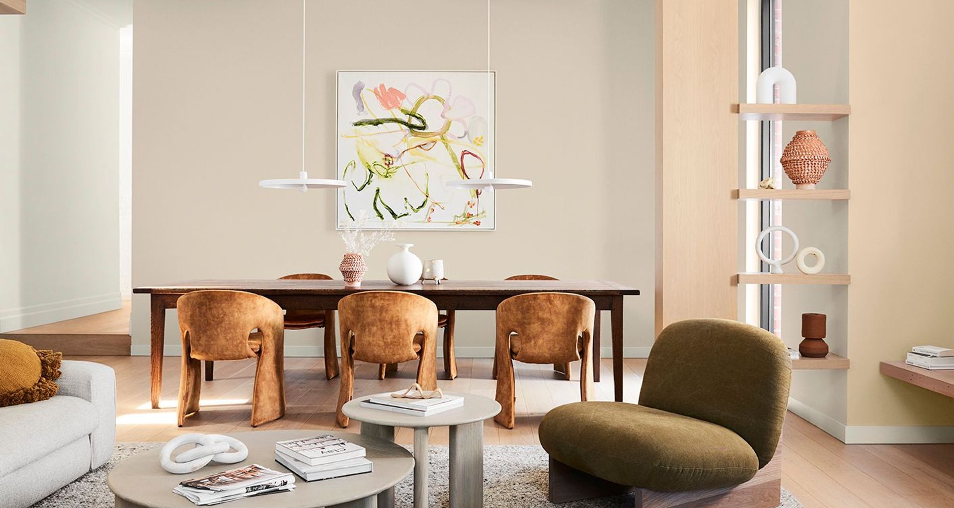
To show you just how easy it is to integrate these upbeat hues into your interior, stylist Bree Leech transformed an open-plan living/dining space in a traditional home using the Dulux Nourish palette.
“The home is bathed in natural light and the owners have some great furniture – through this mini makeover, I aimed to add another level of warmth and character to their quite neutral interior,” says Leech. “There were also some charming period features we wanted to bring out using colour, including sash windows and a decorative fireplace.
“The Nourish colours curated by Dulux are a fresh spin on the rich, saturated colours we normally associate with autumn – think the soft tones of freshly fallen leaves. And they work so well here, adding warmth without sacrificing the light and open feel,” she says.
To keep the makeover short, sweet and economical, Leech reused many of the existing pieces in the room and focused her attention on smart use of colour. “Paint is your best friend if you’re looking for big impact with minimal outlay. And it’s quicker than you might think – a makeover like this could be done in a weekend,” she says.
Bree Leech chose Dulux Wash&Wear in Kauri Cliffs – a soft biscuit shade – for the walls and painted the feature alcoves beside the fireplace in a tonal shade of Dulux Kūaotunu. “This tonal combo makes the space feel soothing, and draws you in,” she says. “Adding colour to the walls also allowed the minimalist pendant lights over the dining table to be a stronger feature – they now contrast against the new colour. We used a Low Sheen paint finish, so there was some subtle illumination.”
A couple of coats of Dulux Aquanamel Gloss in popular Haast Half were used to highlight the fireplace, cornices and woodwork,” she says.
Leech worked with the foundation pieces already in the room – the sofa, rug and dining table. She swapped out the classic dining chairs for something more dramatic; curvy upholstered styles in burnt terracotta with a 70s vibe. Chubby occasional chairs in olive and caramel leather add punch and provide an irresistibly comfy spot to sit.
“When you’re looking to add comfort to a space, curves are the way to go,” she says. “Curvy furniture with deep cushioning feels relaxing and inviting, and it’s easy to navigate around.” To reinforce the look, she also replaced the slender-legged coffee table with a pair of chunky, curved tables.”
Leech brought the walls to life with contemporary artwork in colours drawn from the Nourish palette. She created a striking open-shelf display with ceramics in shades of buff, terracotta and white. “This is a quick and affordable décor idea – simply look around your local op shop for ceramics in a variety of interesting shapes and paint them in tonal hues,” she says.
“A soft, layered look like this creates an irresistibly cosy feel that’s perfect the cooler months,” says Harper. “And while brown-based neutrals can feel like quite a departure after so many years of grey, they’re a pleasure to live with and easy to decorate around.
“Paint is a great way to try out new decorating trends,” she says. “And you don’t have to go all out by repainting an entire room – create an accent wall behind the bed or in your study nook or add a pop of colour to the front door. As you can see, it takes little more than a paint brush to create an entirely new feeling and look in a room!”
Autumn Styling Tips
· Texture time: Style an earthy palette like this with raw textures and natural finishes.
· Choose the right white: Dulux Haast Half is a popular soft white with a subtle beige undertone that works best in open-plan rooms with plenty of natural light.
· Consider the view: When you’re layering tonal colours like this, step back and view the room as a whole before deciding what to apply where.
· Add one or two statement pieces in richer hues: This grounds your palette and creates a sense of balance.
· Avoid clutter: To keep the look calm and open, leave plenty of breathing space around furniture and décor items (this also helps show off their beautiful shapes).
Need help bringing your inspiration to reality? The Dulux Live Chat team is ready to help you take on your next project. Visit: www.dulux.co.nz
These colours are like a gentle hug – warm, comforting and grounding,” says Harper. “There’s a lightness and optimism to the palette that speaks of better times ahead.
Combine them with raw textures, honey-toned timbers and plenty of natural light for a look that feels fresh and welcoming,” says Harper.


