Dulux Winter 2021 Colour Predictions
Warm, grounded colours that speak of security and comfort are set to dominate winter decorating trends, according to Dulux trend forecasters. “The cooler months call for richer hues and cosy textures, and never more so than in a year when most people’s worlds have been turned upside down,” says Davina Harper, Dulux Colour Specialist
“There’s a collective yearning for reassurance and a return to simpler times. We want our homes to provide comfort, a sense of safety and to remind us of better days ahead. And this will be reflected in more than just colour in 2021 – expect to see a rise in plush, comfy seating, handcrafted furniture with an artisanal feel and a greater focus on ‘purposeful decorating’ rather than just decorating to make an aesthetic statement,” she says.
The Retreat palette – one of three trend colour palettes identified in the 2021 Dulux Colour Forecast – captures the mood of this coming Winter. “These earthy tones and muted colours are all drawn from nature – think oceanic blues, nourishing greens, soft greys and touches of mustard. They bring the outside in – ideal for a time when most of us are stuck indoors for long stretches – and plug into the growing movement for wellness in design.”
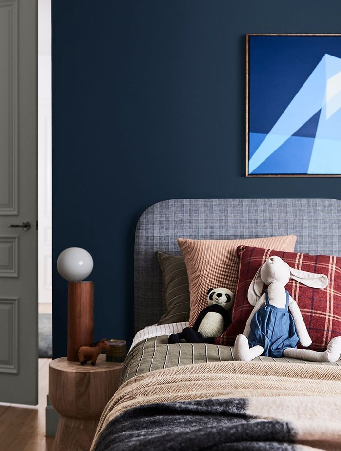
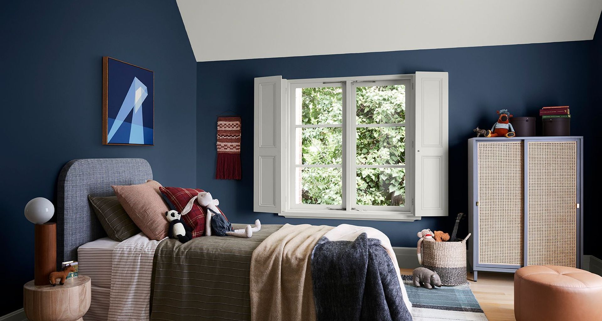
To give you ideas on how you can use these comforting hues in your own home, Dulux worked with stylist Bree Leech to re-energise a child’s bedroom using colours from the Retreat palette. Leech kept the big-ticket items in the room – the bed, bedhead and solid-timber bedside table, and focused on updating the room with bold colour. She chose shades that worked with the neutral tones in the foundation pieces and added in plenty of textures to dial up the cosiness.
She started by adding deep blue, Dulux Wash&Wear in Lake Brunner, to the walls and a gentle neutral, Dulux Mt Aspiring Double to the ceiling and window detailing. “We opted for pale greige rather than a classic white for the ceiling and windows to soften the contrast with the blue. Inky blue works well here – it’s cosy and timeless and sits beautifully alongside the natural materials in the room, such as the timber and woven-rattan”.
To see more of the Dulux Winter Trends here: https://www.dulux.co.nz/inspiration/seasonal-trends/2021
Inky blue works well here – it’s cosy and timeless and sits beautifully alongside the natural materials in the room, such as the timber and woven-rattan