How to style a materials board with colour
Written by
16 November 2021
•
4 min read
AP: Tell me about the clients and their brief?
JK-W: This is an existing house that we moved the family into with young children nearly eight years ago. We made it practical and affordable then – recently they came back to me and asked, ‘Can you please inject some of us into our home – something flexible that can move with us should we do so later on?’
Our clients are extremely outgoing, hardworking and fun - a vivacious makeup artist and a successful business owner who loves nice things. They both have attention to detail, and love colour and personality, so we added huge amounts of their personality into their neutral easy-living home. The home is in the perfect location and just needed to be custom-fitted and refreshed to further suit them.
Everything had to be locally sourced, and we used our local cabinet makers to inject new life into both existing and new pieces. We chose paint colours and fabrics that could stand the test of time with both their children and the many guests that visit.
AP: When you’re putting a materials board together, what do you consider?
JK-W: Definitely our specific client, their personalities and what their current and future situations might look like. Have we got an opportunity to be bold and push them, or are they better in a more relaxed, neutral palette? Who are they? Why are they doing it? Who is it going to be for—are there small children? Are there memorable moments? Or is it for resale?
AP: What was the starting point for the material palette for this project?
JK-W: There were three key pieces that drove our choices. Our starting point was an artwork by Kozyndan that we chose to enlarge and make a feature of. Then there was the mirrored fireplace; it was an existing white Gib fireplace in a difficult long room that we highlighted with a smokey mirror, thus bringing attention to a stunning sculpture by Curtis Jeré that we sourced for our clients some years ago.
AP: What are your tips and tricks for creating an interior scheme?
JK-W: Look at how you live and what you want to achieve. This client's house needed to reflect who they are: really bold personalities who love entertaining and memorable moments.
Also, think about your big ticket items and work backward from there. What are you prepared to spend money on?
AP: What’s your top tip for choosing the right samples?
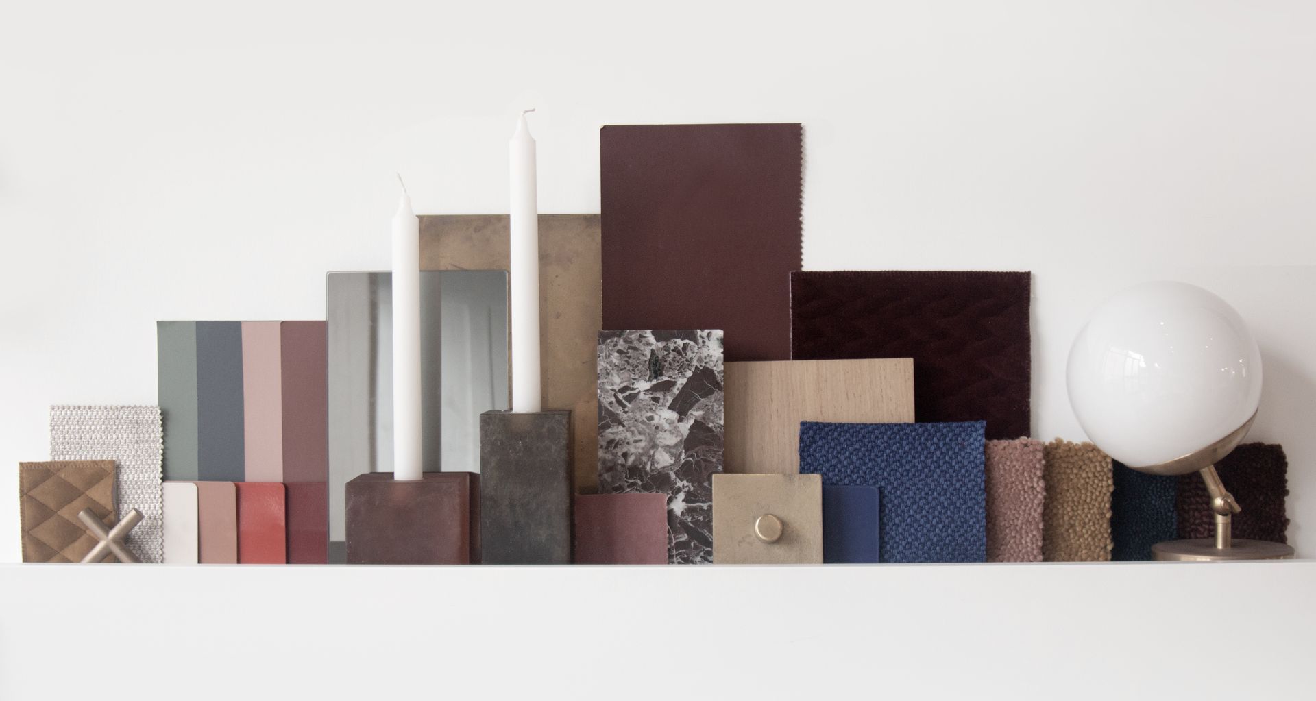
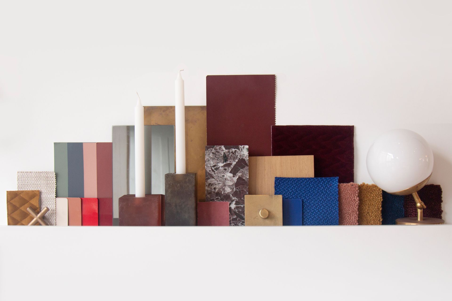
JK-W: We have a ledge at the studio; we lay things on the edge so that we can play with light and texture and colour. We move a sample forward or pull it back to see how the colour or texture looks in different lights.
I highly recommend gathering all of your sampling and make sure you look at it in the morning, noon and night. Turn the lamps on and turn the LED lights on to see how they impact the tone of the samples.

Look at how you live and what you want to achieve. This client's house needed to reflect who they are: really bold personalities who love entertaining and memorable moments.
AP: How do you combine textures and colour?
JK-W: Use sheen and matte textures to throw light round, even if it’s in the same colour. In this materials board we used a cobalt blue fabric and matched that back to a really high gloss lacquer and that gave us the same colour, but in different finishes on the same piece of furniture.
AP: If someone was afraid of incorporating colour into their home, what would you suggest?
JK-W: Paint—it’s so easy to change! Or lacquers and stains—they’re not forever. Artwork is also a great way to inject colour. Or you can powder coat light shades in colour. If you’re afraid of colour and you don’t want it to be too permanent, use colourful accessories like rugs and textiles.
AP: What’s your key advice for anyone looking to incorporate colour in their interior?
JK-W: Don’t be afraid of colour and don’t be afraid of doing different colours in different rooms as long as there is a cohesion to the palette, even if it's not text book—own it and love it!
Find out more about incorporating colour into your interior with JK-W