Behind the design: The Dairy Private Hotel
Written by
07 June 2022
•
4 min read
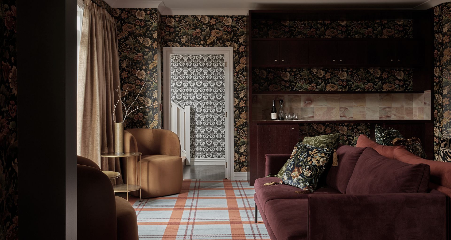
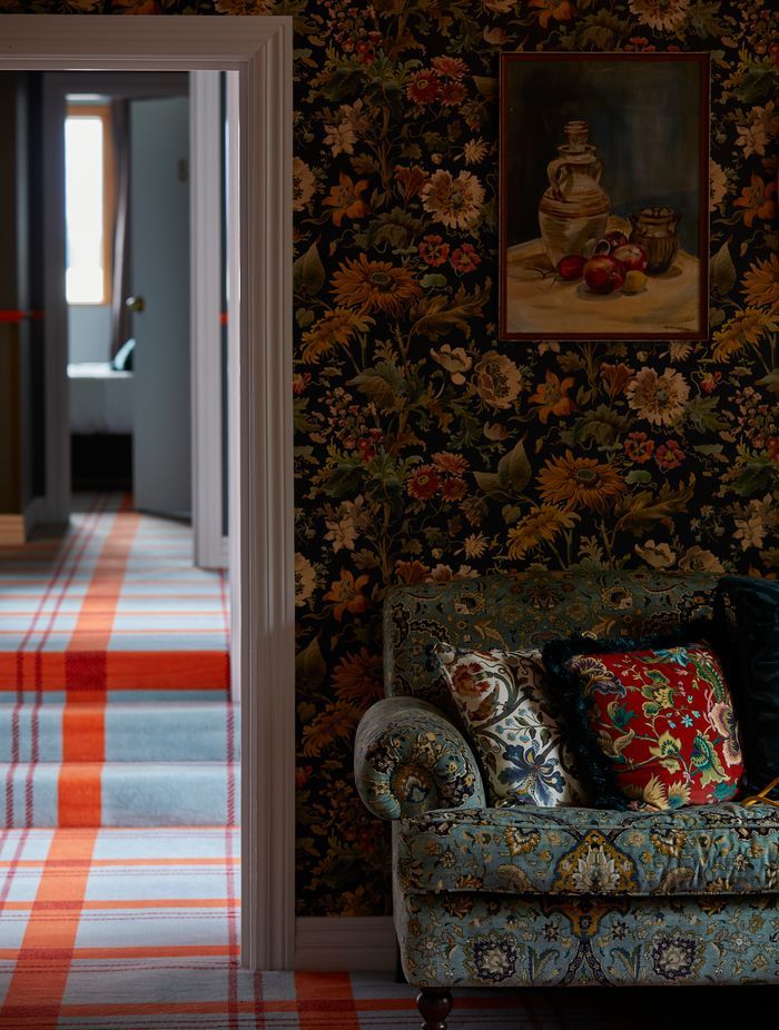
Edgy and eccentric, the hotel is the perfect combination of alpine chic and colourful character with intricate wallpaper on the walls and ceilings, paired with not-your-average choice in carpeting.
We asked Material Creative's Liv Patience about bringing the interior of this hotel to life…
ArchiPro: What was the brief for this project?
Liv Patience: It was a refurb of an existing little hotel called The Dairy that Naumi Hotels acquired. It was really dated, and our client is very charismatic and likes designs to be quite bold – he’s quite a bold character himself. He loves life and colour and doesn’t like white, although it’s funny saying that as he did allow a little bit of white and neutral colour at The Dairy as it has a slightly different demographic to other Naumi locations.
The client really loves Soho House in the UK, and that was the reference he gave us. So it was an interesting brief – for it to be loud and colourful and bold like the Naumi brand, but also wanting it to be characterful and timeless.
The Dairy Private Hotel really is a gorgeous little jewel, and that's what our client wanted it to be – a little jewel of Queenstown.

AP: What was the process of working with the client from concept to completion?
LP: We’d done a lot of work with the client before this, so he really trusted us. And also, we really knew what he would want. He wanted a bold carpet, and that’s where we started.
Wanting a UK influence, we thought it was a really nice opportunity to bring in a collaboration with House of Hackney and all of their amazing wallpapers and fabrics. The deep South Island has a very British feel to it already, but it was important that the interiors still felt appropriate for Queenstown and that it didn’t feel too foreign.
We came up with the idea of using tartan with the combination of pale blue and orange. Once we nailed this carpet choice and everyone was happy with it, everything flowed from there.
It was an interesting brief – for it to be loud and colourful and bold like the Naumi brand, but also wanting it to be characterful and timeless.

AP: How did you get all of the different colours and patterns to work together?
LP: It’s about not being afraid of combining patterns and pulling colours from carpet and wallpaper so that everything feels cohesive. Yes, there’s a lot going on – it’s definitely maximalism – but at the same time everything feels like it’s married quite well.
Even with the artwork, everything needed to be tonal. At first it seems like a lot, but it's also very reminiscent of British interiors. They love the decorative elements, the wallpapers and the carpets, and we can be a bit more modest here about it. As House of Hackney was influencing this interior, we did take influence from British interiors and the boldness of pairing it all together, but the common thread is the tonal element.
The deep South Island has a very British feel to it already, but it was important that the interiors still felt appropriate for Queenstown.
AP: Did you face any challenges along the way?
LP: Budget is always a challenge, and there wasn’t a huge budget for this project. Otherwise, it was quite a straightforward project. We weren't doing anything structural so we didn’t need building consent – we didn’t need any of those difficult things. It was just dressing her up and transforming her with furnishings, which was so fun. It was such a lovely project, we really loved working on this one.

AP: What was the highlight of this project for the Material Creative team?
LP: Working with the craftsman was a real highlight. In particular, the team who laid the tartan carpet were incredible. That carpet is really difficult to work with because you have to line everything up correctly, and their work is just meticulous. They spent hours considering how everything would be laid, and at the end of the day it’s those little touch points that make all the difference.
The Dairy Private Hotel really is a gorgeous little jewel, and that's what our client wanted it to be – a little jewel of Queenstown. And for it to be a place that has a uniqueness to it – it seems to have people talking, people really seem to love it.