Designer Rachel Barthow creates spaces focused on making us feel good
Written by
29 September 2022
•
6 min read

Interior design began as a therapeutic outlet for Rachel’s own self-care journey while working as a mental health social worker. She’d always been creative, but this had fallen by the wayside until she started planning the interior of her first home.
We spoke with Rachel to learn more about her journey into interior design.
ArchiPro: Can you share how your background as a mental health social worker influences your design work?
Rachel Barthow: Initially, I thought that pursuing interior design would be a shift away from social work, but instead I’ve realised how much it has influenced my world view and more specifically my approach to design. I think there was about four years where I was part-time studying design and still working as a social worker, so it was probably inevitable that they would bleed into each other.
As a social worker I spent a lot of my time thinking about what wellbeing looks like, and I think embracing this has highlighted the impact our home has on our mental health and helped give me the wellness-focused lens I use in the design process. In social work, we would also use a person-in-environment approach for assessing client needs – something that has translated really well to interiors.
During the pandemic, the role our home played in sustaining our wellbeing became even more crucial and it really emphasised the importance of self-care. Our homes have had to evolve in a short amount of time to become more versatile, too. They have not only become our office, but our gym, our café, etc., and this has a huge impact on our wellbeing.

Embracing this has highlighted the impact our home has on our mental health and helped give me the wellness-focused lens I use in the design process.
AP: How do you approach each new project?
RB: I take a wellness-focused design approach with each new project. Wellness design is about viewing our home as the site for where a lot of our emotional, psychological and physical needs are (or aren’t) being met.
It is my hope that the spaces I design enhance the wellbeing and enrich the daily life of their occupants. Throughout the design process I’m always trying to come back to how the space meets the needs of those who reside there – this can be from the basic physiological needs, to our emotional state of mind, and ultimately how we achieve a sense of fulfilment in our lives.
AP: Can you tell us about your at-home wellbeing consultations?
RB: This is a one-off meeting where the studio can help a client to identify and refine what their needs are and curate a home to suit their rhythm of life. This means unpacking what family/home life looks like, what the occupants value and prioritise in their lives, or what goals they have, and then thinking about how the space can be designed to support those needs.
There’s something really satisfying about residing in a space that reflects your individuality and is tailored to your lifestyle. Hopefully this process can provide clarity about what a client is really wanting to achieve out of a renovation or build.

AP: What’s one of your favourite interior spaces, either locally or overseas, that has inspired how you think about design?
RB: Two hotel interiors actually spring to mind. Firstly, I think the Calile Hotel by Richard and Spence is divine. I love how it plays with curves, warm hues, and has a Palm Springs aesthetic right in the middle of the Brisbane CBD. I love the idea of translating this to residential spaces – creating a home that is like your own personal retreat away from the rest of the world, a place to replenish and recharge.
The second is the Santa Monica Proper by Kelly Wearstler. I love the texture and movement this designer always incorporates into her designs and this interior scape is no exception. I also love how she’s incorporated so many vintage pieces into the design – it’s such an unassuming way to make design more sustainable.
AP: What are you loving in interiors right now?
RB: I love organic design – using raw organic materials, incorporating natural forms into a design, or using earthy colour palettes. I think these elements help to ground you and connect with the world around you. I also think that when you can connect the space to its greater environment it makes it feel timeless.

AP: What do you love most about what you do?
RB: Creatively I love seeing a concept coming to life – it’s always really fulfilling. Then to see it is cherished in its purpose is like the icing on the cake.
I think these elements help to ground you and connect with the world around you.
AP: Is there a favourite project that you’ve worked on? What do you love about it?
RB: Some of my favourite spaces have been the ones where they have initially presented with design constraints and have forced me to find creative solutions.
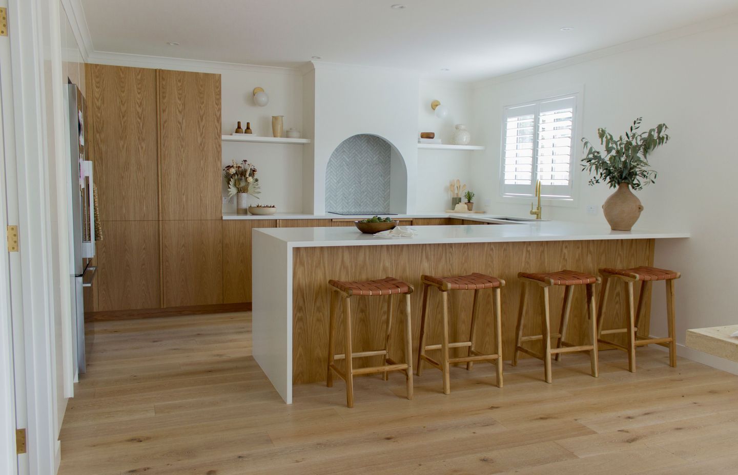
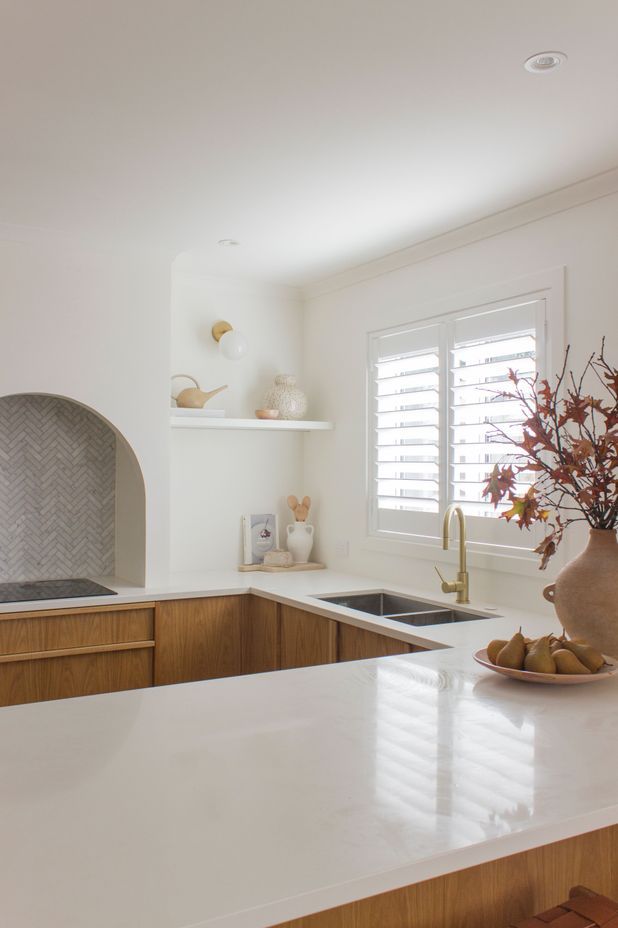
Our Isthmus house kitchen is a good example of this. The kitchen was an area I wanted to challenge myself and do something I hadn’t seen done before. The arched rangehood was an original design and was in response to some of the space limitations I had to work within. The kitchen space was quite wide (almost four metres), and yet had a regular 2.4 metre ceiling height (typical of most Kiwi homes).
I worried that a sea of upper cabinetry the whole way along the width of the room would make it feel really compressed. The arch shape of the rangehood solved this issue by breaking up the space and drawing the eye to the centre. I also loved bringing an arch into the space as kitchens are often very angular – this softens the room and makes it feel really homely.

AP: What’s next for One Something Studio? Are there any exciting projects in the works?
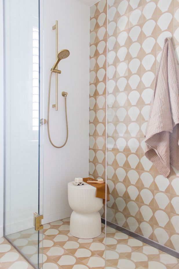
RB: Currently I’m working on a couple of renovations at the moment focusing on the kitchens and bathrooms – my favourite areas to create. I’ve also been working with some beautiful New Zealand brands.
Words by Cassie Birrer