How to style a materials board
Written by
28 September 2021
•
3 min read
What is your starting point for pulling a material board together?
Following our briefing with our client where we establish their interior likes and dislikes and overall ideas on how they want their spaces to feel, we will establish an inspiration or main reference point. This initial inspiration might be a piece of the client's art, an image of a landscape or a fashion image that embodies the elements we have embraced from the briefing. This becomes the central item that forms our collation of materials and finishes for a material board.
Then what is your process?
Once we have established the main inspiration piece, we come together and have a collaborative brainstorm where we draw out samples and finishes from the product library at our studio. This provides the basis for the material selection and the direction for the scheme. An important next step is going out to our suppliers to find new products and finishes, gathering additional samples to add and layer the initial material board. This is all laid up on our tables in the studio and over a period of time we review and refine the selection.
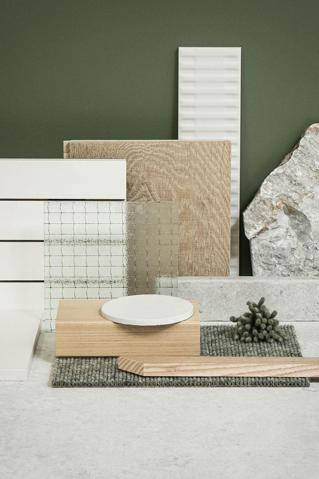
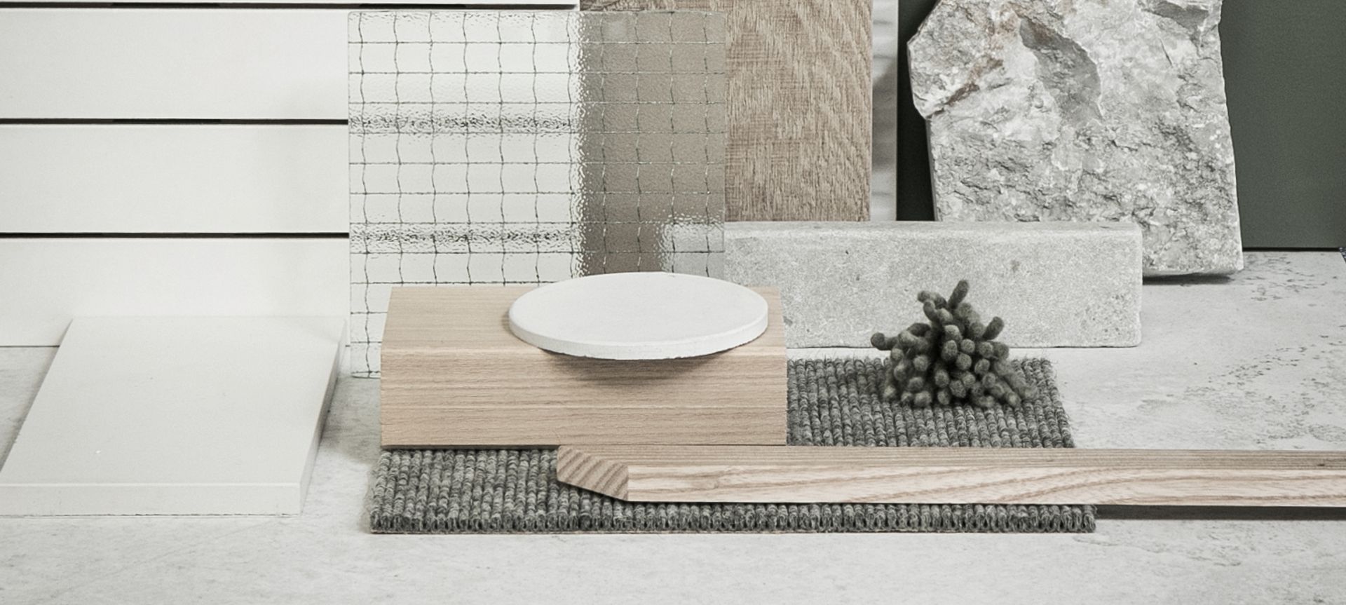
Tell us about how you themed this board.
Our starting point for this board is a landscape image with white parched ground, green (to represent) ground cover and grey/white rocks. We loved the texture that this image evoked and the interplay of the colours—white, grey, touches of tan/clay and the green. The first products we selected that represented these elements were the main oversized floor tile which is mottled and organic looking, and the textured stone. From here it was a simple process of bringing in the colours and textures that worked well together as they do in the image.
How do you mix texture?
We love texture in our interior schemes! It is an element that can make the difference between a simple neutral palette and a palette with depth and substance. But it is important to not have too much texture. We bring in texture through wall finishes, fireplace surrounds, flooring, cabinetry, rugs, window treatments (to name a few). Generally we would look for one or two main hard textural features, for example fireplace surround and a specialty wall finish, then add layers of softer texture through carpets, rugs and window treatments. We love the soft texture that wool rugs and carpet add, balanced with chunky linens for curtains.

How do you combine colours for a cohesive palette?
Colour is so important in any interior space. And depending on the client brief we either combine a lot of colour or we start with a natural and neutral palette and bring in one main colour with tones that we thread throughout the interior spaces. This is evidenced in our material board where we have used a soft green but each green is slightly different in terms of shade and depth, but tonally all within the same range.
How do you select paint colours?
The initial starting point for the paint colours is usually the original inspiration piece/image. From here we will refer to our paint fan decks and the drawdowns we have in our product library to select paint colours that tonally work together. These paint colours will sit amongst the other elements on our material board for a period of time so that we can review them at different times of the day, in different light situations. As the other finishes are refined, we are able to determine the paint colours best suited to the interior scheme we are finalising.