Sophisticated 1970s style in bach kitchen revamp
Written by
11 July 2022
•
4 min read
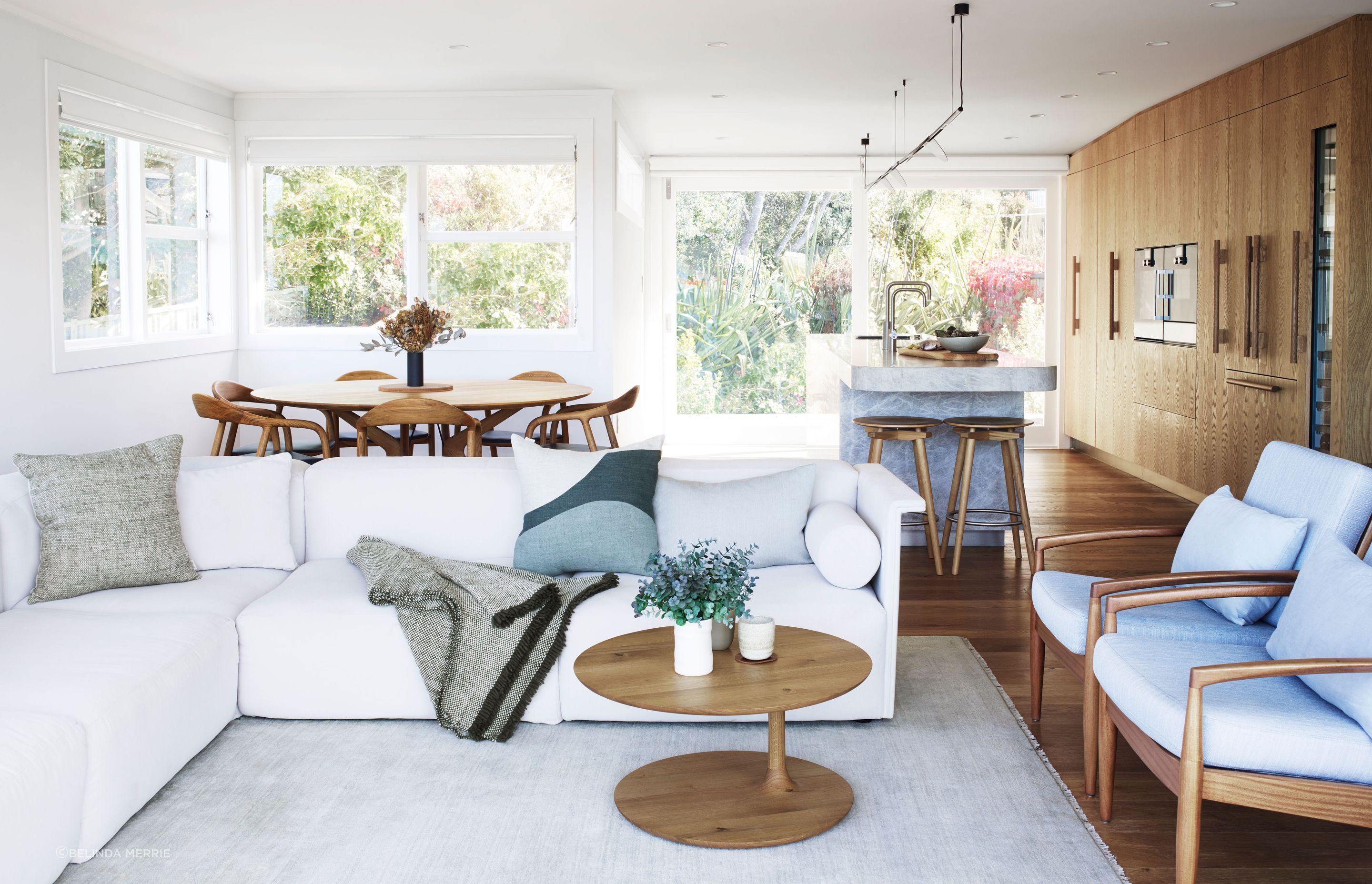
The key consideration in this renovated North Auckland bach kitchen, says interior designer Natalie Du Bois of Du Bois Design, was the outlook.
“It's a 1970s bach and it has the most beautiful views looking out towards Leigh coast. It's absolutely stunning.”
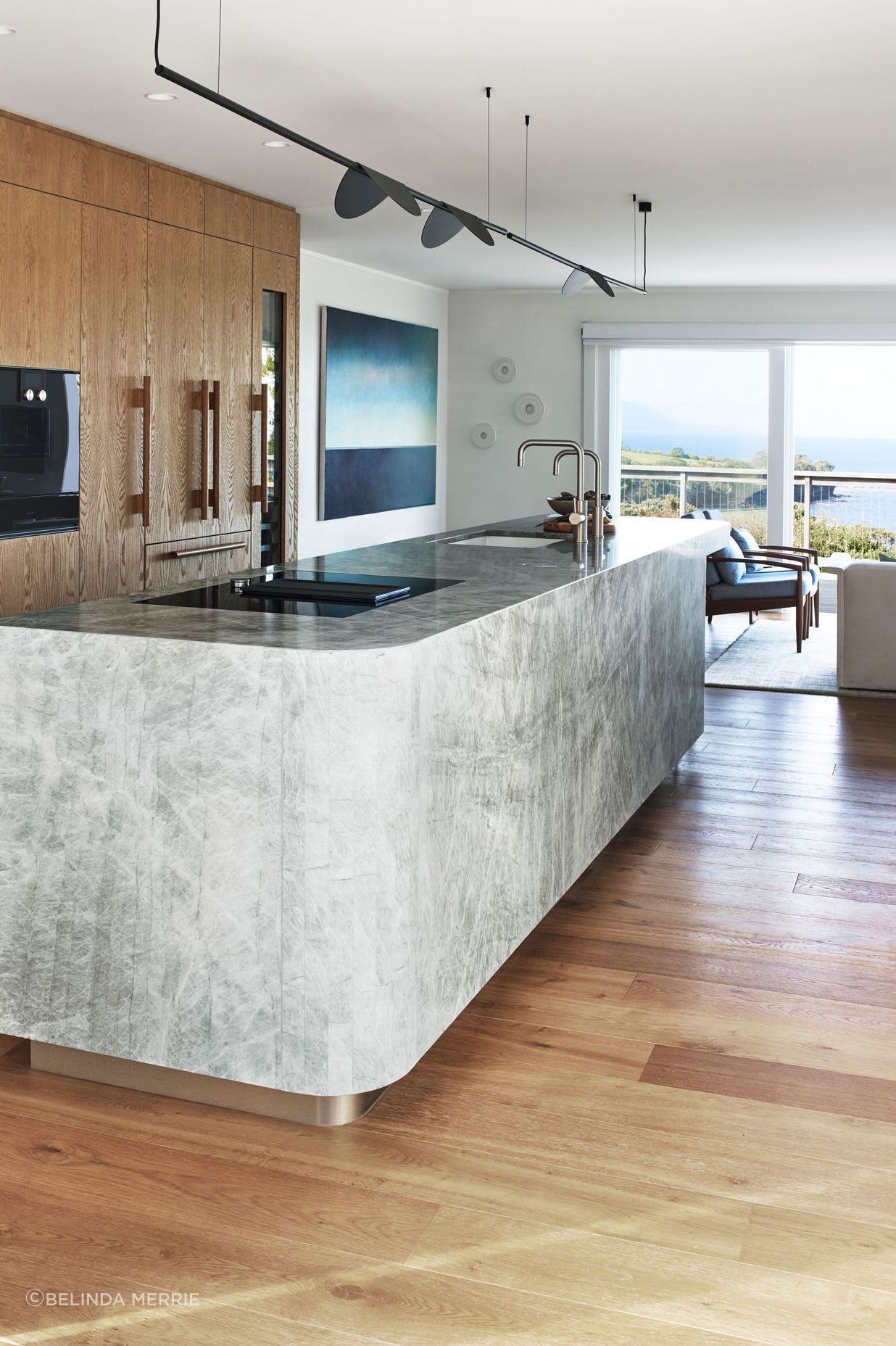
But, before the renovation, no one in the kitchen could appreciate it. “The hob was facing the wall with no window,” says Natalie. “Often people don't realise how much time they're actually spending cooking and using the hob. Why not enjoy those beautiful views by putting the hob and sink in a position where you can see them?”
The bach is owned by a mum with two young daughters.
“Her initial brief was to keep the shape and location of the kitchen and just include a bit more seating. But after I designed a few layouts, I helped her to understand that we could get so much more. She spends weekends and holidays there and wanted to interact with family members and her daughters. So I reconfigured the entire space.”
The original kitchen was run down, and tucked away in an alcove.
“The space was challenging because the ceiling was sloped down on one side and quite low. It was quite choppy.”
Heavy beams overhead were recessed into the ceiling for a more streamlined look. But not too contemporary.
“The client really likes the 1970s look. So I needed something modern, but still have some link to that style and the era of the house.”
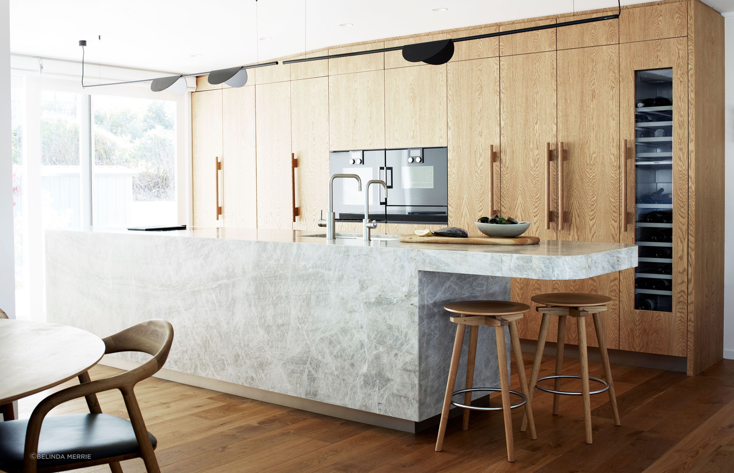
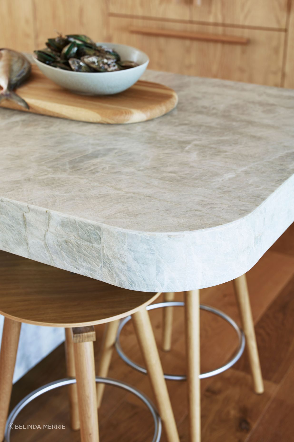
There's quite a bit of timber, she says. “There's timber on the floor, and the timber in the cabinetry. Then there’s the furniture that I specified, and the client kept a few retro chairs that she had. So I wanted to break up all that timber by giving that island a stone feel. We searched for ages for the right stone. And eventually I found something really beautiful.”
From CDK Stone, it’s honed quartzite in Taj Mahal. “I felt that the movement in the stone related really well to the sea, you've got that movement of the water. It has a little bit of greeny-grey in it, but it was still quite neutral.”
She also liked that the stone was striking but not imposing, as the space for an island was quite narrow. “I really wanted to get an island in there. The client wanted somewhere nice that her daughters or friends could sit at while she was preparing food.”
The ends of the island are curved. “It’s more ergonomic for walking through, but it also gives it a bit of a reference to the 1970s.”
But the curves were not easy to achieve. “It was quite a complex procedure because, obviously, stone is flat and you can't bend it. I wanted to make it look like it was a slab of a big chunk of stone and that it was carved into a curve.”
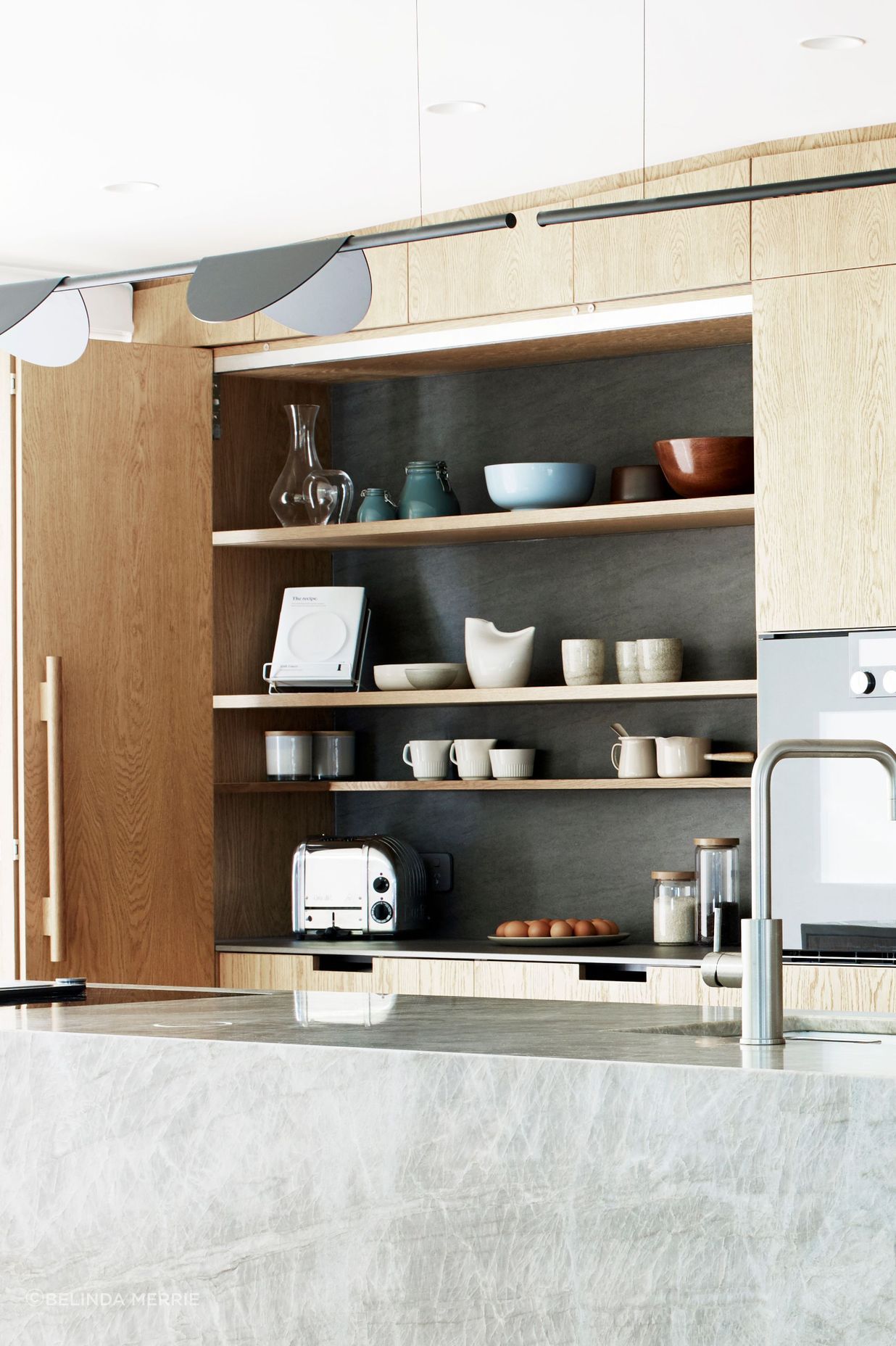
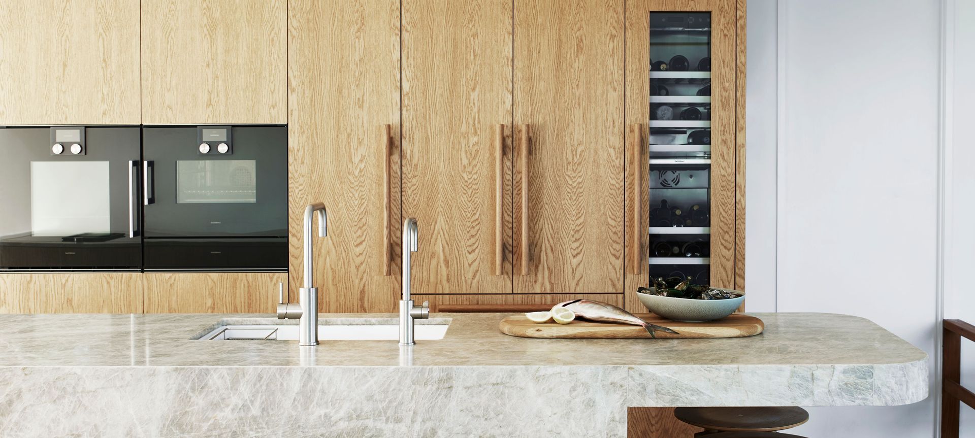
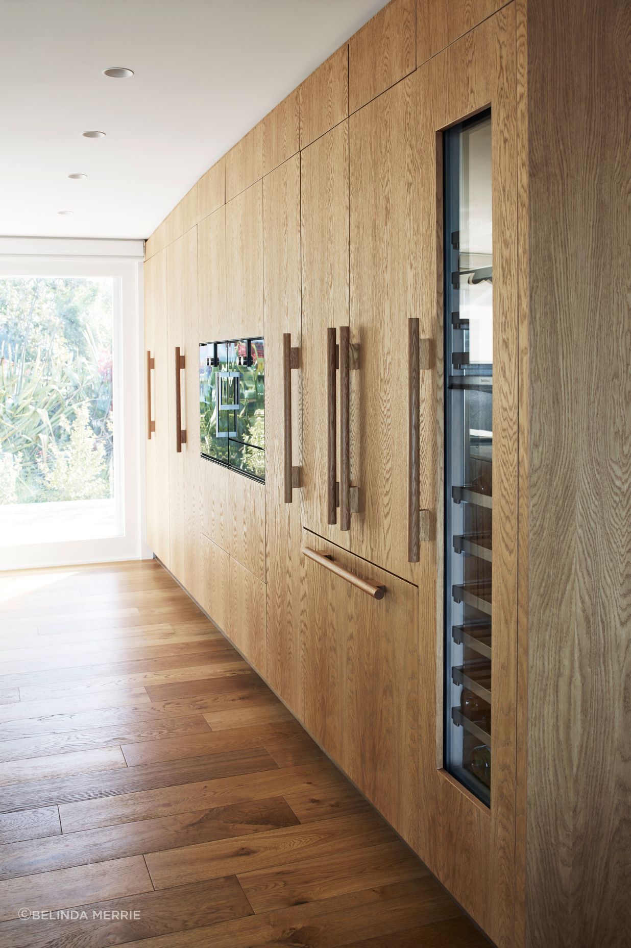
Also evocative of the 1970s is the timber cabinetry. It is bead-blasted European oak veneer and Natalie had it custom-made.” I designed specific timber handles. I really needed something quite sturdy and solid to be able to open those doors. With bigger cupboards you need to have a decent handle.”
Another usability factor that Natalie considered is also in that wall cabinetry. “We really needed an area in that kitchen where you could make a bit of mess and then hide it away. So I've got an area at the end, with bifold doors that can open left or right, or the whole lot can move to the left. It doesn't need to be shut, but it can be if it tends to get stressful. And then you've just got your nice island to look at.”