Artwork Displays

Want to have some stylish artwork displays but not sure how? Maybe you have some extra space on a wall that needs filling?
Here are some clever and stylish solutions for artful displays on the wall.
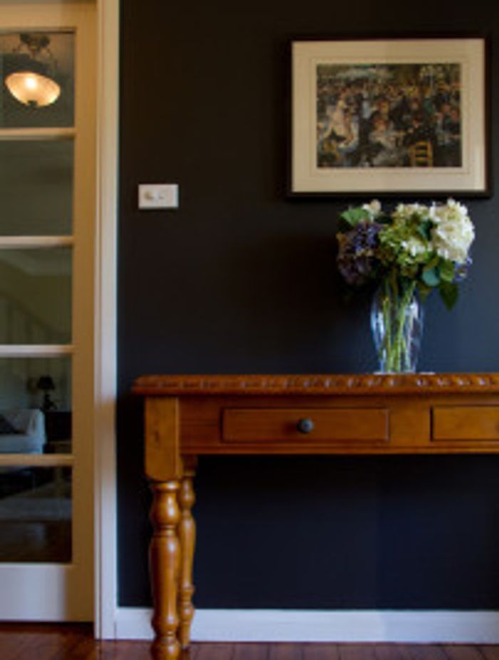
Key places to hang are above a couch, bedhead, foyer, fireplace, or in a staircase.
If you’re hanging pictures that will be viewed from a standing position such as in hallways the best rule of thumb is to hang your artwork so it’s at eye level.

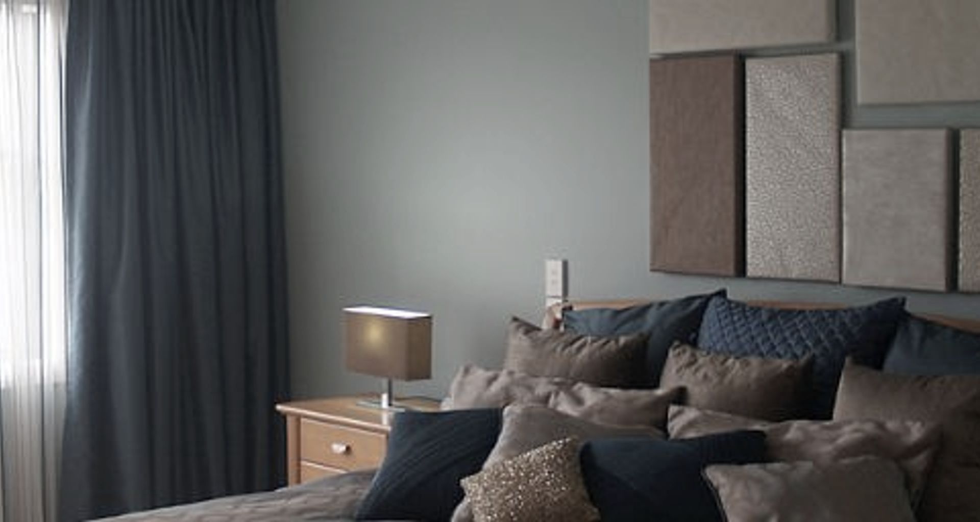
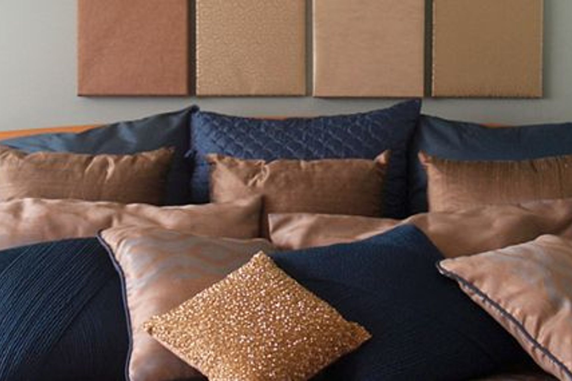
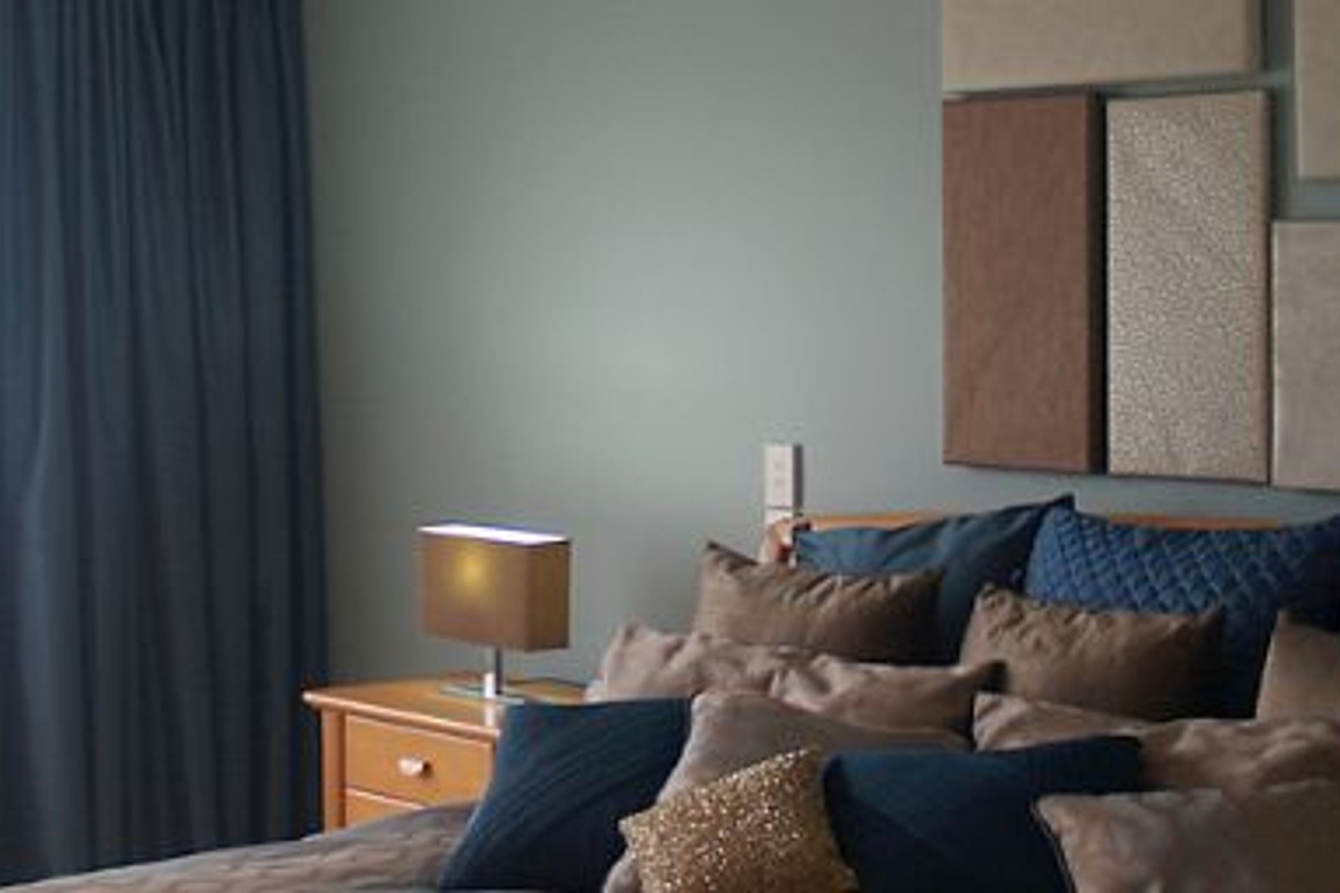
Artwork above bedhead
When putting artwork above your bedhead in your room remember to not centre your picture between the top of the headboard and the ceiling. It’ll end up hanging too high and look as if it’s floating.
It’s best to visually connect your artwork to the furniture below. To create balance, your artwork (or grouping) should be at least 2/3 the length of the headboard.
The shape doesn’t matter, it could be square, vertical, horizontal, round or oval as long as it’s the right size to counterbalance the headboard.

For group hangs, cut out pieces of paper in the same size and attach to the wall to check the spacing. Other option is placing frames on a table or chair and looking at the arrangement from above.
Both these ways will determine which frame should go where, make sure the colours are well distributed throughout the arrangement, and helps to figure out the spacing between each row and frame —it will help save time and possible future mistake holes in walls.
Hanging a group of identical frames

When hanging a grouping of identical frames, number the back of the frames from 1 to however many you’re putting up starting with the one on the right, top row, second row right to left, and bottom row right to left. This will avoid any confusion if you decide to switch out the art but want to rehang all the frames in the same spot.
To save on costs for group hangs buy from places like ikea, freedom or two dollar shops. It’s sometimes best to stick with the same frame style to outline the different artworks.
This helps to provide a way to visually unite different colours, designs and art styles.
To create the best look for hanging try follow these simple rules:
- Never display art in direct sunlight or on west-facing walls
- Try and juxtapose between design elements and style – shape, scale size pattern and colour
- Rules of thirds – hang in odd numbers
- Hang with a variety of methods like string, tape, cord and wire. This will produce interesting effects
- Some art looks best not hung but resting on the ground or table against a wall
We hope this has given you some inspiration to put some artwork displays up around your home.
