A considered, artful renovation of a heritage Ballarat home
Written by
12 August 2024
•
7 min read

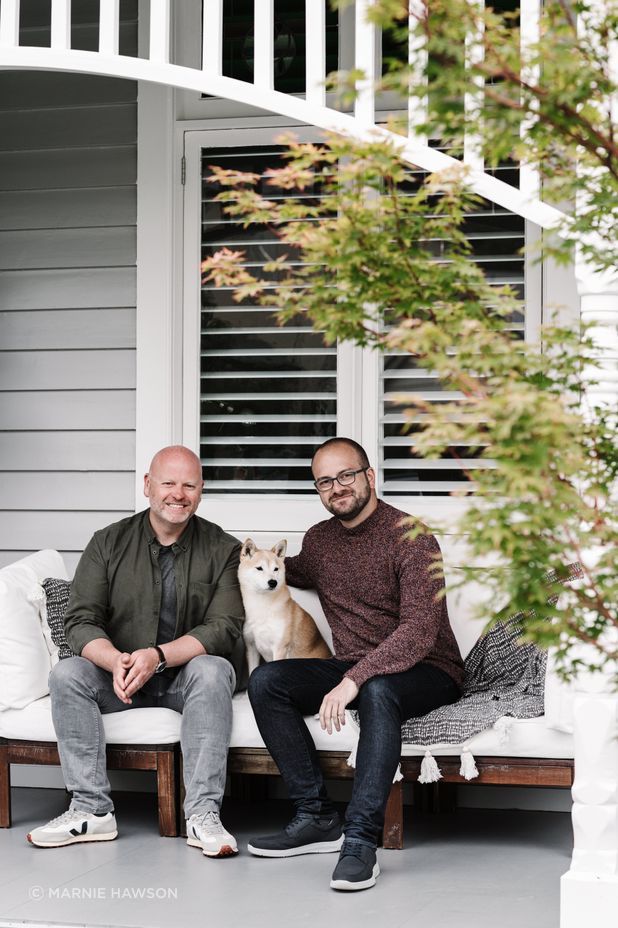
What was once a typical Edwardian home built in 1911 with dark burgundy accents and an unflattering 1990s extension, Loch Avenue Home has been transformed to reflect the homeowners’ lifestyle with modern flair – all while honouring its heritage.
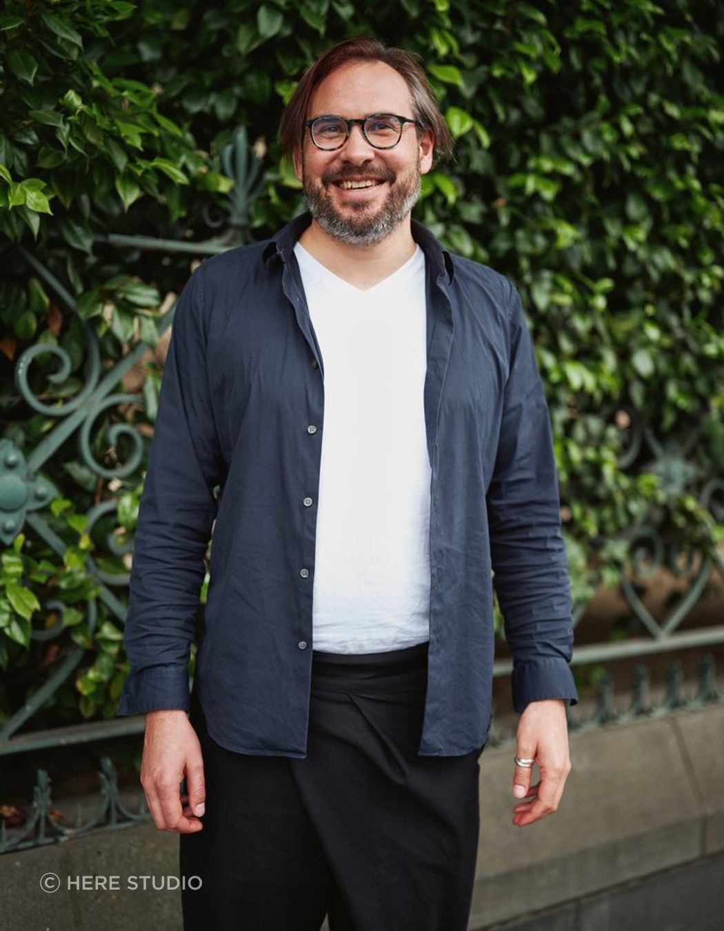
“The clients were initially drawn to us because we understood what their concept of late mid-century modern was,” says Ammon Beyerle, director at Melbourne-based architecture firm Here Studio.
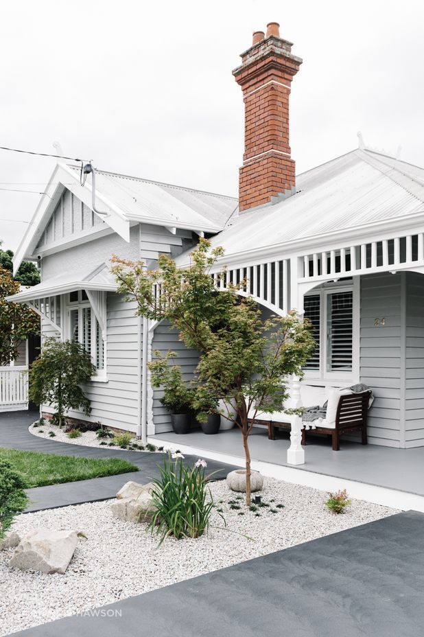
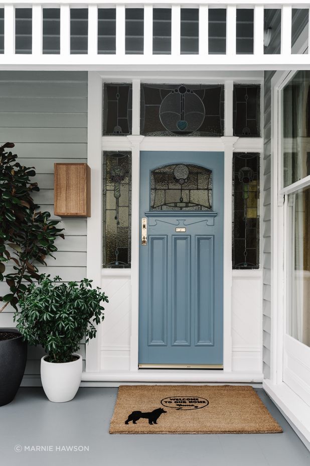
Contemporary in colour, the frontage of the home retains its heritage style with horizontal weatherboards, ornate verandah posts and the original brick chimney.
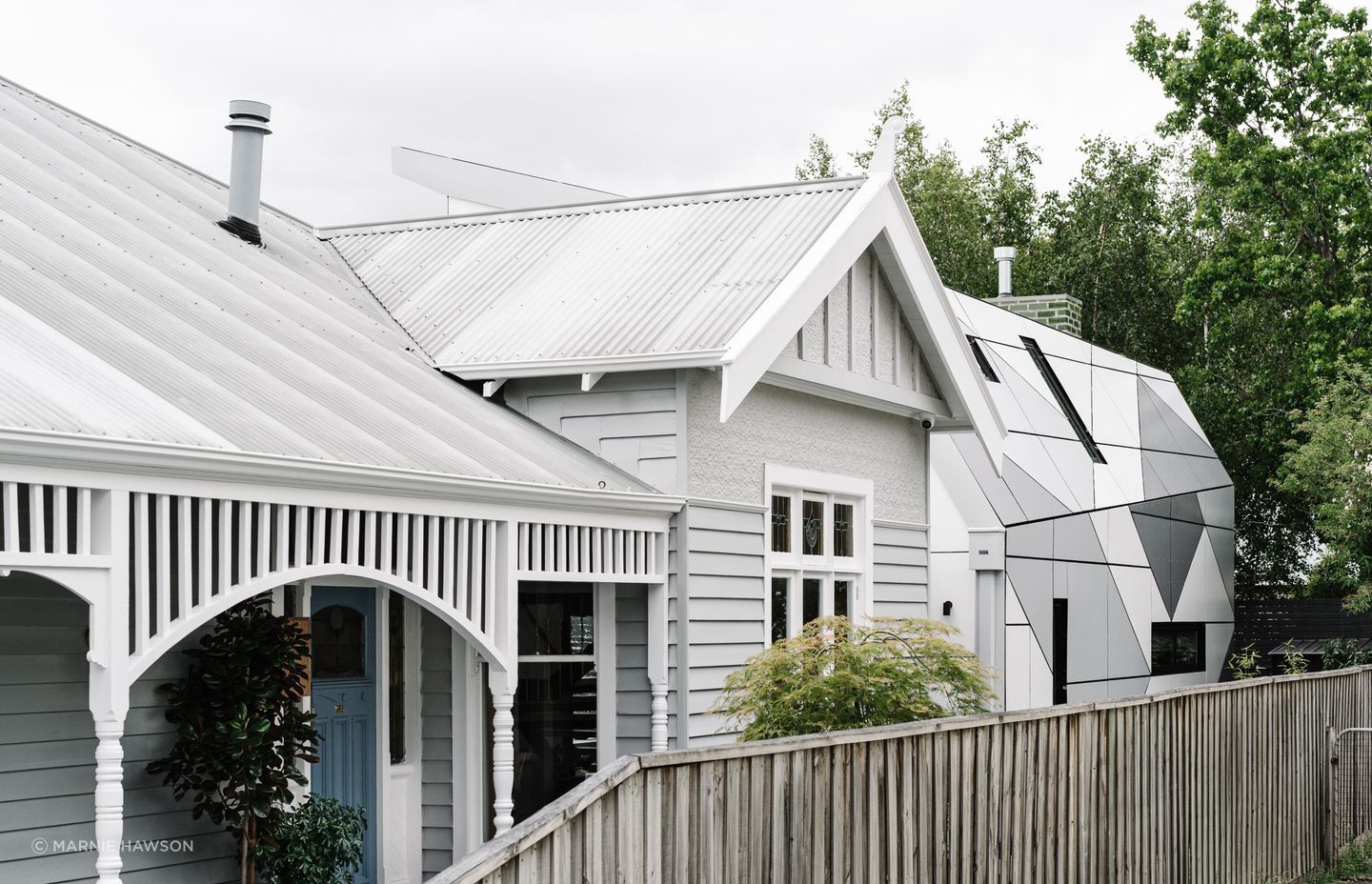
“Arriving at the home, you see the front of the house, you see the period details and you see this little addition at the back. Then as you go past, you realise something is really different here – suddenly you’re put in a different world, it’s very contemporary.”
The difference between old and new may be initially recognised, but considered design details that harmonise and tie the two forms together are slowly revealed.
“When you’re confident and comfortable doing projects with a heritage overlay, you consider what contrast means for a project – is it a meld, is it respect, is it matching? Or is it a stark contrast? That’s what you need to work through and it’s something I think we do quite well at Here Studio,” says Beyerle.
An aluminium façade, the extension speaks to the colour and form of the original weatherboards at the front of the home – a unique interpretation made possible with Beyerle’s experience as a structural engineer.
“Very clearly, the colours speak to the front of the house and the lines speak to the front of the house in the same datum, so it’s tied together. There is a clear separation between old and new with a setback for the door at the side so people can walk straight into the new kitchen and entertaining areas.”
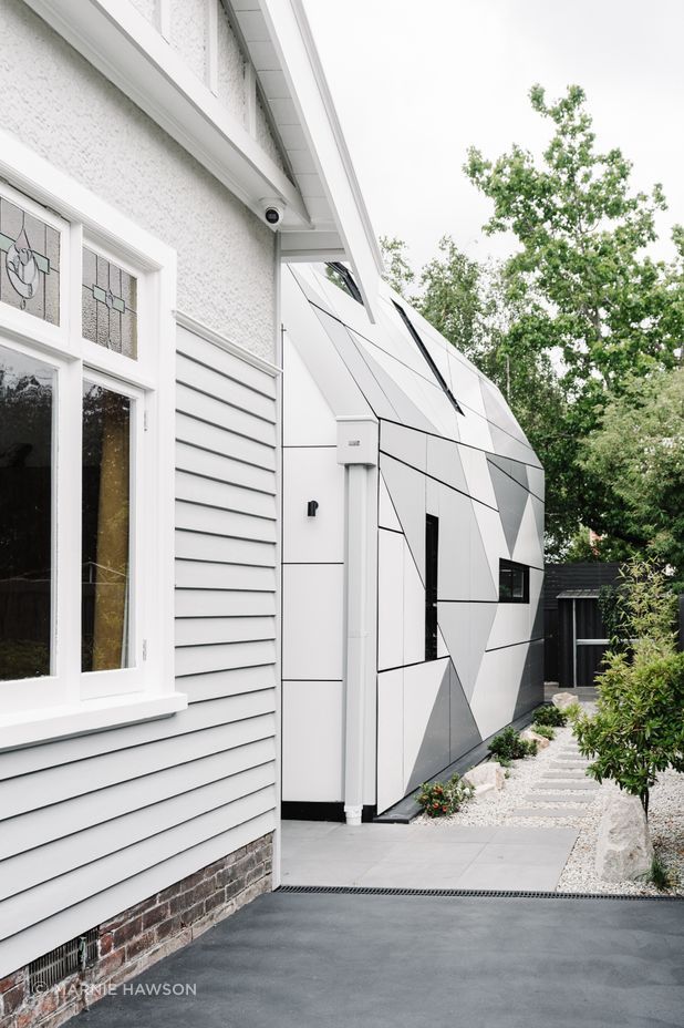
You realise something is really different here – suddenly you’re put in a different world, it’s very contemporary.
Mid-century modern unites the home’s blend of old and new, heritage and contemporary. “The interiors marry the project,” says Beyerle.
The interior is also a perfect example of Here Studio's emphatic, creative and rigorous approach to designing homes as individual as their owners.
“We very much get into listening about people’s lives and their vision of their life. Not only what they’re doing now, but where they see themselves going and maybe what they want to continue,” says Beyerle.
“Some of the first conversations are typically, what time do you get up in the morning? Do you have a coffee? Do you sit for a moment? When do you get together and eat or take a moment to talk about your day? Is that in the morning or the afternoon? These are our fundamental first questions that help to then start shaping the home.”
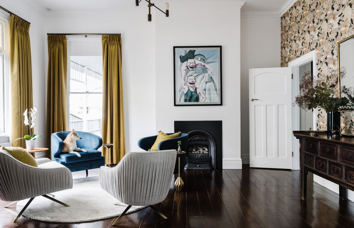
Entering at the side just before the aluminium façade, guests are welcomed into a junction between the original portion of the home and the extension.
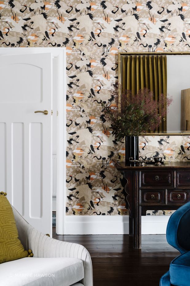
“On your left is a sumptuous library space in the old part of the house. There are dark timber floors, mustard curtain drapes, beautiful velvet blue chairs and artwork above an original fireplace.”
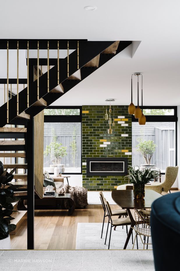
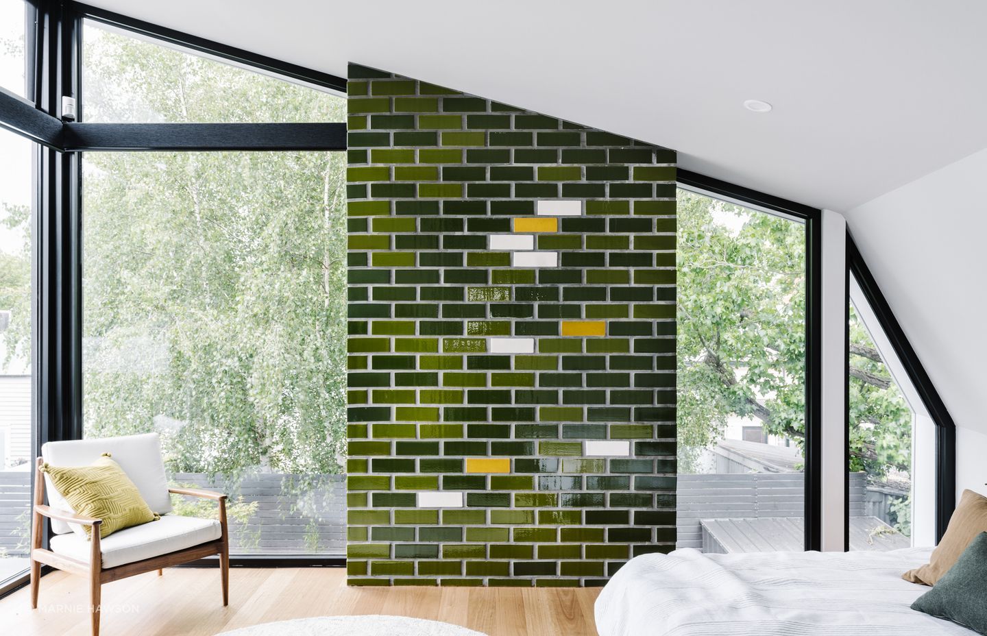
To the right is an informal dining area and sunken lounge with blackbutt floors. Beyond, a stunning fireplace with handmade glazed bricks commands attention. A mesmerising dance of greens with accents of white and yellow, the tiles reach from floor to ceiling, representing the Australian bush in pixelated form – a nod to today’s modernity.
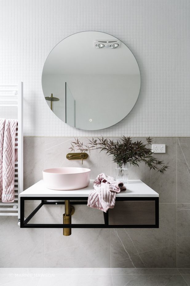
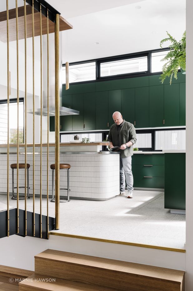
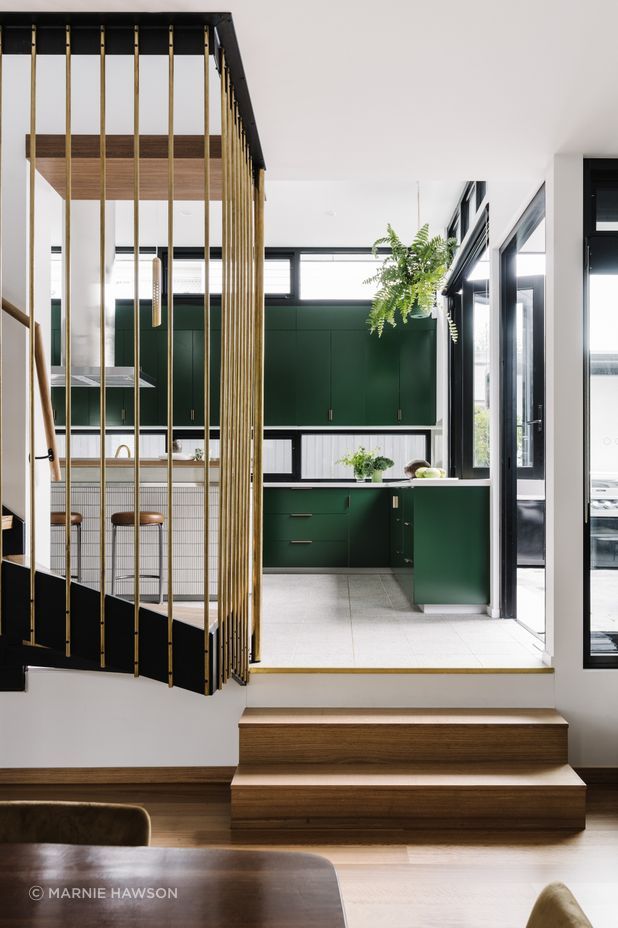
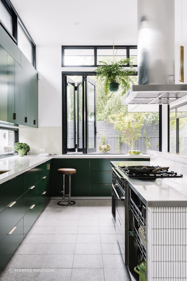
Green also draws the eye to the kitchen. The undeniable heart of the home, the kitchen is spacious with a double-height ceiling and designed to be the centre point for entertaining.
“The owners are very hospitable people,” says Beyerle. “From Ballarat originally, their background is in marketing food brands in China so they’re really into Asian cooking with flames, fresh food, vegetables, spices and herbs. So they had this vision of them in the kitchen doing this with people coming in, visiting them from all over the world because they have lots of international friends.”
For the avid entertainers, the large island bench doubles as a preparation space and gathering area with its bar-like design. Natural light enters the grand space from the north through clerestory windows and the outdoors is brought inside with green cabinetry.
“You can imagine Andrew is in there cooking, he’s got the flame going and then you can take a few steps to the right and you see outdoors to the backyard.”
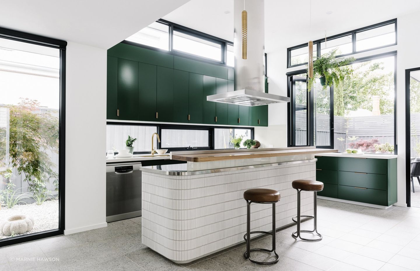
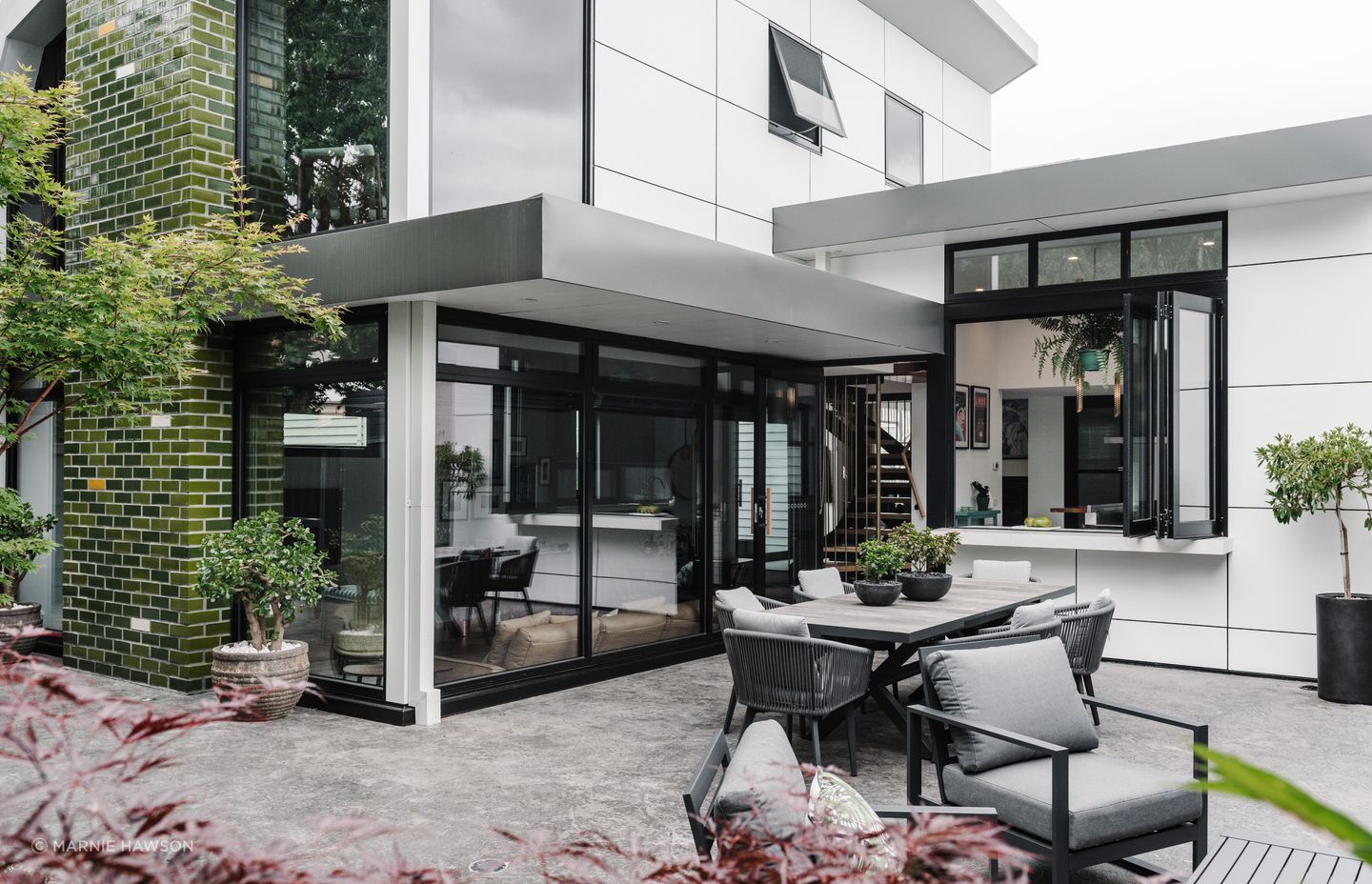
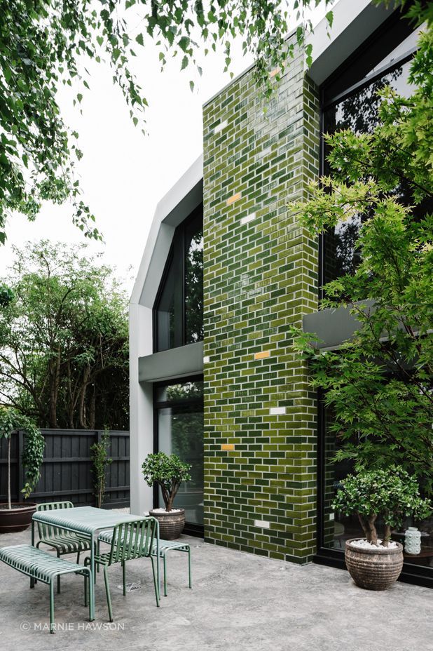
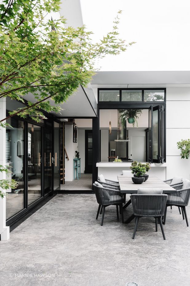
A servery window connects the kitchen with the outdoor entertainment area where green handcrafted brick tiles mimic the pixelated pattern of the indoor fireplace. Double-height, they act as a beautiful coloured canvas for neighbouring properties – a design aspect commended by the local council.
“We took a picture of the Victorian bush which had trees and wattle and such and we played with Photoshop and further and further rasterised it and turned it into pixels. We figured it out over multiple iterations using existing colours at the glazed brick manufacturer and it just sits lovely; it’s got a lovely soft feeling. You’re not in the bush, but it gives you a little bit of a feeling of it and creates that atmosphere with the colours.”
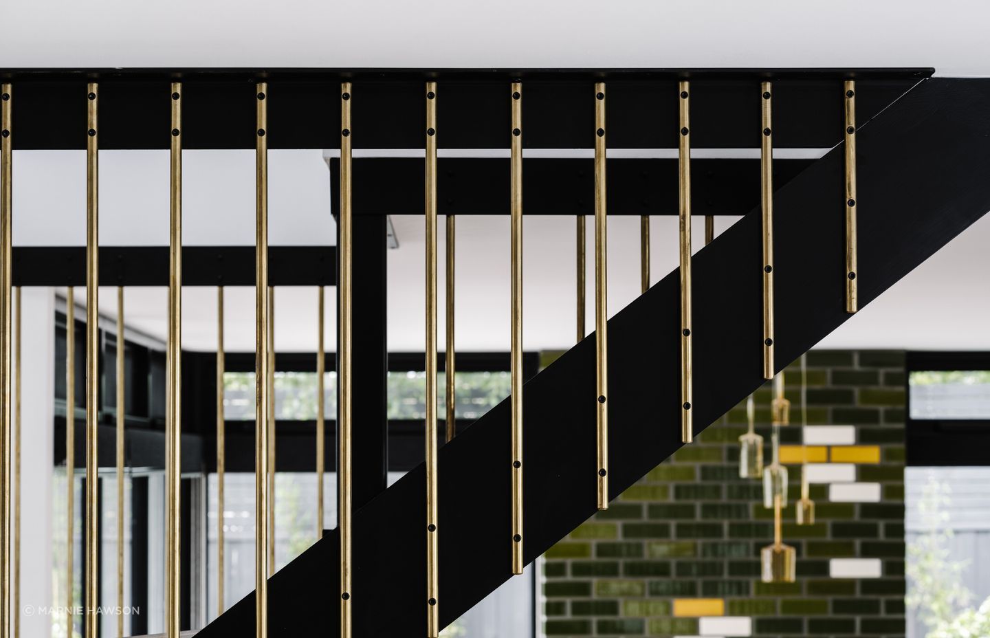
Back inside and journeying further into the home, the staircase with its brass rod balustrade wraps around and up to the master suite.
“The clients had a very strong sense of what their lifestyle would be in the future. They would need to travel because they have business in China, so they would be travelling once a month both nationally and internationally. They needed to be able to get up in the early morning to catch a flight, leave the bedroom and pack their bags very easily,” says Beyerle, with large blackbutt drawers and benches for packing in the master purposefully designed for this.
We want clients to bring different parts of themselves to a project – it enriches it.
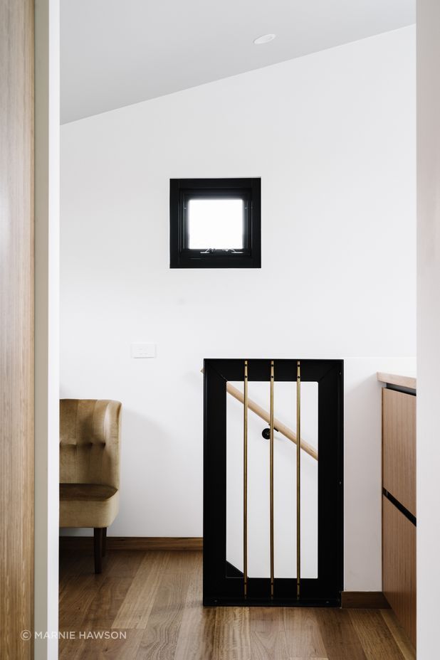
Not only a beautiful home that elegantly combines old and new, the masterful renovation and extension of this Ballarat home has also been designed to suit the homeowners, their needs and lifestyle – all while keeping to their budget.
“We think about a lot for every design and we are tying together use, style and budget. We spend a lot of time understanding what’s going on with the client. Where are they going, where are they coming from and what are they hoping for? We’re very pluralistic in that way – we like to understand multiple threads and then tie that into the building,” says Beyerle.
“For instance, quite often we work with a family or couple and we want to hear their differences. We want clients to bring different parts of themselves to a project – it enriches it. You can see this project has lots of different things going on and it works together; the stories are connected.”
Here Studio’s expert application of ‘light and life’ has also been applied throughout the Loch Avenue Home.
“You’ve got great light coming through from so many different directions, to comfortable places to be, to sit, to work, to use the space, which comes from our listening as well as a deep understanding of the space and the home’s orientation.”
From ‘here, and here, and here’, Here Studio is a team of professional architects – many of whom have lived and worked overseas and bring their own cultures and values to the table. They are dedicated to the details and to bringing homes to life in a way that suits homeowners’ unique lifestyles. Based in Melbourne, Geelong and Ballarat, they can help renovate and extend local period homes and those from the more recent past.
Explore more projects by Here Studio on ArchiPro.