A dream home in Oyster Bay becomes one with its water views
Written by
19 June 2022
•
7 min read
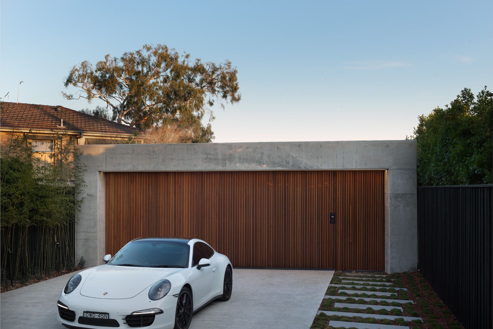
The approach to Oyster Bay House from the street reveals nothing of the grand, contemporary home that lies beyond. Located at the end of a narrow road on an expansive west-facing site, all that’s visible from the street is a boxlike garage and integrated front door.
“The blank facade was partly because the clients wanted their privacy, but also a philosophy of mind that a street is for cars,” explains architect Peter Couvaras.
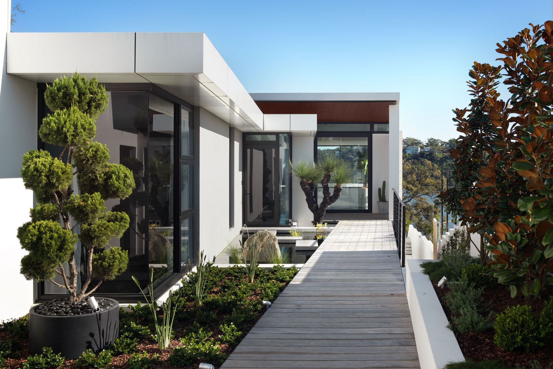
Enter the home, however, and a more dramatic story begins to unfold. A walkway leads through the garden past a koi pond to an enormous glass pivot door that opens to reveal the first glimpse of sweeping river views out to Como Bridge.
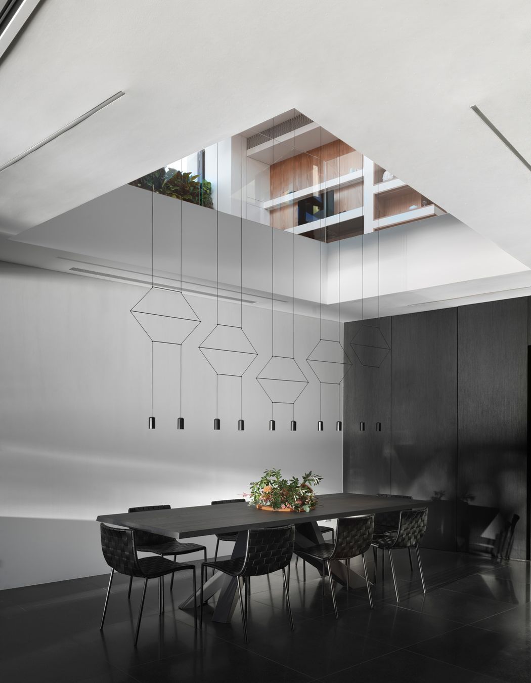
Once inside, visitors are presented with a choice. A mirrored lift is the express option to get down to the ground-floor living areas, but the couple who lives here tends to take the scenic route via two sets of stairs descending through the impressive three-level void.
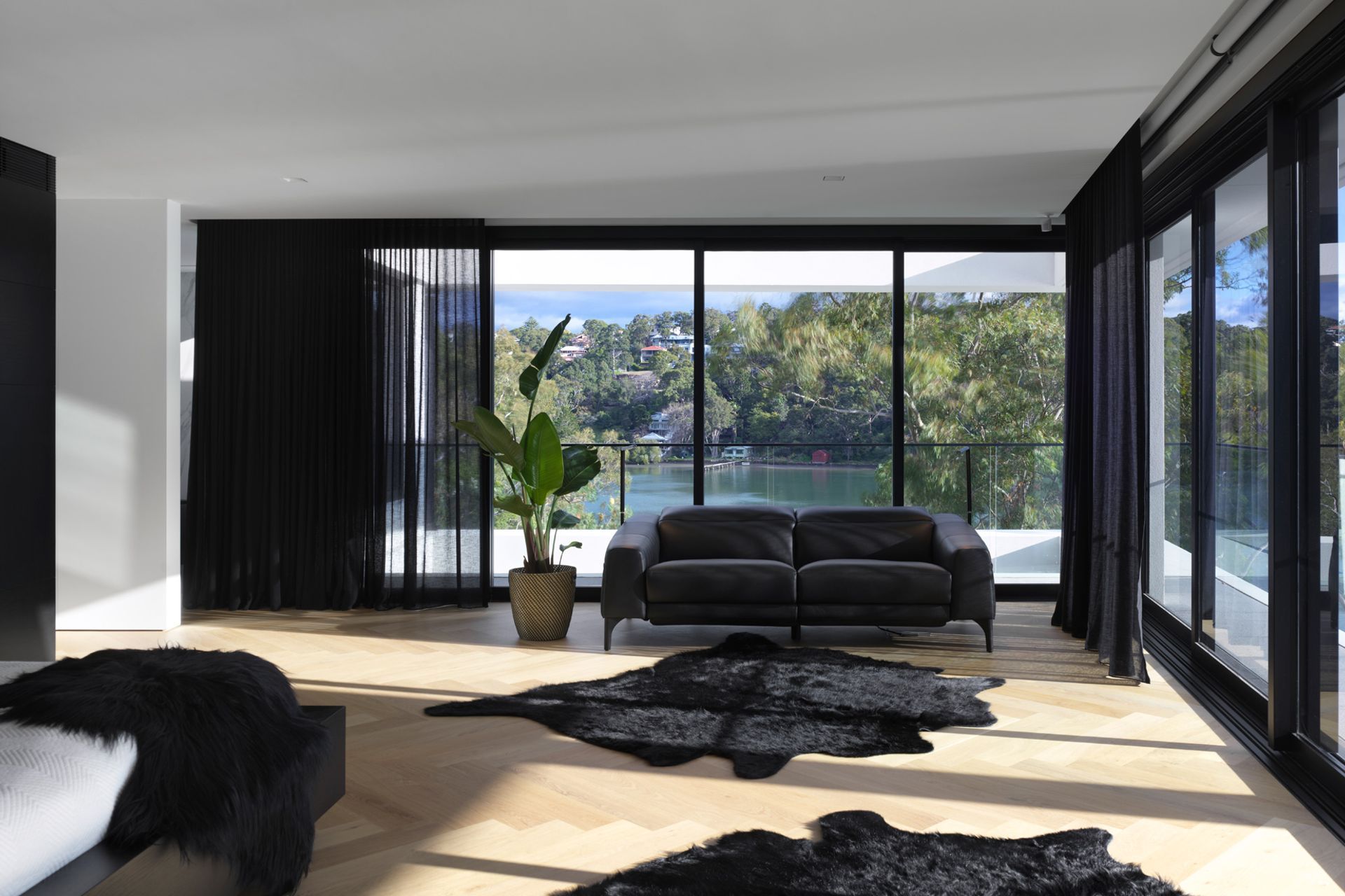
The top floor is home to a guest suite, and the middle level houses the bedrooms, including an ultra-spacious master suite with the same incredible water views as the living areas enjoy directly below it.
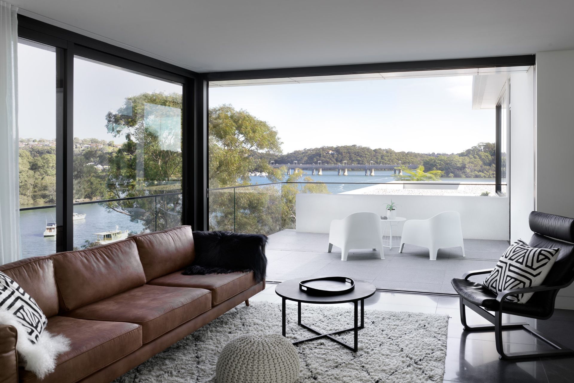
“When you walk down that last flight of stairs, you feel like you've actually walked into the view, and you become a part of the landscape that this house sits in,” Peter says. “The clients wanted the living area as close to that water level as they could have it so we designed the whole house around that view, but in a way that doesn't just throw the view in your face - we designed it so that the view unfolds and you get to see different aspects of it from different parts of the house.”
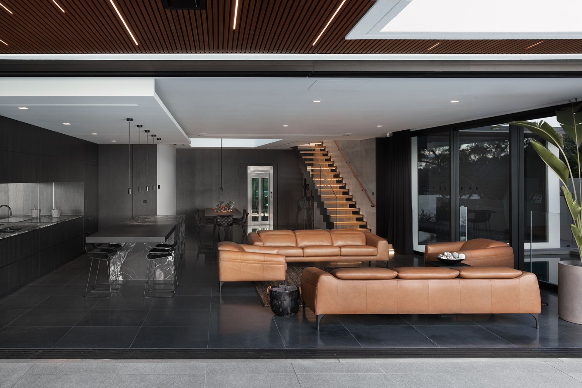
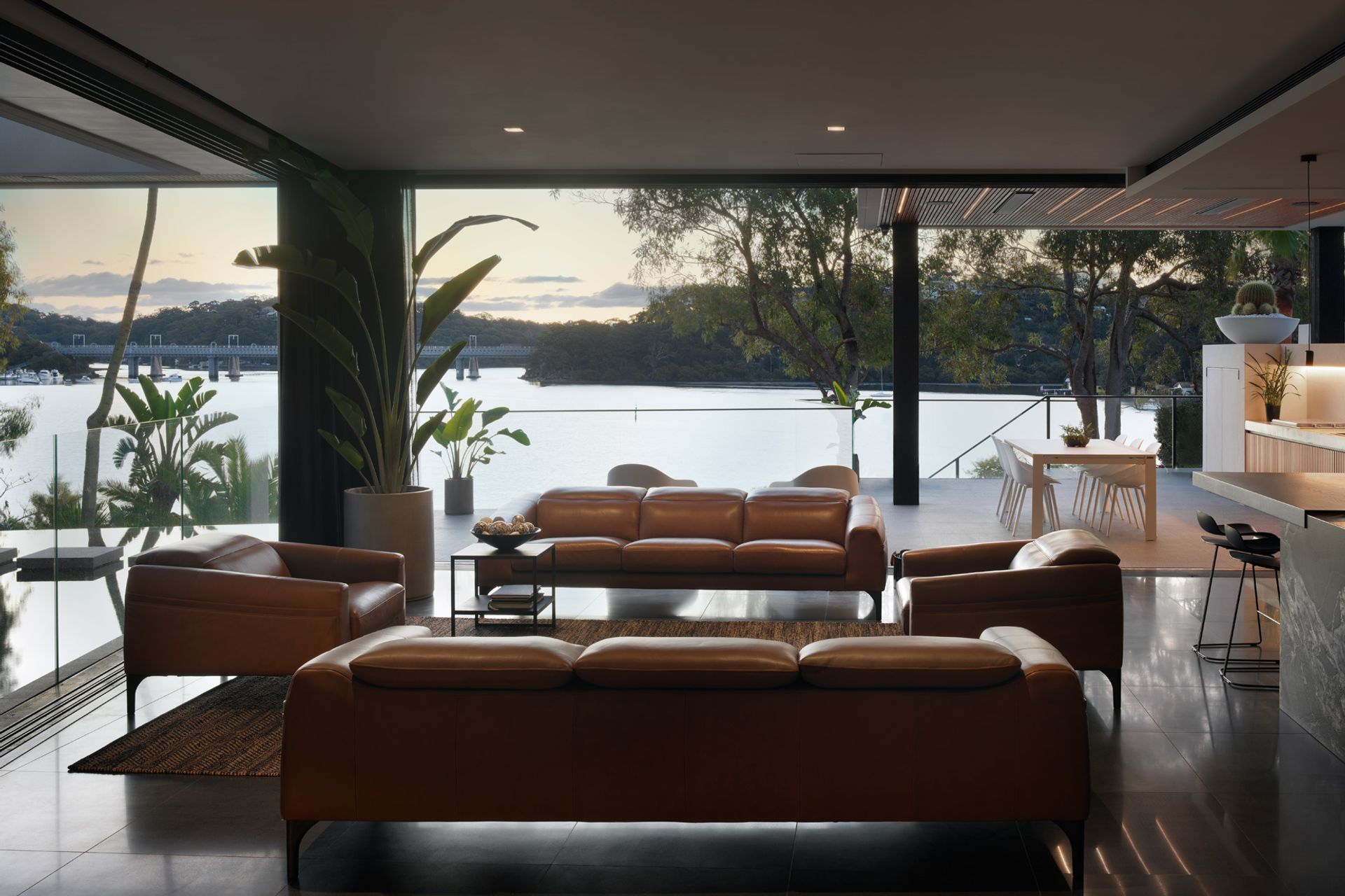
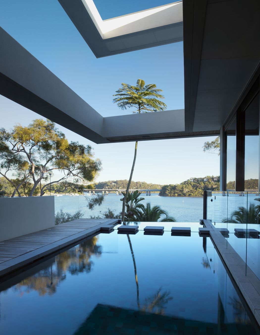
Comprising an open-plan living area, kitchen, and dining area beneath the void, along with a cosy media room, the ground floor opens up around the pool and entertaining deck so the home can become one with the view.
Homeowner Gareth says she had always wanted to build her dream home, and when she and her husband found this block in Oyster Bay, they knew they’d found just the place to do it.
“The block is unbelievable because you have almost a 280-degree view with no neighbours in sight,” Gareth says.
She especially loves that the house can be opened up to host frequent gatherings of family and friends. “All the doors completely fold away to create this indoor-outdoor flow,” Gareth says. “We’re entertainers so it’s fabulous.”
All the doors completely fold away to create this indoor-outdoor flow ... we’re entertainers so it’s fabulous
The grandchildren can be in the pool, guests can spill out from the kitchen onto the covered deck and barbecue area, and there’s even a large projector screen that descends from the ceiling “when the footie’s on”.
“The expansive living-dining-kitchen, with doors that stack away, open out onto the terrace and the pool,” explains Peter. “It becomes one big open room, exactly the way they'd imagined.”
A dream home it may be, but the five-bedroom, five-bathroom house was a long time coming. The homeowners lived in a “dodgy little fibro cottage” perched at the top of the site for 12 years before rebuilding, collecting ideas for their future home from beautiful hotels in their travels around the world.
Interior designer Sally Farrugia of Farrugia Design worked closely with the homeowners to bring their vision to life. "The owners were amazing because they had a great design aesthetic ... it's wonderful when you're working with clients who are so design-focused," says Sally.
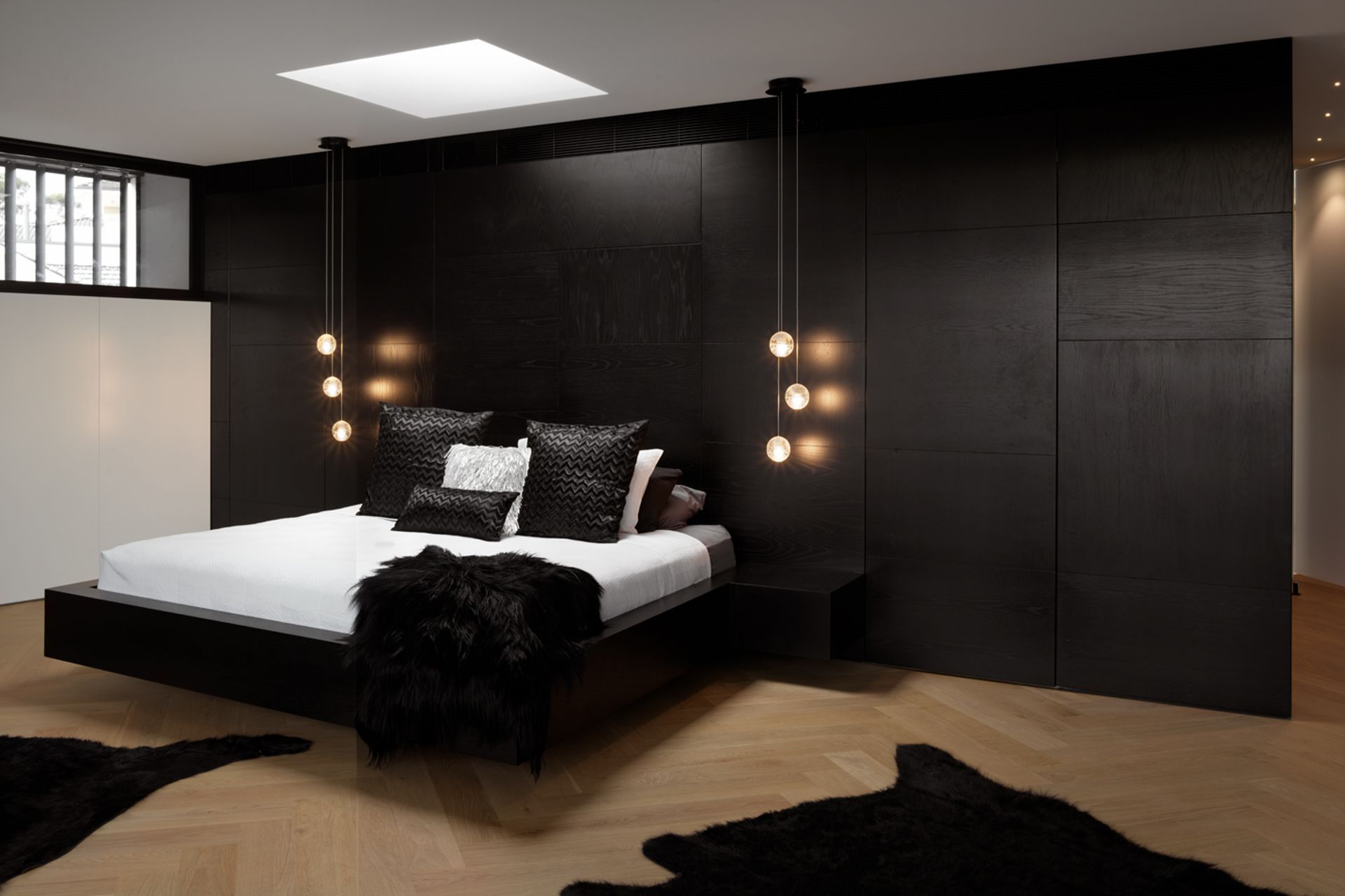
"Gareth has a real love of woven, textural things so we were continually looking at how we could bring these into the design," she adds. "Texture in a space really makes it come alive."
Layering stone, concrete, glass and timber with leather, luxurious fabrics, shapely furniture and an abundance of greenery delivers texture, pattern, comfort and a feelgood ambience throughout the home.
"You can have lovely surprises in each room that are different but if you have a consistency of materials that connect the spaces as you're walking through the home, it just feels right," Sally explains.
You can have lovely surprises in each room that are different but if you have a consistency of materials that connect the spaces as you're walking through the home, it just feels right
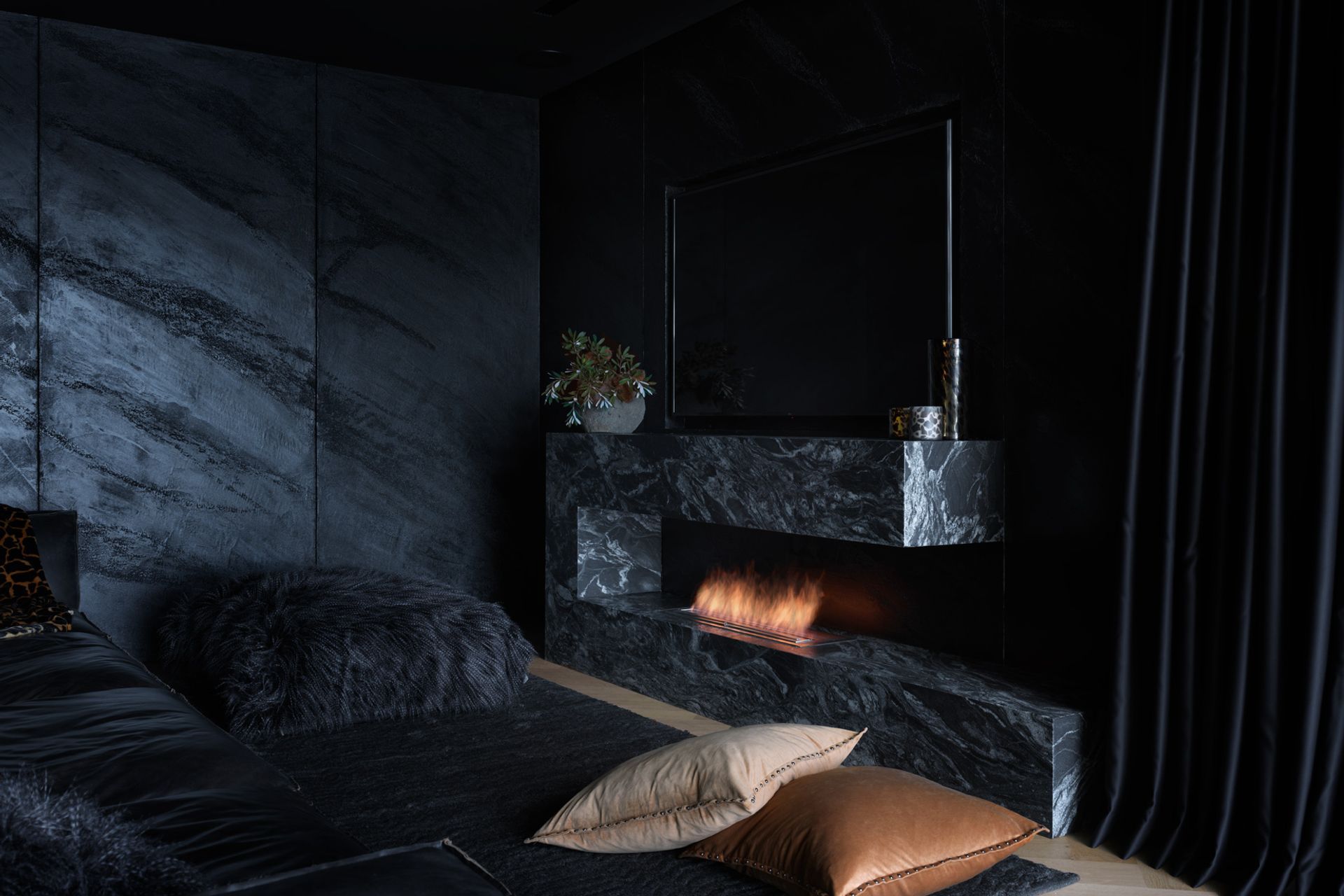
“The finishes are all dark and moody, almost Japanese in their feel, and that actually highlights the landscape and the view from the inside,” says Peter. “Even though everything is beautiful, well-designed and detailed, your attention isn't drawn to the house or the finishes or the style, your attention is drawn to the view and the landscape it sits in.”
From the water, however, the house is designed to stand out. “Rather than try to blend in, we've deliberately designed a crisp, white, angular house from the outside that, when you look at it, you can see there's a man-made object.”
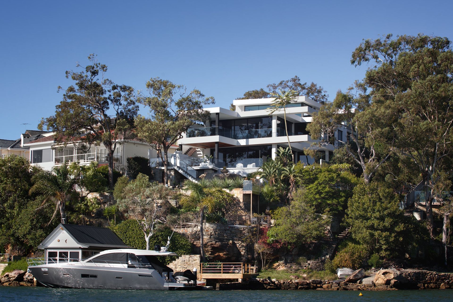
A double-height cantilevered structure over the pool elongates the house when viewed from afar, while from the side, the house clings to the rocky hillside as it steps down three levels towards the water. A pathway leads from the house down to the water itself, where a boathouse (complete with kitchen and loft sleeping quarters) provides a waterside sanctuary.
“The site was extremely challenging to build on, given the steep slope and limited access,” says Stacy Bakker, principal of construction company Bakker Built. “Securing the structure to the site was an engineering feat that required lots of steel and lots of concrete.”
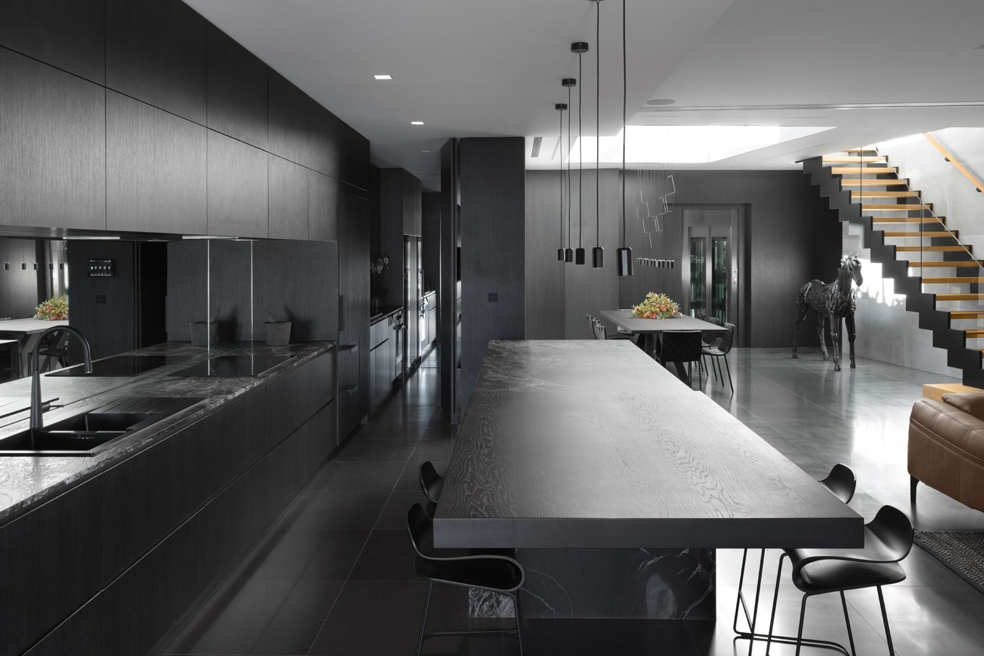
Getting the slab of granite that would become the kitchen island down the hillside and into the house was a particularly memorable challenge. With the help of a crane, Stacy and his team guided the slab “very, very gently” down through the three-level void into place.
“That was a good fun day,” laughs Stacy.
Although the materials chosen for this house are sophisticated and smart, they were also chosen for their practical and functional qualities.
The house won’t need to be repainted, for example, because the Rockcote exterior render is impregnated with colour, and the recycled wharf timbers used around the pool and walkways will add patina and character to the home over time.
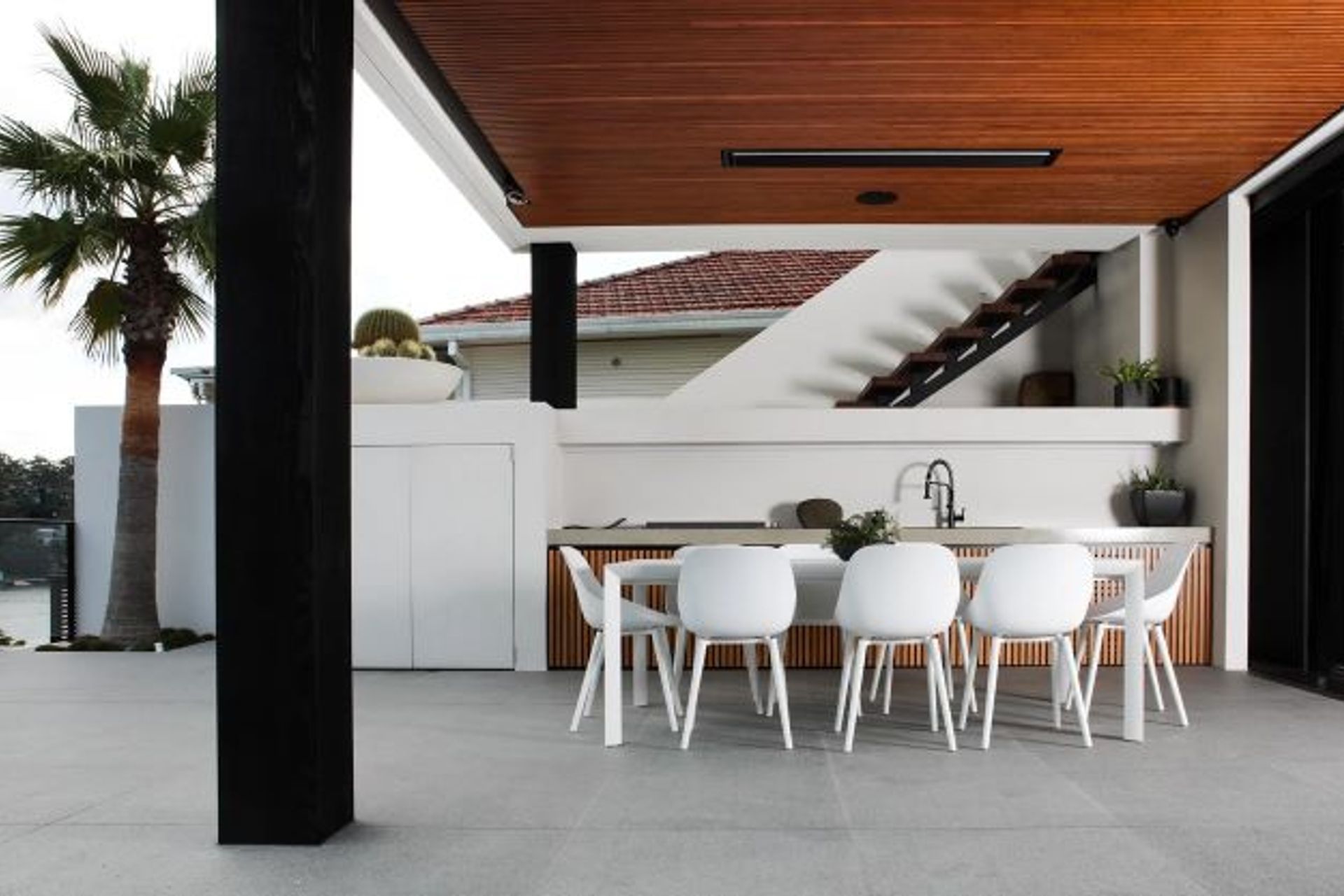
From the bamboo cladding in the outdoor entertaining area, to the understair lighting and bespoke bathrooms, the high level of detailing required a collaborative effort to get every little thing right. “Nothing is an accident, everything is thought out, planned and very particular,” Stacy says.
“The detailing is second to none; it's right up there,” he says. “It was a struggle, don’t get me wrong, but I think the end result is phenomenal.”
Interior designer Sally says seeing the homeowners enjoy a home that's both beautiful and functional is the ultimate reward for the whole team behind this large project.
"It's all about designing a space for people to live and work in and enjoy their life," says Sally. "It makes me proud that we've created a beautiful haven for this family and their extended family."
The home is also a career highlight for Peter, the architect.
“This is probably the first project in my whole career where I've been blown away when I saw the final product,” Peter says. “Normally, projects are what I imagined they would be in my head but when I walked in here, I was just like, ‘wow, this is better than I could ever have imagined’.”
Discover more architectural projects by Couvaras Architects, interior design projects by Farrugia Design, and construction projects by Bakker Built.