A micro bakery designed to elevate the customer experience
Written by
12 November 2023
•
4 min read

How do you bring personality to a space only wide enough for a few people to stand in – let alone turn it into a functional café and bakery that can operate effectively with a constant flow of customers?
In what was once a tight corridor used for storage in the heritage wing of The Hotel Windsor, Kudo Artisan Bakery is a unique space for customers to take their pick of delicious pastries and coffee to-go.
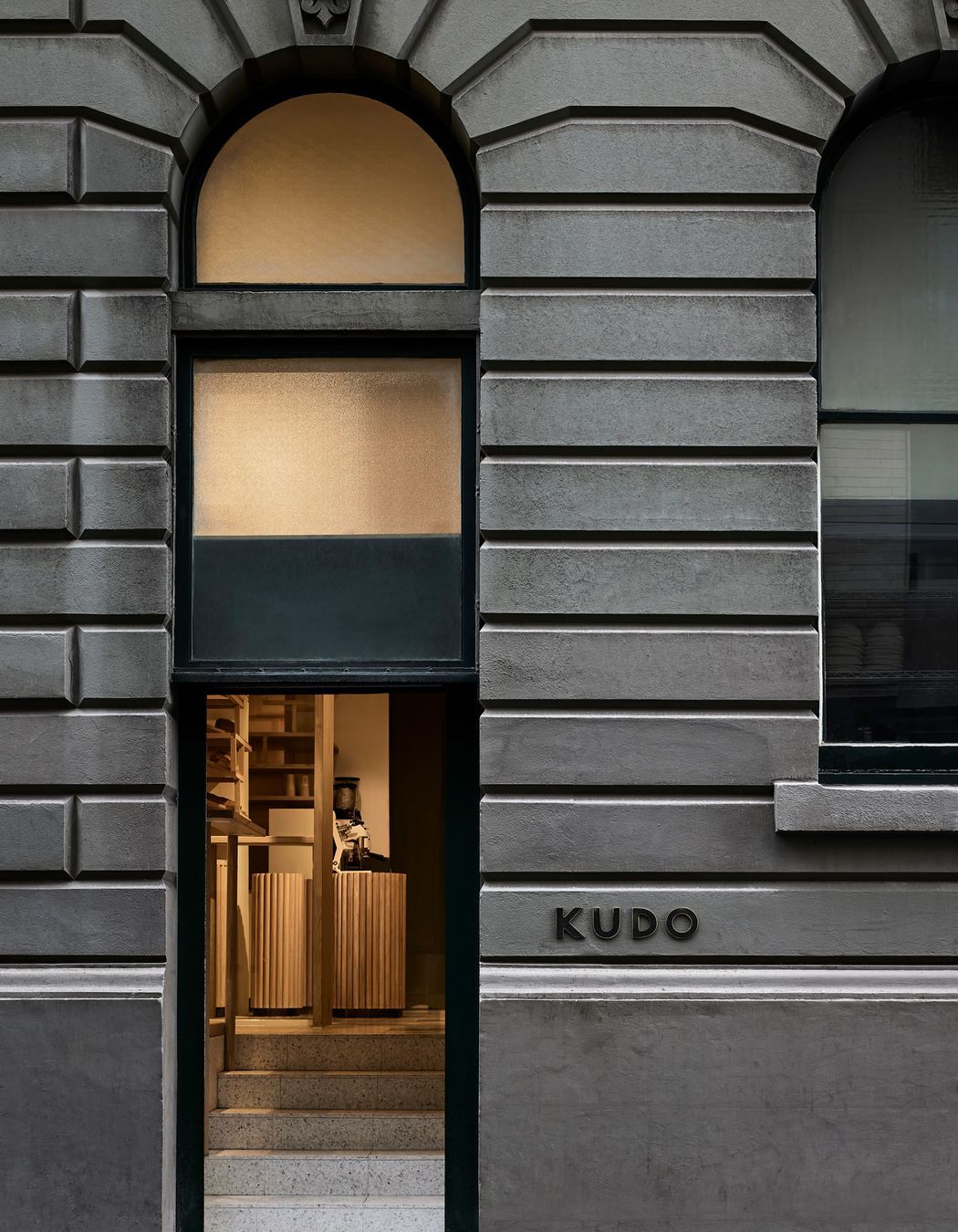

“The brief from the client was simple, but challenging – converting an underutilised corridor space into a unique and welcoming space to sell artisan baked goods,” says Kei Kitayama of Melbourne-based architecture and interior design firm, Kitayama K Architects.
“Another request from the client was to take advantage of the high-volume space with an elegant solution to conceal the existing services running through the space, servicing the hotel and facilities in the floors above.”
Sculptural timber screening envelopes the space, hiding the existing services while also creating a warm, inviting atmosphere and celebrating the high ceiling.
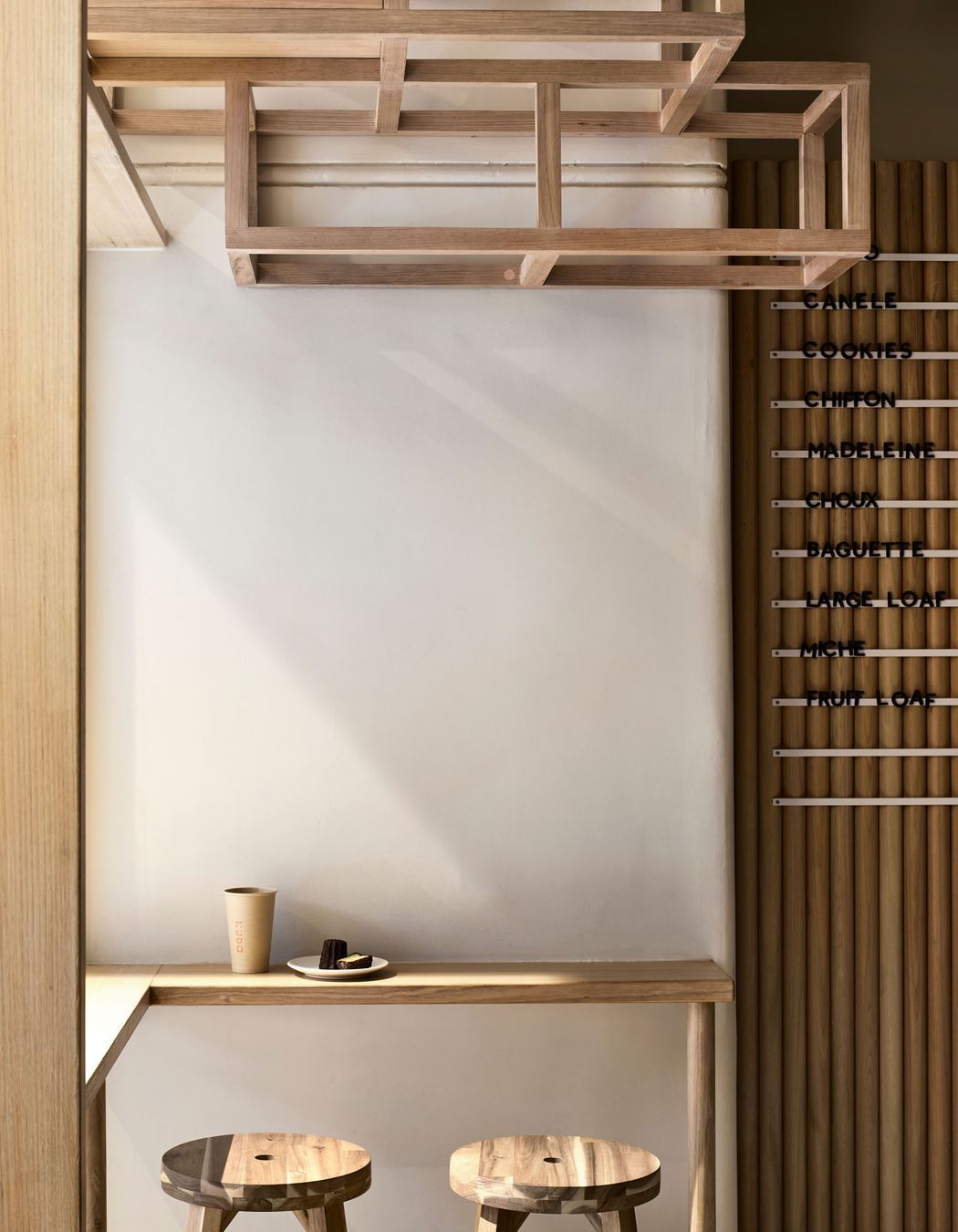
“Customers are able to see through the open timber frame screen and appreciate the original structure,” says Kei.
“The timber frame skeleton in the narrow, but high-volume space is intended to mimic the running bond brick pattern. It’s our modern interpretation of the traditional construction methodology – the overall framing of the structure is detailed with intricate joints with a fixing method to have minimal impact on the existing building fabric. It also gave us the opportunity to incorporate shelving for product display, adding another functional benefit to the design.”
Bringing texture and warmth to the space, the timber screen allows the narrow floor space to feel open and is an approach commended by Heritage Victoria.
“It is a design inspired by the existing heritage structure that draws customers’ attention to the ceiling space and the heritage building structure beyond. It is a skin to decorate the heritage structure without modifying it,” explains Kei.
The overall framing of the structure is detailed with intricate joints with a fixing method to have minimal impact on the existing building fabric.
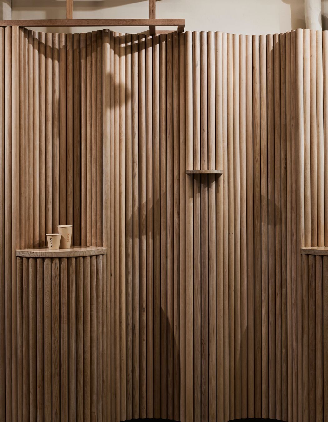
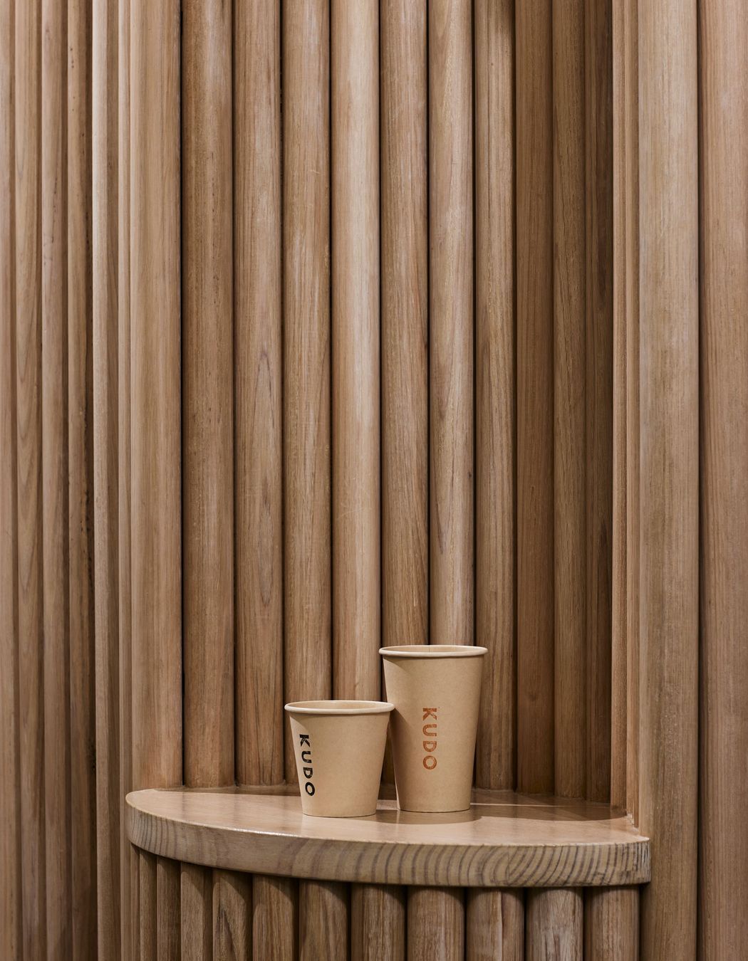
When customers enter Kudo, the pared-back, natural materiality of the space allows the baked products to be the focal point. At the back of the bakery is a coffee station and serving area, with seating at the front.
“It’s an open space for people to sit, wait and enjoy the baked goods,” says Kei.
Kudo’s baked creations were even used as design inspiration; in particular, the crust that envelopes the custard centre of canelé pastries – a name that comes from the French word for ‘fluted’ – was the inspiration for the furniture.
“Canelé-inspired furniture sits on the ground plane, guiding people around the narrow space. The pieces create organic traffic movement, similar to a sculptural garden. The mobile pedestals display the goods, capturing patrons’ attention. The timber joinery used demonstrates how interior design elements can be secondary in the overall scheme to focus on the products being sold.”
Above, the timber frames make effective use of the high ceilings, without closing the space in.
The main challenge in this project was to overcome customer flow in the narrow space. The design solution was moving away from the traditional arrangement of a long serving bench with customers on one side and the working space on the other, says Kei.
“The circular joinery pieces allow customers and workers to move between the pedestals displaying baked goods, the work bench, and the dining and waiting area. The mobile units allow flexibility to meet different operational needs.”
The result? “A space where people can wander around for discovery without hindering business operations.”
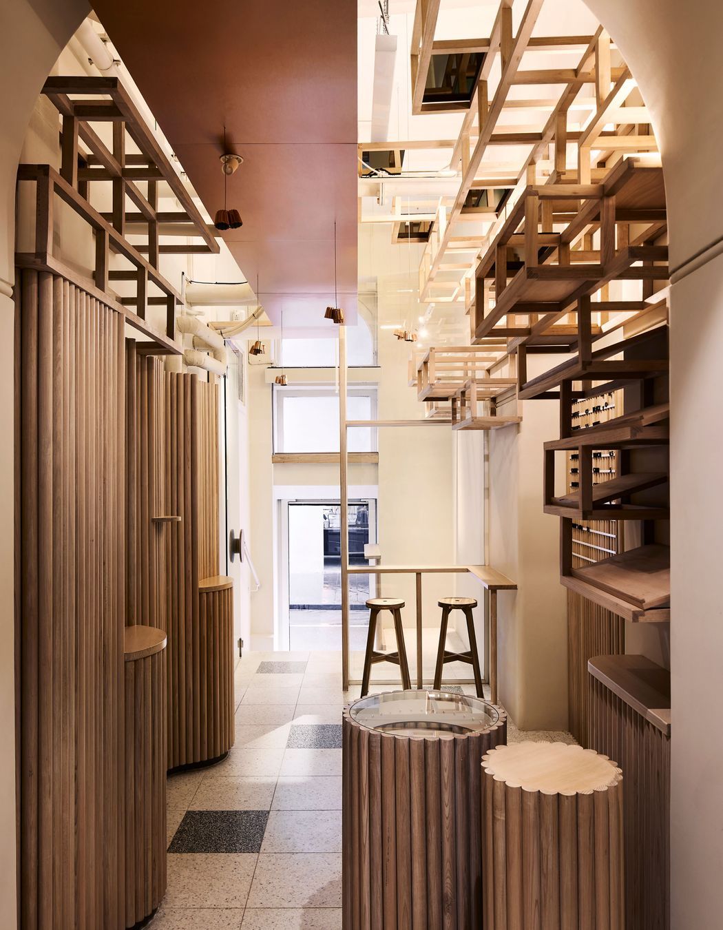
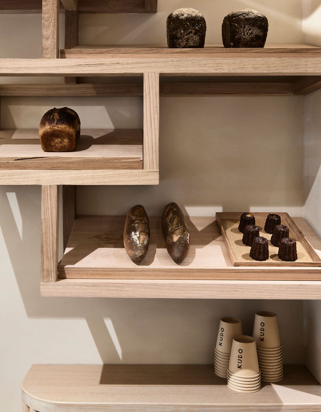
The timber joinery used demonstrates how interior design elements can be secondary in the overall scheme to focus on the products being sold.
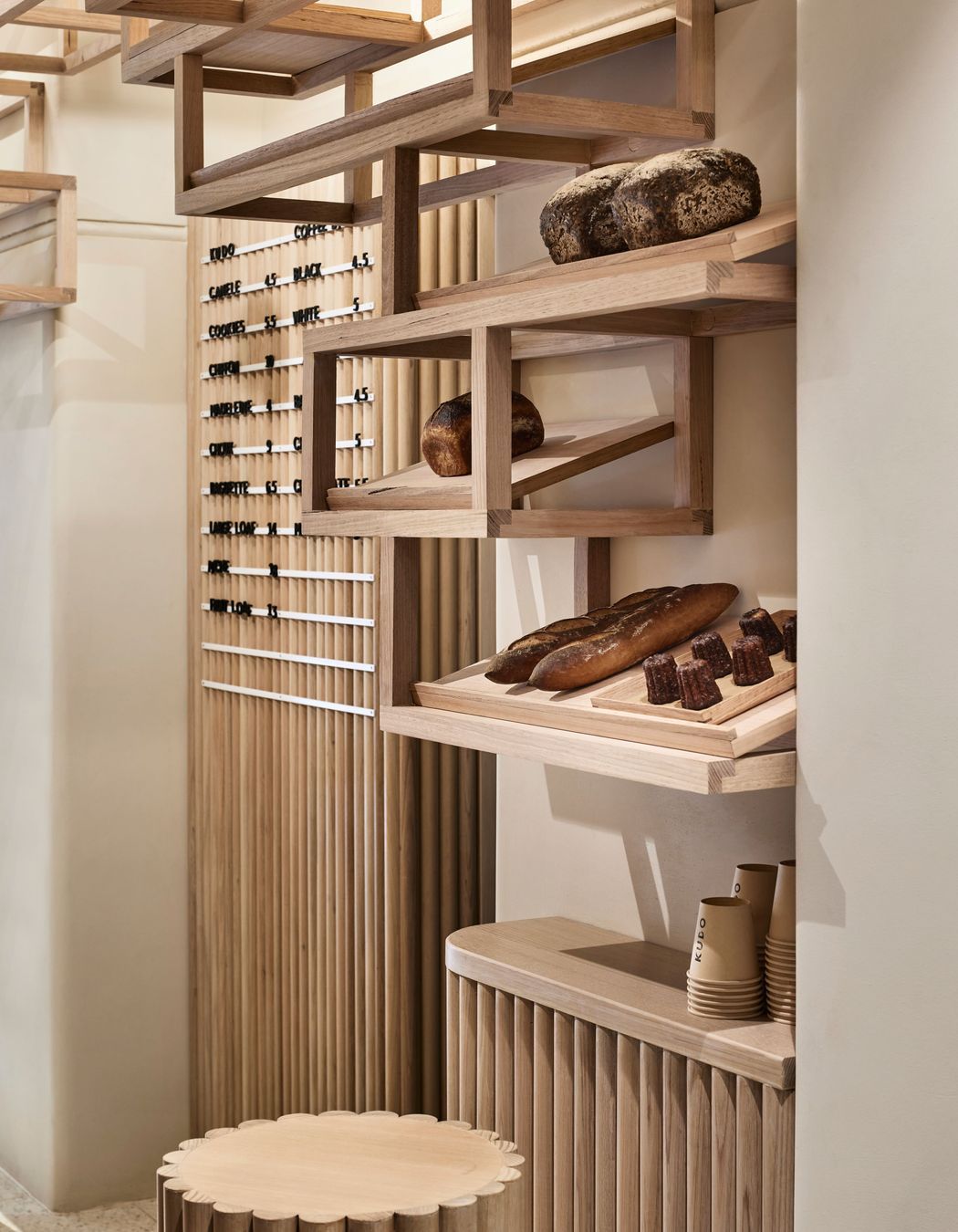
In his work, Kei always seeks to create memorable architecture by responding to the client’s brief and the existing site context. By challenging the idea that cafés and bakeries always have a long bench to display food, with a work surface and serving area attached, Kitayama K Architects has crafted a design that elevates the available space.
“The narrow site for Kudo wasn’t suitable for the typical layout while providing sufficient circulation space. To overcome the constraint in width, our solution was to divide the display and bench joinery into small modules. Some have glass tops to display the baked goods and others have timber tops to form a working surface,” says Kei.
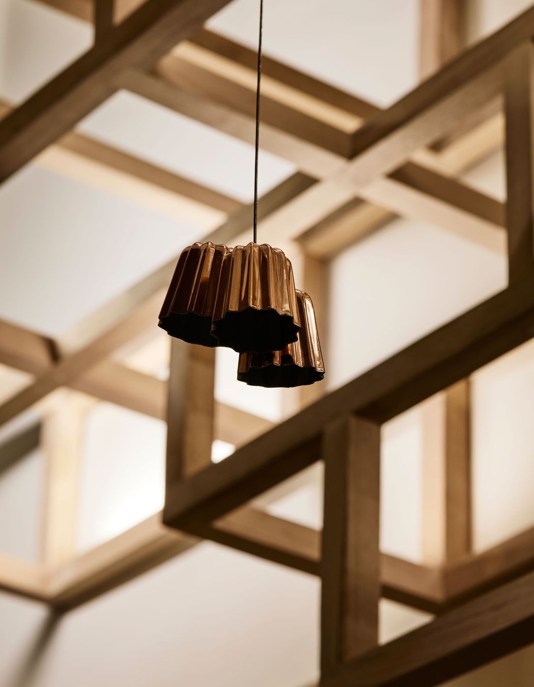
“Visitors often remark on the design details, from the copper canelé moulds suspended from the ceiling to the glass-topped trolleys inspired by canelé – one of the signature baked goods of Kudo,” share owners of Kudo, Felix Goodwin and Elena Nguyen.

Explore more projects by Kitayama K Architects on ArchiPro.