A refined renovation for a South Yarra townhouse
Written by
28 March 2022
•
4 min read
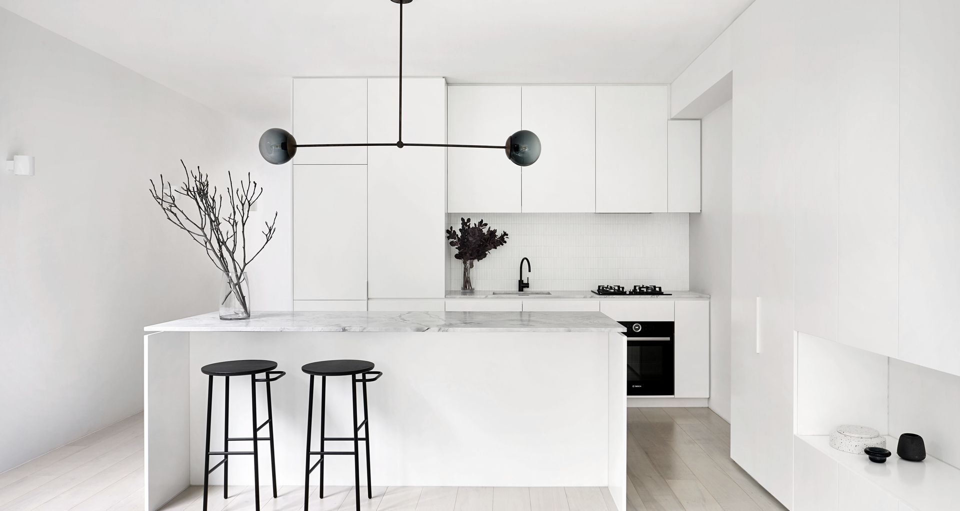
When they bought into South Yarra, the new owners of this townhouse had location and potential on their minds. Upscale South Yarra is one of Melbourne’s oldest inner-city suburbs, and is sought after as much for its beautiful homes as it is for its bustling shopping and restaurant scene. The newly purchased ‘90s-style townhouse was not one of the area’s standouts, however, and was out of step with its sophisticated surrounds. It would take some innovative thinking to turn it into the fresh, clean, minimalist home the family of three imagined themselves living in.
“When they bought this property it was more about the bones of it,” explains Winter Architecture director Jean Graham. “It was kind of daggy and the layout was really ordinary.”
The Balinese-style rear garden also needed addressing, because it would no longer fit with the look and feel of the new home. “We worked with a landscape architect to tie that in, so it would be in keeping with the house,” Jean says.
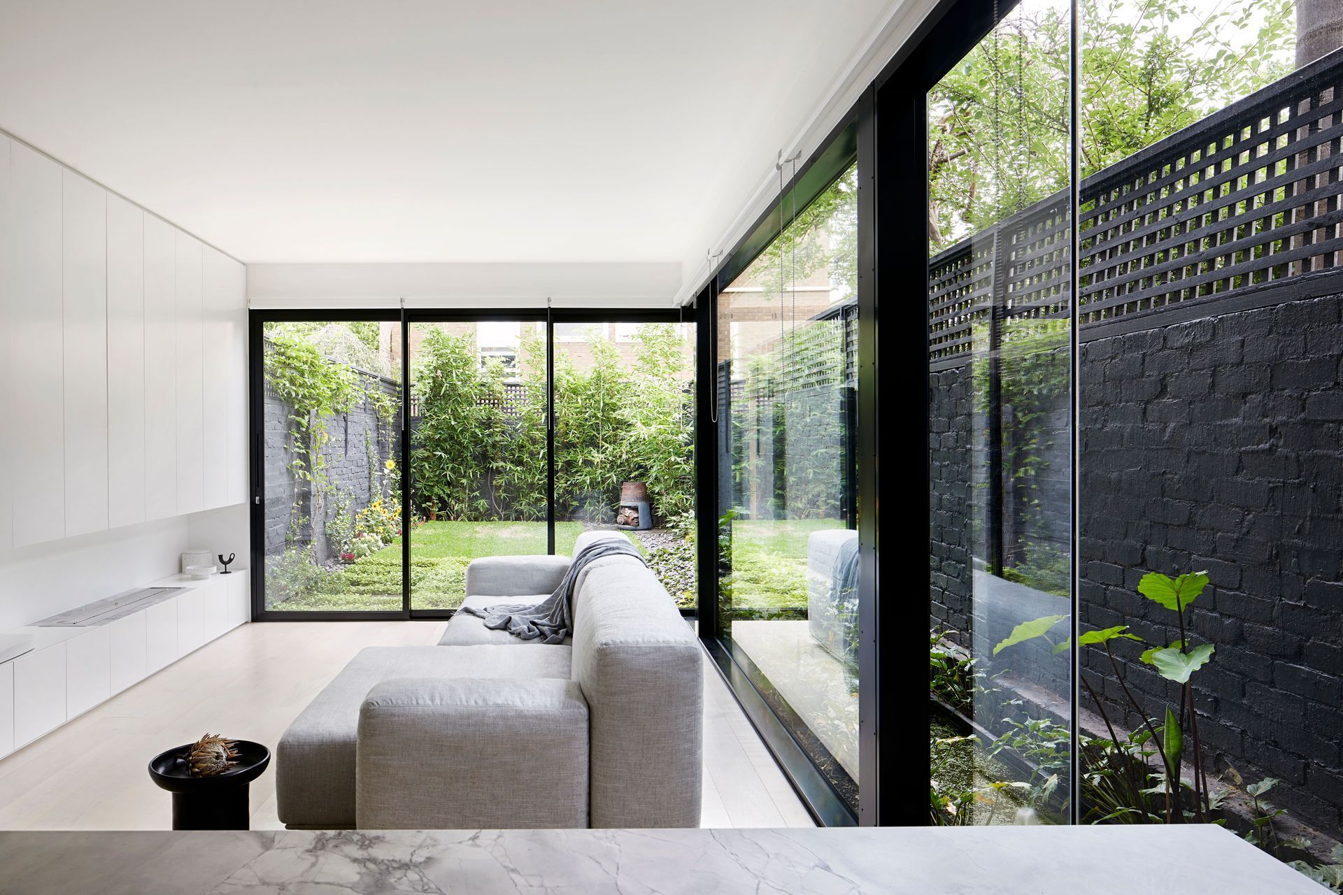
Kelly Royle Landscape Architecture set about creating a high-performing, compact outdoor living space and a seven-metre-long reflection pond. The lush greenery in the reflection pond and garden beyond is visible from the front door, becoming a focal point that draws the eye outdoors. Three sliding glass doors open up at the rear of the house to extend the living area and blur the boundary between inside and out, while thermally efficient glazing helps ensure the home feels comfortable throughout the year.
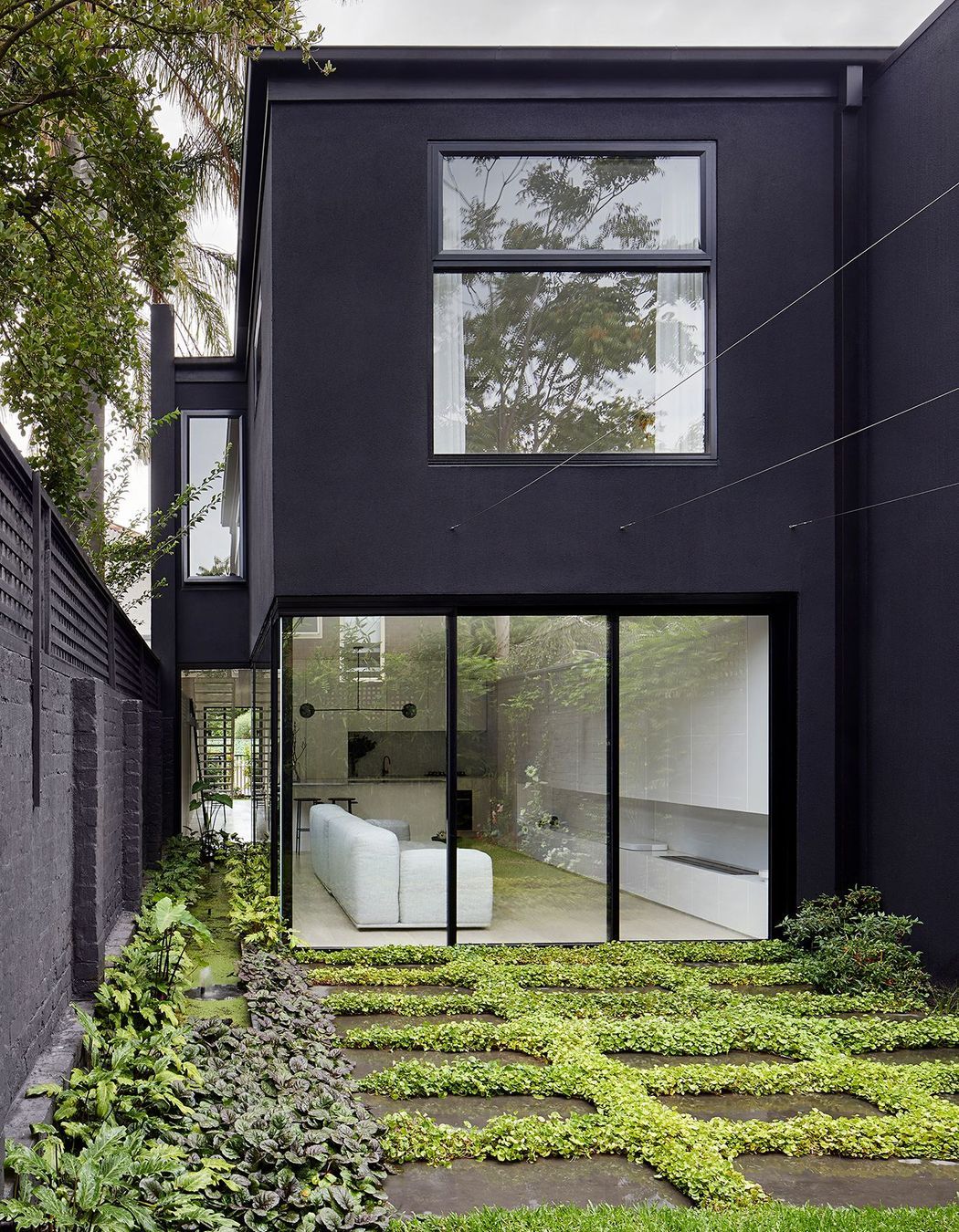
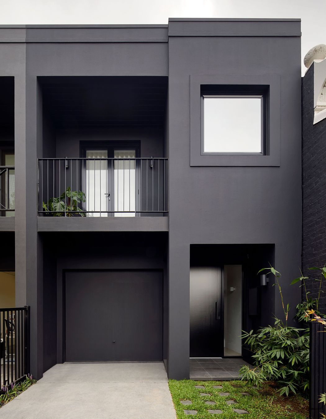
From the front, the townhouse stood out for all the wrong reasons. With cladding ruled out due to budget constraints, the architects opted to have the home recede from the tree-lined streetscape with black paint, black window frames and a simple black balustrade.
The dark and now rather noble exterior contrasts brilliantly with the light and bright interiors, which Winter Architecture reworked to make the most of the narrow footprint.
Moving walls around and combining functions served to free up space. The wide upstairs hallway now doubles as a study, the kitchen and dining areas have become one, and the laundry is tucked away in a bathroom.
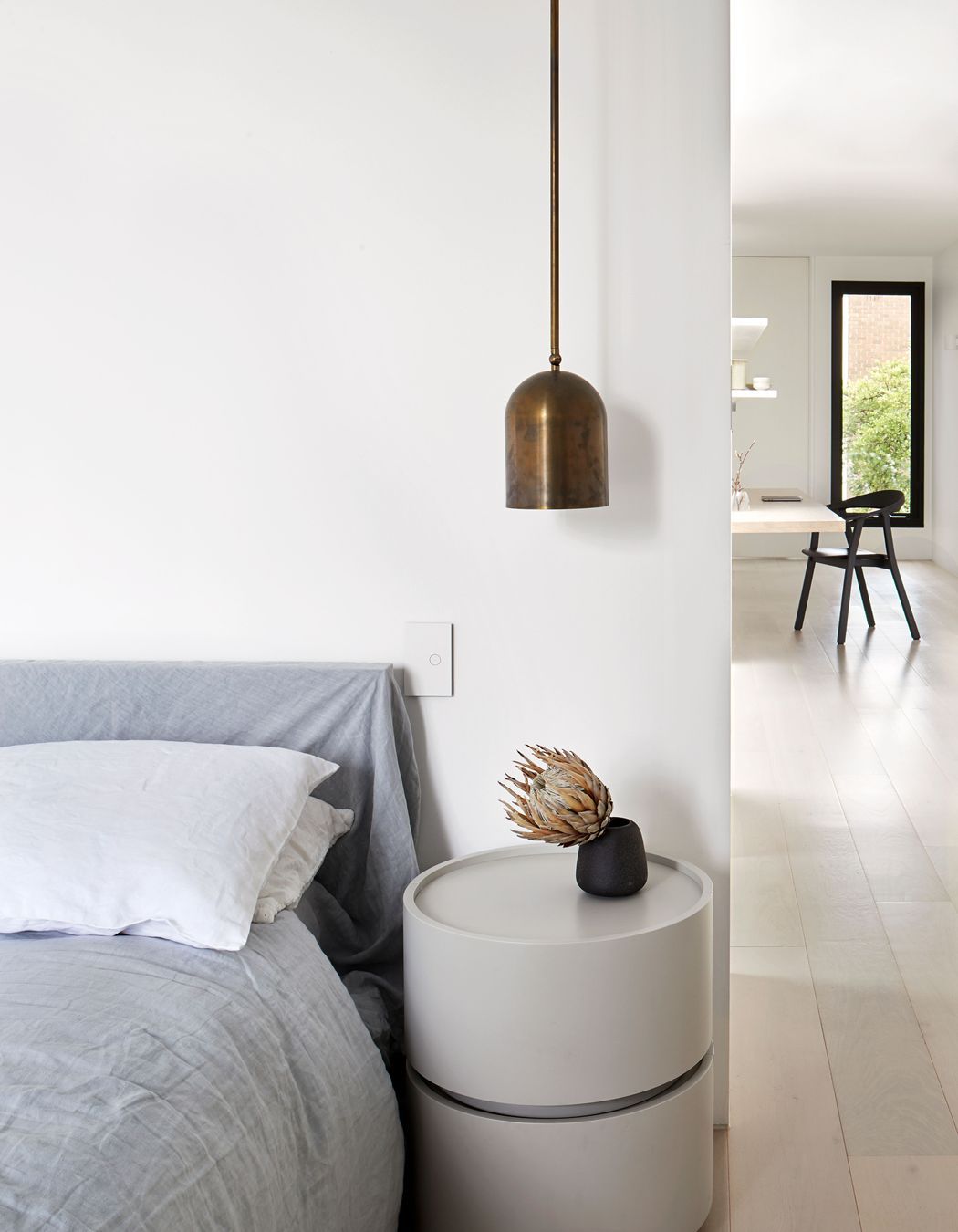
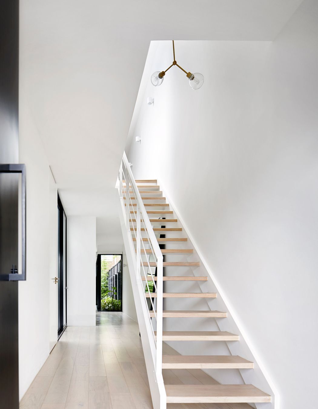
Winter Architecture senior interior designer Cara Rodrigues says the team approached the house by looking at what could be taken away, minimising distractions to “give the eye somewhere to rest”.
Gone were the low ceilings, dark flooring and low doors, along with a multitude of visual clutter. Cornices, bulkheads and unnecessary ornamentation were all removed.
Opting for open risers on the stairs allowed light and views to penetrate the home, while opening the kitchen/dining to the main living area and garden beyond enhanced the light and airy feel. All kitchen appliances are integrated to create clean lines and a refined look, and the sleek custom cabinetry is intentionally low-profile to make the most of the available space.
They love the light within the space and the way that makes them feel
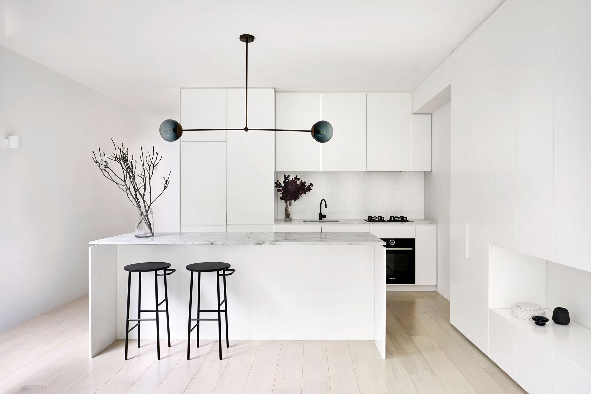
“When I think about the brief that we were given, it was really about being white and clean and easy to maintain,” Cara says. “In doing that, we looked to Scandinavian design and certainly Japanese design as an influence.”
As for the clients, they now love coming home. The reimagined townhouse not only delivers in terms of a clean and minimalist aesthetic, the layout now incorporates three bedrooms (one with a walk-in wardrobe), two bathrooms and a powder room, a study and plenty of storage.
“They love the light within the space and the way that makes them feel,” says Cara. “They love the space so much that they now find themselves eating out less and wanting to be at home.”
See more projects by Winter Architecture and Kelly Royle Landscape Architecture, and get in touch.
Words by Joanna Tovia