A serene & monastic renovation of a Federation-era villa in Sydney
Written by
14 November 2023
•
6 min read
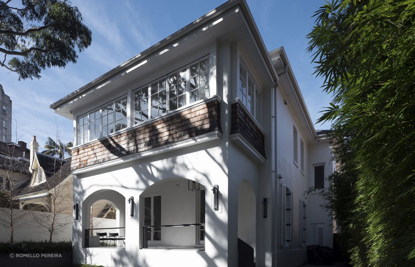
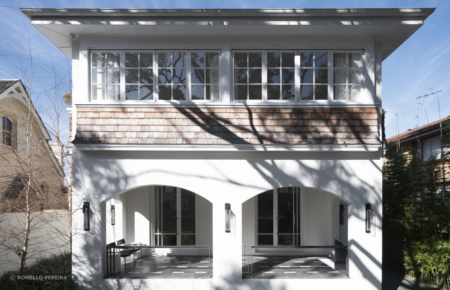
On an idyllic loop road on the Elizabeth Bay peninsula in Sydney, a row of lovely two-storey Federation-era homes jostle for position amongst newer, contemporary dwellings. The suburb is one of the highest-density areas in Australia, and as such, the large parcels of land originally featuring grand character homes have been sliced and diced to accommodate modern apartment living.
The intensification of dwellings means the original homes now exist on very confined lots, which makes renovating a challenge due to restrictive site access. Therein lay the challenge for Smart Design Studio when it was tasked with the redesign and renovation of a stunning two-storey Arts & Crafts-style home in the area.
“It's a beautiful home but it's in the tightest space ever, and it's built on the top of a stone cliff so it was very difficult to construct, too,” shares Smart Design Studio principal and architect William Smart.
On top of these challenges, the rear of the home is about two metres from the boundary, which drops down two storeys to neighbouring buildings. This meant the clients’ brief for a modern extension at the rear of the home with a basement space and outdoor pool needed careful consideration to achieve.
The clients had fallen in love with a previous project by Smart Design Studio, Orama, which features a double-height volume at the back of the house. The family of four also required four bedrooms and a spacious study, and to enhance the existing living spaces.
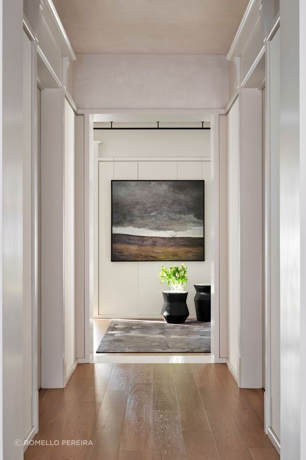
Thankfully, the bones of the home were strong, the handsome facade was intact, and the existing central hallway provided an obvious connection between the new and old parts of the home.
Its existing character features also provided a great reference point for the new extension.
“Some of our work in the design was just to lean into the Federation-style detailing and run with it,” says Smart. “There are very tall windows with cross bars, and the architraves have grand heads to them, which look impressive and beautiful and so we ran with that detailing throughout the interior, rebuilding the architraves for new doorways to be similar to the others.”
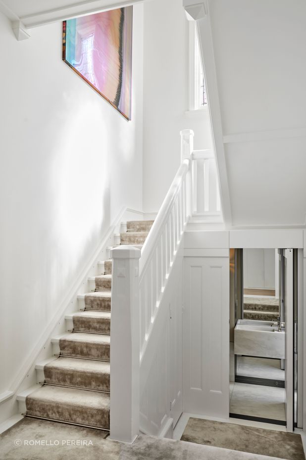
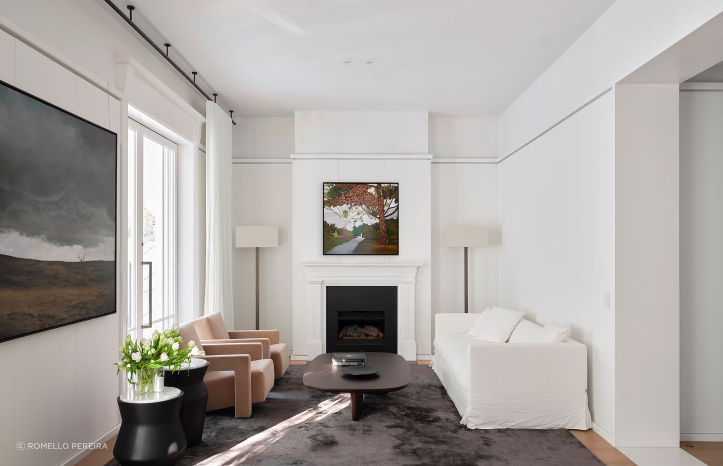
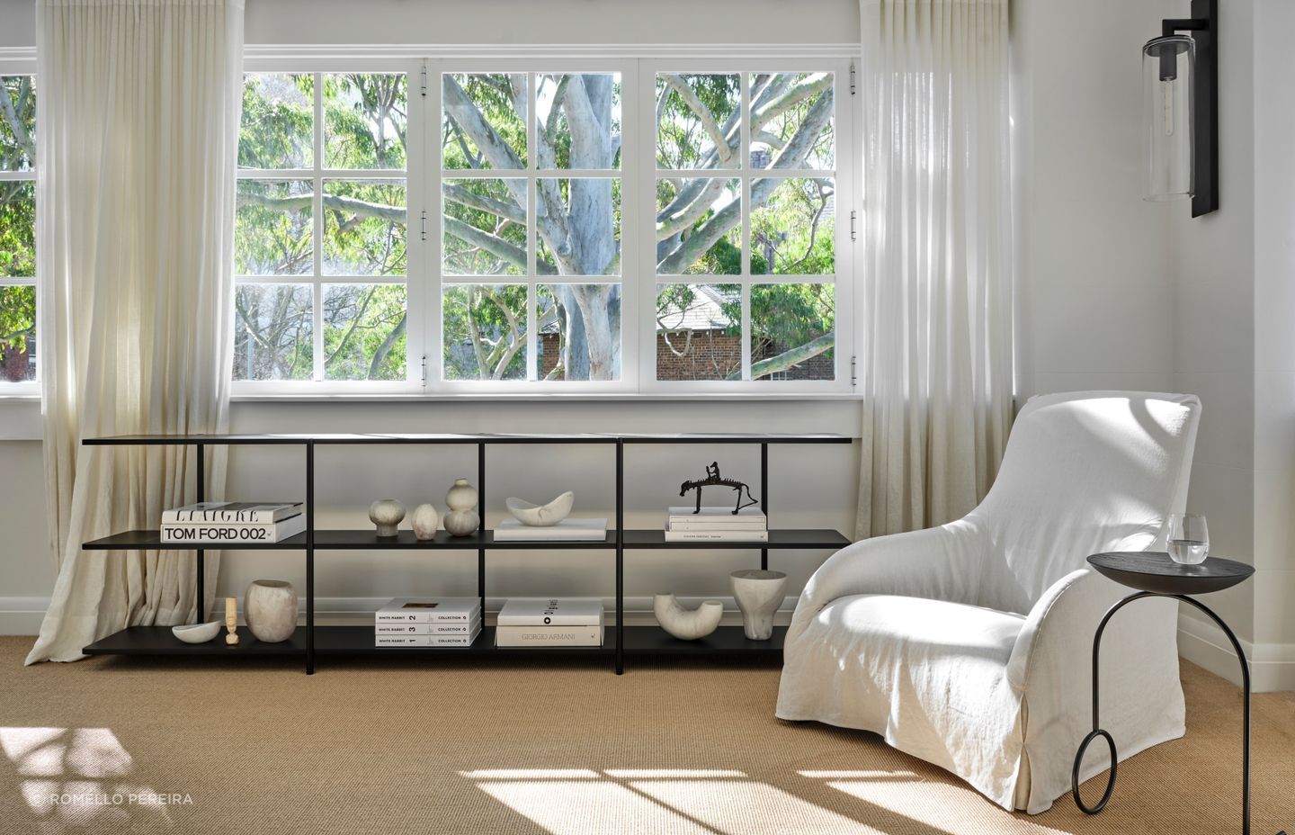
The Arts & Crafts-style architectural details then inspired the more contemporary curves and gracious modern elements of the new extension, which was excavated by hand, the dirt having to be manually shifted to the front of the site to enable space for a basement.
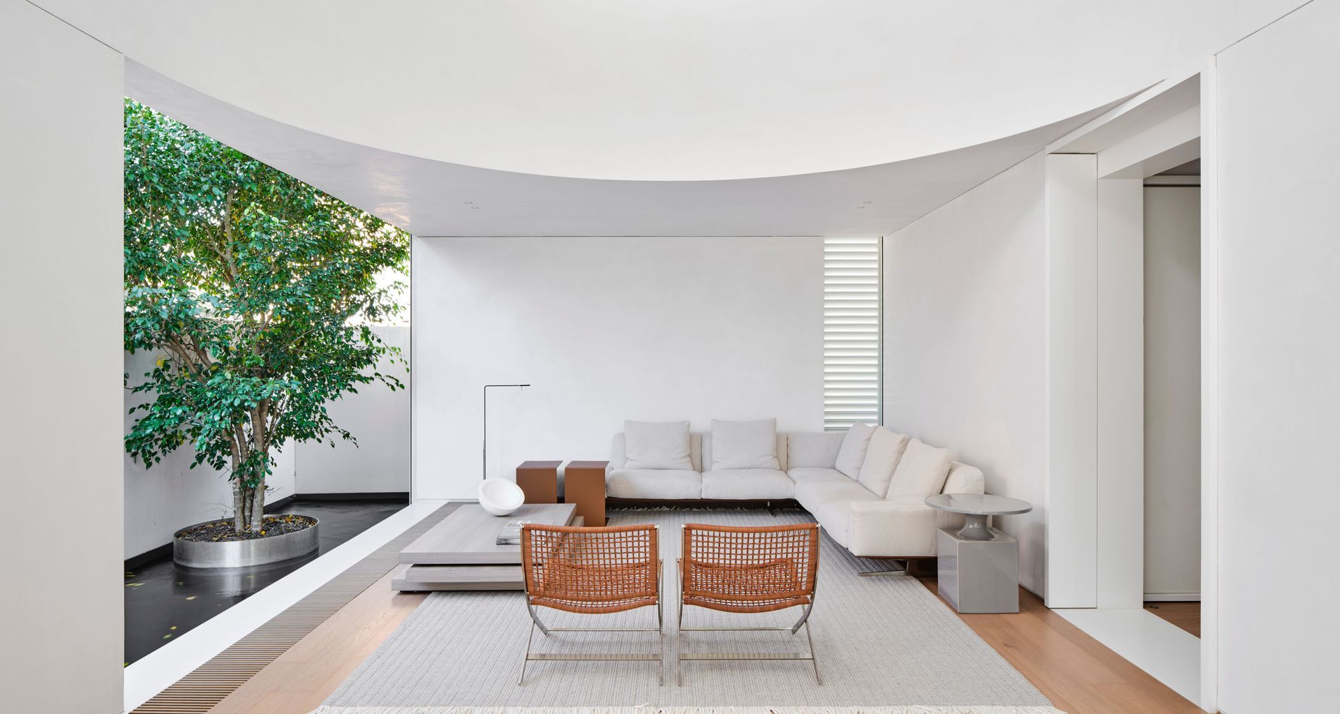
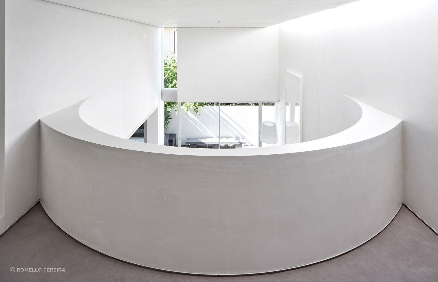
The new extension impressively takes in four storeys, with a rooftop terrace, a living space featuring a double-height void with a mezzanine study accessed by a new staircase, and underneath it a basement with a gym and laundry.
The new space celebrates the classic grandeur of the existing home with strong curves and a serene materiality.
“What we tried to do is create a contrast between new and old, so the front part is restored and embellished, and the rear part is much more simplified and reduced; but they're very different in form,” says Smart.
The sweeping, curved balustrade that closes off the mezzanine study overlooking the main living space is a simple yet bold design move, and it allows the client to work from home and feel connected to the rest of the house.
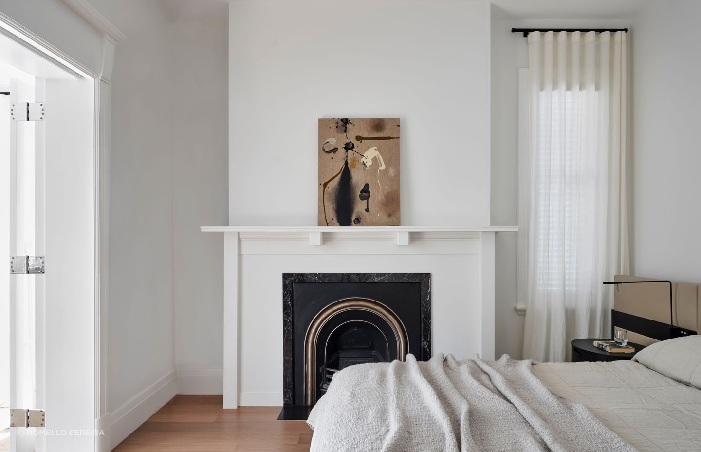
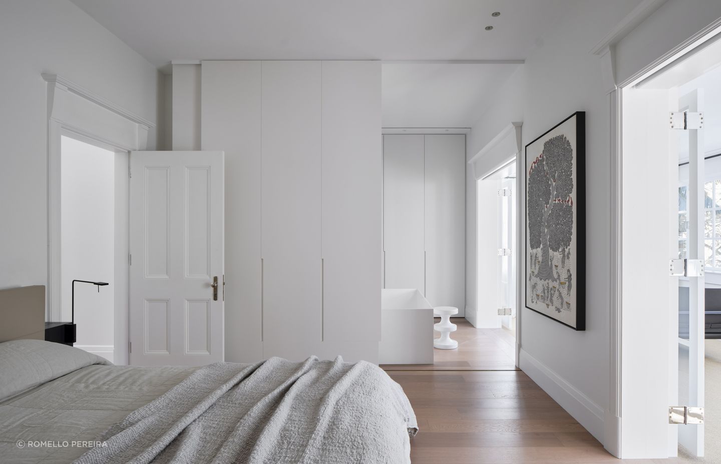
Playing with the design of the apertures in the new part of the home was also crucial in achieving the tranquil feeling in the space.
“The light is very beautiful in that room; there's a north-facing clerestory window about a metre high that bounces light and washes the wall, instantly giving you enough light that you don't need to rely on windows into the room to light the space,” says Smart.
A narrow sliver window between the old and the new parts of the house cleverly separates the spaces and brings in light, and the sliding doors to the north side allow different sources of light from different orientations to be brought into the living room.
“When you pull all that together, you get this very soft light in the space, so shadows aren't strong - they're very light and delicate; it's got this beautiful, dreamy quality to it.”
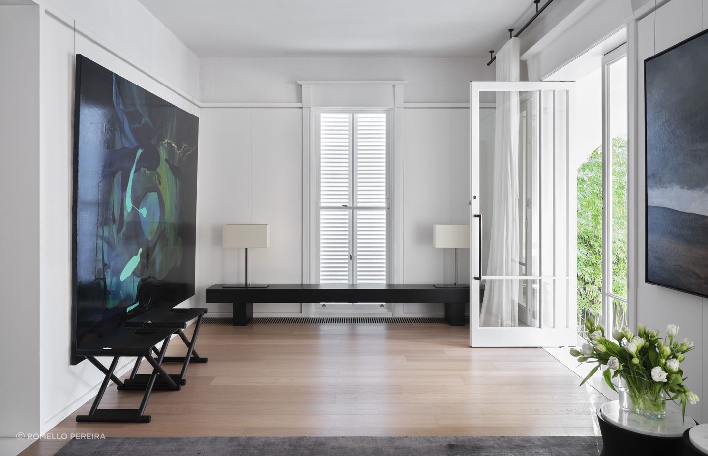
The materials and finishes in the space have low levels of contrast, giving a monastic feeling to the room. Smart worked with the clients to choose stunning artwork and sympathetic furniture, nodding to the classic styling of the original home.
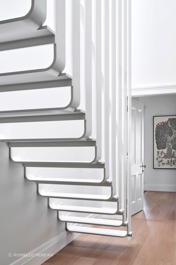
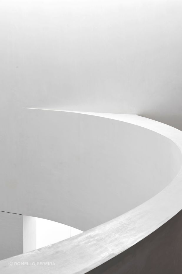
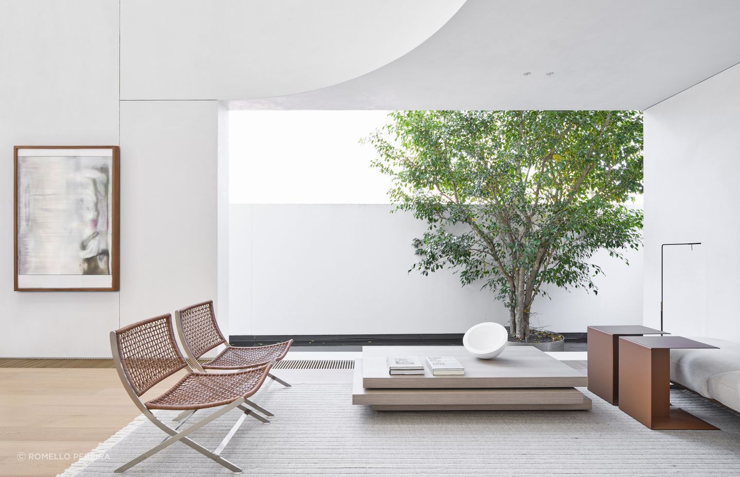
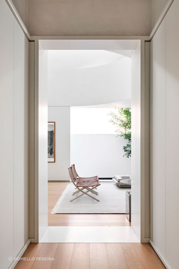
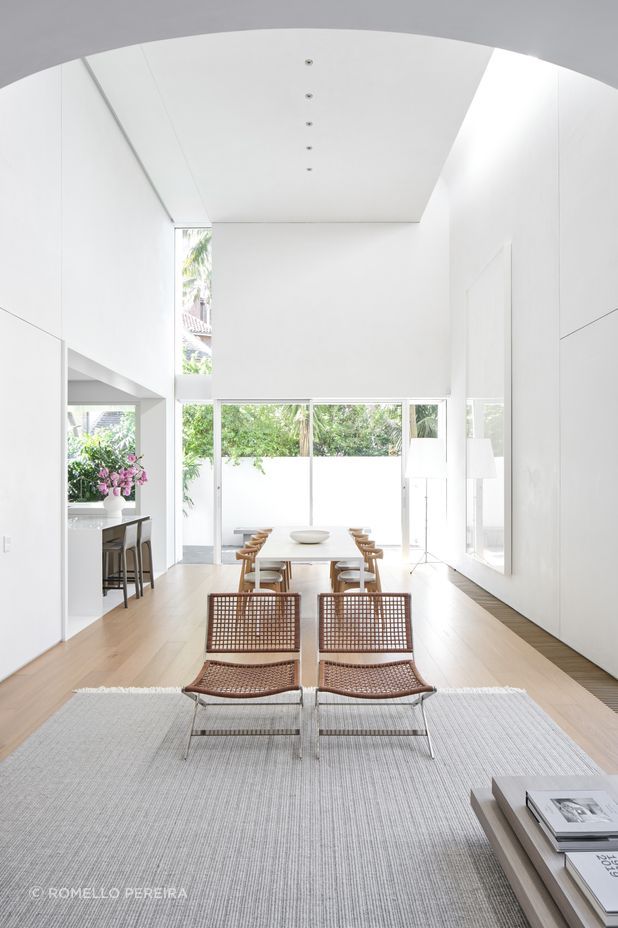
The interior material palette is then elevated by the use of contrasting textures; oak floorboards were installed throughout, integrating the new and old parts of the home, while linen-wrapped wall panels feature in the front rooms and down the hallway. Above the dado line, unpainted wax-rendered walls offer a soft, textural surface similar to a Venetian render, says Smart.
“When you look closely, you can see the walls are quite imperfect. We love that they're mottled and they have this kind of beautiful sheen to them that picks up the light in a lovely way.”
The palette stays very light in the bedroom and bathrooms, which have a delicate quality, while the kitchen contrasts against the serene living space with a jaw-dropping blade of marble that stands at the back wall of the kitchen, dividing the ‘working’ part of the kitchen from the outward-facing part.
The kitchen opens out onto a new pop-out window which was installed to the side of the house, cleverly bringing light into the back area of the space.
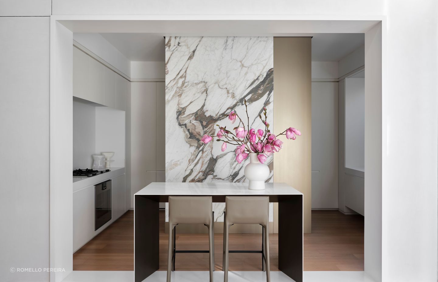
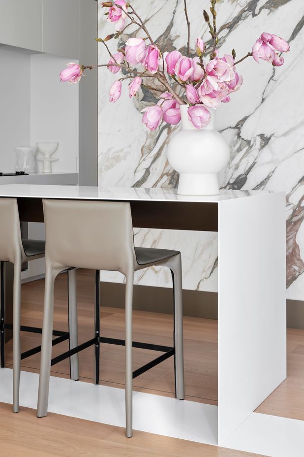
In another unconventional move, instead of an island with cupboards underneath, an elegant bar takes pride of place in the kitchen, with a very thin front edge and the structure carefully concealed within.
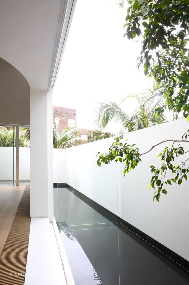
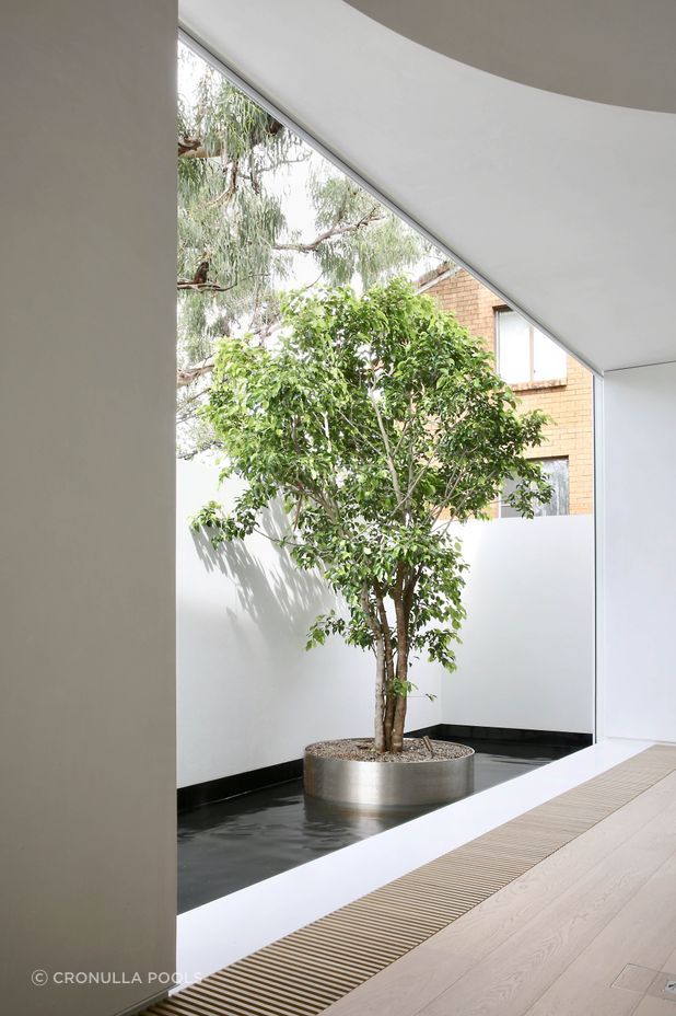
Another clever design move at the back of the house is a huge motorised door to the exterior, which opens out onto a shallow reflective pool made out of black granite slabs, which then falls into a narrow swimming pool running across the back of the house, so that both act as a water feature and a place to have a swim at the end of the day.
It’s an incredible achievement for one of the tightest possible sections to work within, and, Smart couldn’t be happier with the result.
“The power of that new space is just in the one or two design moves that create strong gestures; the home looks very strong from the outside,and it feels just as beautiful when you're within that beautifully detailed white box.”
Discover more projects from Smart Design Studio
