A special paint treatment enhances the compact and clever ‘Paper House’
Written by
06 March 2023
•
5 min read
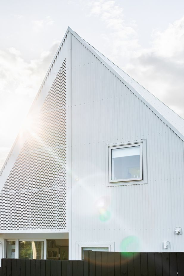
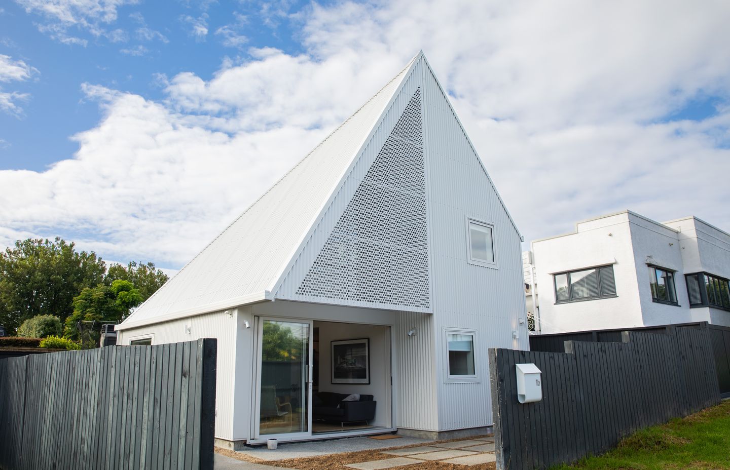
On a compact site in Westmere, a very carefully designed home makes the most of every inch of space available. The house resembles a paper plane from the outside, and an intricately folded work of origami on the interior, and was designed by Crosson Architects for a client who wasn’t afraid to show their playful side.
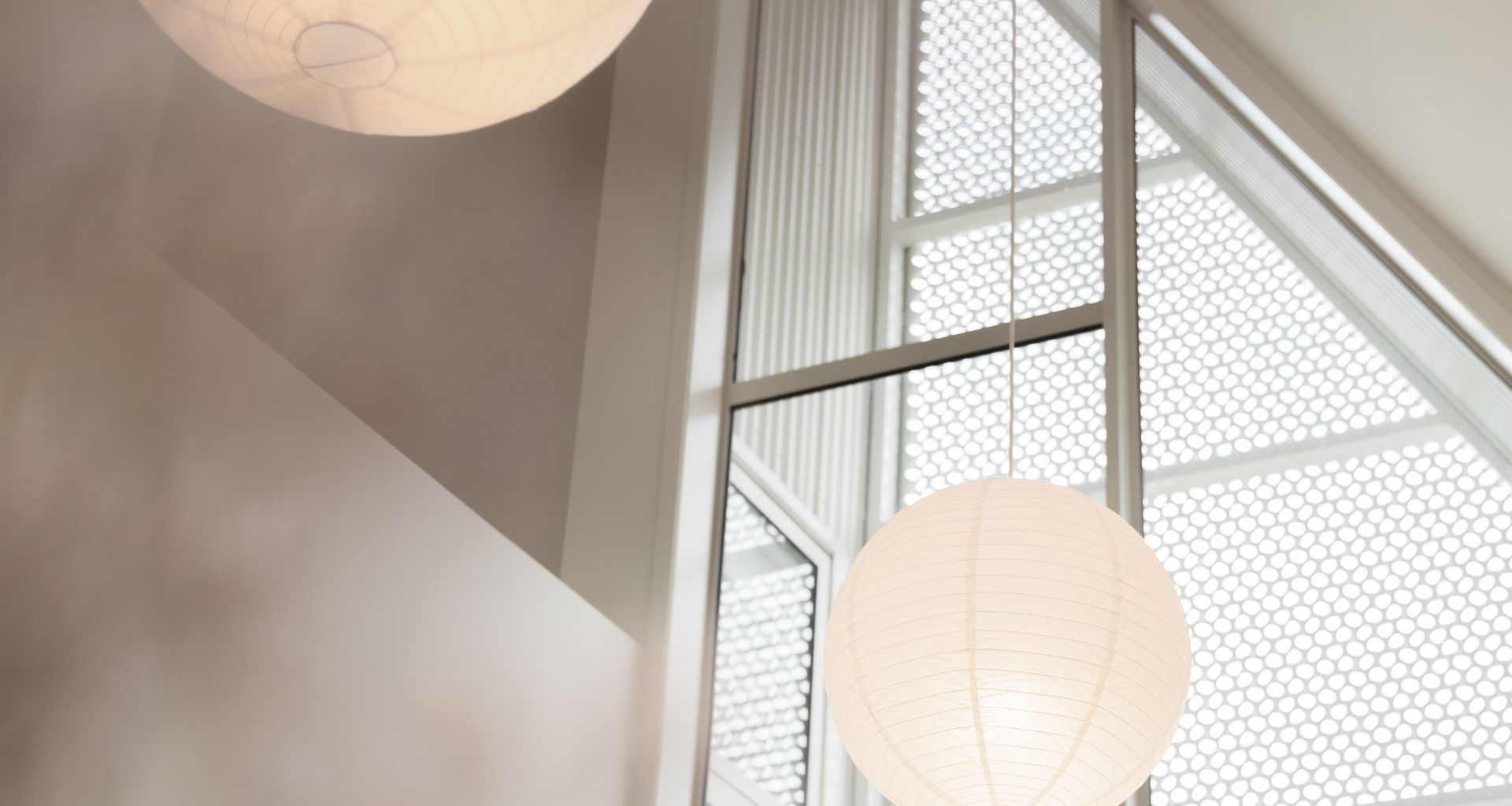
The architecture features a steep gabled roof, which is cut out on one side to bring in light into the living spaces through a dramatic triangular window, which is shrouded in an artful, perforated screen, casting a pretty pattern of dappled light into the interior.
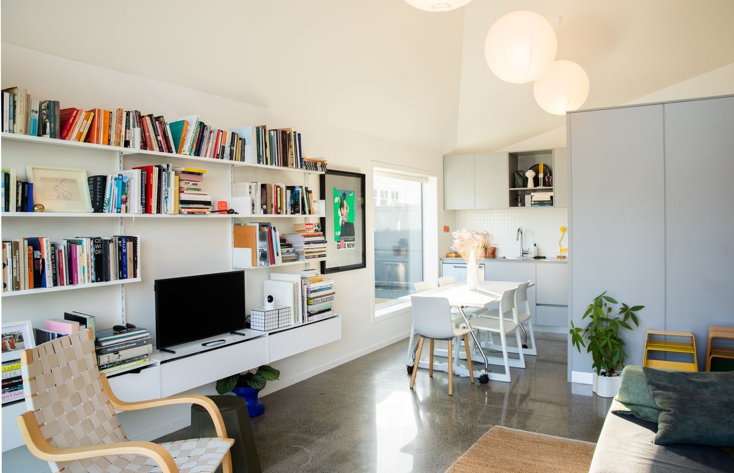
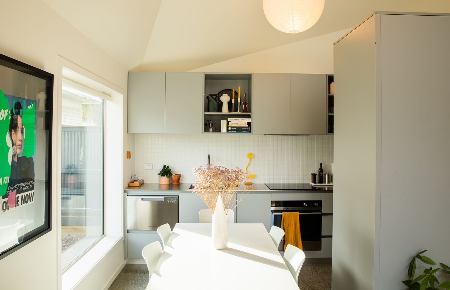
The small open-plan living spaces are well considered, with picture windows that frame exterior spaces, bringing in light and highlighting the homeowner’s art and book collections.
Given how simple and straightforward the composition of spaces is, it was crucial to get the paint finishes right, but only weeks from completion, the painting crew booked to do the job pulled out and G&K Decorating was called upon to complete the interior painting in a very tight timeframe of just two weeks.
Established just over a year ago, G&K Decorating, run by young couple Georgia Foley and Kroydon Falefitu is a decorating firm with a difference that provides the whole suite of interior lining and paint finishing services.
G&K Decorating director Kroydon Falefitu says the homeowners were very clear about what they wanted to achieve, and he and his team made recommendations on how they could achieve the seamless finish they were after.
“The clients were really stoked that we could just jump in at a moment's notice, and they wanted a very matte, white, clean-lined finish that would allow the architecture to take centre stage.”
In the interior, Kroydon selected a spray finish for the undercoat and first top coat, with a rolled finish with a microfibre roller for the final coat to minimise any stipple, making the surfaces as smooth as possible.
“The ceiling has a lot of angles and it's quite beautiful. The light comes through the perforated panel on the outside and hits the walls, so we wanted to minimise texture on the walls and create an incredibly seamless finish.”
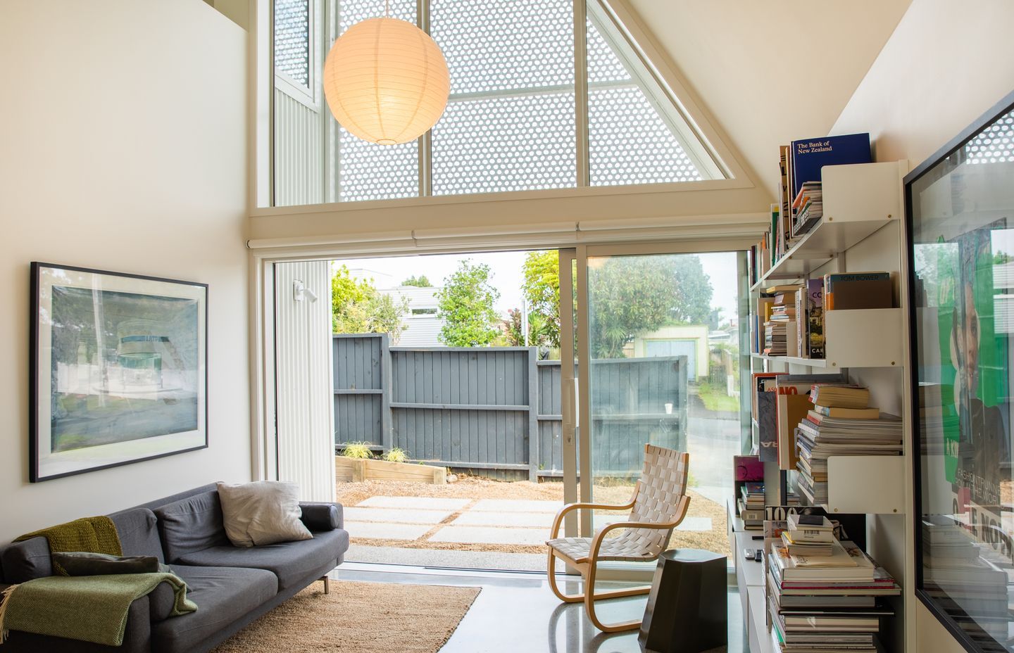
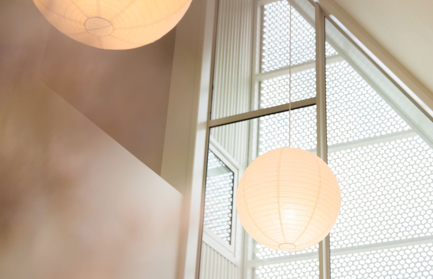
However, the tall and tricky angles of the living room ceiling made this tricky at times, as the team was using a mobile scaffold that was at risk of touching the walls if it wasn’t carefully manoeuvred. This was particularly challenging when spraying the folds of the ceiling.
“We literally had inches to play with. If you moved a bit you would hit the ceiling, so the boys had to problem solve a bit to get to certain areas, which was something different and fun.”
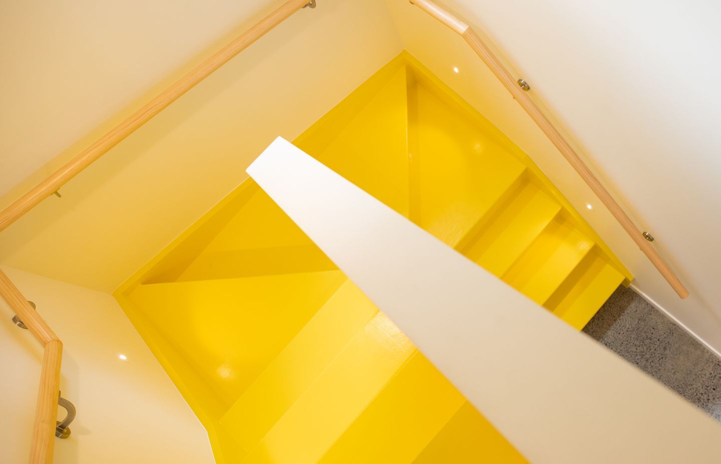
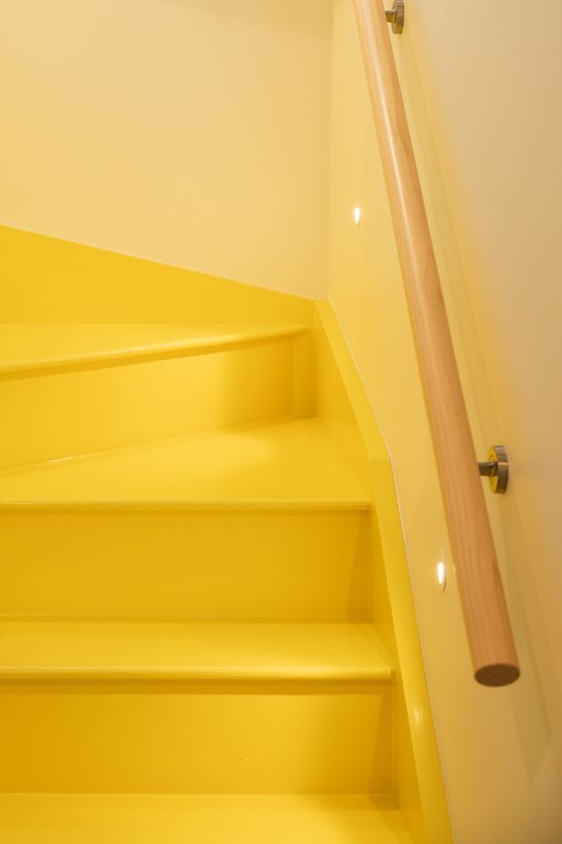
Speaking of fun, the owners wanted to enhance the stairwell leading upstairs to the master bedroom with a bold dash of Resene Southern Cross, a beaming, sunny shade of yellow that makes a feature of what might have otherwise been a utilitarian space.
Juxtaposed against the calm white canvas of the rest of the interior, it’s a surprising feature, and it needed a specific type of paint to create the hard-wearing surface that could cope with the foot traffic.
Typically an epoxy system would have been used, but given the very tight timeframe for the paint to set, an alternative solution was suggested by the Resene technical team.
The timber staircase was sanded and prepped, and a quick-dry primer was applied, before the yellow lumbersider top coats. To finish the surface off, G&K Decorating applied a concrete wax that’s normally reserved for concrete floors. The treatment, which hardens up over time, was ideal for protecting the bright yellow stairs.
The end effect is bold and contemporary, sitting harmoniously alongside the white interiors.
“I did question it at the start, but it really pops, particularly given everything else is one colour!”
Kroydon says the success of the home is in the stunning architecture paired with carefully chosen paint finishes.
“Painting always plays a critical role in ensuring the overall success of a project, even though it may be an afterthought in the initial stages of the design. The paint in this home is a backdrop that provides a nice clean, open feel to it. The stairs are a bold feature, while the sleek white walls just sit in the background, creating a border like a picture frame for the beautiful architecture.”
Often seen as the least trendiest of the trades, the plastering and painting trade is having a revival, led by G&K Decorating, who are demonstrating the right way to up-level an aesthetic.
“Georgia and I are both young and super energetic and we’re coming into the industry really hard-hitting and we’re setting our sights really high. We’re investing in our business because we think that people’s approach to the decorating trade needs to change. When you grow up, everyone wants to be a builder and the last option is to be a painter. I just want to flip that on its head. We’re into design, culture and fashion and our job is at the design end of the build – it's aesthetically pleasing. Most tradies’ work, you can't see it, because it's behind the walls. But for us, we get to talk clients through the options and when we're done we take pride in our work. I just really want to set the standard for what painting’s going to be about over the next couple of years and make a name that way.”
Discover more projects by G&K Decorating