An alpine home with two faces in Wānaka
Written by
25 June 2023
•
4 min read
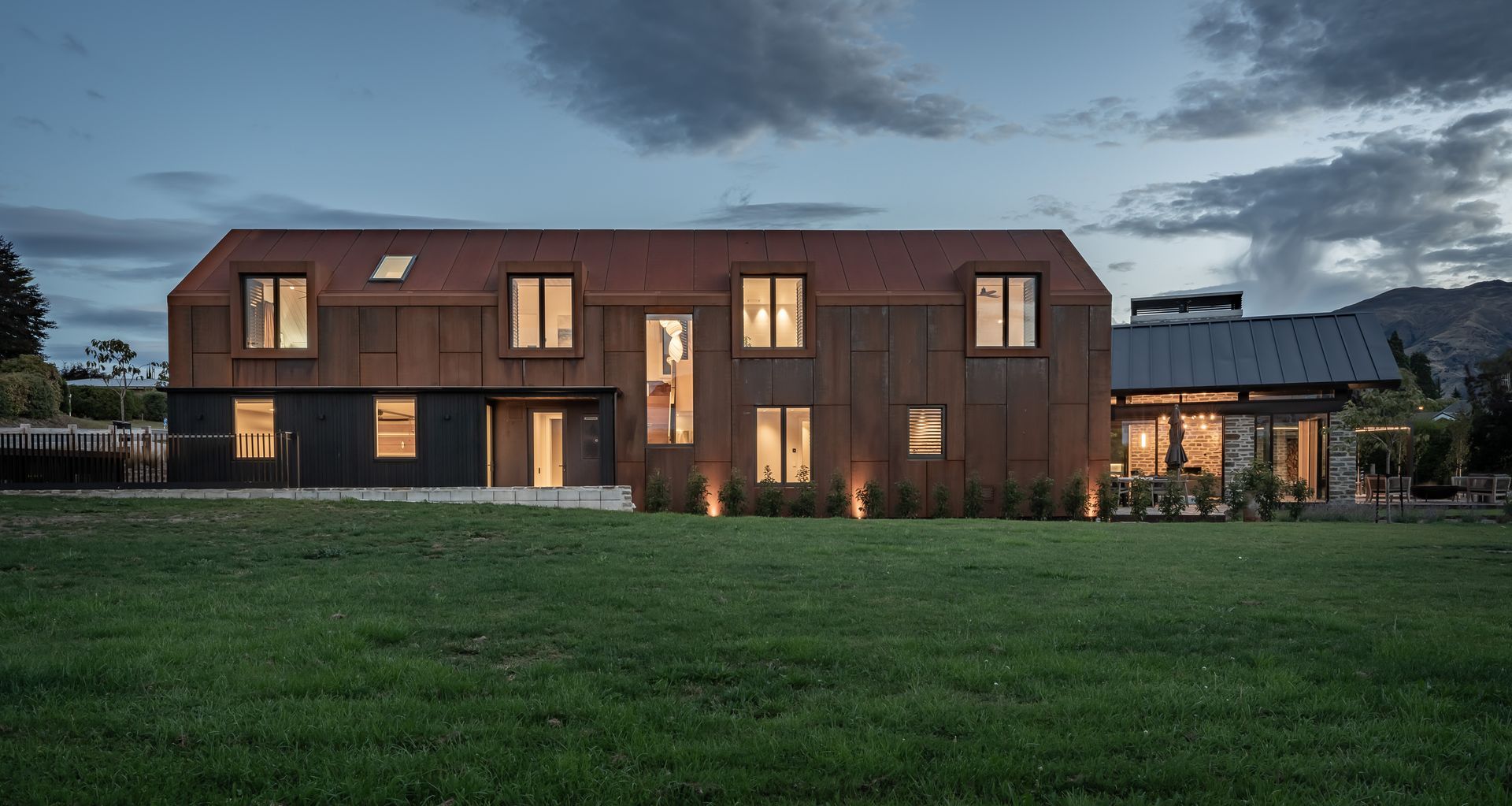
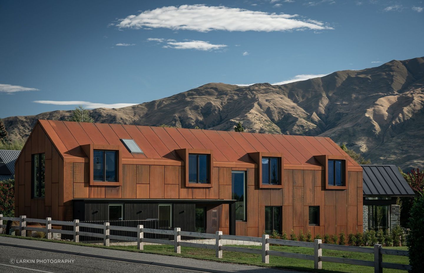
“What’s interesting about this project has been the public reaction,” says Mason & Wales principal Hamish Muir. “It’s been quite polarising because of its street presence and the corten steel cladding makes such a bold statement – people seem to be quite open in telling you whether they like it or not.”
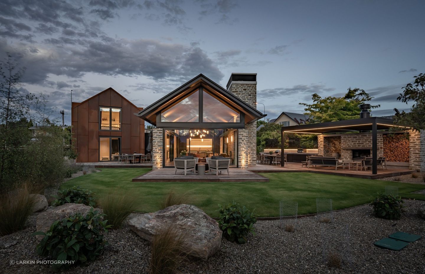
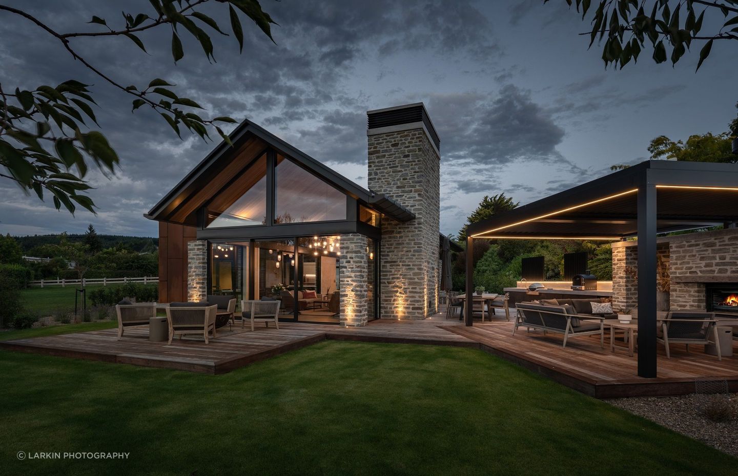
Love it or hate it, the Weathered Barn certainly has a captivating persona, created by the juxtaposition of two unique forms, one single level with a shallow roof pitch and large eaves, clad in stone, the other two levels with a steeper pitch and clipped eaves, clad in corten steel.
An alpine getaway for a couple and their grown children, the distinct gables forms have been carefully articulated and have an anthropomorphic feel – someone has even cheekily suggested they resemble Fred and Wilma Flintstone.
“This was not the intention, but people seem to have taken an interest in this house, and they don’t hold back in sharing their views. I actually quite like the interpretation that the barn is a big handsome bloke, whereas the pavilion has a more feminine style. There's something quite likeable about the barn – he's quite a big handsome guy like Fred Flintstone, whereas the pavilion has a more feminine feel, like Wilma.”
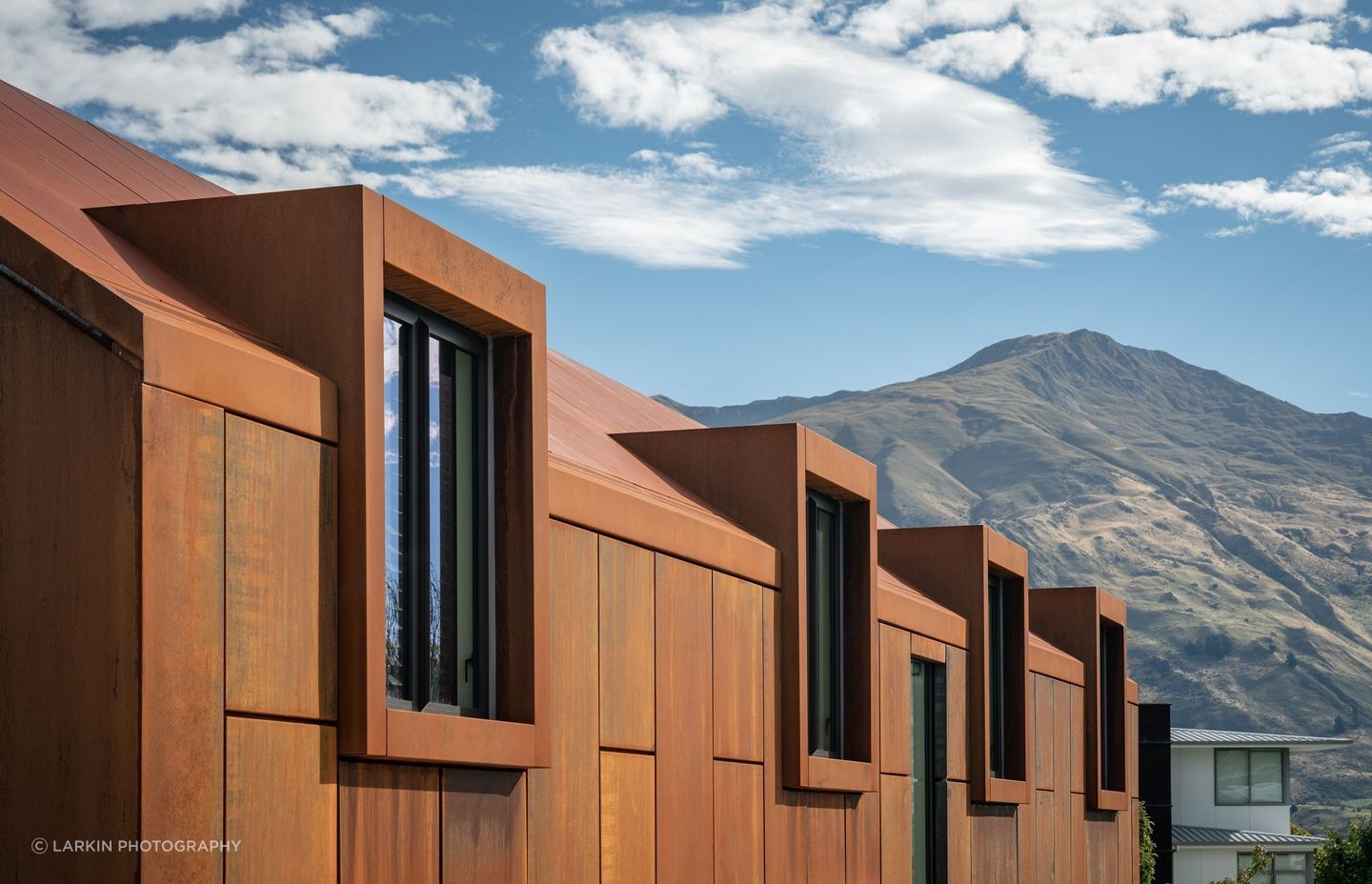
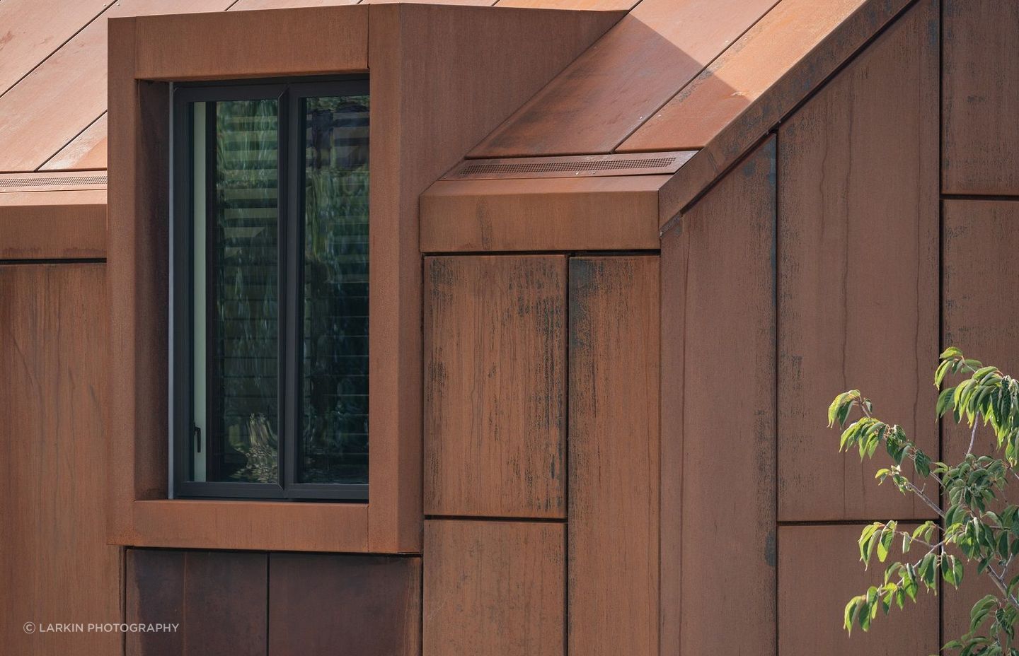
When choosing the exterior cladding materials, the clients specified low maintenance. Typical options such as stone, or corrugated iron didn’t satisfy, so Muir encouraged the clients to visit Te Kano Estate winery, which features corten steel cladding.
“We were surprised they actually loved it – we never thought that a client would be brave or bold enough to use this on their own home, and we were thrilled because the rustic warmth works perfectly with the textural stone cladding.”
The one requirement from the clients, whose work involves infrastructure and civil engineering, is that they didn't want to see any downpipes on the building.
Muir was happy to take up the challenge, and developed construction detailing to accommodate this request. He says that In contrast to the controversy of the finished project, the design journey with the client was “about as enjoyable and straightforward as they get”.
On the spot, Muir sketched a plan of how he envisioned their house might look, and he says the client immediately approved, and in fact, the finished project is not too different at all from that original drawing.
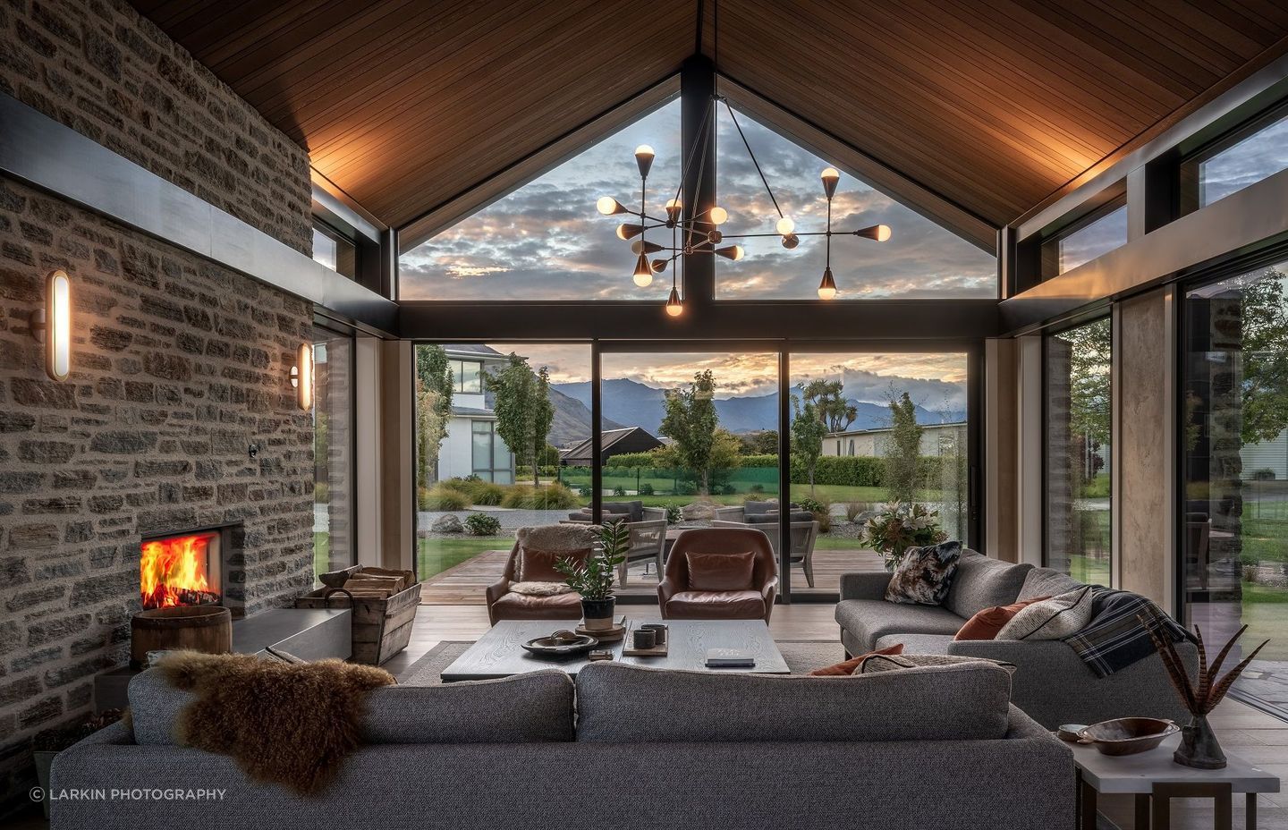
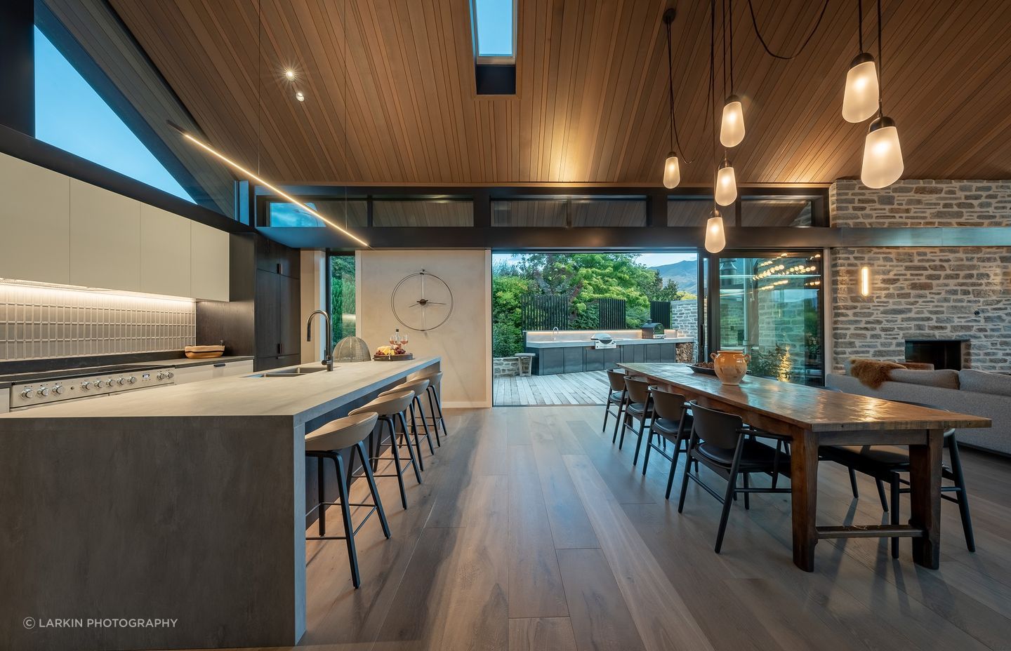
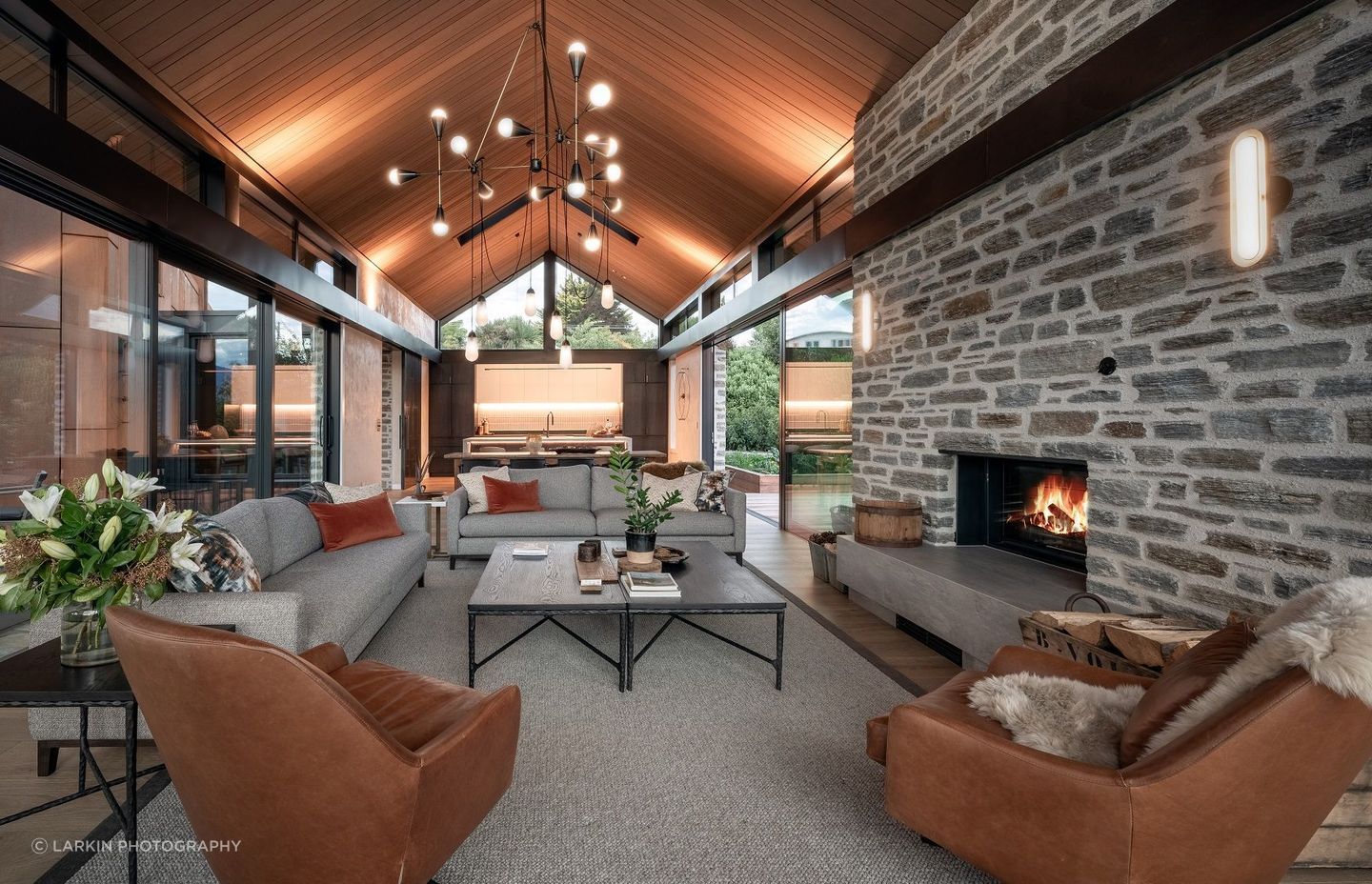
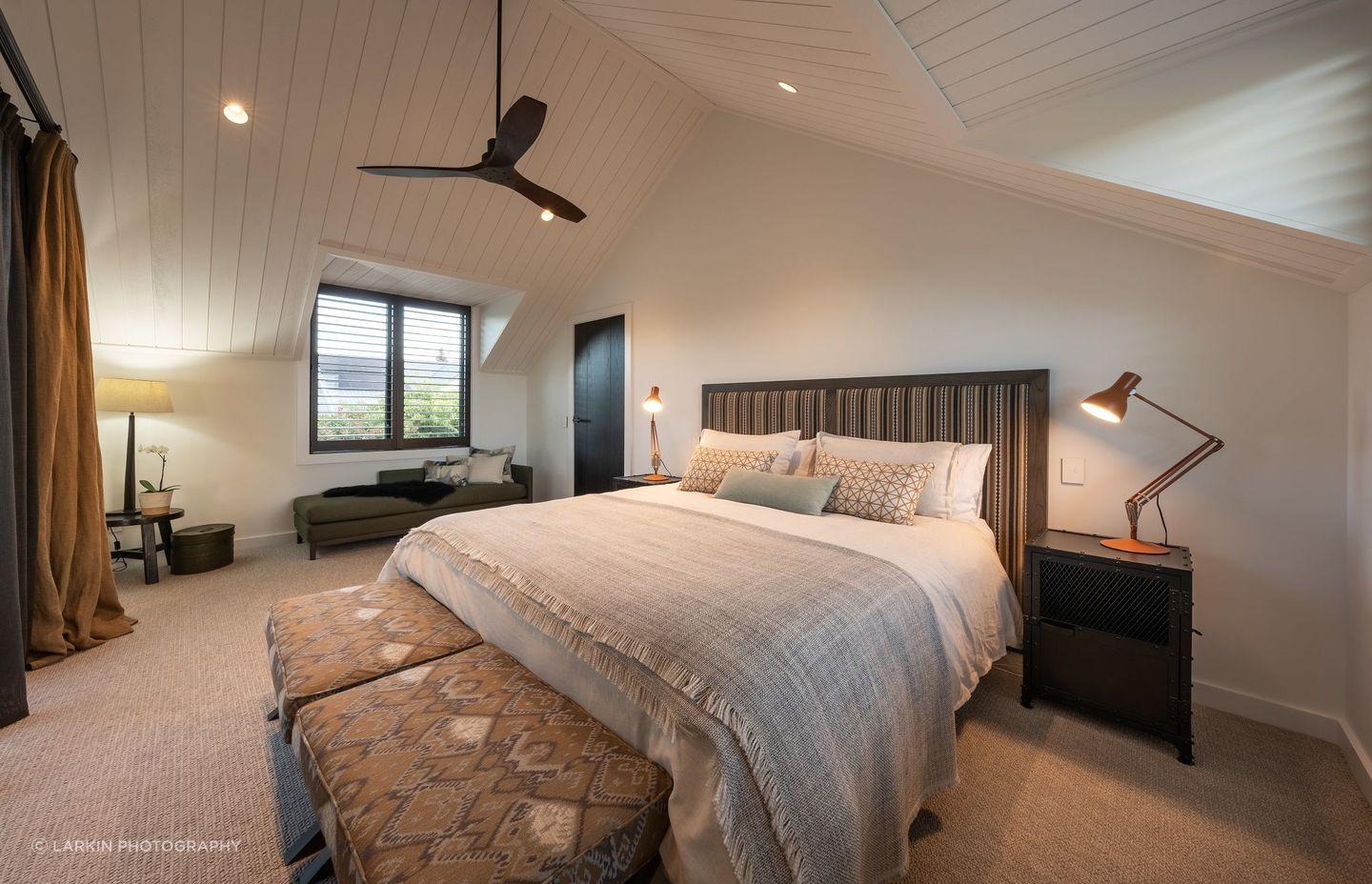
His vision created an arrangement between two distinct building forms, a low slung pavilion that references the stone homestead typology of the area, which is higher spec and contains the living and communal spaces, and a taller, barn-like structure that references the agrarian form of farm outbuildings, and contains the sleeping quarters, amenities and garaging.
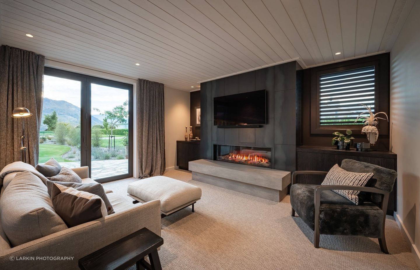
“There’s a hierarchy between the homestead and the barn, where you've got a slightly more crafted pavilion with timber and plaster finishes in the interior, versus the utilitarian barn, where the level of finish is more utilitarian.”
The buildings were purposely juxtaposed on an angle, with a linking structure joining them.
“There was a strong logic in doing so: to align the living spaces with the lake and mountain views, between established trees and surrounding houses,” says Muir.
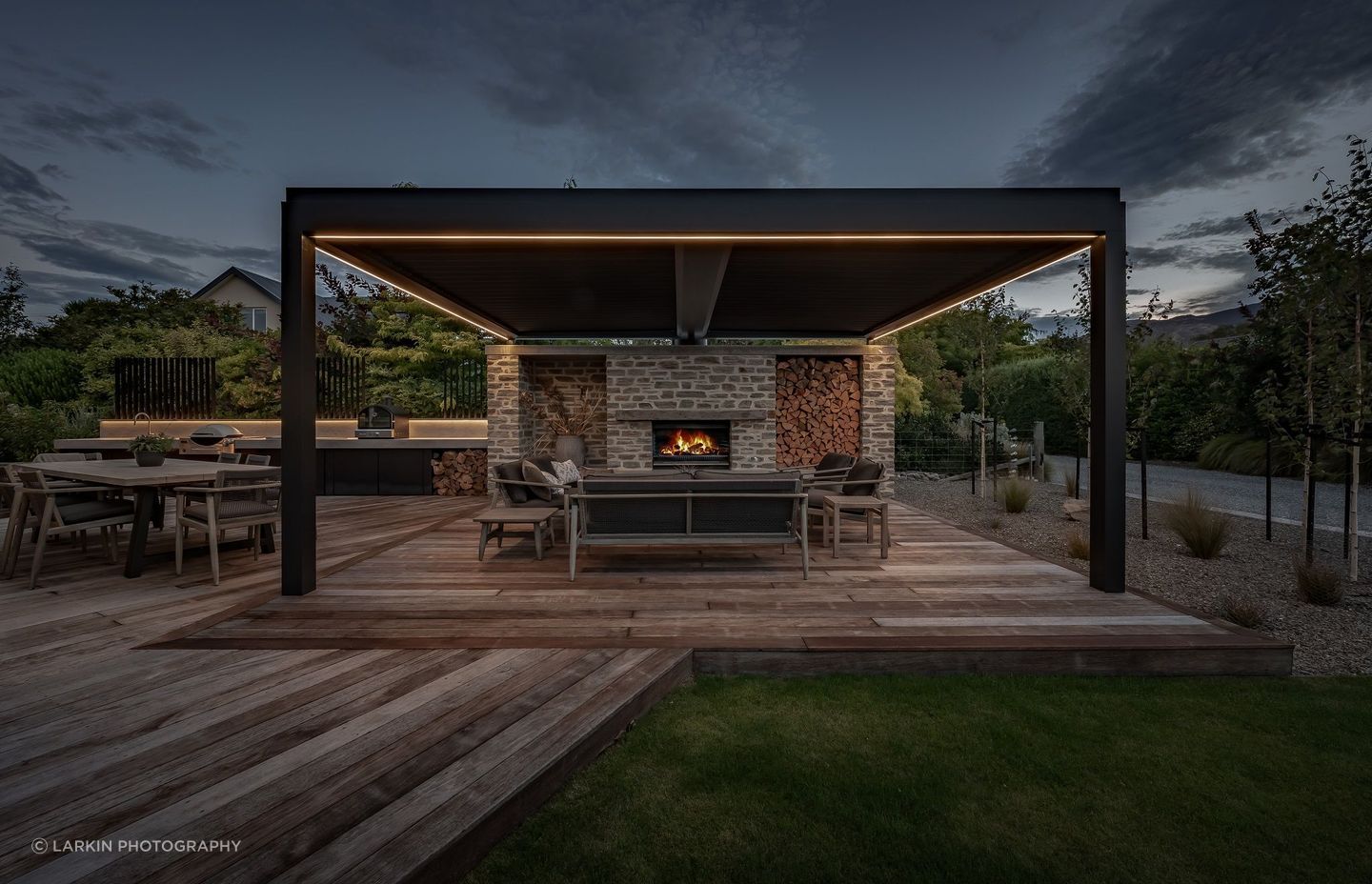
The arrangement of the buildings also allows a separate private outdoor living pavilion to the northwest that features a built-in outdoor kitchen and large open fire under a retractable louvre roof for the family to enjoy year-round.
The entrance to the home is through the glazed link between the buildings, which is clad in blackened timber and steel. Flagstone paving leads from the forecourt to the entry porch to the entry gallery, as well as through to the landscaped garden beyond, to further create a division between the two building forms.
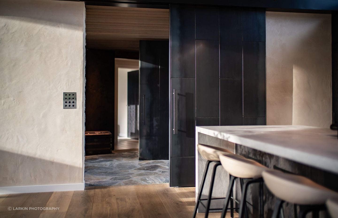
To the left, the stone cladding of the pavilion continues through from exterior to interior, with a steel panelled sliding door that opens through to the kitchen, dining and living spaces, which flow through to outdoor kitchen, dining and lounge. Warm and textural materiality with large wood-burning fireplaces provide a luxury lodge-like feel.
Interior designer Janine Fitchew worked closely with the clients to finish the interior spaces, which Muir says was an excellent collaboration that exceeded the clients’ expectations.
Recently the home was open to the public for a house tour benefiting Breast Cancer Awareness, and Muir says there was plenty of feedback.
“I've never had a project where people have commented so much and are so challenged by it. It's confronting in a good way, as people's first impressions often change when they see the other side of the house, and learn more about the design and how much the owners love their new holiday home.”
Discover more projects by Mason & Wales.
