Black is not back...

Any colour as long as it’s black. While that is a broad-brush statement, this does seem to be the motto of architects everywhere – you see it in their clothes and in their cars so little wonder it’s difficult to get them to incorporate much colour in a design. It wasn’t always this way. Celebrated Swiss architect Le Corbusier is known for his passionate lauding of white in vernacular architecture. One of his seminal buildings, the clean-lined La Villa Savoye on the outskirts of Paris, is a concrete holiday retreat completed in 1931. It was this architectural classic that marked a turning point in Le Corbusier’s thinking. It was also his last commission where he indulged his passion for all-white architecture. Later in life, he embraced colour as only an artist can; he even developed two paint colour collections. “Man needs colour to live,” he said then, quoting fellow painter Fernand Leger. “It’s just as necessary an element as fire and water.”
Le Corbusier went on to offset all that concrete severity by using bold colour statements on buildings such as Berlin’s Unite d’habitation and the pair of Jaoul houses in the upmarket Paris suburb of Neuilly-sur-Seine. While the red-brick, concrete and timber exteriors may look neutral, inside Le Corbusier employed primary shades of red and green to coat items of built-in furniture, in tiling and on walls – a technique which he believed emphasised the geometry of the architecture.
So if Le Corbusier and the mid-century modernists were doing it, when exactly did colour leave our lives and non-descript neutrals gain so much ground? Perhaps it was during the 80s and 90s when we became focussed on home as investment, rather than somewhere to live in for life. We became frightened to express an opinion, reluctant to make our own mark. Homeowners started using colour only in painted surfaces and not in the intrinsic make-up of dwellings. Happily, the wheel has turned from such pared-back austerity. Scratch the surface and you’ll find that there are those in the architecture profession who are prepared to give colour its due and add a little more pep to the material palette. Because our homes are usually our biggest investment, there’s something to be said for keeping the bulk neutral, yet the key is to have a bit of fun. Here are some ideas:
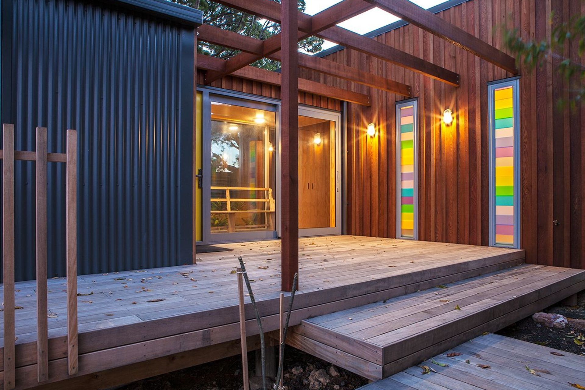
· Colour blocking is a modernist tradition that has since been revived in fashion and painting techniques. This model of colour use can readily be explored in the materiality of buildings. One Box™ house on Waiheke Island, for instance, features louvred windows where panes of glass are tinted in punchy shades such as citrus lemon, apple green, sky blue and lilac. Louvres alongside the front door instantly lend personality to the approach to the house. Internally, these banks of coloured louvres become the art and act like a stained-glass window to throw light in pretty colours into the rooms.
· Colour can be used in big-picture context when it suits the occupant and the function of the building. Dour has no power in an artist’s studio, for instance. In a Box™ project in Clevedon, the plywood cladding in orange brown looks striking on the container-like building. The owner, a hobby artist, bucked the trend and requested a vibrant shade – and the joinery to match.
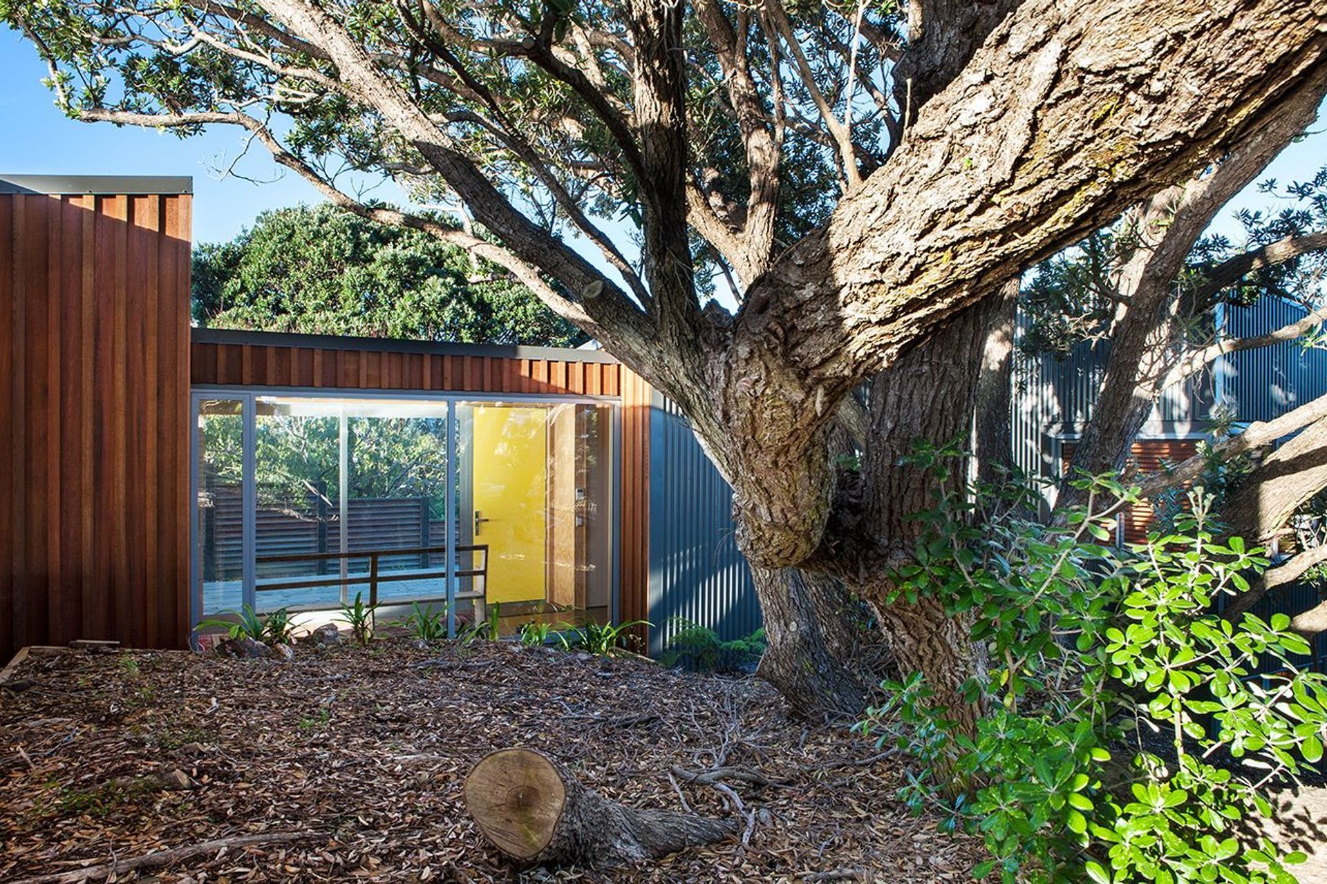
· An exuberant welcome is a good way to pursue hues. Put a brave face on your building with a front door that adds a pop of Mondrian-like colour. Don’t make it a wishy washy greeting, either. Choose something strong and vivid from a vintage palette, such as a seafoam green from the 50s, burnt orange from the 60s, or even a cheerful pillar-box red.
· Repetition is the name of the game. Choose one colour as an accent and stick to it. This can be used on the front door, in tiling, expressed as a section of panelling to, say, brighten up a stairwell, or in a kitchen where cabinetry tends to be in black, white or another take-no-chances shade.
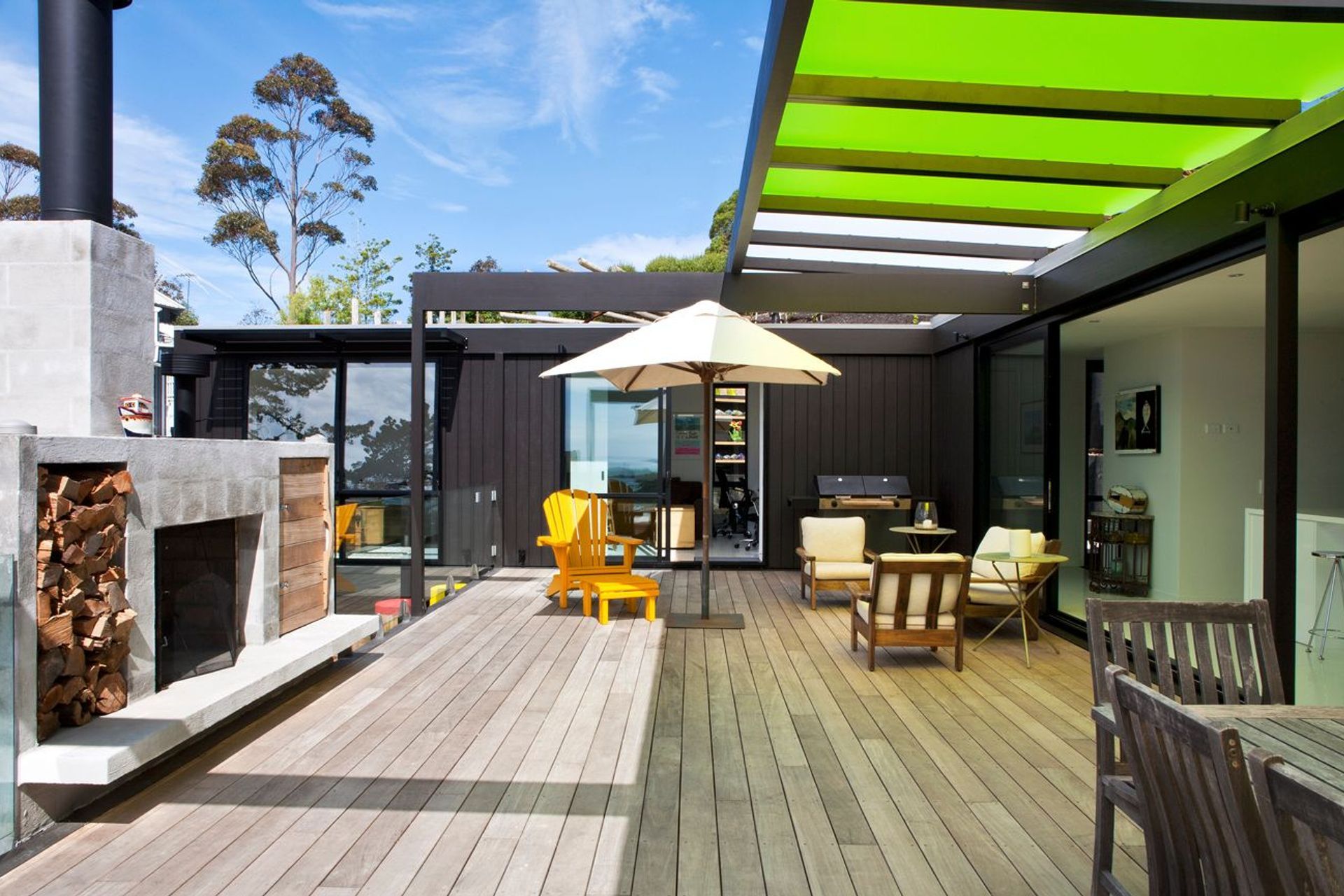
· Consider bringing colour to your alfresco areas too. While we wouldn’t suggest it as cladding (unless you’re an artist, see step above), use Perspex panelling on all or several panes of a covered pergola. It brings an unexpected artfulness to the space and filters the light beautifully.
You can add as many text blocks as you like or just use one big text block.
You can also click the teaser text at the top of the page to edit it.


