Architecture Showcase

The practice offers
full architecture, master planning, and interior design services for all types of projects in both the residential and commercial sectors.
Our young, and dynamic team approaches each project with a fresh, questioning attitude, and a focus on tailoring the design to the brief and the site. We pride ourselves on the outstanding quality of the service we provide from the conceptual level, down to detail design,
We are passionate about creating rich, layered spaces that provide dynamic places to live and work, and respond sensitively to the site and location.
T Plus Architects are members of the New Zealand Institute of Architects and NZGBC (New Zealand Green Building Council).
SERVICES & CAPABILITIES
T Plus Architects offers a wide range of professional service including the following:
Architectural design, from initial sketch concepts through to construction detail design. We also provide larger site planning and optimisation, as well as interior design.
Design management and coordination of consultants. Procure fee proposals from other consultants and set timelines for the production of their information and designs to meet deadlines. Manage coordination between disciplines (fire, structure, services),
Produce Architectural documentation to obtain Resource and Building consents, and other regulatory approvals. Correspondence with local councils.
Organising procurements of construction contracts and competitive tendering or pricing on client’s behalf. Drafting construction contracts, based on industry standards.
Site observation. Processing payment claims and administering the construction contract.
LIGHTBOX HOUSE
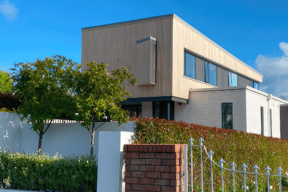
An existing 70’s brick and tile house was transformed to create a modern, urban beachside retreat for our clients.
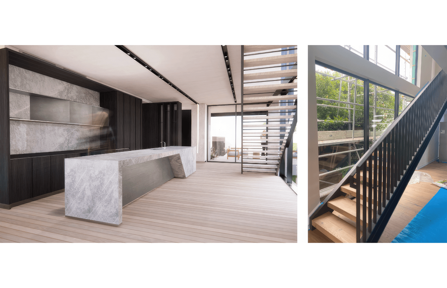
Our design was sculpted to respond to the way the family lives, with a series of entertaining spaces that string together. The kitchen forms the heart of the house, and forms a link from the existing south- facing pool to the sunny living spaces with views out to the ocean.
A feature steel stair with double height glazing pulls light into the middle of the house.
The house has recently been completed, and we have professional photographs scheduled to be taken.
SPRINGS ROAD DEVELOPMENT
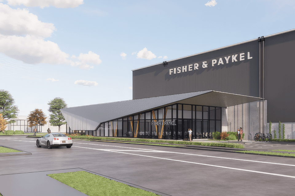
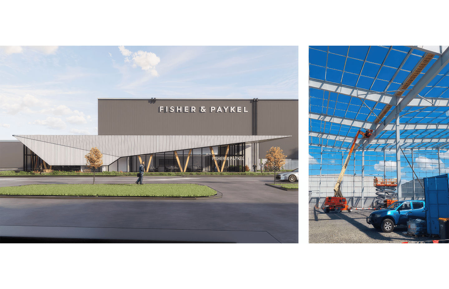
We are the Architect and Lead consultant for a large warehouse and office in Auckland. The Building is owned by a large listed property investor and will be used as a national distribution center.
We were tasked with creating a highly functional building, providing 25,000m2 of high storage and meeting a stringent 5 star Greenstar rating.
The project required very fast delivery and a striking design for this flagship property.
This project is currently under construction.
PANORAMA HOUSE
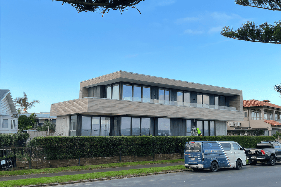
Our client’s love of modernism and clean lines lead us to explore the idea of what beachside modernism could be.
The mass of the building was carefully planned to consider the exterior spaces as much as the interior, creating sheltered private courtyards, and sunny spaces to relax with the view. The house is was designed to be able to expand to accommodate family and friends, and contract to suit the couple.
The design plays with deep eaves, balconies, and cantilevers to create a dynamic form. And softens the aesthetic with a focus on rich textures and a natural colour palette inspired by driftwood.
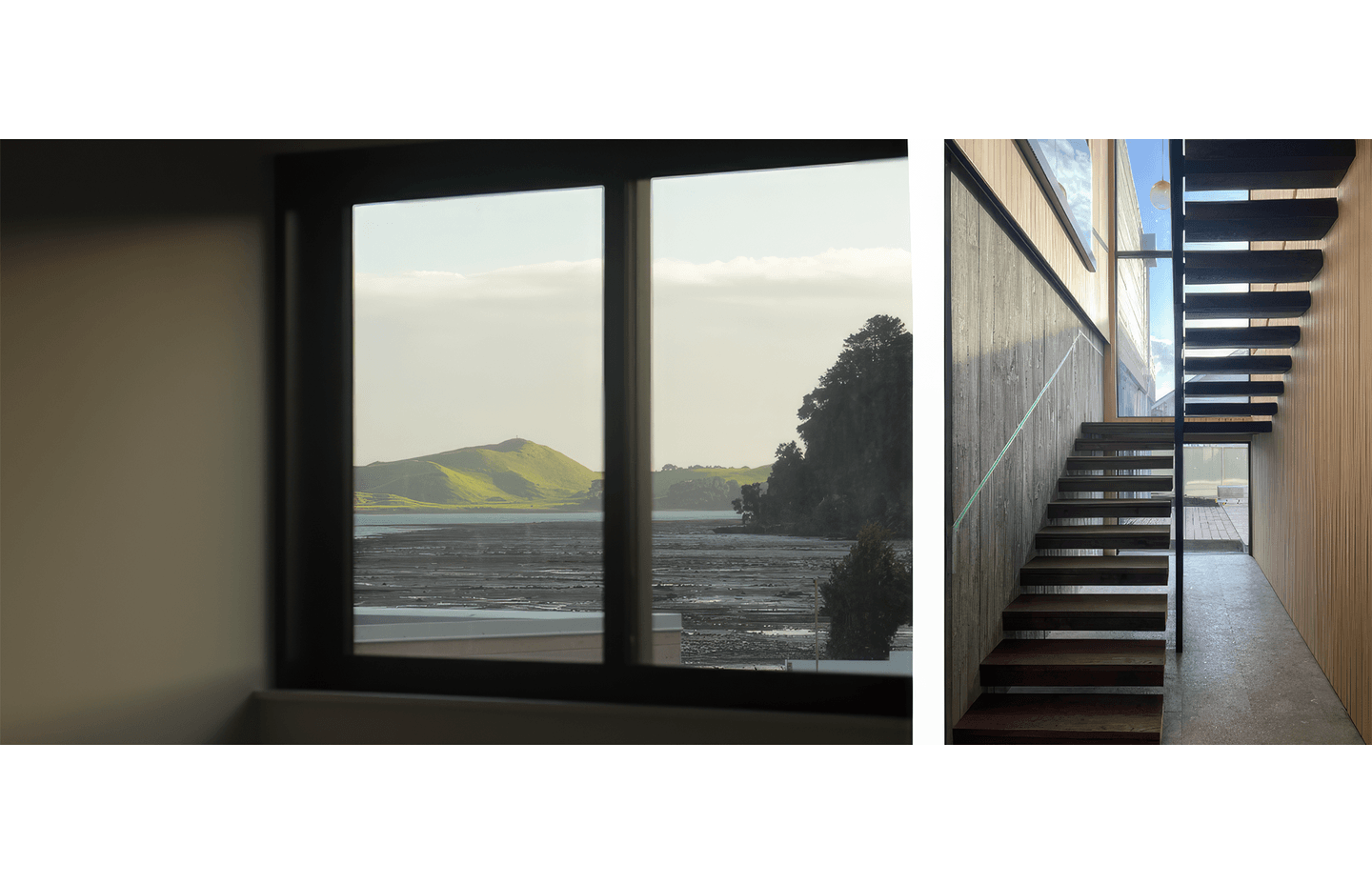
The entrance was pushed to the side of the house to allow the living space to stretch the width of the site and make the most of the views. The entrance and stairs combine to form an impressive double height space, conceptualised as a lantern, it glows with the warm timber paneling and large areas of glazing. Windows were carefully placed to capture views from every room.
The house has recently been completed, and we have professional photographs scheduled to be taken.
SUZUKI SHOWROOM
The brief for this project was to design a vehicle showroom set back from the road and located centrally within the site to allow a large area exterior vehicle display in front and around the building.
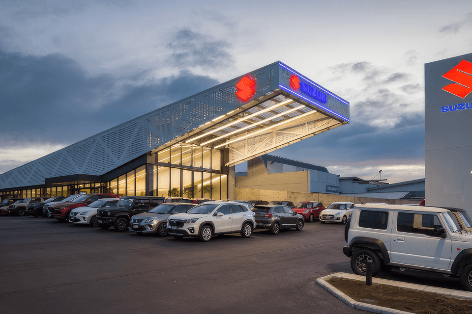
Two large mono-pitched steel trusses span the length of the building, creating a smaller interior showroom and a large exterior canopy. The canopy cantilevers towards the front of the site to maximize the building’s street presence, provide good signage opportunities and create a dynamic and eye- catching shape.
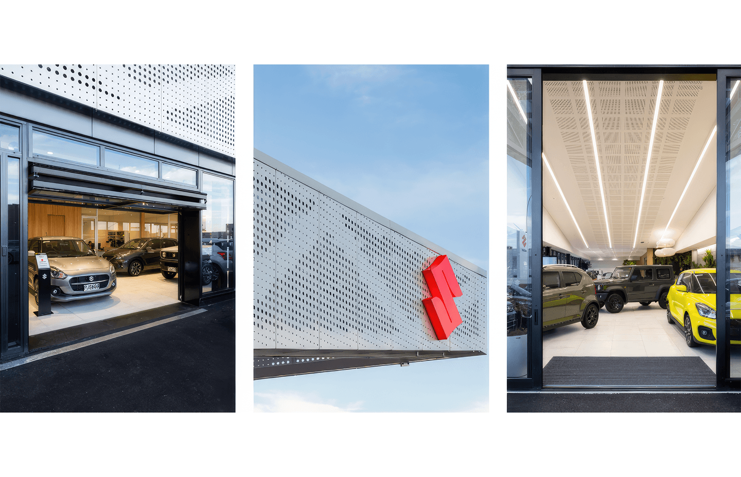
Continuous linear strip lights that run from the underside of the canopy and continue into the interior to draw the eyes of the passerby from street down into the interior spaces of the showroom.
The whole of the building is wrapped in perforated aluminum sheets in a pattern mirrors the rhythm of the struts and webs of the adjacent trusses.
BARULHO
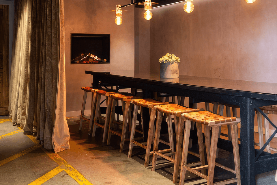
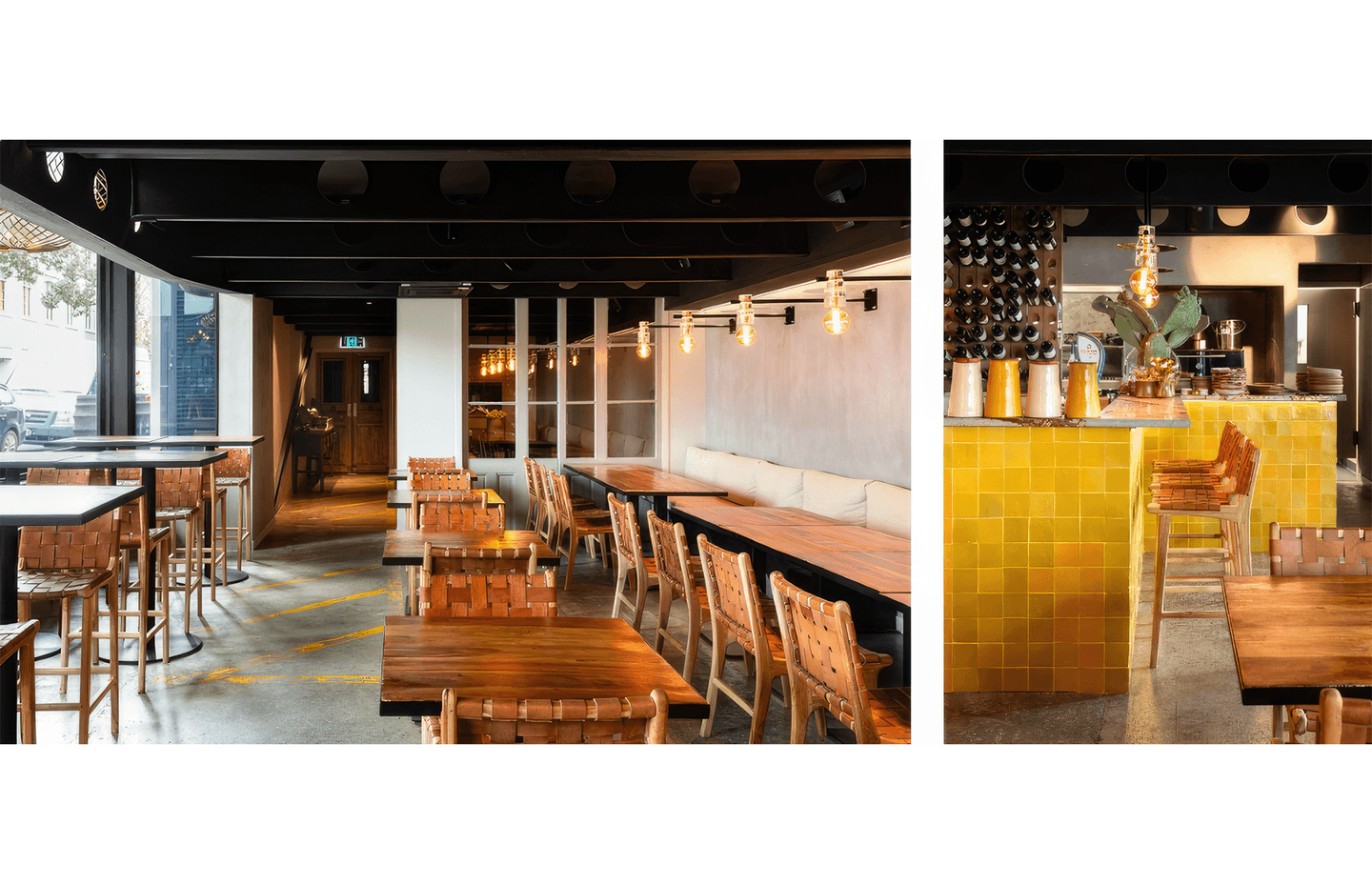
Barulho was a small Tapas bar in Parnell. The Client wanted to grow into a Spanish-fusion restaurant but lacked the space.
The opportunity to carve this space out of the ground floor of the adjacent carparking building was a challenge that we were excited to take on.
The space that was created embraced the location and left spaces and surfaces with a raw, finish. Remnants of the carparking lines can be seen on the floor, and the plastered walls and handmade finishes were incorporated as a nod to the client’s Argentinian roots.
Precise coordination and innovative thinking was required to insert services, circulation spaces and a functional commercial kitchen within the confines of a space designed for cars.
MT ALBERT CHAMBERS
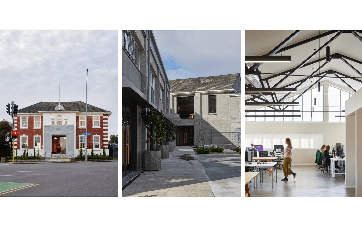
The former Mt Albert Chambers was constructed in 1927 as a center for the local borough council.
It was sold off by the council, and had spent decades being insensitively altered, and extended.
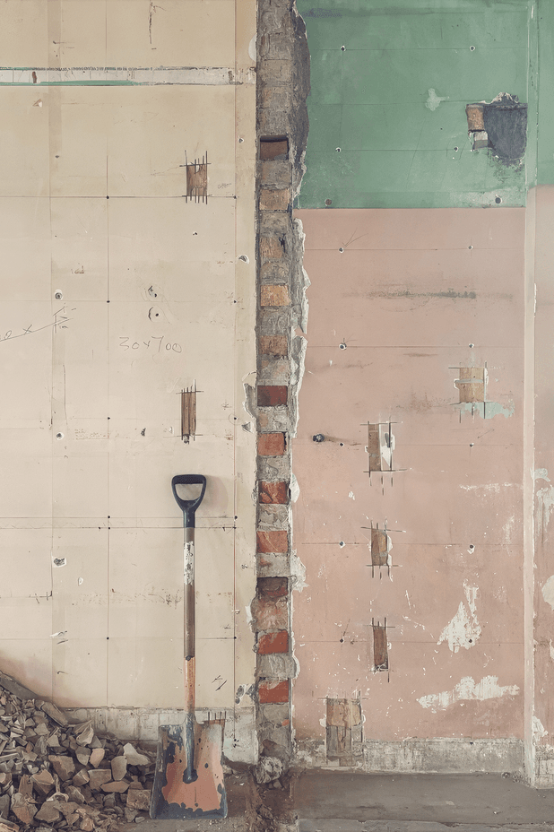
During this project we uncovered and restored layers of heritage features that had been hidden away, and reorganised circulation and amenities to create modern and functional office spaces, with a high level of flexibility with regards to tenancy sizes and functionality.
The double-skin brick building required extensive seismic strengthening, and we strove to minimise the impacts of the structural work on the character and openness of the spaces.
We peeled the 1970’s extension off the rear of the building, to expose and refurbish the more utilitarian, rear heritage facade.
The 1970’s extension was then extensively renovated, including a new roofline, that transformed the building to respond to the rear facade of the Chamber building. New steel trusses were used to create airy, modern interiors that reflect the vaulted ceilings of the Chambers.
This consenting process for this project was split into three stages, enabling a faster start on site, and a high level of cooperation and coordination between Architect and Builder.
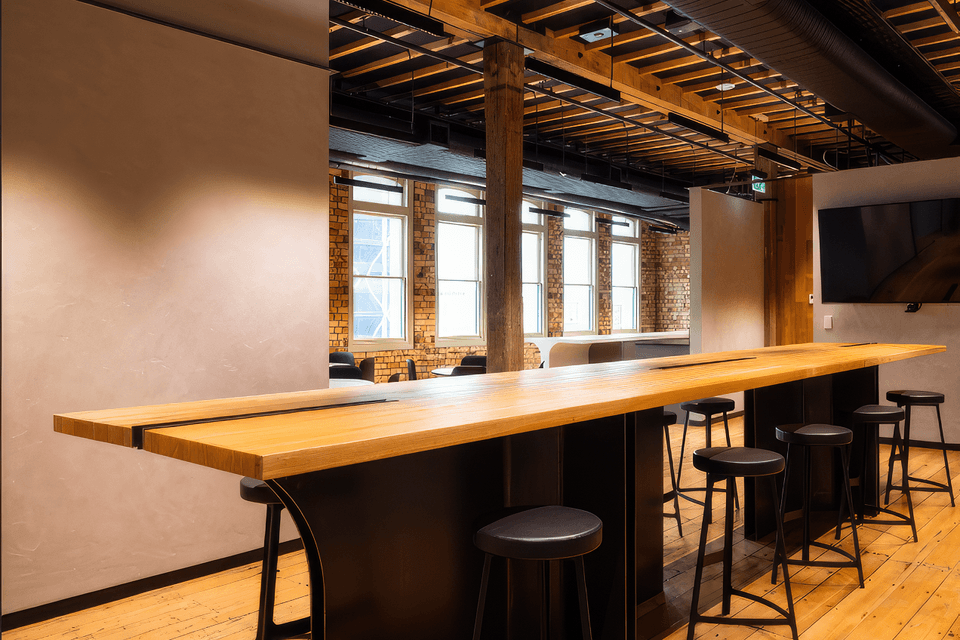
BRITOMART OFFICES
This office fitout was undertaken for a busy listed property investment company with a growing team.
The fitout is located within the recently restored Hayman Kronfeld Building; an amalgamation of two listed heritage warehouses.
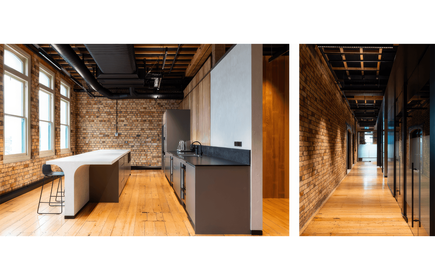
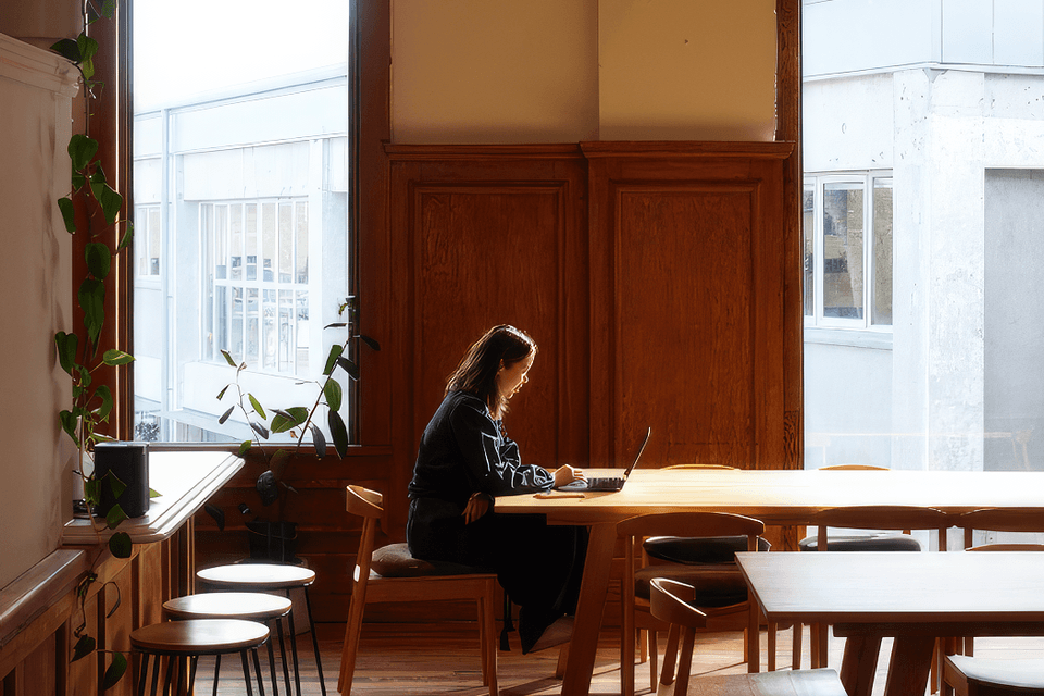
Care was taken to express the existing timber structure, and to carefully coordinate services on the ceiling to allow the timber to shine.
Industrial style materials and forms were used to highlight the buildings form, and communicate the nature of the tenant’s property portfolio.
Playful curves were used to contrast and lighten the more serious colour palette, and warm tones and textures work to create a welcoming space.
