Bathroom renovation

We seem to be bombarded with images of things looking perfect, perfect houses, perfect furniture, perfect meals, and even people looking perfect. It is easy to think that this perfection is the norm. If you make things, design things or even bake things, you will probably be familiar with aiming for perfection, but often not quite getting there. Often left pondering “I probably should have added this, or done that.”
I should be telling you how we get things perfect first time, every time, and never run behind schedule. But I won’t. There will be plenty of contractors who sing that song. However, that is just not the reality of home renovation. There are always hurdles to jump and problems to solve. The important thing is to solve the issues and make the best decisions you can along the way.
And when mistakes are made (yes we make those too), fix them and move on. It is only the result that remains and the experience that you remember.
This bathroom renovation is no exception. It is not perfect, but I feel happy it comes close, with only a few things to note down as experience.
These are the things that I like about this space and hope will be helpful to you.
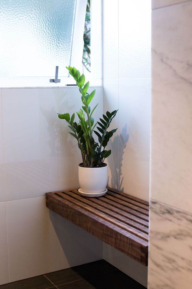
1. This bathroom is flush! The architect liked things flush. For example, the door frames are flush to the tiles and cedar cladding. The slate floor is flush with the concrete floor. The glass is flush with the tiles. This gives a lovely clean and simple look. But trust me, having things flush is not that easy and requires very careful accurate work and meticulous detail. It also requires getting the whole team of trades to be on point, working towards the same result. Close to flush, is not enough. Only flush is good.
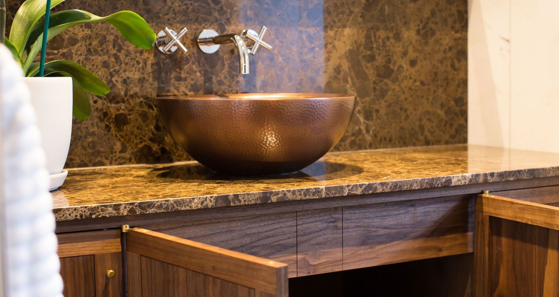
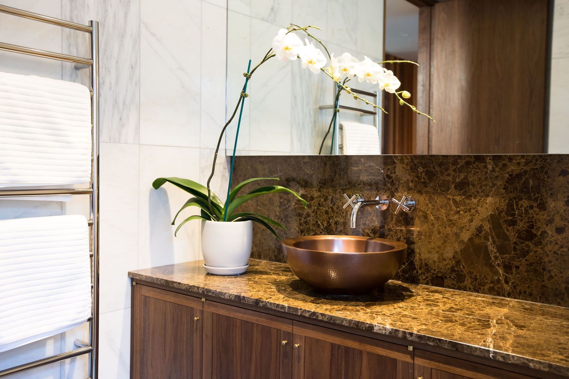
2. This building is a 1960s vintage, so the brief was to keep things as honest as possible. For that reason, there are no colour changing LED strip lights or speakers in the shower. Without the “bells and whistles” this space feels genuine. As much as possible, natural materials were chosen, like natural stone, real timber and brass.
3. Slate floor tiles from Artedomus were used on the floor. These feel really safe underfoot, even when wet in the shower. Being natural stone, they require a stone sealer, but this is not a hard job. I would recommend sealing all six sides of the tile before it is laid.
4. The stone wall tiles are from SCE Stone (very good to deal with). I enjoy the natural inconsistent look of them. Also the architect has chosen a pleasing proportion to stretch the otherwise low ceiling.
5. In the shower, we broke with the natural trend and went with a ceramic tile just to be practical with cleaning. The “super white” tile from Tile Space Ltd is just that! No messing around, just bright, white and clean. I highly recommend using as small a grout width as possible, 1.5mm can be done by a skilled tiller. That just means less grout to clean and more tile to see.
6. Timber windows! Just can’t beat them. I love the warmth and silence of the timber, and the way they close on the seals. We have glazed with Low E laminated glass. The laminated bit is what protects timber, carpets etc. from sun damage. Also, we used an obscured “Cathedral” glass which is more in keeping, than the typical frosted glass.
7. The brass hardware is from Chant. This stuff is heavy and solid and manufactured beautifully, right here in New Zealand. And with true Kiwi engineering spirit, they are happy and willing to do custom work. I really love the look of the dark brass and its living finish. Highly recommended.
8. Solid core doors. Don’t mess around with anything else. Hollow core doors are fine. Hey everyone has them, but it’s a bit like taking your sister to the school ball. It would be fine, but it just isn’t going to feel the same! Solid doors are slightly more expensive, but are super heavy and close with a substantial “clunk”. So good!
9. Full height. On this job full height doors were the answer to the low ceiling. And I mean dead tight to the ceiling, no gaps, no trim, just tight. This means no pre hung doors and fitting one jamb at a time, dead plumb, an important detail.
10. We have used solid timber door frames made from rough sawn walnut boards, dressed ourselves, to ensure they are straight. That was super important, to achieve flush. Buying pre dimensioned timber from others is almost always disappointing. These door frames were installed with timber plugs concealing the screw heads and are basically invisible. This is an easy job to do. I have no idea why contractors poorly install screws and expect the painter to have a miracle filler.
11. Finish. I really love the timber finish here. It has a rich polished surface. The timber has an almost transparent 3 dimensional quality. I have got there straight off a sharp hand plane. No sanding. That just seems to kill the grain back to a dull cloudy surface, as opposed to a bright glossy surface off a plane blade. James Krenov would often make furniture with no finish on it at all! He said he could not do anything more to make the wood more beautiful. But for this work, some protection is required. An oil finish makes for a dead simple application, leaving a natural looking surface without the film build up. Also the on-going maintenance is very easy with an oil finish, as opposed to polyurethane or lacquer. A great product is the “Woca” brand and is very well supported here in New Zealand by Design Denmark.
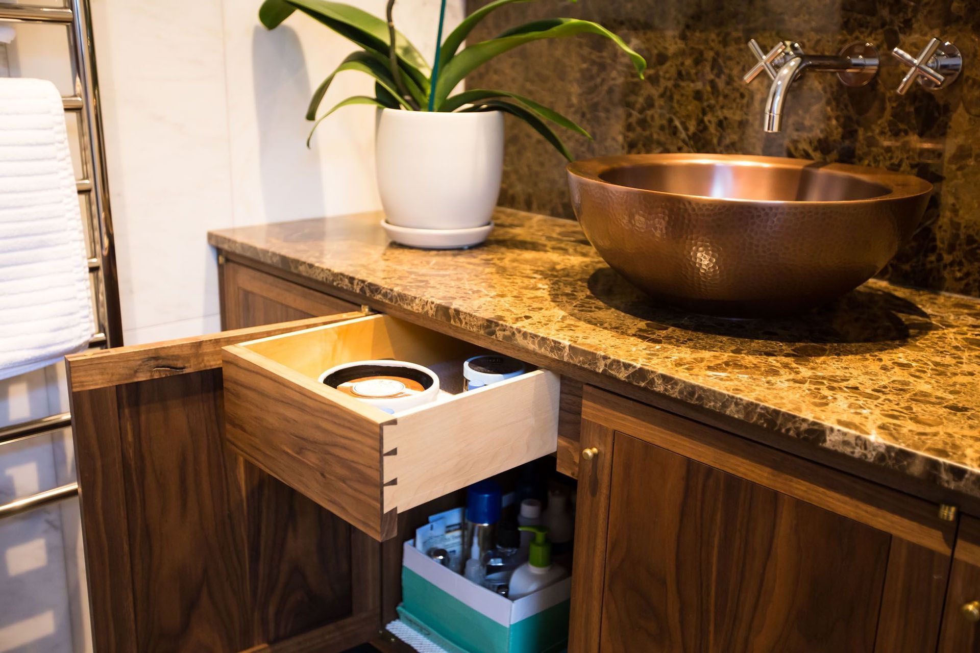
12. I am pretty happy with the cabinet. Again, to remain honest to the age of the house, there are no adjustable hinges, soft close or push open things. Don’t get me wrong, I really love high tech German products. They work beautifully and we use them all the time. But this was just not the desired aesthetic or experience we were after. The cabinet has come from a few walnut planks, and a piece of maple for the drawer sides, nothing more. Built using no tricks or shortcuts, just good robust joinery to take the weight of the stone. The doors are frame and panel construction, with a book matched floating panel. The frame is complete with still visible scribe lines from laying out the joinery. That is not a defect or mistake, just the marks of a maker. I love how the doors swing freely on brass pivot hinges with no adjustment. The doors come to rest with a satisfying click of the small bullet catch when closed.
13. Storage. The problem with a cabinet with doors is getting to things is not quite as easy drawers. I figured, why not have drawers behind the doors? I love this concept. It feels like a little surprise when you open the door and there is something else waiting. Easy access of the drawer but keeping all the space of the cabinet.
14. Big Mirror. I think I can see too much of myself for my liking, but it makes a small room feel massive especially going to the ceiling.
15. Polished edges. The good thing about using stone is the edges can be polished leaving a soft finished edge on exposed corners. This means there is no need to have aluminium trims, which is not so nice.
16. The architect hid part of the shower behind a solid wall which also meant the shelf with all the messy showering essentials are not seen and keep the room looking tidy.
I hope these things may be of some help. If you are planning a renovation or new building work, we would love to help. We may not give you perfect, but rest assured we will give you our best work.