Best of Both Worlds
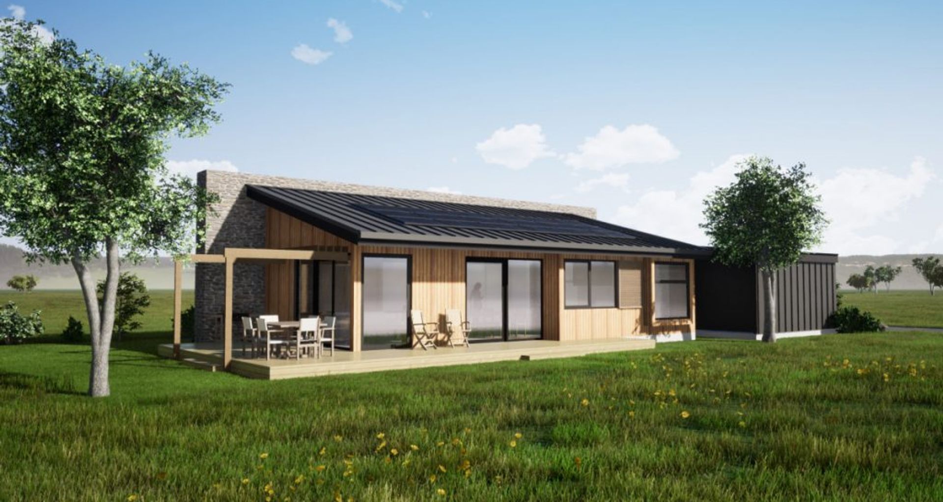
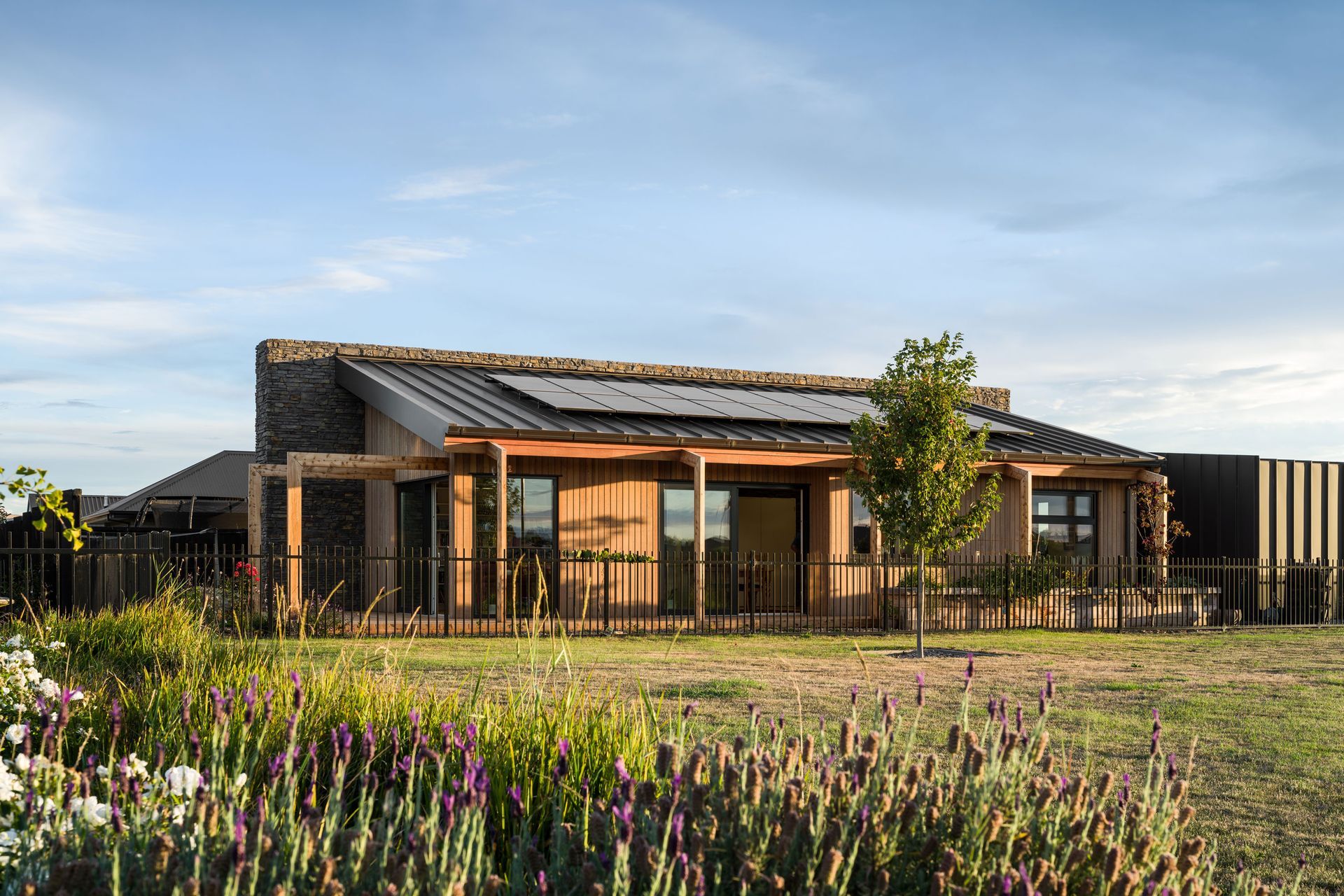
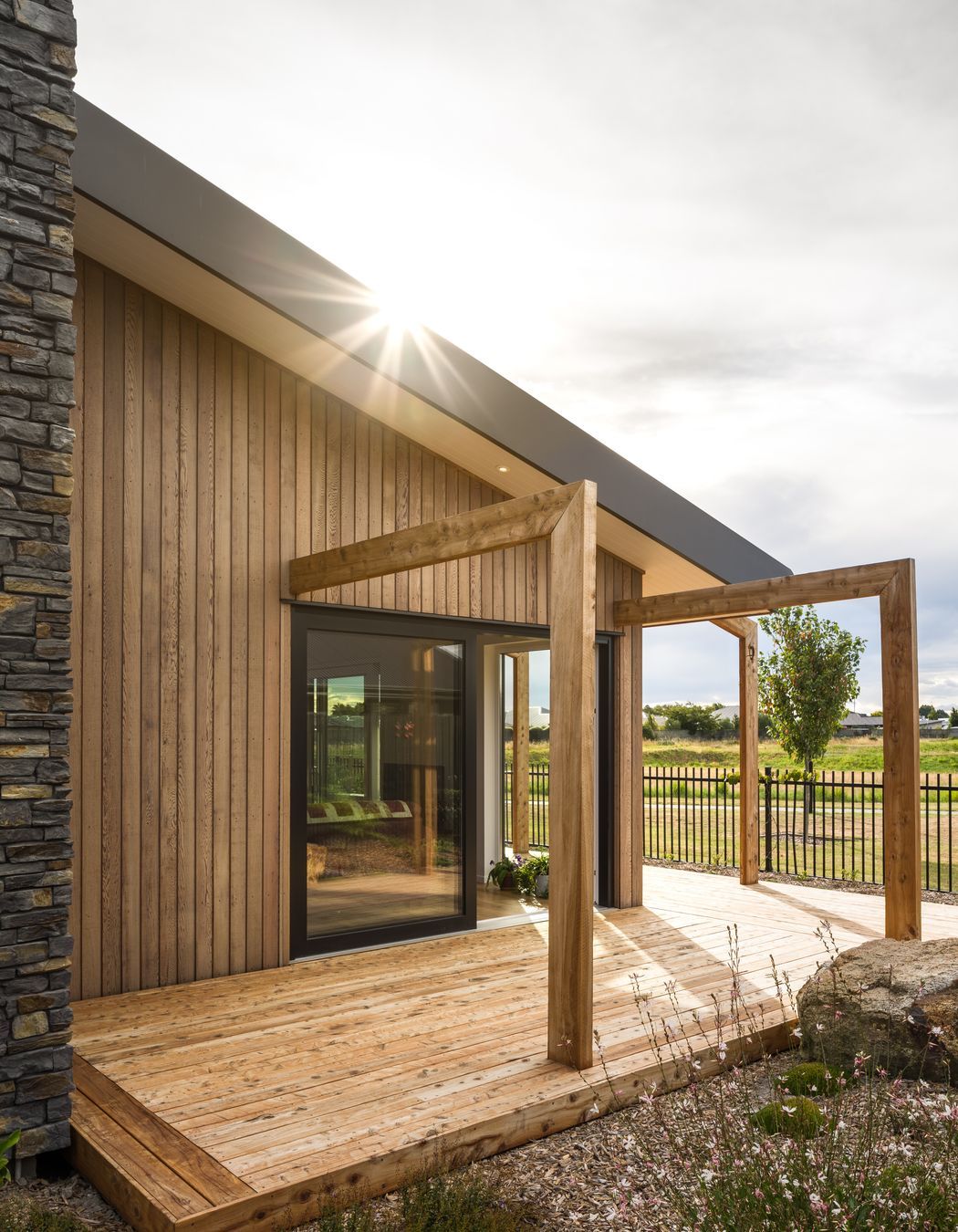
This new Canterbury home designed by Bob Burnett Architecture checks the boxes as a sustainable, certified Superhome that is also a joy to live in.
WORDS CASSIE DOHERTY PHOTOGRAPHY DENNIS RADERMACHER
There’s a winning combination when it comes to house design, says Bob Burnett, director of Bob Burnett Architecture. It’s the bringing together of beautiful architecture and high-performance criteria. And too often, the beautiful architecture takes second place.
“I think the key is design,” says Bob. “A lot of sustainable ratings are about the technical side, the thermal performance. It’s about ticking the boxes
and filling out the spreadsheet. While these technical specifications are very important, I think a Superhome needs to be the best of both worlds: a holistic, well-designed home, first and foremost, with beautiful aesthetics and the best possible living environment.”
And Bob should know. He founded the Superhome Movement in 2015 after the Christchurch earthquakes forced him into a series of rental houses, highlighting New Zealand’s dire housing standards. The organisation lobbies for change in the country’s building industry.
And at Bob Burnett Architecture, he leads by example.
“Once people experience living in a home that’s well-designed, they understand. It’s all about having an aesthetically pleasing home that is delightful to live in, as well as warm, comfortable and high-performance. The best comment I hear when we finish a home is that it’s got a nice feel. As designers, that’s what we’re striving for, to provide something with some soul.”
Homeowners Paul and Shirley Watson can attest to that. “If someone had told me beforehand that our house could be so nice to live in, I wouldn’t have believed them,” says Paul of their new-build home in Prebbleton in Canterbury.
“When we talked to Bob, he talked about how he had all these checkpoints for making a home extremely energy-efficient but how you could easily get caught in the trap of just checking off those boxes and end up with a really dry design. He actually thought about the liveability and the design all the way through.”
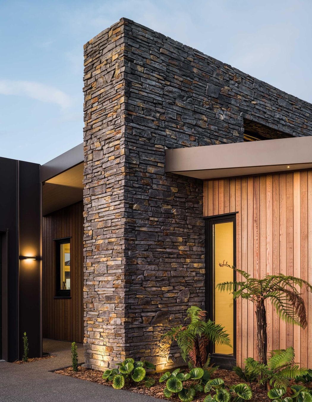
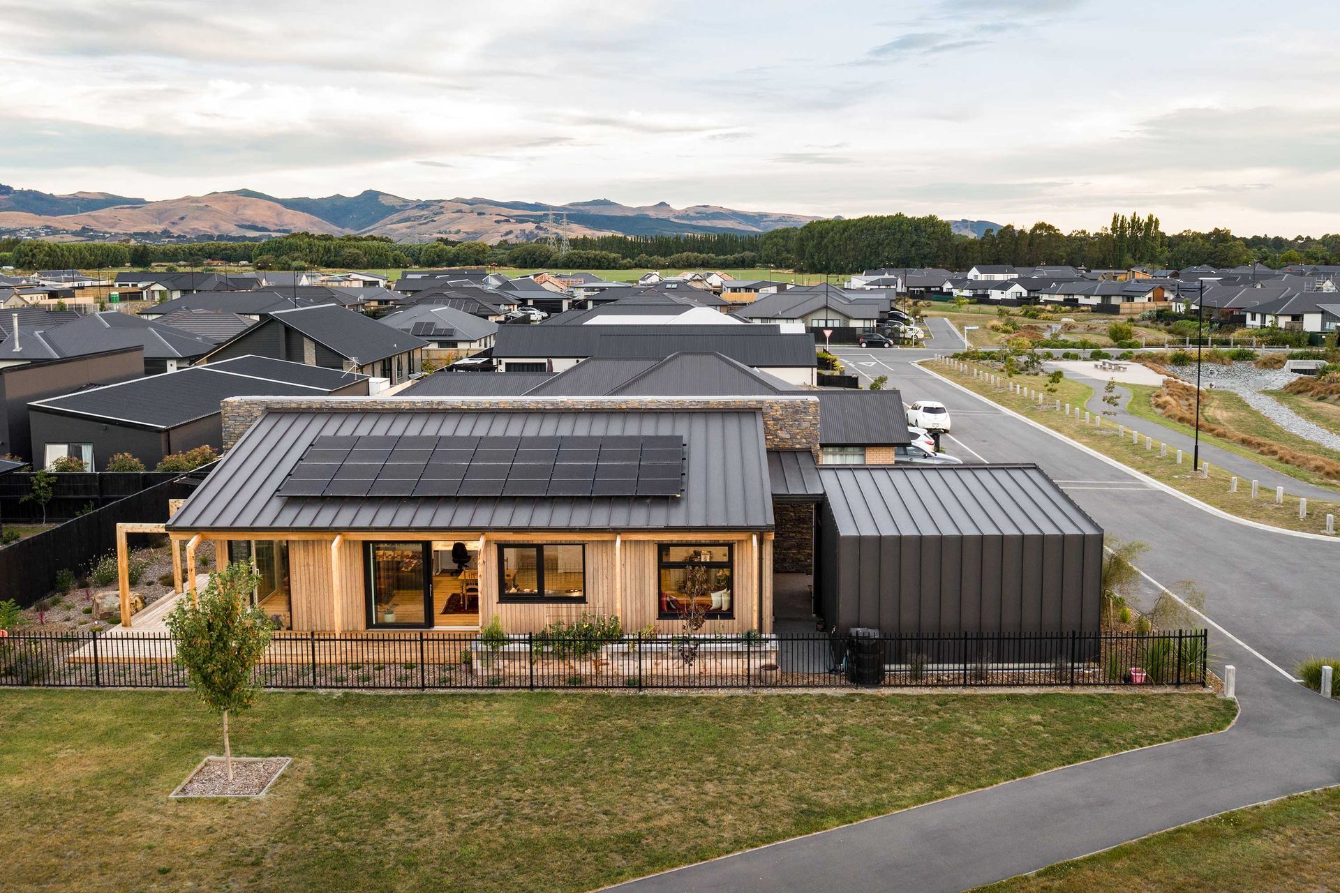
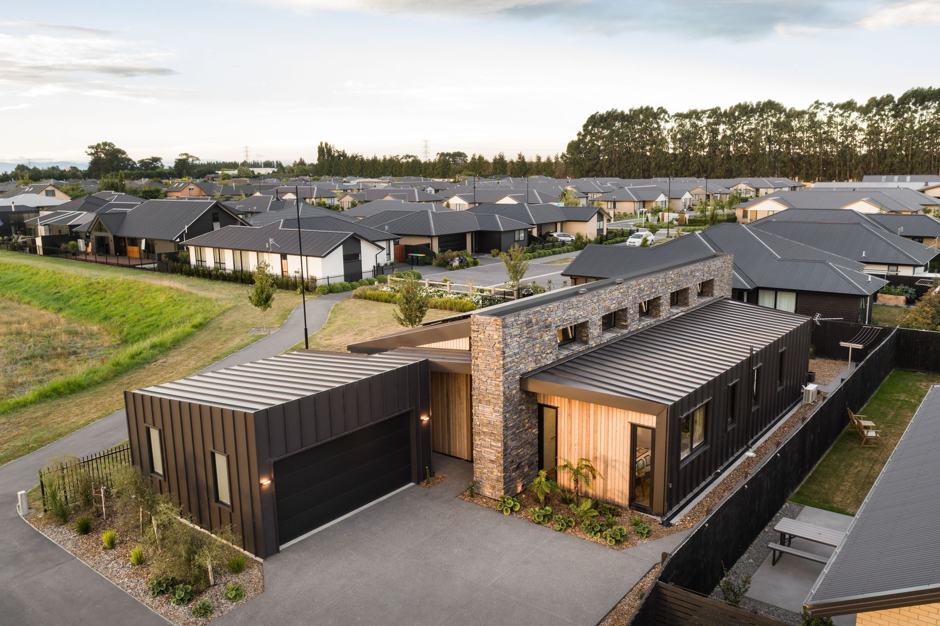
And there’s nothing so illustrative of the concept of form meeting functionality than the stone wall that runs through the centre of the house. It’s a dramatic feature, clad in Classic Stone veneer that makes the house a standout.
But there’s more to it than that.
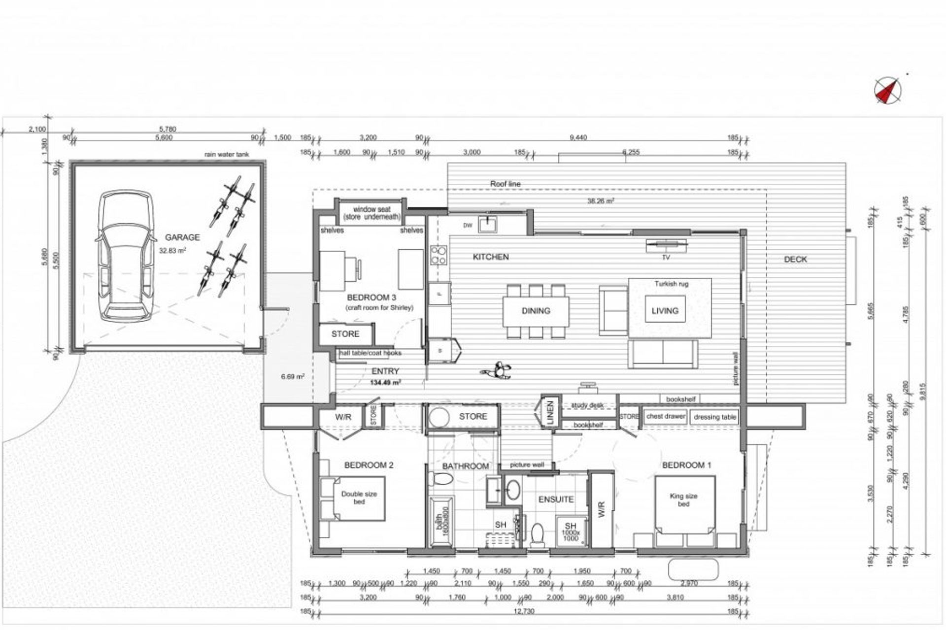
“It serves a few functions,” says Bob. “Spatially, it provides the separation between the public area and the private area. So there are two bedrooms and two bathrooms on one side and on the other, the kitchen-dining-living and the guest bedroom that Shirley also uses as her craft room. It allows for high-level windows for cross-ventilation and that beautiful quality of light. And the wall also houses a lot of the plant infrastructure. So the heating system is actually inside the wall, as is the ventilation unit and the ductwork, the hot water cylinder and a bit of storage.”
“Dealing with waste, that’s a big one,” says Bob.
“And it’s actually easy to have a lot less waste going to landfill. The construction industry is responsible for approximately 50 per cent of waste to landfill, with a lot of it being completely unnecessary. You can eliminate waste just through clever design. Using prefabricated methods, for example, and using optimal dimensions so you’re not cutting materials in the first place.”
And the main principle, of course, is overarching.
“Design filters through all of those things,” says Bob.
He and the homeowners are pleased with the end result.
“A really good part of this project was having really good clients,” says Bob. “People that are like-minded, have a similar world outlook and understand the things that we do. Who take the path less travelled and have the courage to do something different.”
