Design Trends 2022

The delightful days of summer have flown by, and we find ourselves wondering how the seasons have passed so quickly already. The days have shortened and our attention is drawn indoors. It’s where we will spend the majority of our time in the cooler months. But more than just warmth and comfort, our indoor spaces can provide us with excitement and inspiration.
Tactile texture & textures
Tactility isn’t simply about having an interesting texture to fondle. More often than we realise, the tactility of a surface is appreciated visually. Unless we are talking about your favourite rug or throw, most of the textural surfaces in our homes are rarely touched. Through a more sophisticated understanding of tactility we can add visual interest to the materials that are in our spaces.
We are seeking to add visual weight. Think of a chunky carpet or rug. A very heathered wool. Slubby linens. Velvet.
We want these materials to have a very obvious presence. They invite us to touch them or snuggle down into them. The heft of their visual appearance is deeply soothing.
More than just comfort, these textures create depth. In a very subtle and unnoticed way, our spaces before more 3D. There are many more surfaces, textures and tones. These nuances add sophistication to our homes, and are very responsive to changes in lighting. Think of how the soft and comforting hues of a fireplace flicker on a favourite fireside rug.
It’s important to note too that textures don’t have to be screamingly obvious like timber or fabric. They could be chrome or other metallics. Leather. Suede.
Wallpaper is a great way to add texture. Jute is a wallpaper constructed from strips of dried grass that are woven into sheets. Or look to silk wallpapers such as Graham & Brown’s Silk Pearl from the recently released Genesis collection that provide lustre as well as texture.


All these textures we’ve discussed above can be layered with a range of colours. As long as it’s harmonious, you can go wild with colour or pare it back tonally. It all depends on the setting and the intended mood of the space. The choice is yours.

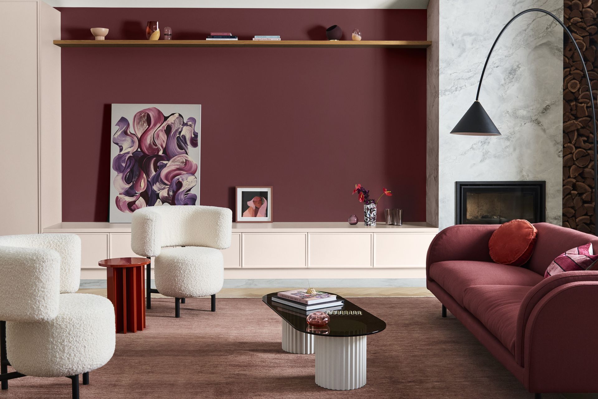
Warmer material palettes
The clue is in the name here. By adding warmth to the finishes and colours in our homes, we can lift the mood of a space, making it more emotionally nourishing. Warm colours are proven to be energising. They can even raise body temperature, thus making you feel warmer.
Be mindful of this energising effect. You may not want to use an intensely warm colour in a bedroom or area where you predominantly want to relax and avoid stimulation. In spaces like these, more subtle warm tones can imbue a restful but nonetheless positive energy.
Nowadays “warmer” doesn't necessarily need to mean golden yellows, rosy terracottas, or lush browns. It also applies to rich neutrals. Think warm whites, or greys such as Dulux’s Sandfly Point and Stony River.
These colours are on full display in Dulux’s 2022 “Flourish”. It’s an inviting palette that draws you in with its warmth, invoking the 1970’s in a 2022 aesthetic. Gone are the days of chocolate brown with orange. Instead earthy browns play well with other refined colours such as dusty rose, petrol blue & soft neutrals.
If you’re not ready for full room warmth, try introducing it through styling elements with Weave’s Como cushion in Spice or Ocean. Or work with beautifully toned oak flooring like Nature’s Oak Matterhorn.
Maximalism
Maximalism is colour and pattern everywhere. More is more! We are using colours and patterns of different scales, layered with objets d’art, mementos, and curios that you love to enhance the space visually — adding interest and drama.
It is not an excuse for clutter! Whilst maximalism means abundance, it shouldn’t mean overconsumption.
In the beginning, it’s wise to work within a consistent colour palette or pattern theme. Let’s take stripes as an example. Working with this consistent theme we can play with stripes at various scales. From cushions to wallpaper. Rugs, throws, and accessories. Think delicate pinstripes alongside a bolder wallpaper such as this large scale stripe from Aspiring Wall’s Shades collection
Maximalism allows you to express your playful side. Picture an eclectic country home with modern chintz, unexpected coloured leopard prints, contrasting paint colours. Or look to the Memphis design movement with its bold colours, geometric shapes and curvy silhouettes. All layered with sentimental objects and art.

Even though it is recommended keeping a consistent colour scheme, there are no rules in maximalism. It’s the opposite of minimalism. It’s self-expression. Filling the room with the colour and texture and personality of your life. Let your imagination run wild, then execute your vision with a practical elegance.
Article by:
Lou Stringer
Founder + Director, Said Studio.
@_saidstudio
saidstudio.co.nz