Designing a building so iconic it forms the basis of a brand
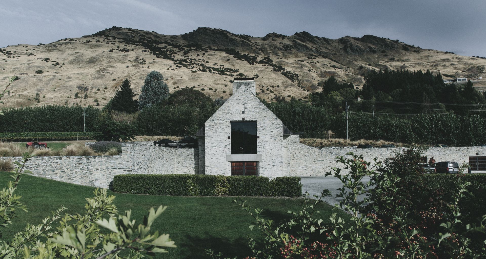
On the eastern edge of picturesque Lake Hayes, on an elevated plateau in the Queenstown district and with a far-off vista of Coronet Peak, sits the resplendent restaurant building of Amisfield Winery. Constructed at the beginning of the 21st century and nearing its 20th anniversary, the stunning stone monolith has aged as well as the wine that is served at its tables.
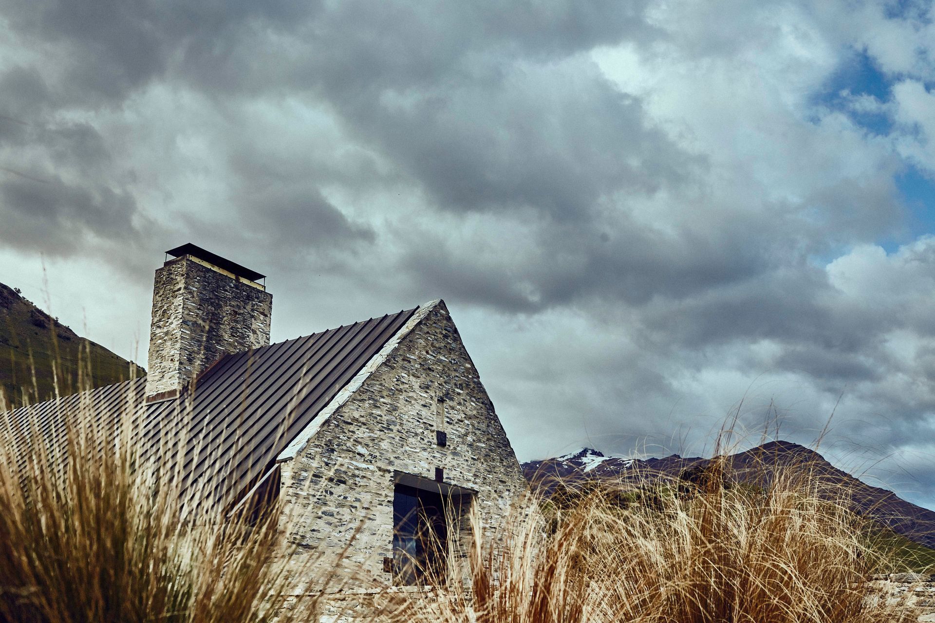
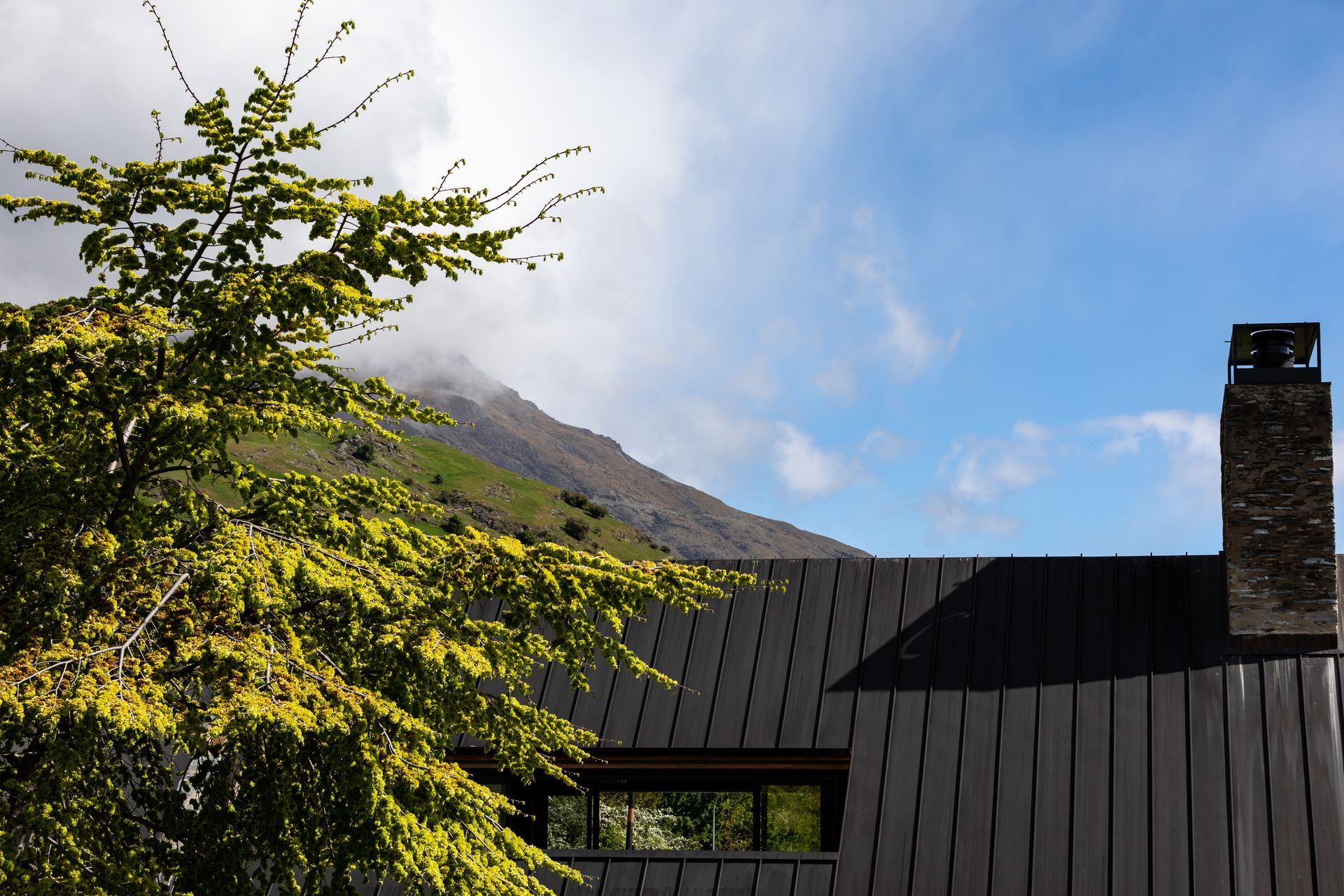
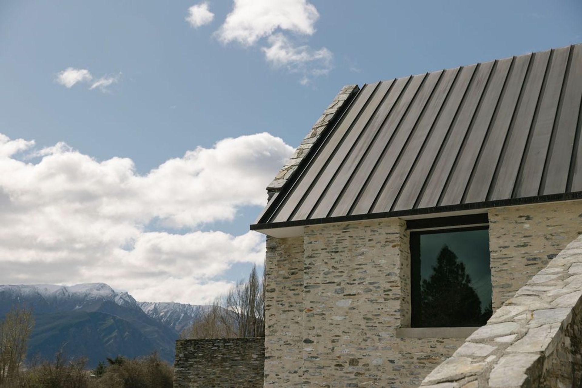
The building acts as ‘front of house’ for the brand — so much so that the company’s iconic logo features the famous gabled roof and chimney silhouette. And much as Amisfield Winery’s identity is intrinsically linked to idyllic alpine landscape, so too is this building: clad in locally-quarried schist and timber recycled from old bridges in the region, the form is topped by a steep copper roof — and the signature gabled end develops a 4.5m high window facing Lake Hayes and the mountains beyond.
From the building’s original conception, it was of utmost importance that the project demonstrate respect for the natural environment as well as for the local architectural vernacular. The powerful surrounding landscape has implied a building of comparable substance, which has in turn been sited such that it sits in the land rather than on it.
Almost two decades on, this vision remains successful: the restaurant is a fixture in the community, both making its presence felt as an unique and imposing stone building, but also retaining its connection to its surroundings in the craggy Otago grassland. This is in no small part due to the creative vision of Kerry Mason and Huia Reriti, who were the project design architects on the project while they were at Warren & Mahoney, and were the primary force behind the iconic design.
And to further understand how it achieved this, ArchiPro sat down with Greg Young, who worked on the project as part of the Warren & Mahoney team, to discuss the design and its endurance throughout the years.
ArchiPro: This building has a big presence, tell me about the material choices.
Greg Young: The original plan was to use the exposed schist, the natural material that pokes out of the hills around the building. Not many people know this, but we ended up actually using the schist that was dug up from the owner’s farm as the ground was dug up to put a road through.
And though it looks incredible, schist isn’t overly durable — it’s quite a crumbly stone. So after it was laid, they put plaster over it to protect it — which is quite a traditional way to do it, but I think it’s really worked in this case — and it turns out it got a bit of a following, it was used in many other buildings in the region.
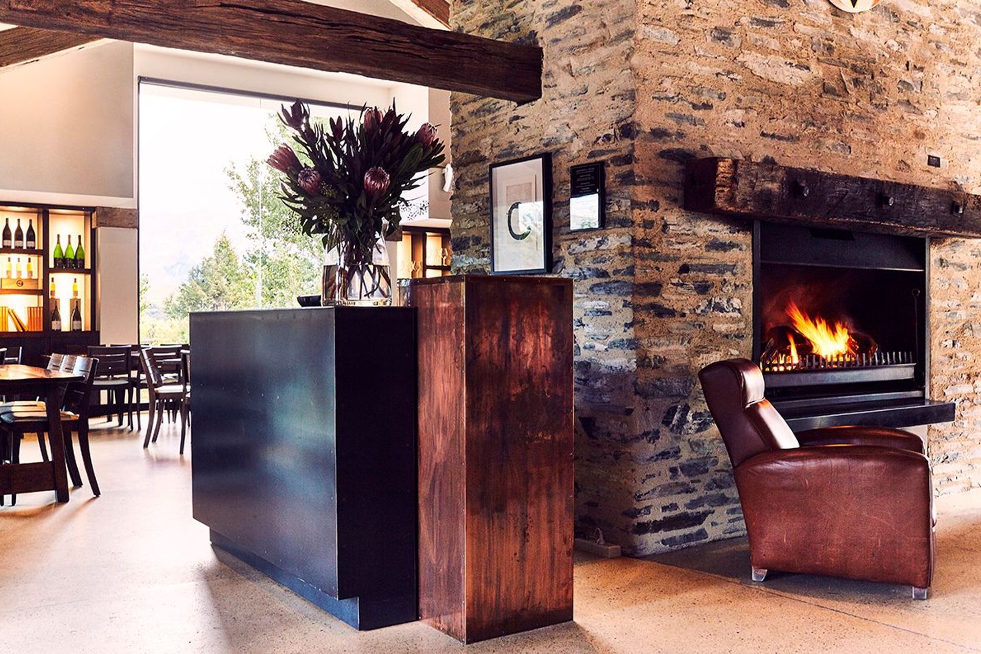
We also used a local quartz stone chip as the aggregate in the exposed concrete floors.
The timber came from bridges that were demolished on the West Coast. It’s an Australian hardwood called Ironbark, and this was also not the original timber that was going to be used — but one of the contractors sourced this beautiful timber and it was too good to turn down. And now it’s become iconic — a lovely timber, and really strong too.
AP: Obviously the location and the landscape were integral to the design. Can you tell me how you took the location into account when considering the design?
GY: The building is sited on a rise, oriented backing onto Coronet Peak. This was done with specific functionality in mind: the building cuts into the hill to accommodate for wine cellaring, while also making the building seem expansive, but not too open. This also allowed us to create a courtyard on one side of the building, while having a more expansive space on the other.
The building’s interaction with and relationship to the environment was always front of mind for every stage of the design process. An example of this is how the walls extend out from the building and disappear into the rising ground, integrating the building with the landscape and blurring boundaries between constructed and natural forms.
AP: Were there any challenges that you remember experiencing on the project?
GY: The biggest challenge from my point of view was keeping it cohesive — there were lots of different clients and stakeholders who were passionate about the project, so it was a delicate balance to try to meet everyone’s expectations. For example, it was really important that we were aligned with the landscape architects to make sure that the building integrated into the landscape.
But it all worked out in the end — the build itself was really straightforward, the builder was really good.
What was/is the highlight of the project for you?
GY: It’s been really rewarding for me to see that the architecture of the building has defined the brand. The logo is the front facade of the building, so it’s great to see how the success of the architecture can inform the success of the company itself.
*This article was amended on 11 August 2022 to better represent the work of Kerry Mason and Huia Reriti as project design architects for the Amisfield Winery and Cellar Door project.
