Explore the look: Seen Skin
Written by
06 September 2022
•
3 min read
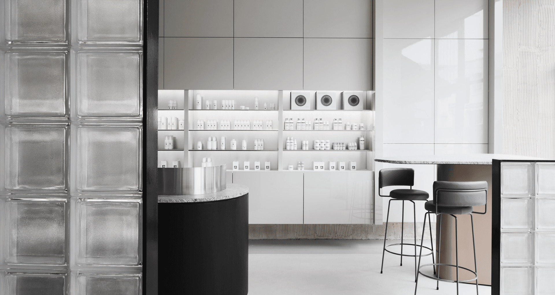
Seen Skin is a holistic beauty and wellness space tucked away in the heart of Melbourne, and its refined interiors are the result of a harmonious collaboration between builders, S&K Group and design firm, Golden. The team were tasked with creating a design scheme that presented a physical manifestation of the brand’s ethos of striking a balance between aspirational and authentic skin health.
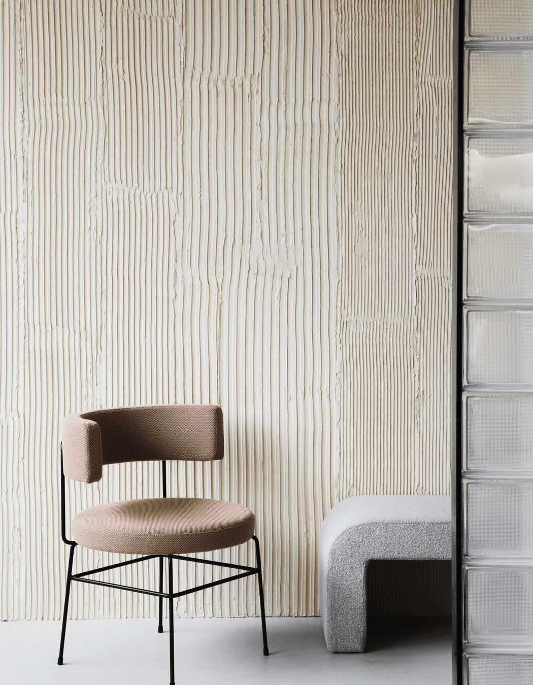
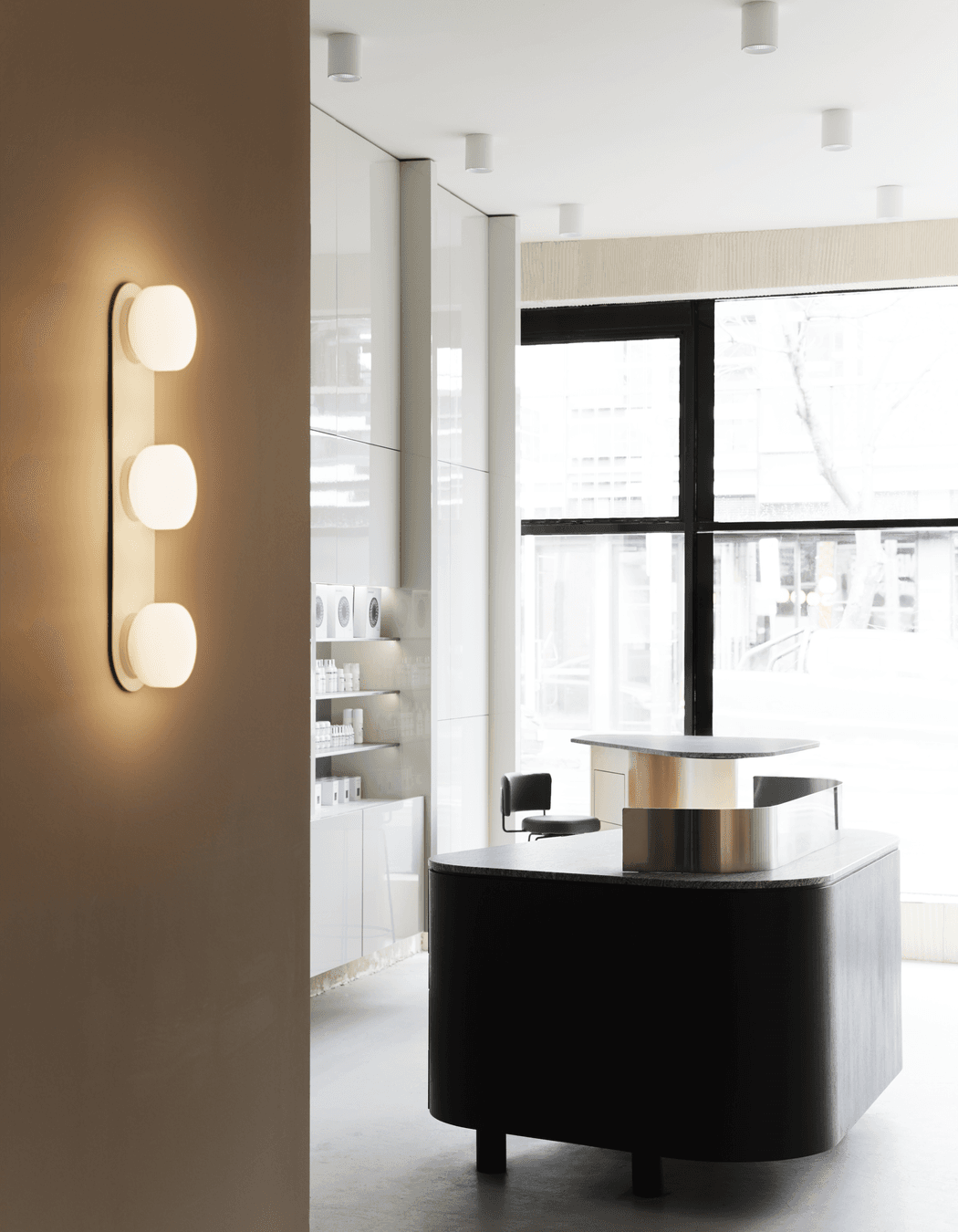
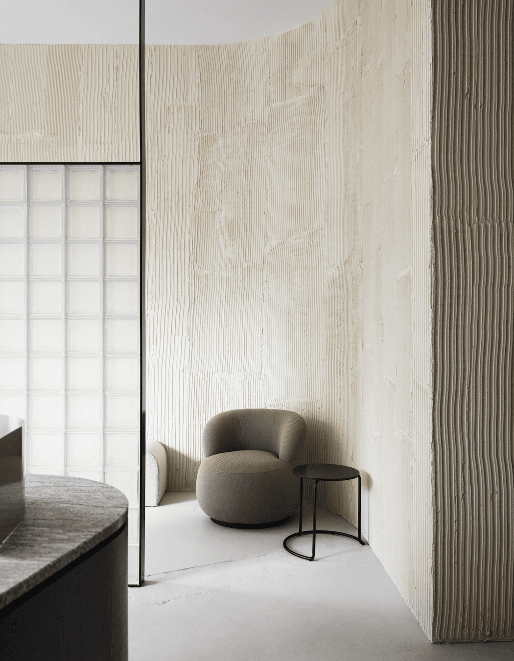
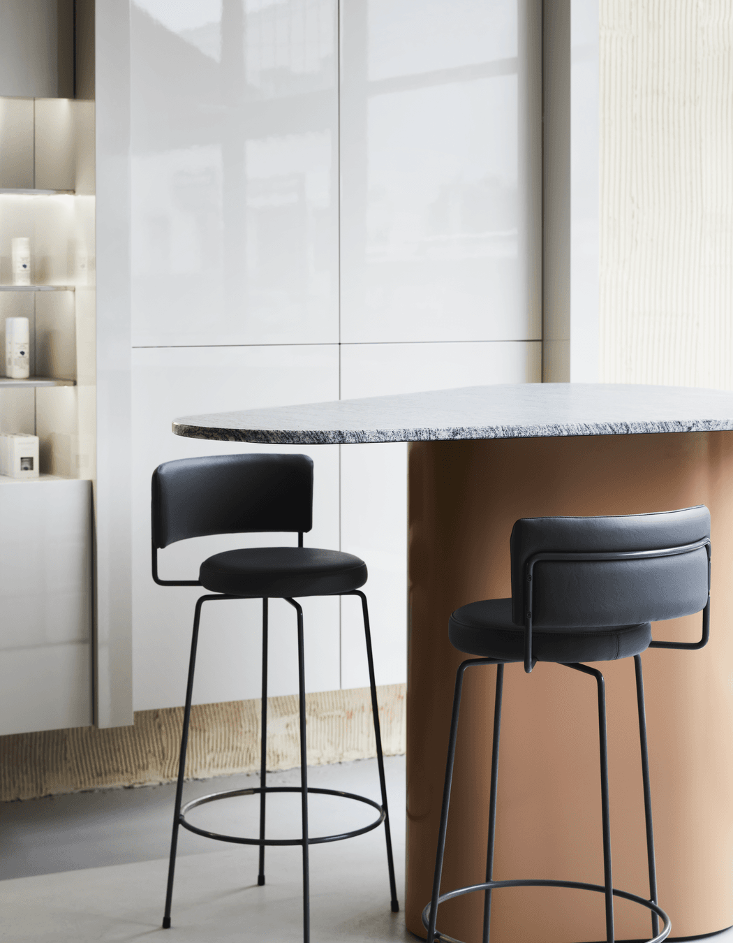
The design outcome is a pared-back aesthetic that uses colour and texture to create warmth, contrast and depth. Polished materials have been juxtaposed against raw surfaces and fabrics, then bathed in a tonal palette of earthy neutrals that highlight their beautiful tactility. Granite, render, glass bricks and jute have been used to build a calm and inviting environment for clients to enjoy, with an elevated aesthetic that extends into every treatment room.
Lessons in design
Apply these decorative techniques to your own home or project to recreate your favourite elements of Seen Skin.
Use shape to soften minimal design
The interior architecture of Seen Skin is clean, sleek and minimal with lots of hard clinical surfaces. However, the use of rounded forms – the table, reception desk and furniture – softens the effect dramatically, a styling trick that can be applied to residential spaces, too. Choose occasional chairs, bar stools, coffee and side tables that have rounded, shapely or organic forms, and ensure the upholstery is of a tactile nature, such as linen, leather or boucle.
Create warmth with raw materials
Although sleek and contemporary, Seen Skin emotes a welcoming feeling thanks to the clever use of grain. The hand-applied wall render, glass bricks and jute wallpaper are examples of this technique. Recreate this in your own home by applying limewash, textured renders, grasscloth or sisal wallpapers to walls, or celebrating exposed timber beams and raw brick structural features.
Build visual harmony with a tonal palette
The interior design scheme of Seen Skin has a limited palette of white, beige, black and tans accented by marble and natural materials, an almost monochrome aesthetic that makes the compact space feel open and cohesive. Tonal neutrality is a quick and easy way to make any home, regardless of style, feel elevated. Do it yourself by choosing a similar palette, then use the lightest of the shades as your foundational base, the darkest as your accent colour and everything in between for furniture, homewares and cabinetry.
Shop the look
Feeling inspired? Consider introducing these gorgeous products to your own home to create a similar interior scheme.
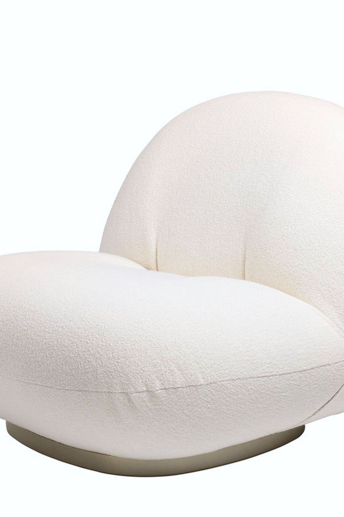
A luxurious swivel accent chair upholstered in boucle is the furniture item du jour, and it sits just as pretty in French-inspired interiors as it does minimal, contemporary, mid-century and Hamptons themes.
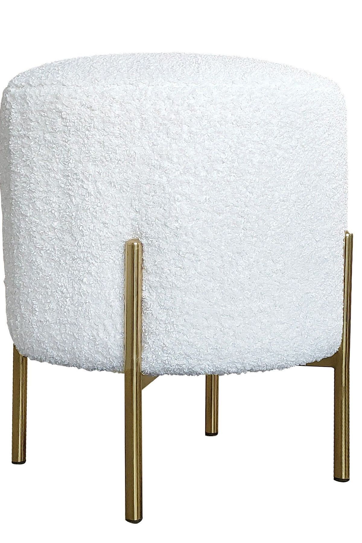
No living space is complete without an ottoman. It’s a versatile piece of furniture that functions as extra seating for unexpected guests, and allows you to put your feet up after a long, hard day at work.
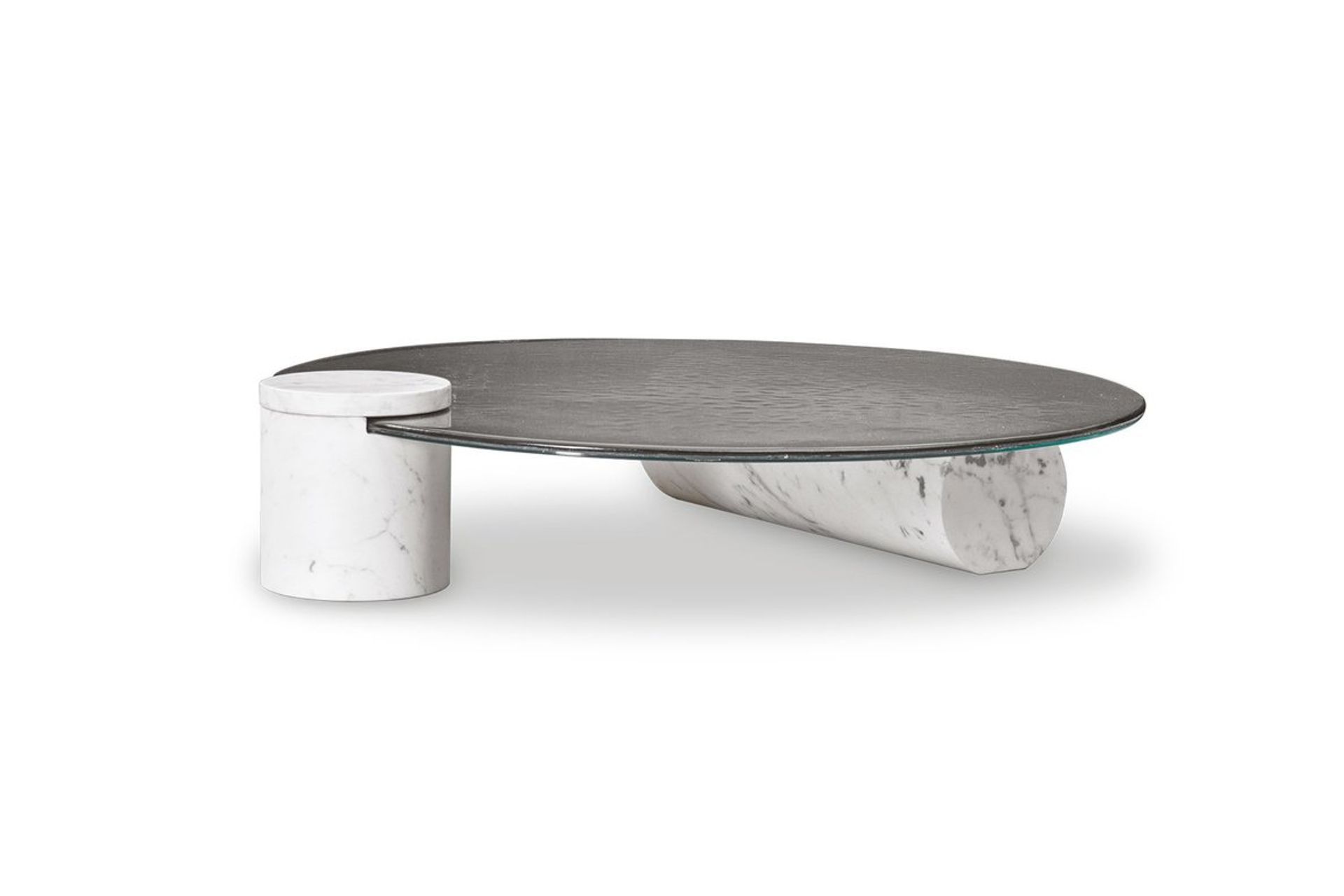
With chubby column legs, a rounded top and unusual composition, this coffee table ticks all the boxes for shape, contrast, texture and creative ingenuity. Added bonus? It has massive style cred.
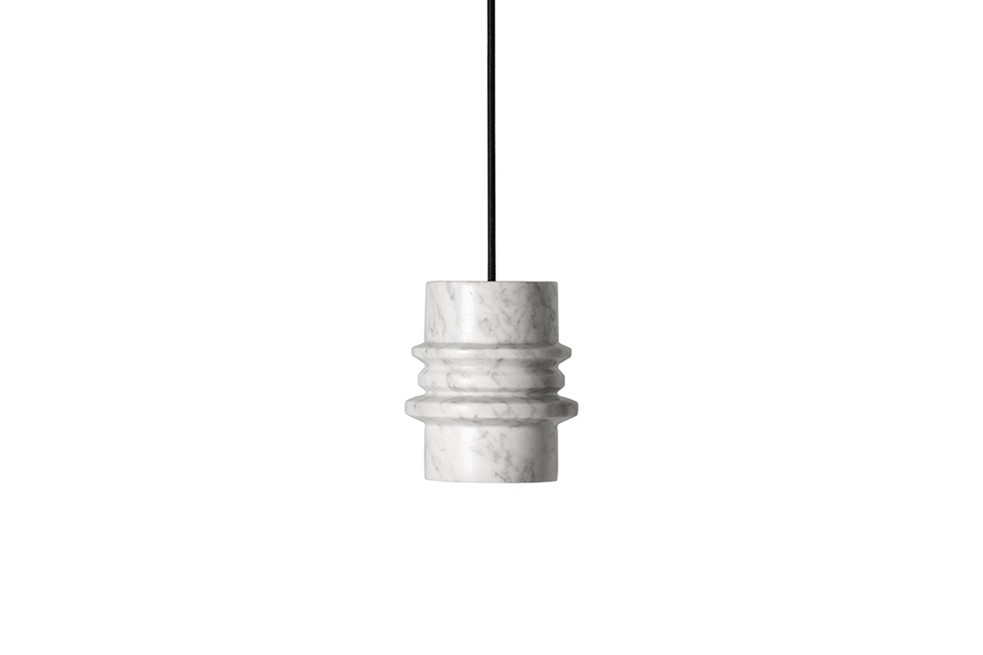
Although small in scale, this rippled marble pendant has visual weight that, when installed, will draw the eye towards your ceiling without obstructing sightlines, creating an illusion of height and space.
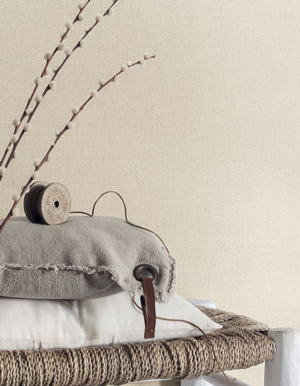
Add subtle texture to your walls with linen wallpaper. Available in a range of colours, this product has endless creative possibilities that can be applied to suit Scandinavian, Japandi or Mediterranean-style interiors.
Browse more beautiful commercial projects on ArchiPro.
