From a paddock to a sense of place in the Southern Highlands
Written by
09 July 2023
•
5 min read

As you drive away from the bustle of Bowral’s busy café and shopping scene along the rolling green hills of the Southern Highlands, you’ll come across a luxurious property, with a lavish home at the centre of the semi-rural 11-acre estate.
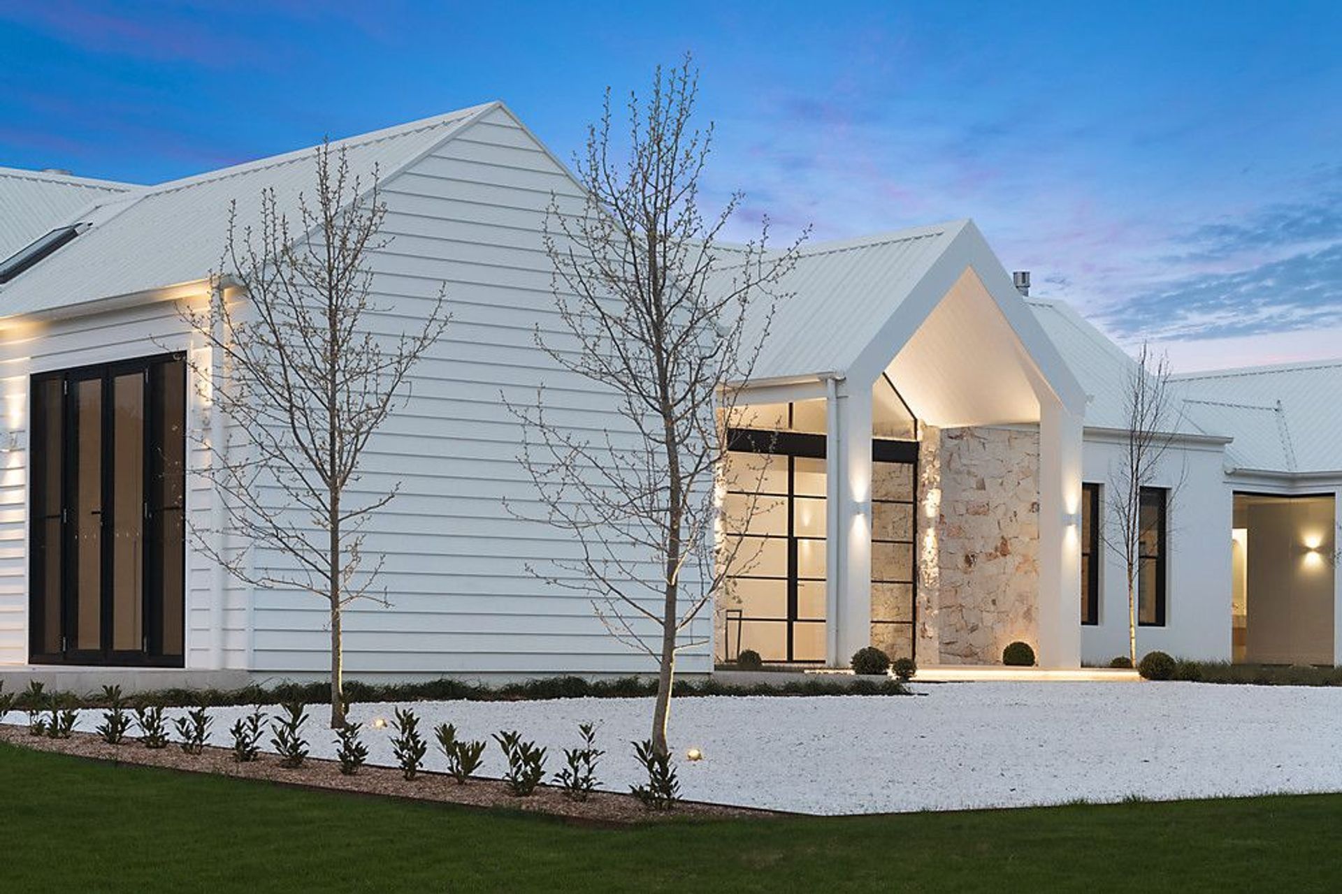
Once a blank paddock, Herald Park is a generous yet comfortable home that makes the most of the surrounding landscape, offering breathtaking panoramic rural views to form a sense of place and delight for its owners.
Eventually, there'll be a garden that grows, but initially, our goal was placemaking, as I like to call it... to give you a sense of arrival
The brief
The modest brief from an exisiting client was for a “contemporary and practical home, taking full advantage of the site”. Martin O’Toole, Director of Martin OToole Architects, notes that each new project presents the opportunity to create something unique and delightful.
“That’s something we do well; I get comments every year from clients as they discover new things about their house. It takes years for them to fully discover the house as they experience it through the seasons,” remarks Martin.
The constraints
While an expansive, level plot sounds like a dream to work with, turning a paddock into a semi-rural lifestyle property requires some experience.
“As a country firm, I’m used to working on acreage. City architects could struggle with acreage because they're unfamiliar with not having any constraints. They’re used to having side fences and building envelopes and council regulations,” explains Martin.
“The block, while it had some beautiful aspects with views towards Mount Gibraltar, it had no trees, so it was just a blank paddock. The important thing for us was creating a sense of place,” continues Martin.
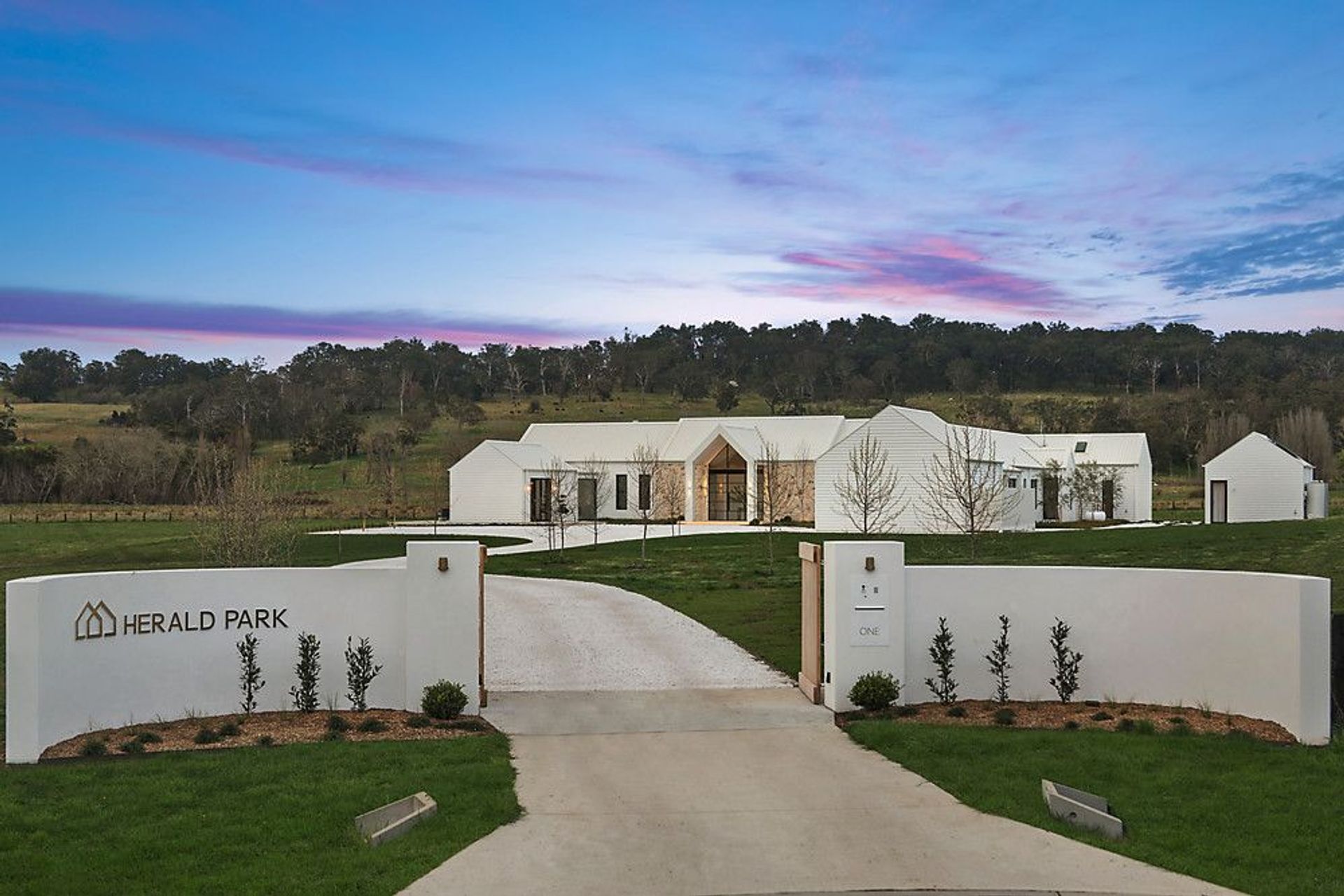
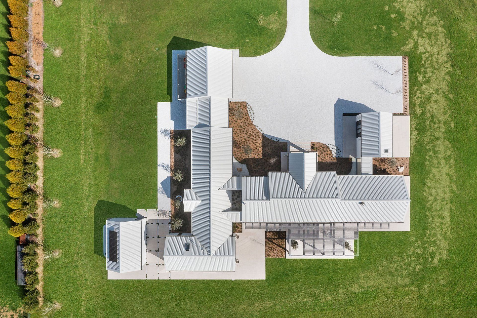
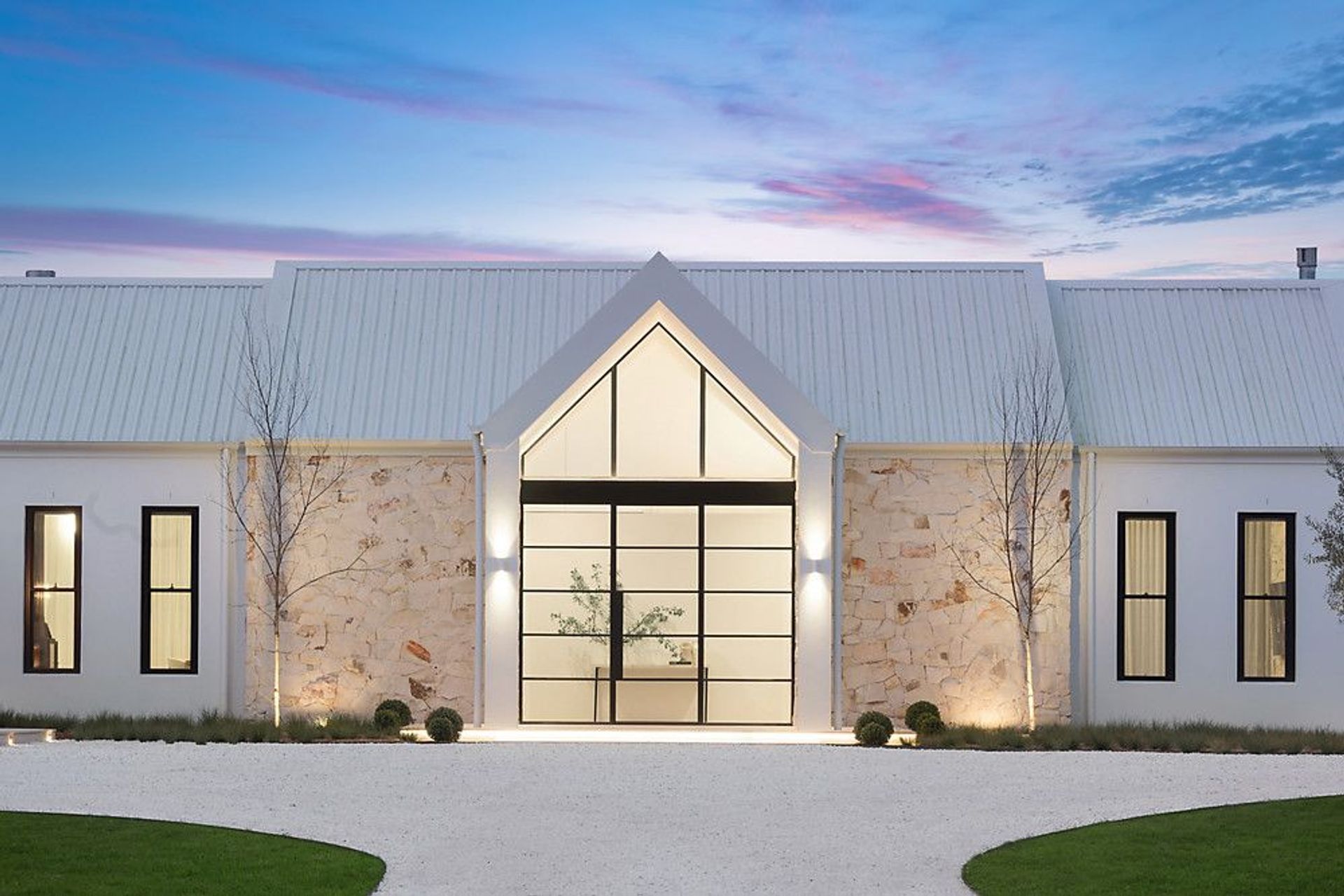
“Eventually, there'll be a garden that grows, but initially, our goal was placemaking, as I like to call it. And that’s why we deconstructed the building to a degree – pulling it apart and creating pavilions and courtyards to give you a sense of arrival,” O’Toole adds.
The design
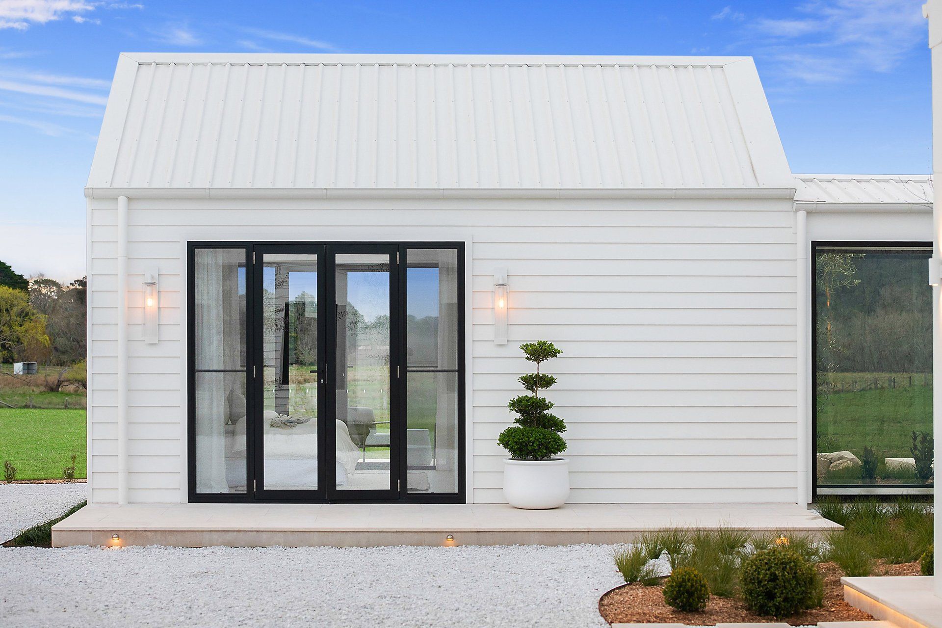
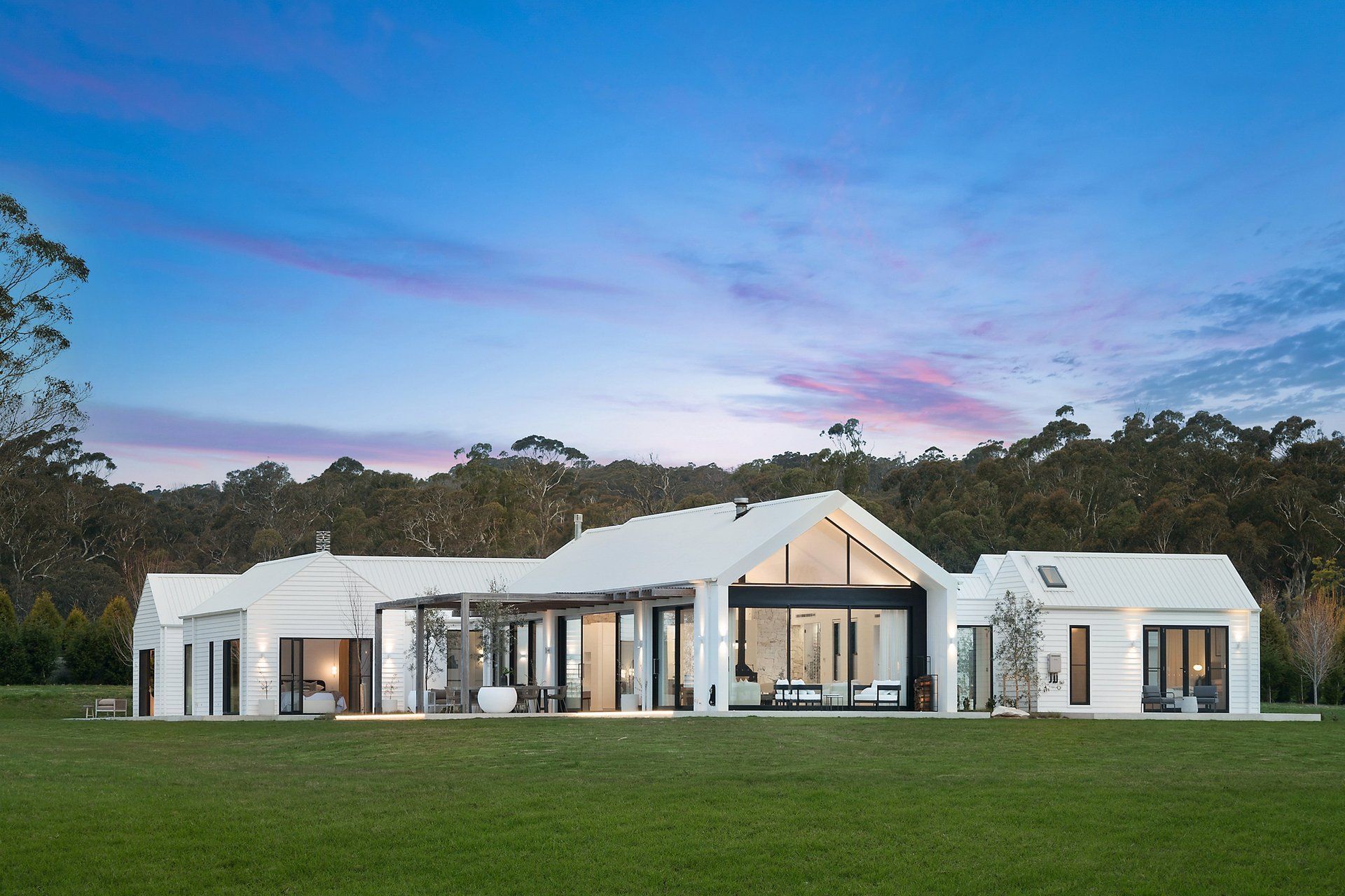
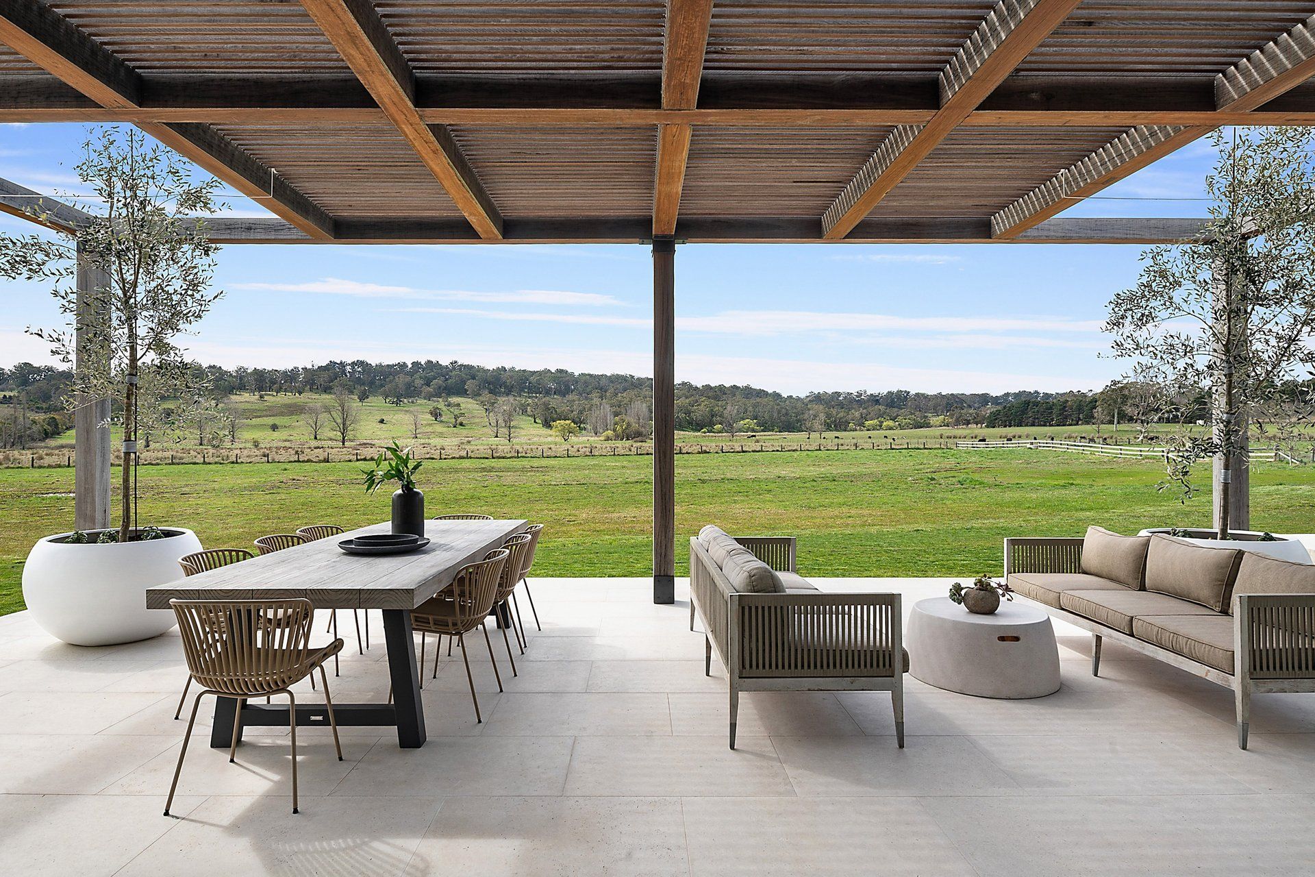
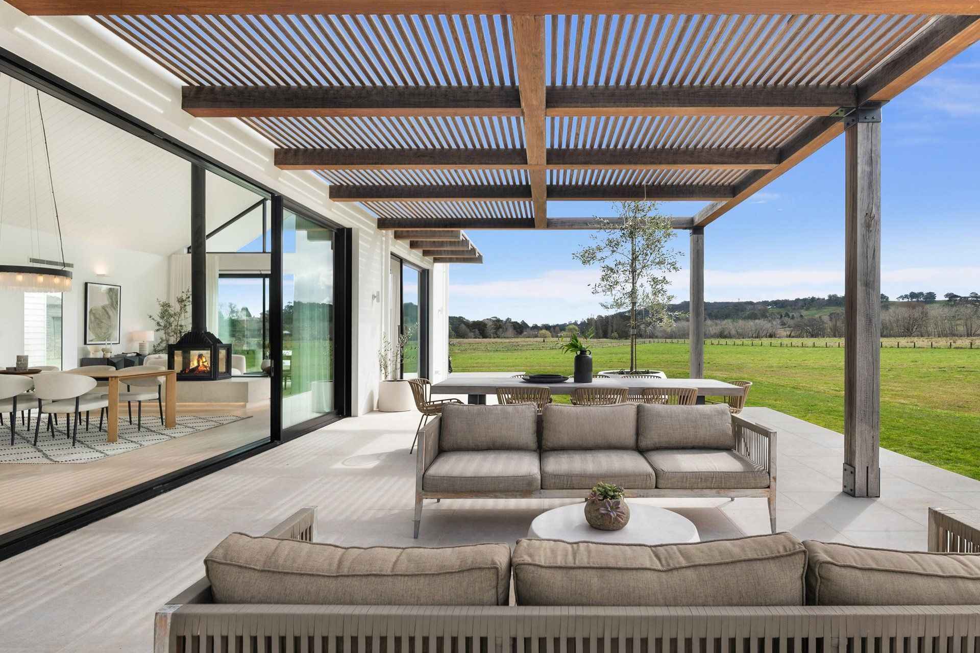
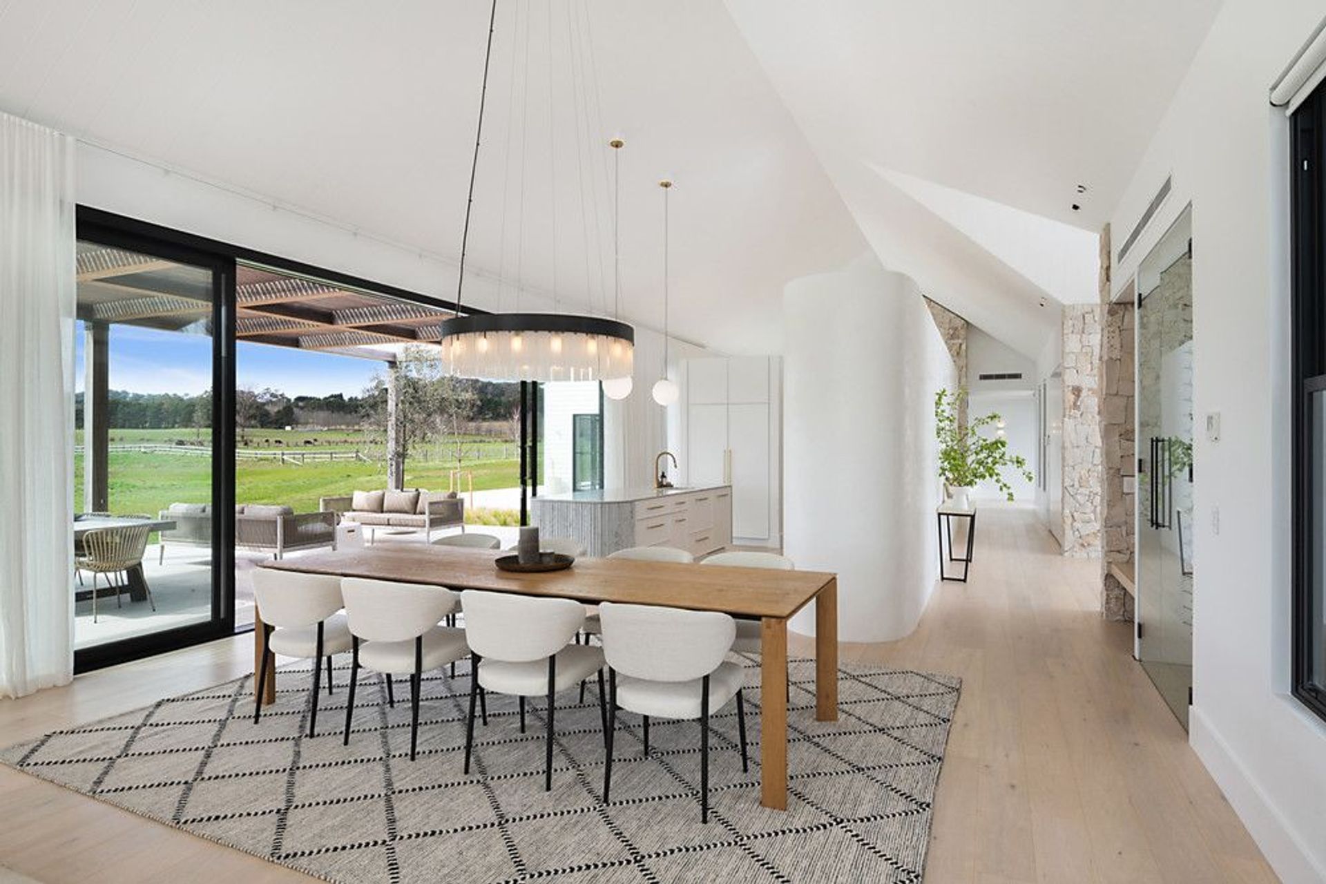
The L-shape design holds five bedrooms and three north-facing sundrenched living areas, including one nestled into a convenient separate guest studio.
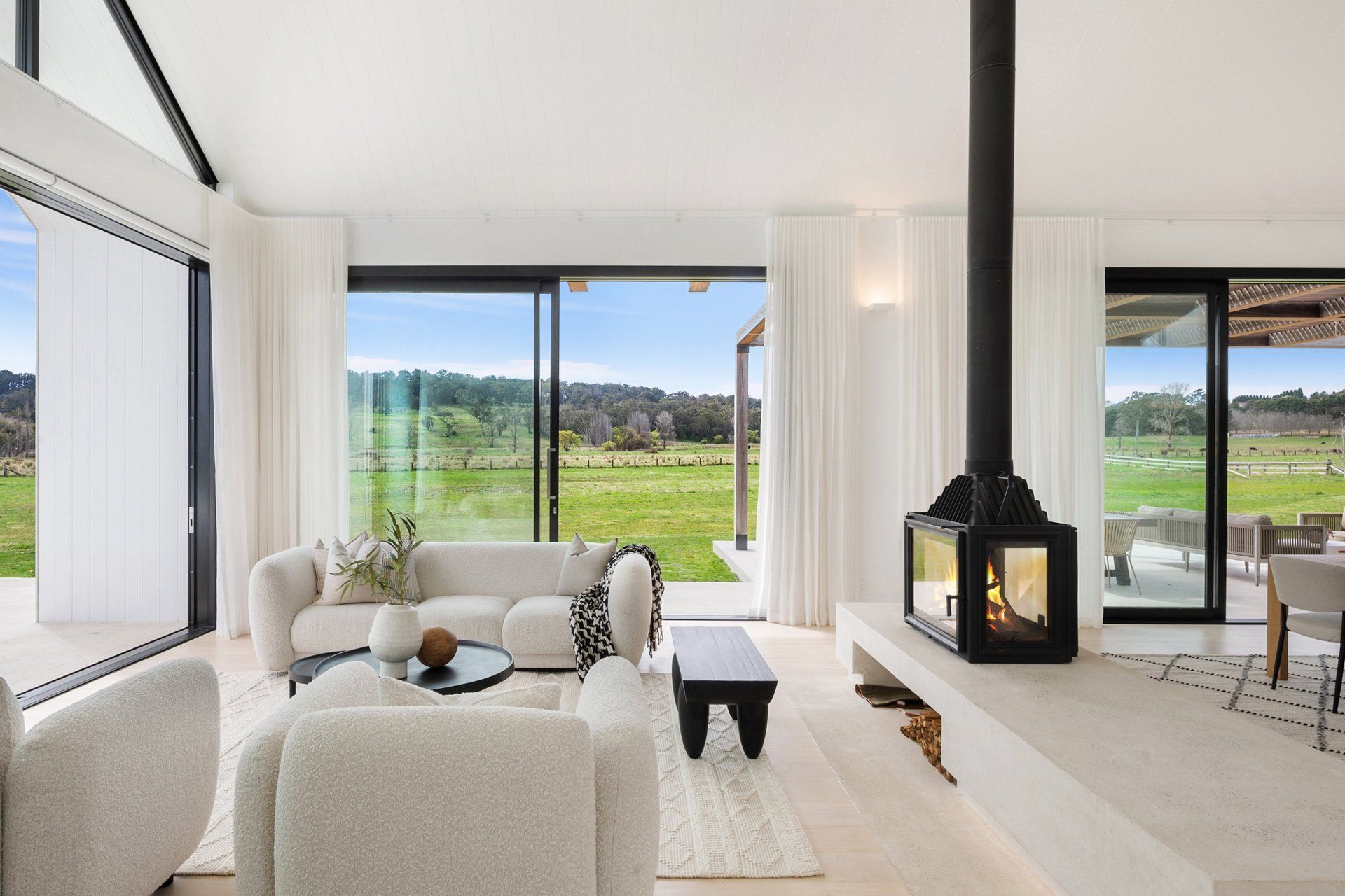
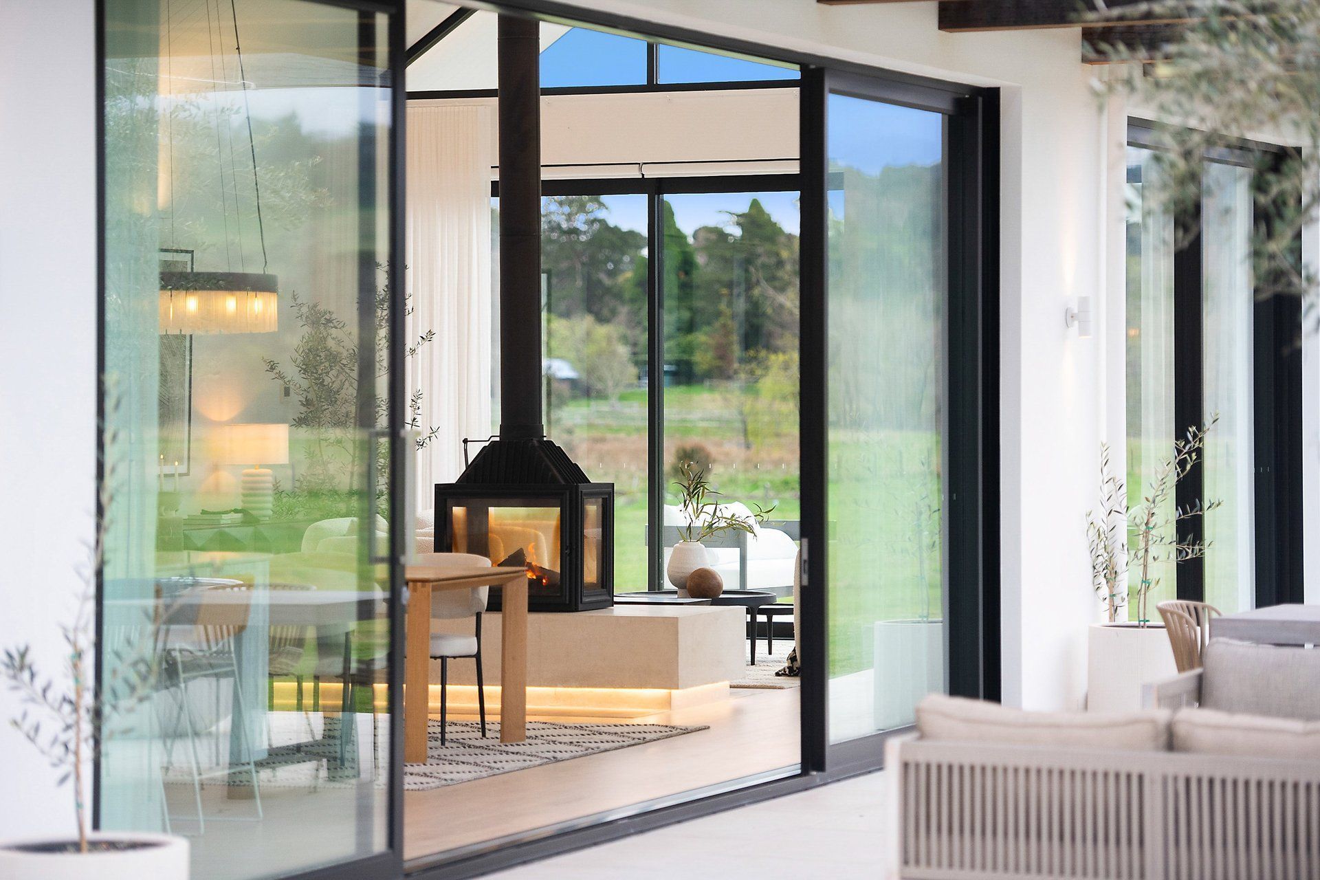
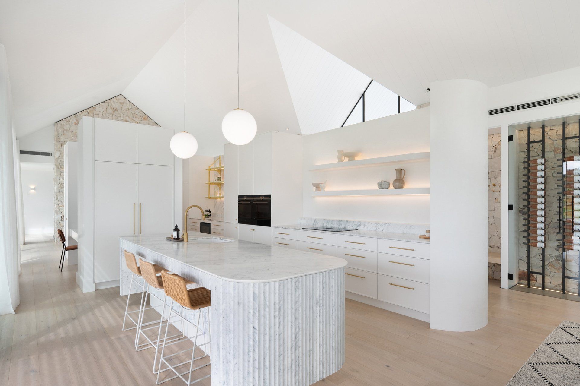
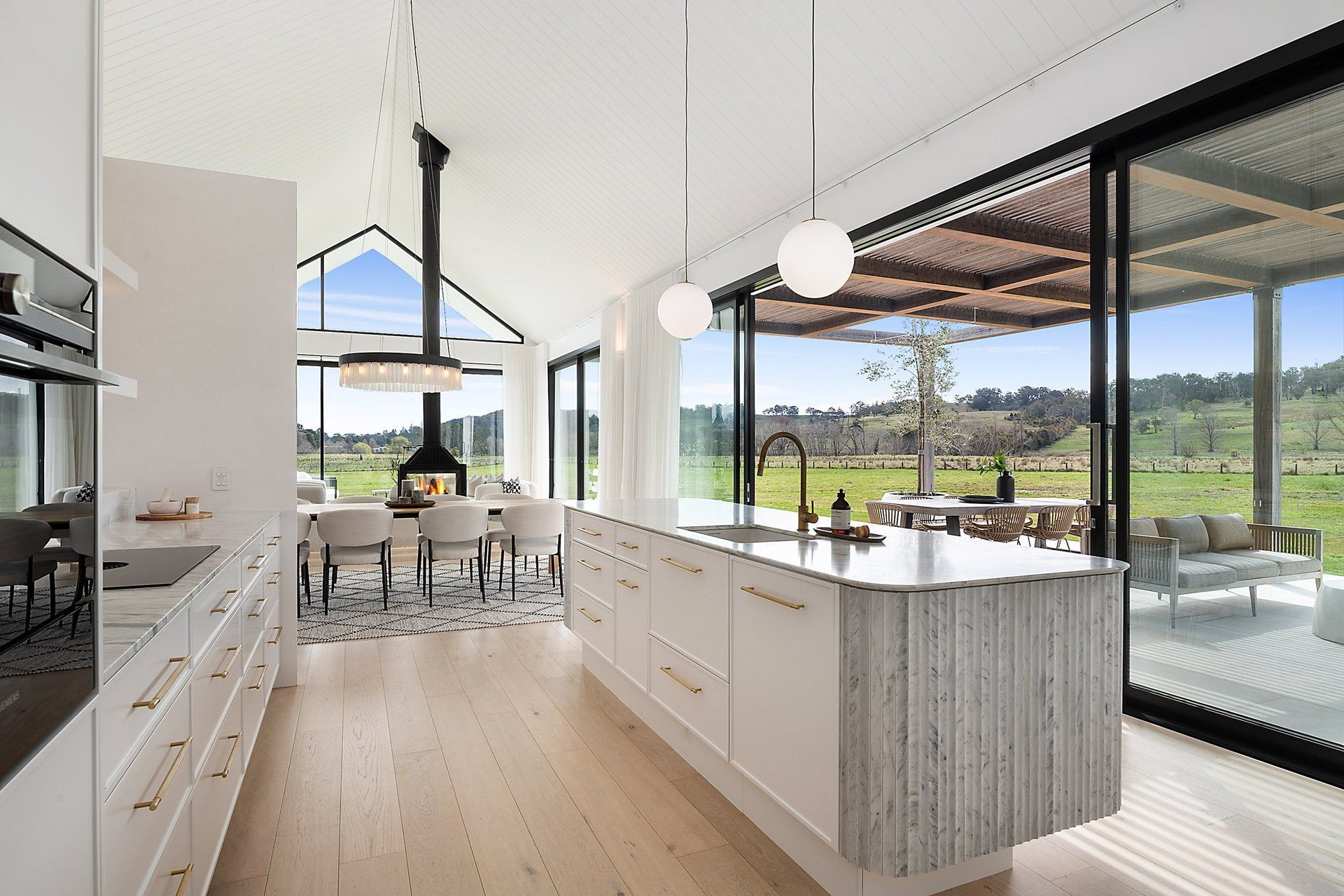
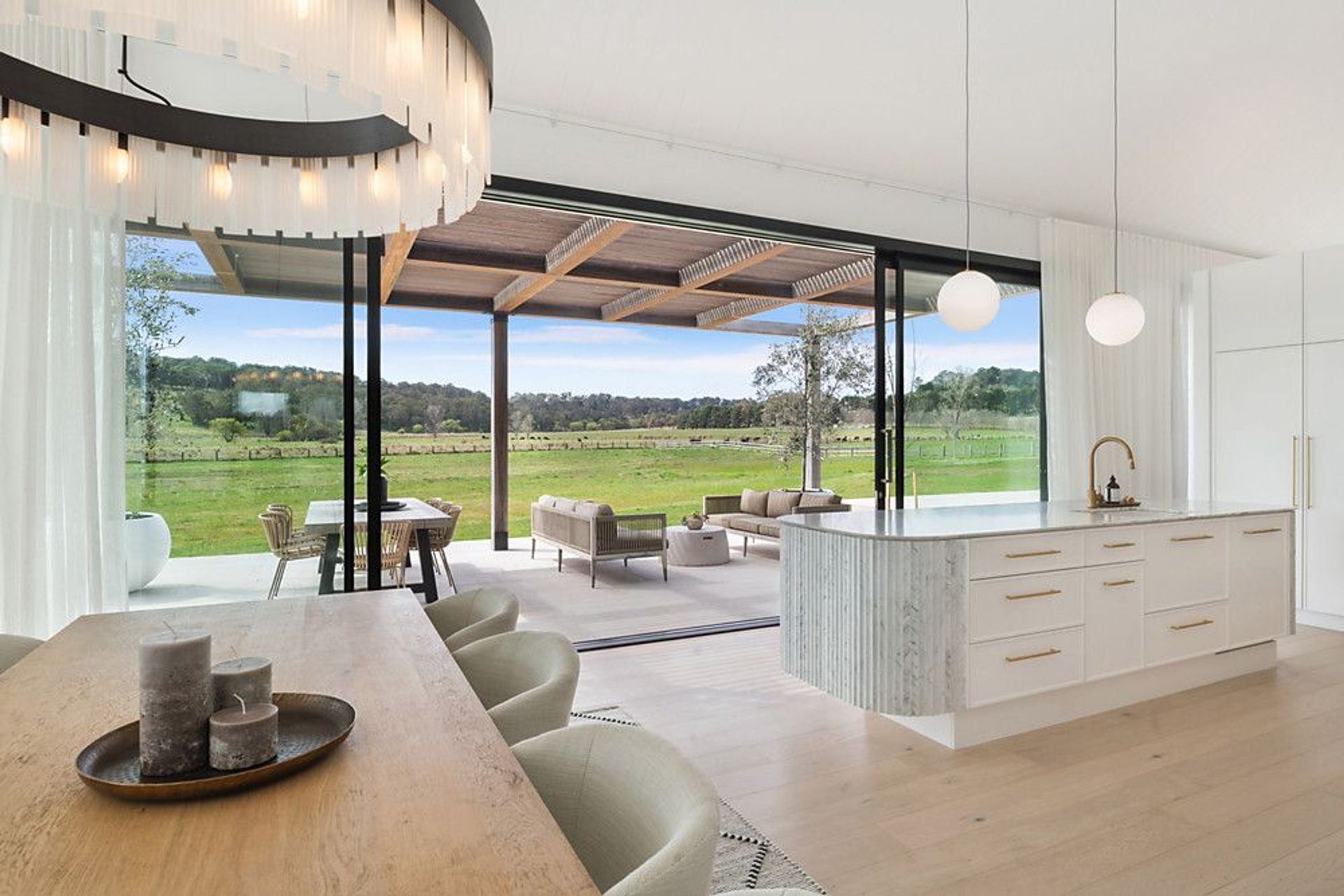
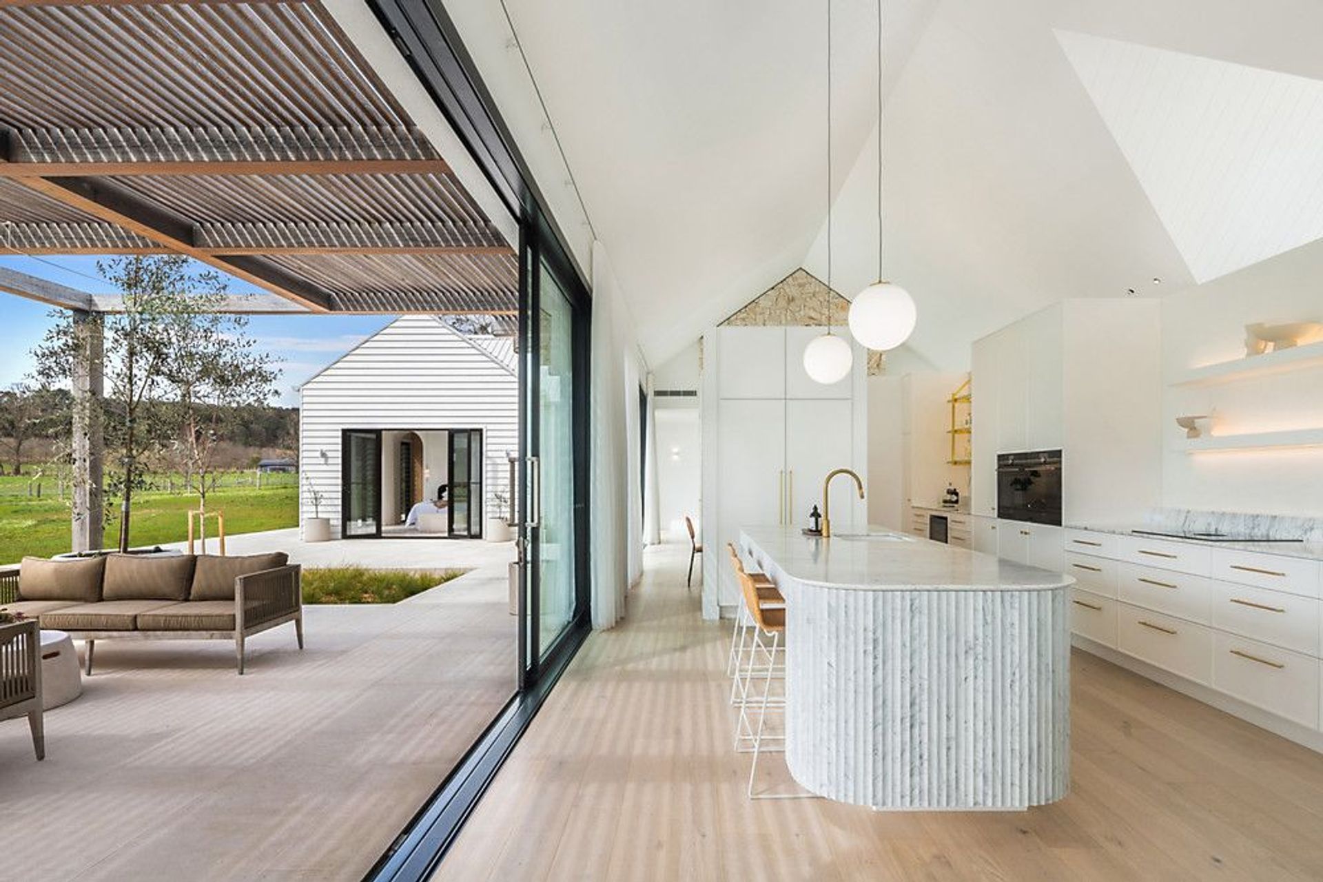
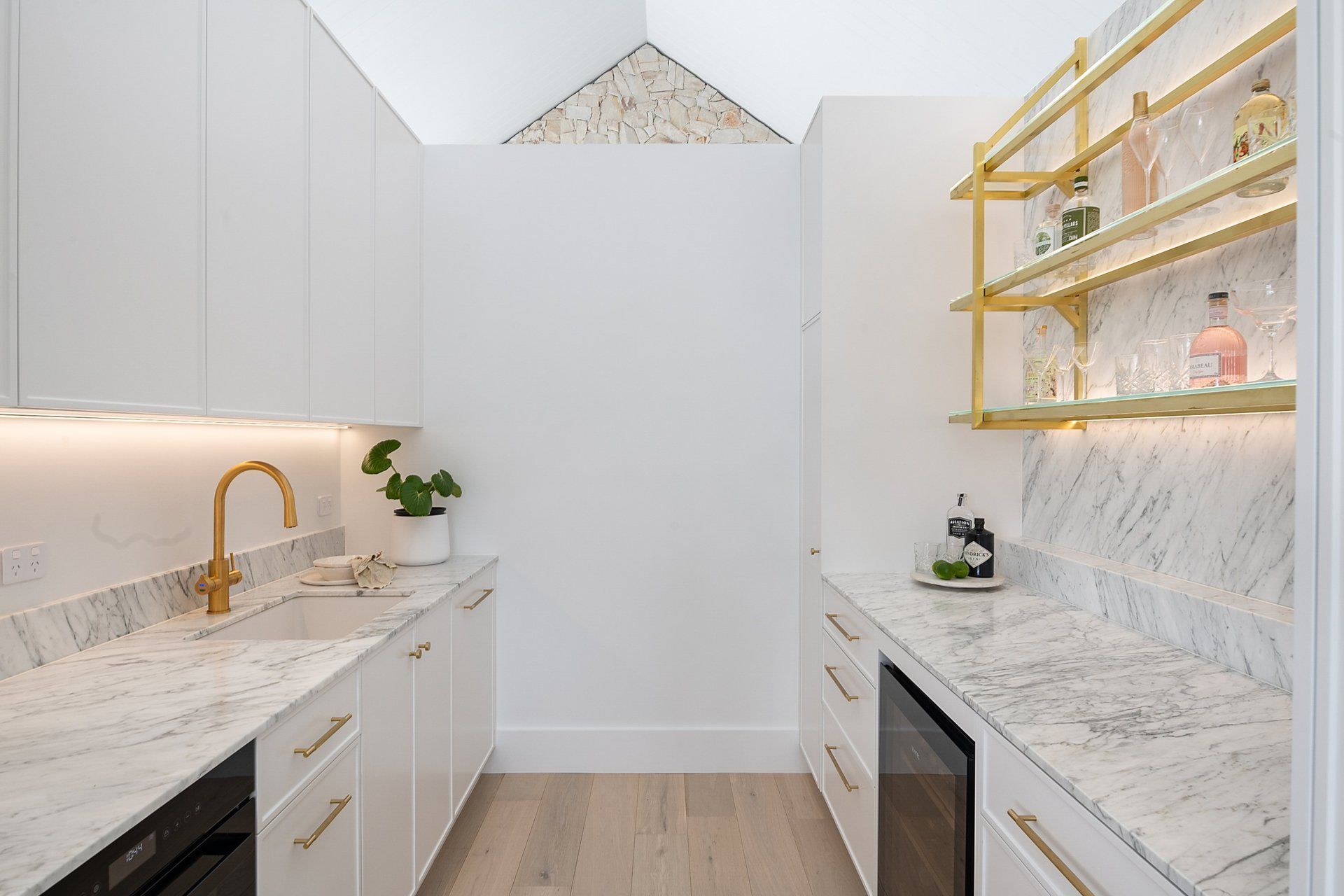
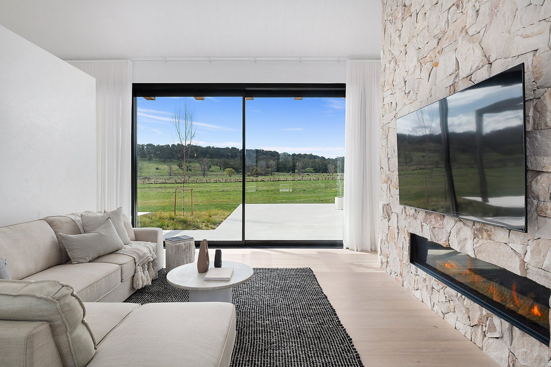
The central hub of the home encompasses the galley-style kitchen with a curved island clad in custom fluted marble, and a main living space with a woodburner fireplace as its focal point. This space extends past the media room and splits into the east wing, which houses the bedrooms and utilities.
“For Martin, a rural house is not about the house at all but about framing the views.
“For me, the house is a vehicle of connecting and engaging with the site. Even the way you arrive, when you walk through the entrance; an entrance is important because that's the first place the person will touch the building,” says Martin.
“I think it's a real shame when, particularly with country homes, the front door is not used, and people come around the back. We design houses so the front door is used because I love the ceremony of people arriving and people leaving the house,” adds O’Toole.
“Sometimes you get these glass pavilions, and you just look straight through them. I like the unfolding and the discovery of views as you pass through the house, so we deliberately frame them, and you sort of discover them as you go through the house,” says Martin.
I'm not into paper architecture. Our designs get built, and to do that is to use materials that are practical.
The outcome
Herald Park looks comfortable within its landscape, as though it's always been there thanks to the exterior’s classic and conventional materials; a combination of smooth render, Artisan Exterior sandstone and James Hardie Scyon Linea weatherboard. “I'm not into paper architecture. Our designs get built, and to do that is to use materials that are practical,” explains Martin.
“I'm looking for classic materials that don't date, and durability in a building is essential – not only the structure of the materials, but in the way they wear and age.”
Greeted with an expanse of black-framed glazing surrounded by sandstone and humbled with weatherboard, the grand entrance and Venetian plaster wall foyer draw visitors inside, building anticipation for what’s beyond. While the sandstone continues within the interior, there’s restraint used with the quantity of stone to avoid dominating the space, creating warmth and texture while drawing the outside in.
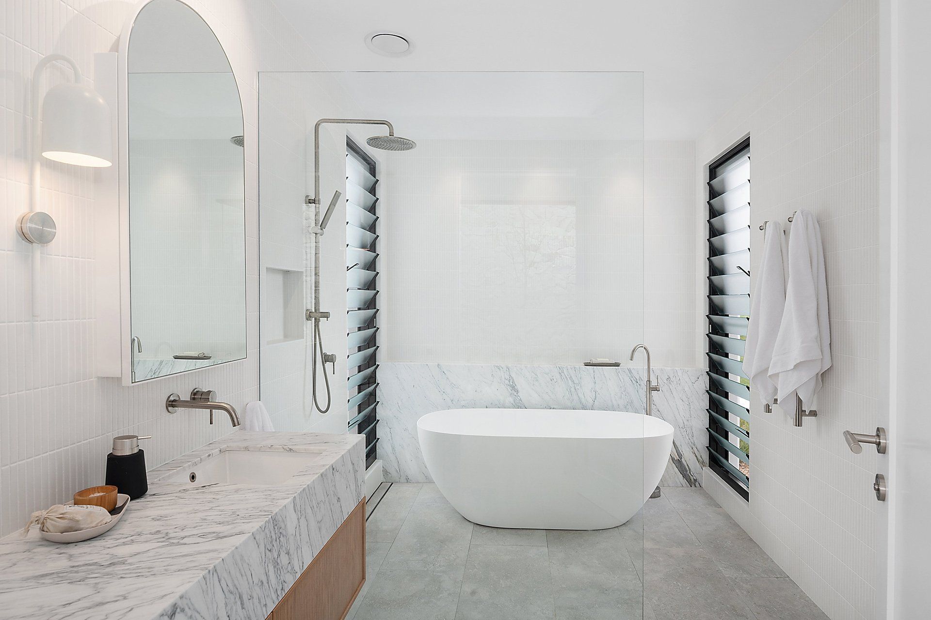
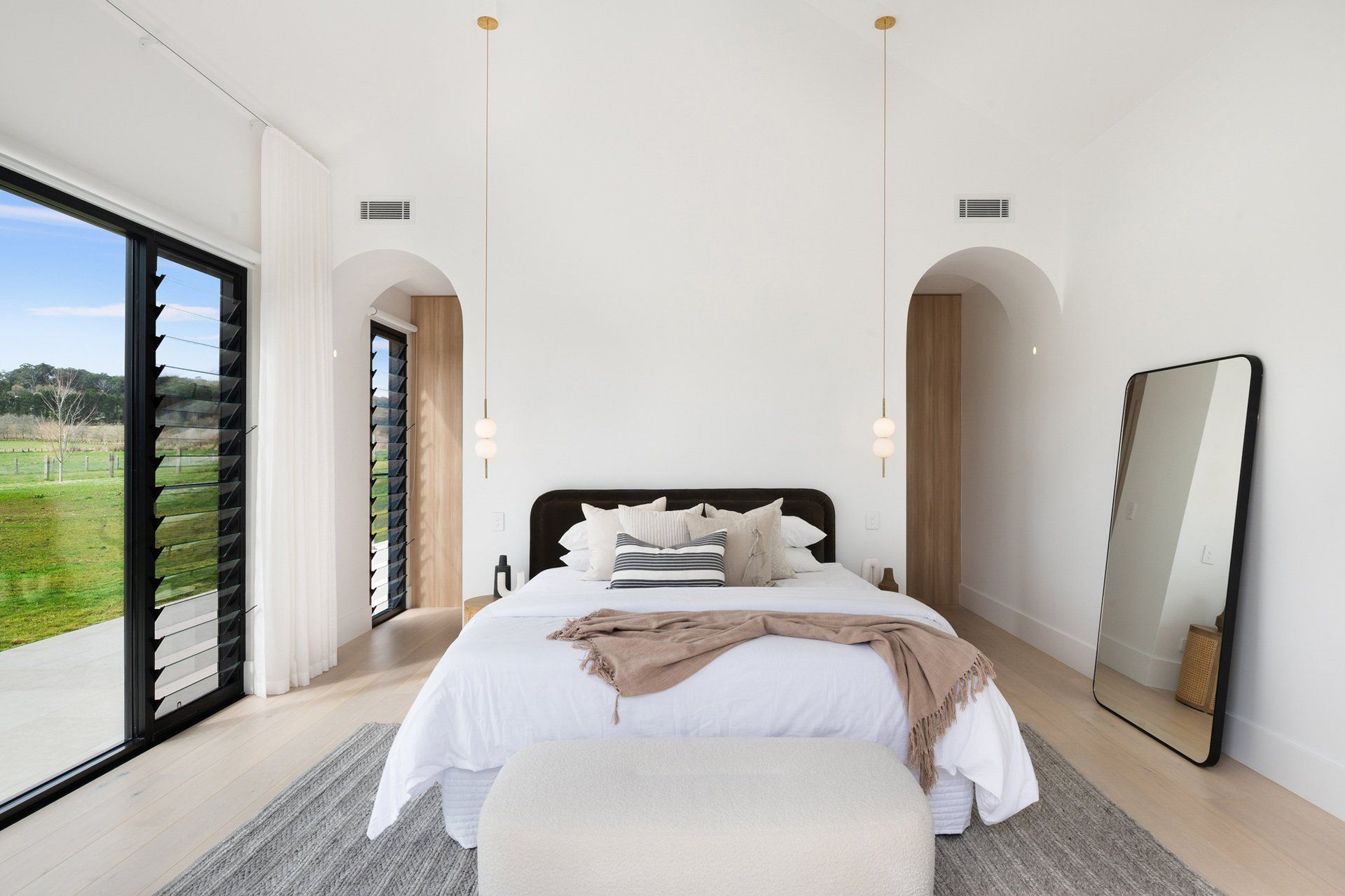
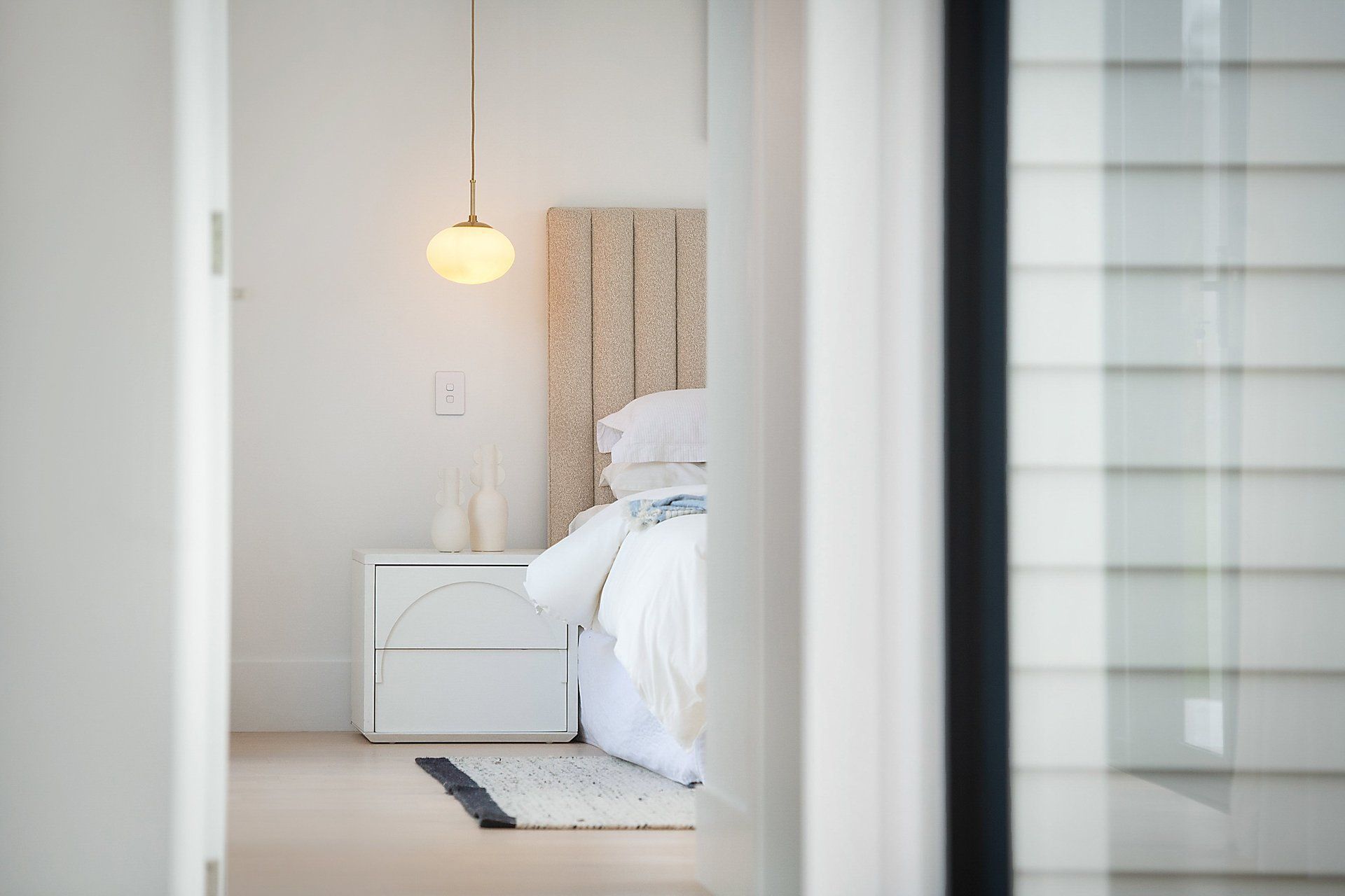
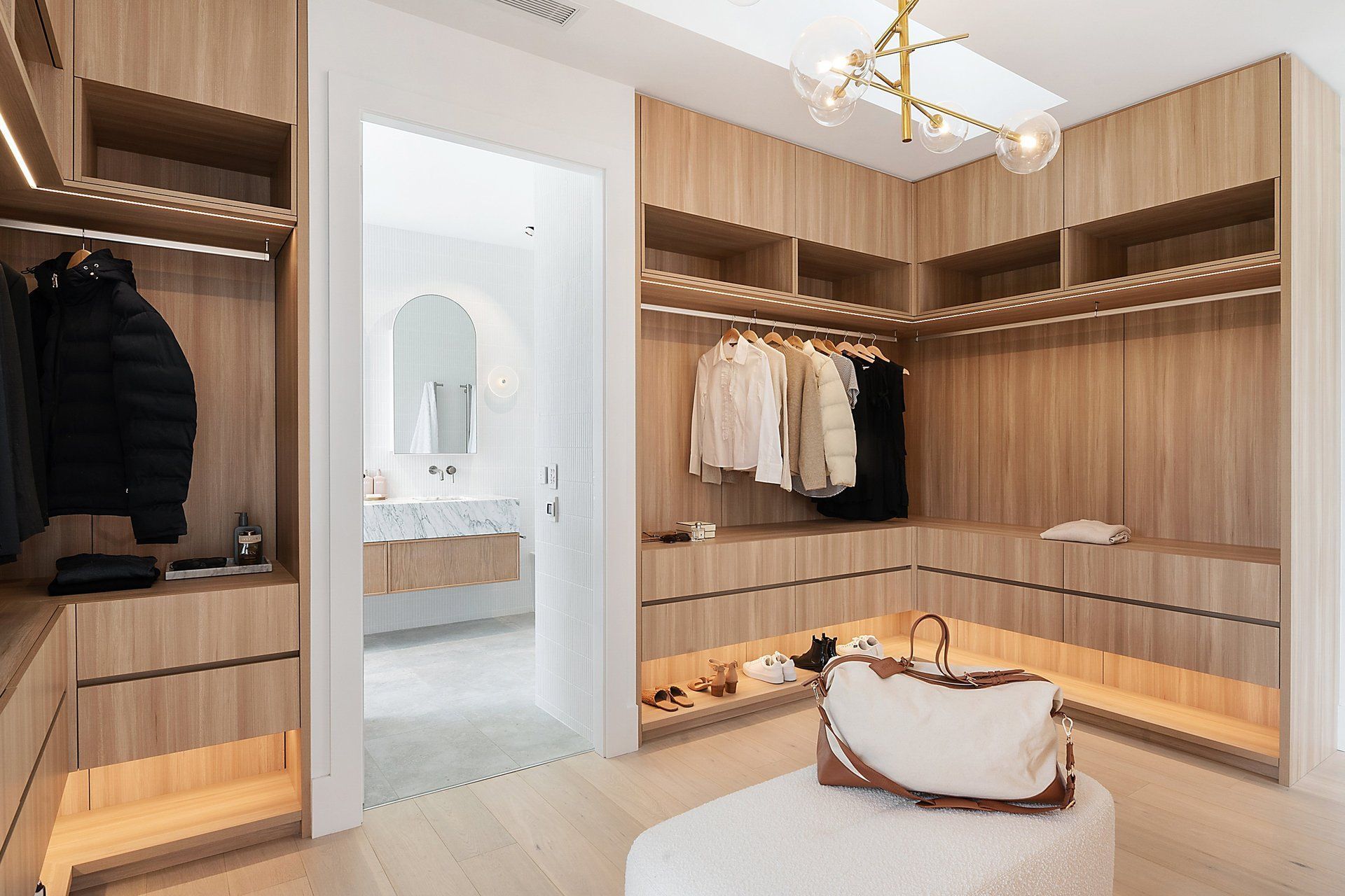
With a penchant for subdued interiors, Martin’s clever design features a functional layout and textured materiality, creating a homely feel. “Our interiors are quite understated, and that's because I want the people who live in the house and the views to be the heroes,” says Martin.
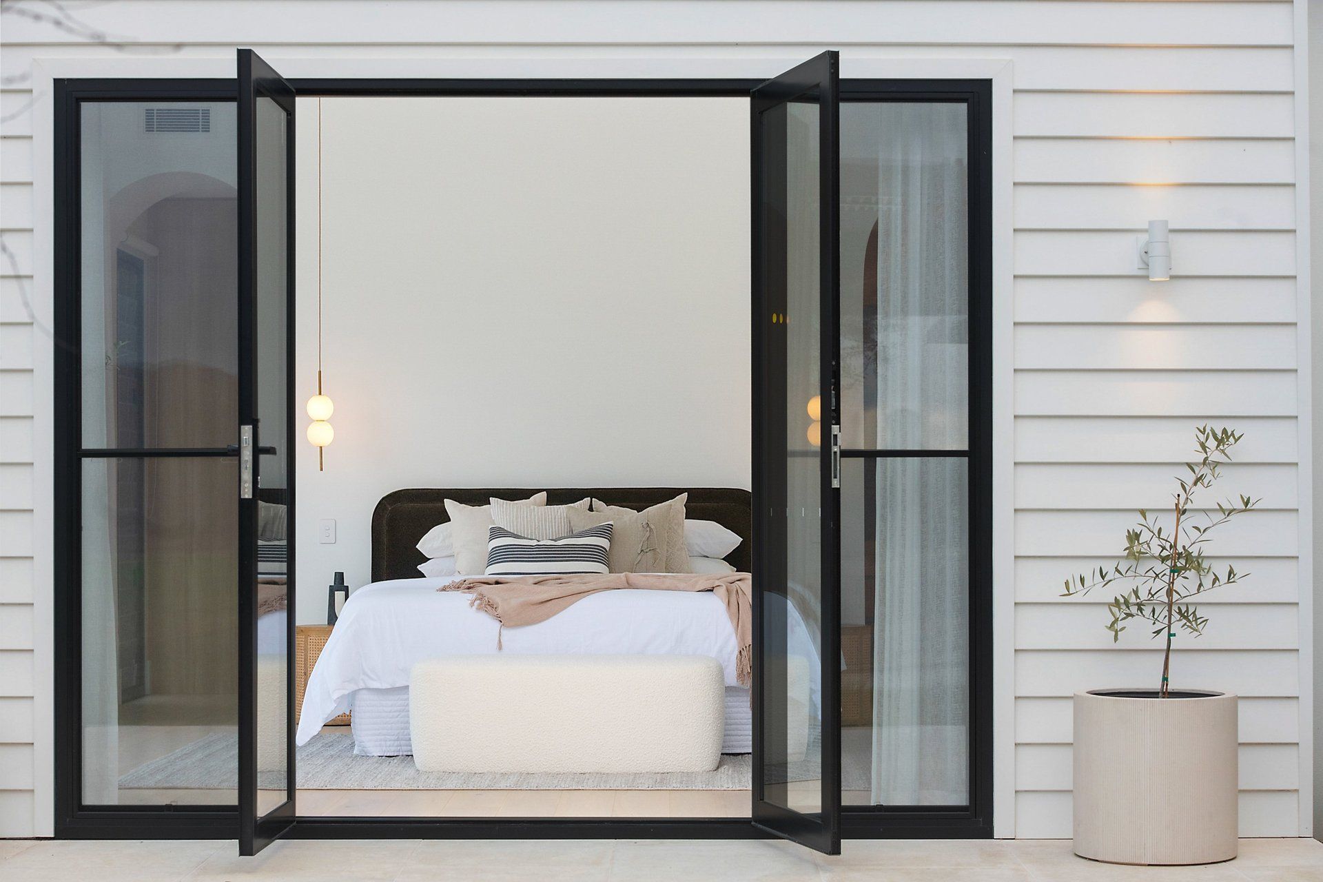
"I prefer for people to walk into a house and not be overwhelmed by the architecture. Often people will say, ‘wow, this is amazing!’ and they're not even aware of how the design is working as a vehicle for generating a lifestyle, experiencing the landscape and evoking a sense of delight,” says Martin.
