Future Classic Mad Chair Collection
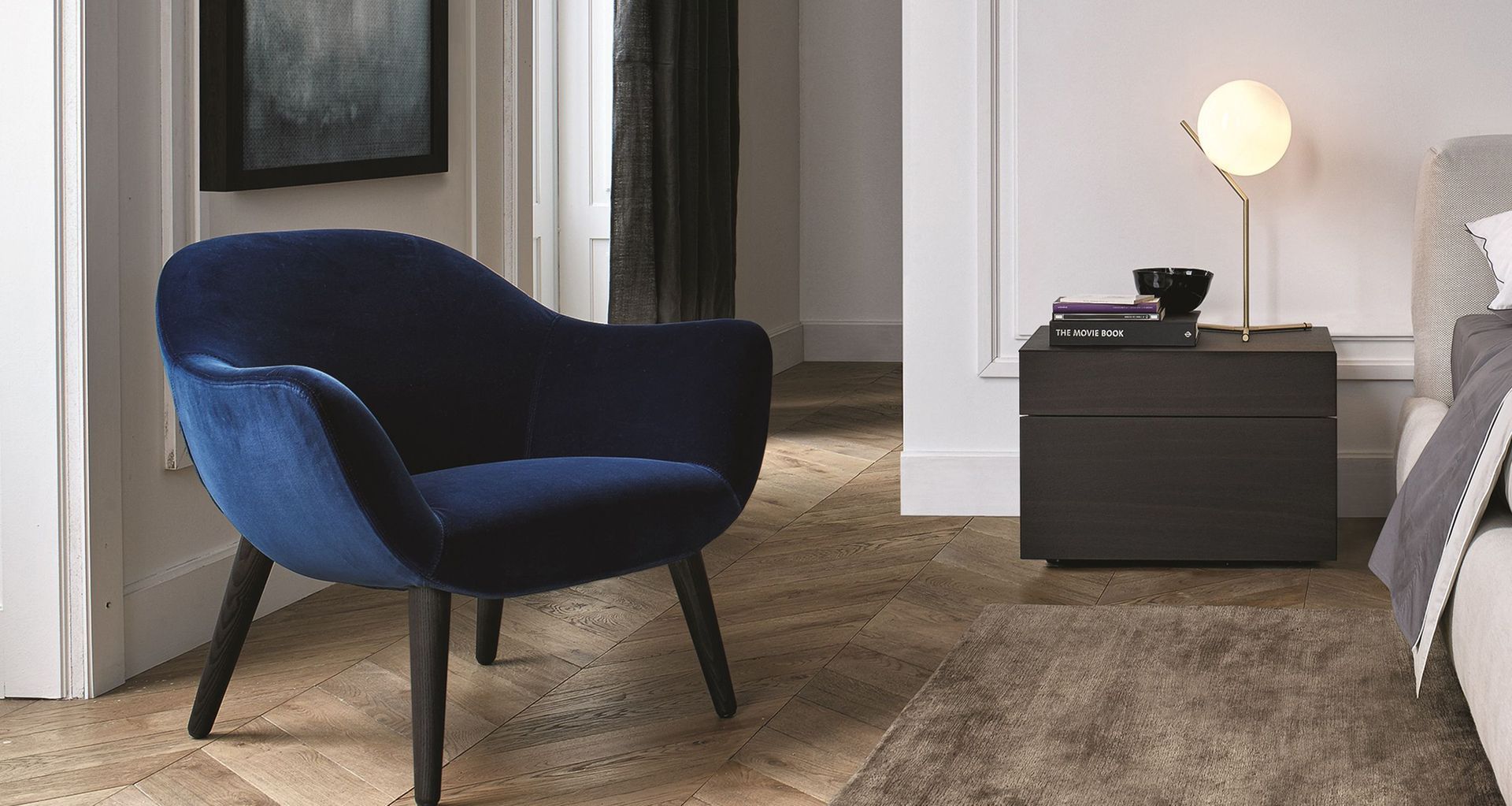
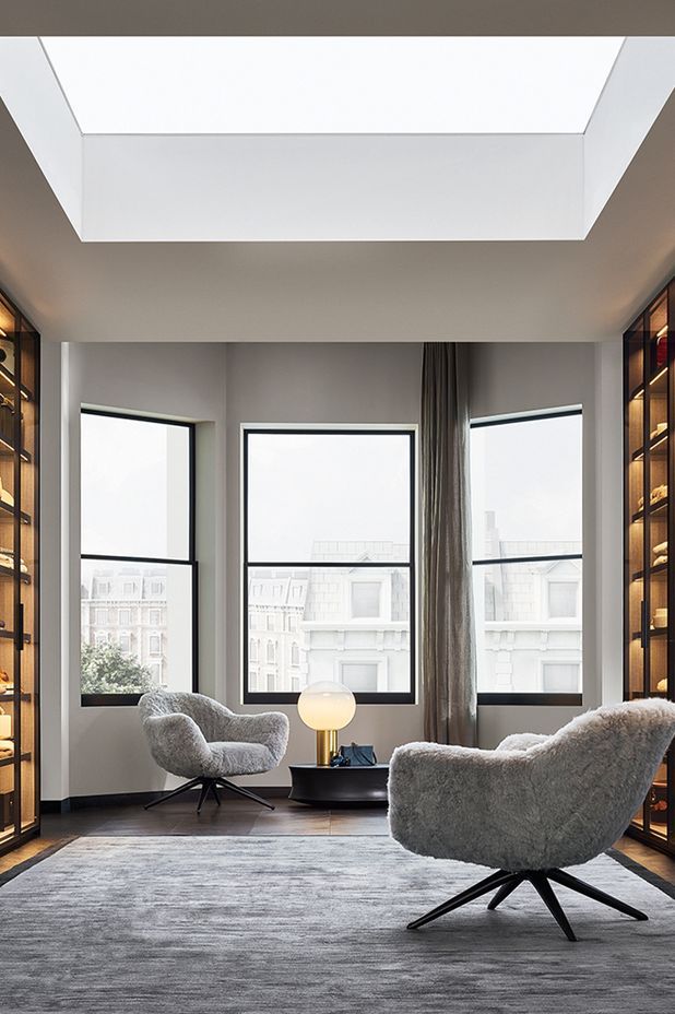
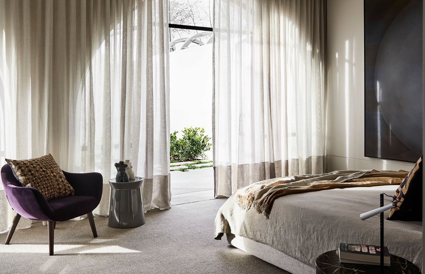
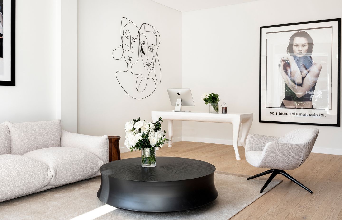
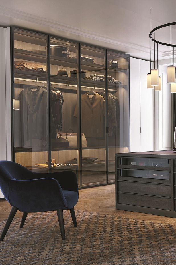
Humour has always been enmeshed in the work of Dutch design guru Marcel Wanders. Whether it was his horse-sized horse lamps or his coffee tables conceived as a pig supporting a serving tray on its back, Marcel Wanders regularly combines wit with functionality. Less confronting, but equally as clever, is his Mad collection of furniture produced for Poliform. It started with his ‘Mad Chair’, which was first unveiled at Salone de Mobile in Milan in 2013 and was followed by other pieces such as the Mad Dining Table, the Mad Chaise and the Mad Joker Chair. The Mad King and the Mad Queen chairs joined this regal collection, now seen in some of the finest living rooms throughout the world.
Those familiar with Constantin Brancusi’s work will appreciate the finesse and purity of each line. Likewise, Emmanuel’s Concorde dining table is masterfully handled with a branch-like timber base that supports either a chamfered-edged marble top or one in timber. Timeless, elegant and avoiding faddish design for the moment, the Concorde design, also released as a desk, addresses Emmanuel’s avoidance of simply ‘style’.
However, Marcel’s velvet-covered Mad chair, dining chair, armchair, or chaise lounge, is quintessentially Future Classic – combining comfort with beauty. And while it can be found in period homes, this collection also regularly appears in minimal and often cutting-edged interiors: the contrast of raw concrete walls and ceilings juxtaposed with sumptuous velvet-covered furniture.
Interior designer Jo Lawless, co-director of Lawless & Meyerson, included two olive green velvet Mad Chairs (with armrests) in an open plan living area in a house in Sydney’s Double Bay. With a generous terrace lined with timber-battened screens and a backdrop of the water, the house (an extension to a Victorian home) is calm and contemplative. “Our clients took a ‘journey’ with us, both with the architecture (designed by architect Kevin Ng, a director of MHN Design Union) and with the furniture,” Jo says. These chairs also complement the grey hues in the house, from the concrete walls in the living area to the grey module lounge suite and the customised coffee table.
There’s something quite ‘friendly’ about the design. It’s almost like being given a hug by a friend.
The chairs’ spayed timber legs are also firmly anchored on the grey textured rug and the width of the chairs, along with their curvaceous armrests, allows for the owners or friends to relax and admire the views over an entire afternoon. “There’s something quite ‘friendly’ about the design. It’s almost like being given a hug by a friend,” Jo says, who also sees these chairs as a balance to some of the more austere finishes in this luxurious home. “The olive green also worked perfectly in this setting,” Jo adds, referring to the canopy of the mature trees in the foreground. The Future Classic story was first published on Est Living, by Stephen Crafti.
