HERE magazine explores small home design

Simon Farrell-Green, editor of HERE magazine explores small home design with Artis.
If there’s a sadness around my most recent meeting with Laura McLeod, an architectural designer at Artis, it’s that the house we’re designing will never be built. Because it is delightful – modest, but with good spaces and some special touches. It has great separation between bedrooms and living areas. And it’s clad in trapezoidal steel, in Pioneer Red. What’s not to like?
A recap: for most of 2023, we’ve been working with the team at Artis, which is owned by Box, an architectural design-build company. Artis offers a system of modular design components based on sensible proportions and modest materials that can drastically reduce the stress and expense of building. We’re using a real site, in Glen Innes, Tāmaki Makaurau, and we’ve set out to design a two-bedroom house for an imagined young couple.
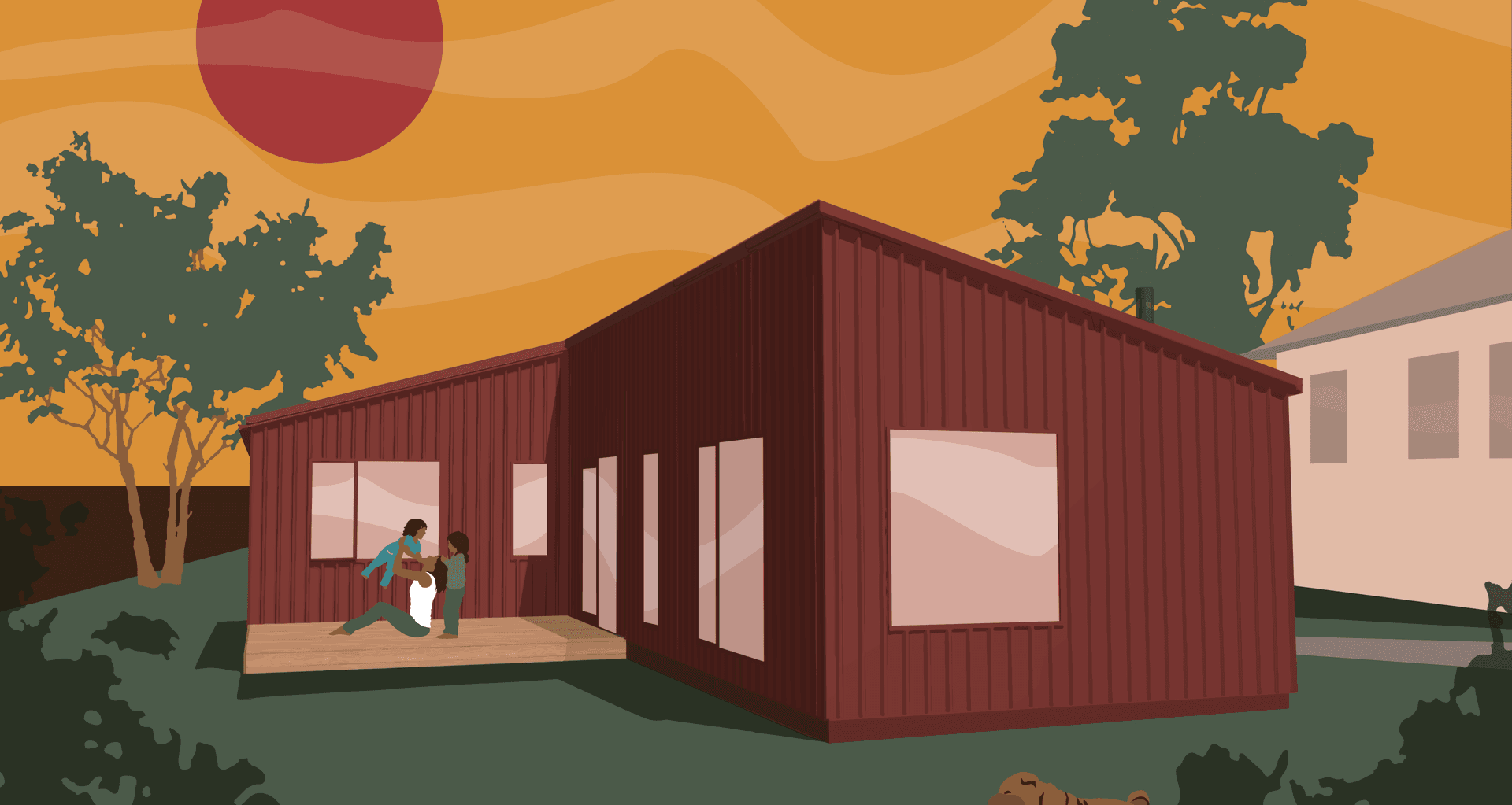
Back in the middle of winter, we sketched out the form of the house on the site, and in spring, I showed up to see where McLeod had got to. The image on the screen was really cute: think of a standard gable, then split it in half lengthwise and slide one wing back – you end up with a north-facing living area in one wing, two bedrooms in the other, and an entry in between.
It’s compact, but it has delight. In the living block, there’s a generous raked ceiling above the living space, and that comes standard with the Artis model. There’s a proper covered entry outside the front door, and McLeod’s window placement is careful – a tall one at the end of the hall, for example; a lovely one in the living area looking out to the garden.
At one point, we had vaguely talked about it being red and this has become the one significant move. McLeod clad the design in Colorsteel, with Pioneer Red running across walls, roof and even the aluminium joinery – including the front door. “I think it’s really striking as a single block of colour,” she says. “It has a calming simplicity to it while also making a bold statement.”
My one suggestion to her plan? Moving a woodburner from the middle of the room – between living and dining – to the end. That’s entirely personal: I think a hearth should be a defined space, the focus of a room. Others would probably want a telly there. And it might be academic: a woodburner is additional to the standard Artis spec, and we may not be able to afford it.
Now we just have to choose some internal finishings, and that’s where the fun starts. The genius of the Artis system is that they’ve picked a range of high-quality materials that come at a reasonable price – then they work with you to make it personal. There’s a relief in that, and McLeod’s taste is excellent. “We’ve worked hard to find some well-priced, quality materials and finishes,” she says. “When you’re building at an affordable level you don’t have a lot of options – but we’ve found colour can be quite a powerful thing.”
You can download the full model from our website, but in short, we’ve pursued a strategy of using compelling colours from standard components – plasterboard and Melteca – to create moods and feeling. We’ve selected a range of intermediate, soft colours throughout with earthy cabinetry and chocolate-brown floors. I wasn’t initially sold on the dark floors. We went around in circles with samples, finding some were too grey and some were too yellow, until I realised McLeod was right all along.
Next, we’ll find out what it all costs. Check out our Building Blocks podcast with McLeod in which she’ll tell me if I’ve blown the budget – and whether we can afford that woodburner. In the meantime, I’m just keen to get it built. Anyone want to give us some land?
