Inside a home built within the bones of a corner store and warehouse
Written by
15 October 2022
•
4 min read
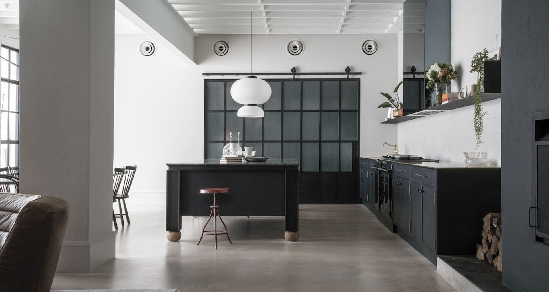
It’s hard to believe that this beautiful home in Sydney’s inner west was built upon the bones of a leaking, cracked and tired corner store and bakery warehouse. The transformation was completed by Anna-Carin Design Studio together with architects with landscape architect The Garden Social and builder, Pamment Projects, in 2021."
Finding the location
Interior designer and studio founder Anna-Carin McNamara had an existing relationship with the client, who had asked her to find a warehouse or factory to convert into a home. “In the first visit to this site it became clear this was the right place,” Anna-Carin tells ArchiPro. “Mainly due to the vibrant location, the historic architecture and character of the building – it was a perfect raw canvas.”
Shaping the brief
The client, a couple with grown-up children, wanted to convert the two spaces into a home where the whole extended family could gather with grandchildren and partners. “The brief was to retain, restore and reuse the original building fabric and materials as much as possible,” says Anna-Carin. “And to respectfully weave together the natural and built environment to create an unexpected urban oasis.” However, extensive remedial work was needed to make it happen.
Rising to the challenge
The corner store was built as a cottage in 1909, and the larger warehouse in 1922. The design team chose to approach this conversion as a continuation of the past lives of the buildings and positioned the central courtyard as a central gathering place in the new floorplan. However, despite the two separate dwellings being on the one title, the only connection between the two was through the open courtyard and an exterior set of stairs.
Under construction
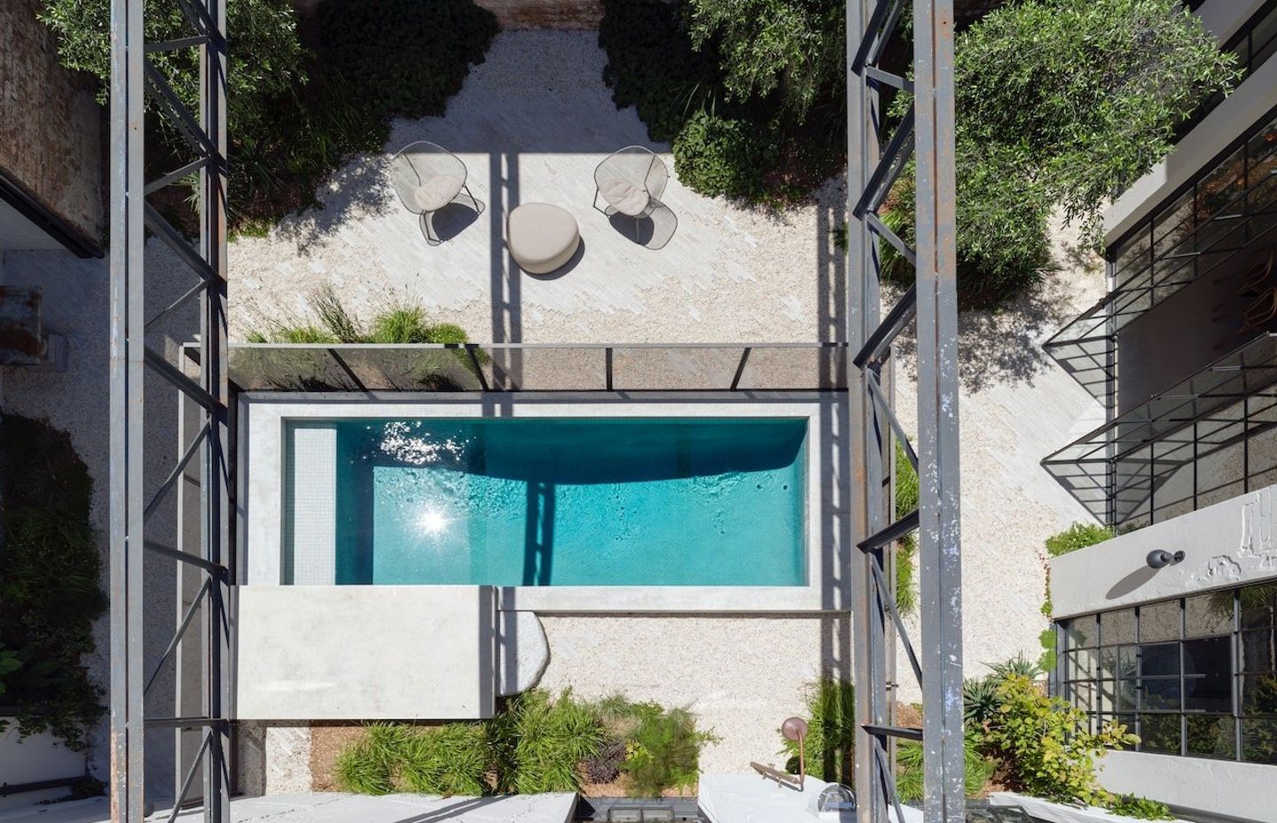
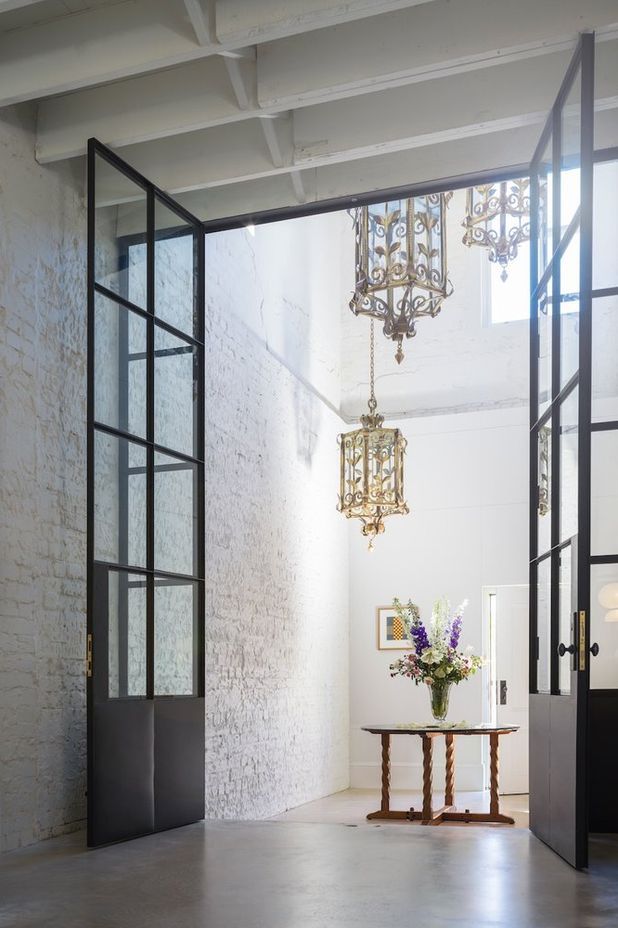
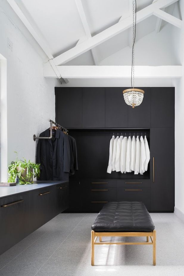
“The courtyard was dominated by a pool that seemed too big for the space, leaving access to the garden awkward, and very little greenery,” says Anna-Carin. The staircases were relocated and a wall was broken through to create a connection between the two dwellings. The size of the pool was then reduced and greenery reintroduced to the area. The floorplan was reconfigured to suit contemporary living and existing spaces were restored and redesigned to ensure functionality and a pleasant aesthetic. The metal-framed windows and doors were custom-made, joinery was hand-painted and the bricks salvaged from the remedial works were hand-scraped and reused for new walls.
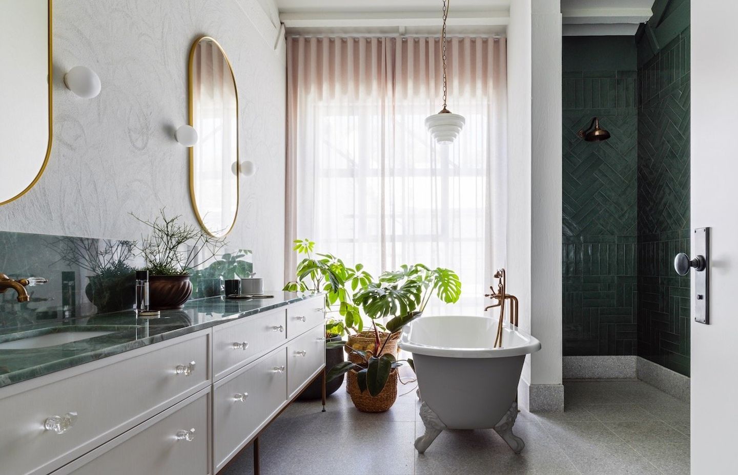
“The courtyard was designed brilliantly by The Garden Social, and Pamment Projects carried out a lot of remedial work prior to starting the fit-out – we had a dream team on site and a very engaged, enthusiastic and wise client,” says Anna-Carin. “The courtyard is the hero of the home, and all the rooms that look into the central courtyard were kept restrained to allow for the seasonal changes of colour to be emphasised. The rooms without an outlook were wallpapered with botanical prints to make the interior democratic.”
Dressing the home
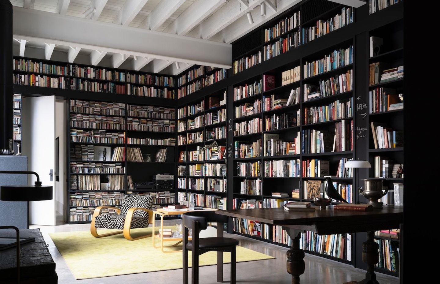
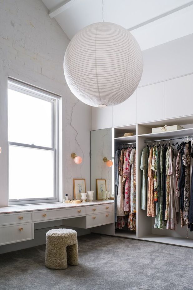
Inside, Anna-Carin established an interior environment that feels secure, playful and wise. A materiality of brick, concrete, steel and natural stone was chosen as the base, and layered with a palette of white and grey in response to the visual framing of the courtyard. “The home’s unassuming, untouched facade encloses and protects the interior spaces where a sense of safety and serenity is prevalent,” says Anna-Carin. “The wallpapers with whimsical colorful patterning invite imagination and escapism, while the thousands of books on display radiate knowledge and inspiration.”
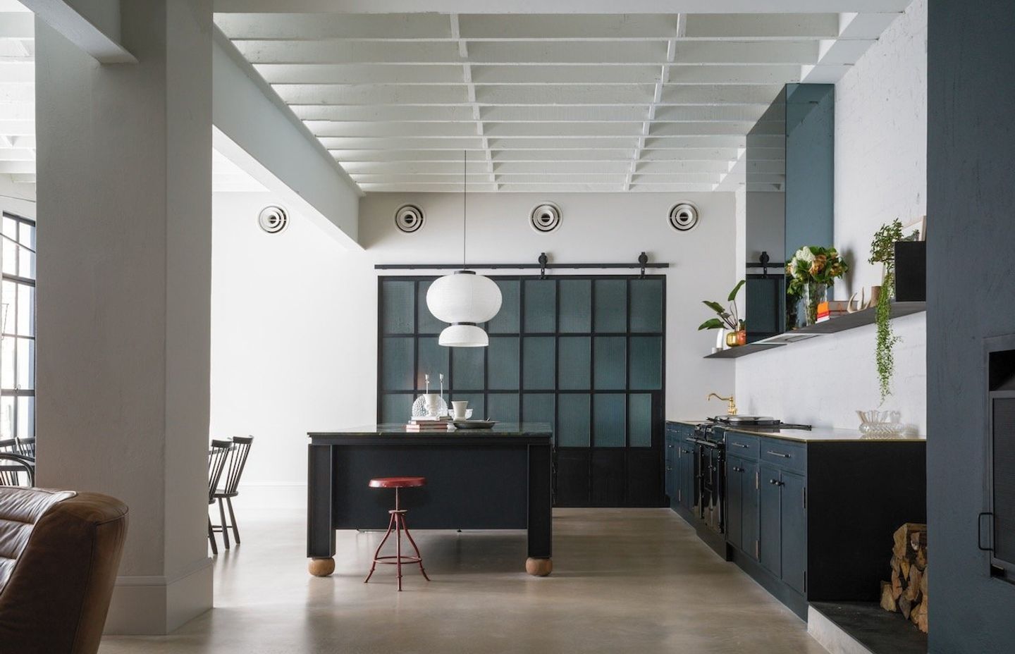
Although the furniture throughout is mostly sourced from the clients’ own collection, most of the lighting was found in antique shops to maintain the original character of the home. “The chandeliers in the entrance were originally hanging in the David Jones store on Elizabeth Street at the same time this building was built,” says Anna-Carin. Small touches of colour and brass accents were then woven into each room, the brass chosen for its timeless appeal and natural patina.
“Brass is a classic material that becomes more beautiful as it ages, just the way we intend this building to do.”
See more projects by Anna.Carin Design Studio on ArchiPro.