How to choose the right paint colours for your home
Written by
22 September 2022
•
6 min read

What is your advice for selecting paint colours that make a space feel relaxing?
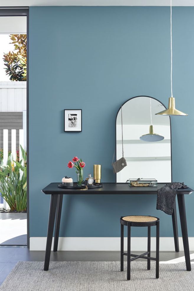
Andrew: Colour is such a powerful tool for decorating. Choose the mood you want for your room, then investigate colour to create that mood. Colours can calm us, just as colours can make us restless or uncomfortable. I do love greens and blues for creating calm spaces. Soft green-greys, muted olives, sumptuous teals and delicate celadon green can all create a calming oasis.
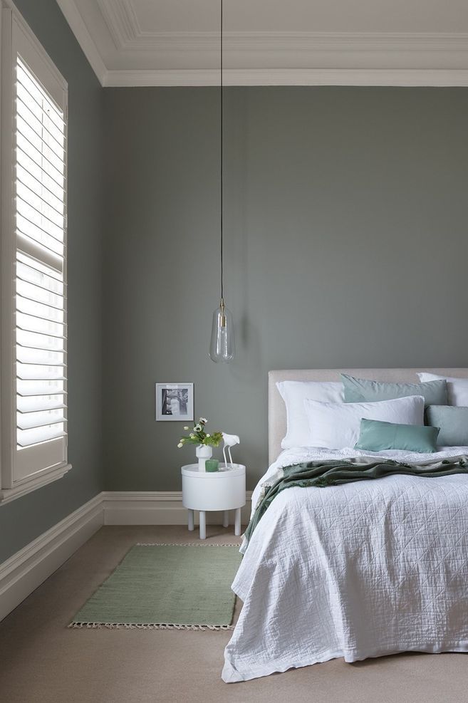
For a bedroom, soft blues and greens are the go-to. These shades reduce stress and create a relaxing oasis. A soft green such as French Green is a wonderful choice, as it has both cool and warm elements to it, bringing a feeling of serenity and contentment. It pairs beautifully with neutrals, blues and whites.
Probably our most popular colour for bedrooms is Hailstorm, which is a soothing muted grey green, with undertones of blue. A much-loved colour for its liveability, elegance and complexity.
For a bedroom, soft blues and greens are the go-to. These shades reduce stress and create a relaxing oasis.
What is your advice when selecting a colour for a cosy space? Is it all about undertones, or something else?
Melanie: While undertones are the key, they are not the only consideration you should be making. Some colours are just never going to create a cosy, snug vibe – like cool whites, ice blues and pale, cool greens. Mid and darker shades can create a cocoon-like feel, but again, the undertones are important and even in lighter colours they can bring a cosy element.
I don’t want to get too technical, but the actual tints themselves that are used to create the colour are also a vital part in creating the right feel. At Porter’s Paints we create colour using our unique earthy pigments, so even if we are creating a “cool” colour like a blue, there is a smoky, rich element to the colour that comes from the colourants used.
What tips do you have for choosing a cool colour to work in a cosy scheme?
Melanie: If you love cooler tones like greys, blues and greens, look for ones that are complex with some warm element to the undertones.
For example, a cool, simple grey where the colour is created by adding a black tint to white paint could feel cold and soulless, whereas a grey that has a more complex colour formula with black, a little red oxide, a hint of umber, perhaps an element of ochre, will feel enveloping and calming as the undertones enrich the colour and give it an earthy complexity that is warm and cosy.
The same principle applies to blues and greens – we can enrich and add character with the construction of the colour and the addition of warmer elements in the undertones. The human eye can see tens of thousands of colours and a complex colour is softer on the eye and easier to live with than a simple one. This complexity creates spaces that are comforting, soothing and snug.
The human eye can see tens of thousands of colours and a complex colour is softer on the eye and easier to live with than a simple one.
What colours and finishes do you expect to be popular over the next year?
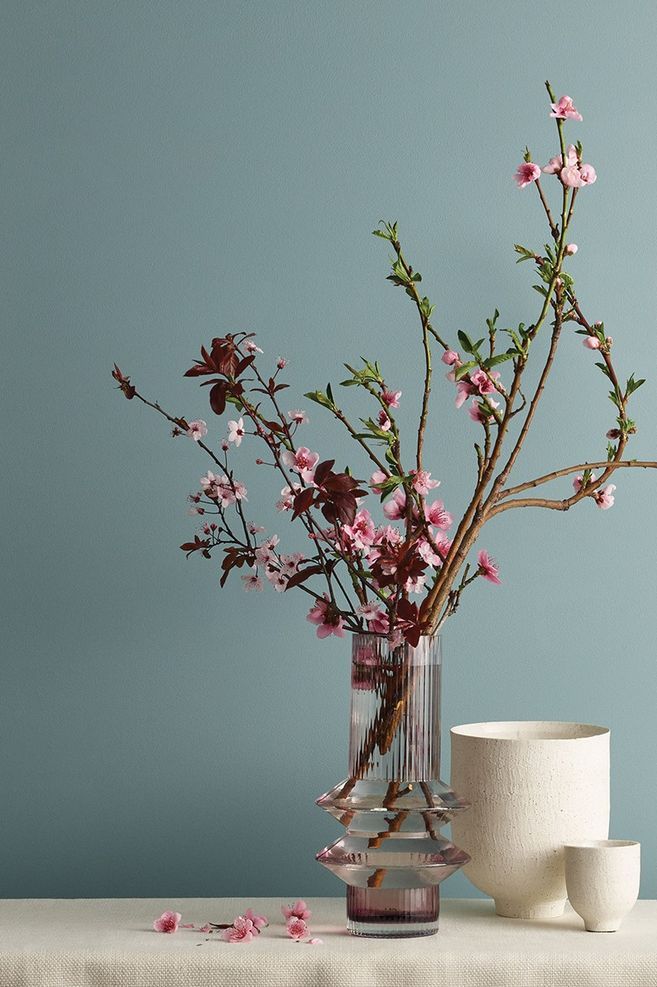
Andrew: More blues and greens – we are all loving blues and greens and everything in between. Aqua is not the right name for it – there is a huge range of heavenly tones that are blues on the cusp of green, and greens that change into blues as the light changes. Porter’s Paints has so many lovely colours that sit in this space, for example Hailstorm and Hamptons Blue.
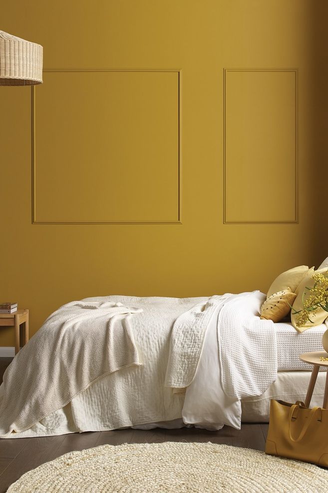
Yellow is trending back, but complex and strong. Yellows are not simple, but straying into turmeric and deep ochre.
Russets, earthy pinks, rich red tones and red ochres will start to emerge.
Can you tell me about the Capsule Collection and the colours that are part of this?
Andrew: The Capsule Collection is an essential and versatile curation of 32 Porter’s original colours that have been cleverly designed to stand alone or to team elegantly together. With both interior and exterior colour schemes in mind, and with a small curation of perfectly harmonious trim colours, the Capsule Collection is your “go-to” for success.
When adding colour to our homes, we are trying to create spaces that we feel comfortable, relaxed and safe in. We kept this in mind when we created the Porter’s Paints Capsule Collection and every one of the 32 colours in the range is made from our signature Eggshell Finish, designed to add character and complexity to any wall, both interior and exterior.
When adding colour to our homes, we are trying to create spaces that we feel comfortable, relaxed and safe in. We kept this in mind when we created the Porter’s Paints Capsule Collection.
Is there anything to consider with paint colours to ensure they are the desired colour both during the day and night?
Melanie: Unlike other colour creators, we formulate colours with rich pigment combinations that ensure that the colour changes with the light. Layering pigments enhances the effect light has on colour, changing, deepening and developing colour and mood as the day moves into night. Porter’s test pots contain our premium grade Eggshell Finish, so you have the assurance that what you test is what you get.
Tell me more about Stone Paint. Where can it be used and why?
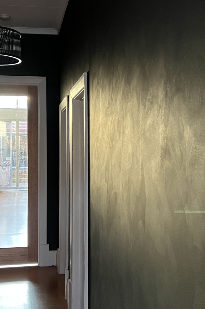
Andrew: People often ask me what my favourite product is at Porter’s Paints, and are genuinely surprised when I tell them Stone Paint given all the other amazing finishes we have. It is one of the flattest broadwall acrylic paints on the market, with less than 2% sheen level; it’s an ideal choice for both interior and exterior masonry or gib walls as it provides texture, durability and exceptional colour fade resistance, while bringing the true depth of Porter’s colours to life.
You can apply Stone Paint with a roller if you are after a completely uniform finish that hides imperfections and glancing light issues, however I prefer applying Stone Paint in a random uneven criss-cross method with one of our Italian block brushes, to create a slight uneven texture on the wall that catches the light in different ways, to give the impression of a natural stone or plaster finish.
Stone Paint is available in two textures: fine and coarse. Stone Paint Fine contains marble dust, creating a fine stone-like finish, while Stone Paint Coarse contains particles of graded quartz, creating a coarse texture finish like cement bagging. This product is UV resistant, dirt resistant and with most colours containing less than 5g/L of VOC’s, it is extremely low in odour.
Explore the colours available from Porter’s Paints on ArchiPro.