How to style a materials board with Designworx
Written by
29 March 2022
•
4 min read

Tell me about the clients and their brief?
This board is for the Isle of Man project that won the International Property Award for 2021 for Best Residential in the UK – Isle of Man.
Working with different personalities requires an integrated design to reflect these. I asked both clients to pick three words that relate to their personality and that they would like the house to reflect. One response was "cosy, sociable and relaxed", and the other was "convivial, elegant and cultured".
When you’re putting a materials board together, what do you consider?
There are many things to consider when specifying colours, products and finishes for a project. The most important being, “How does the client want to feel in their space?”
Once that has been determined, the design direction can be followed through to support that. For example, if a client wants to feel calm and light, then choosing a palette that will support this is important. Or if the client has toddlers or teenagers, then products may need to be more robust.
A product being fit for purpose is important, and whether it will stand the test of time required of it. The client may also have existing items that they want to use – layering the design to incorporate these and enhance them must be carefully thought out.
What was the starting point for the material palette for this project?
There was no one starting point for this project as the client brief required a slightly different response in the many rooms, yet all the rooms needed to pull together and flow from one space to the next but maintain their individual character.
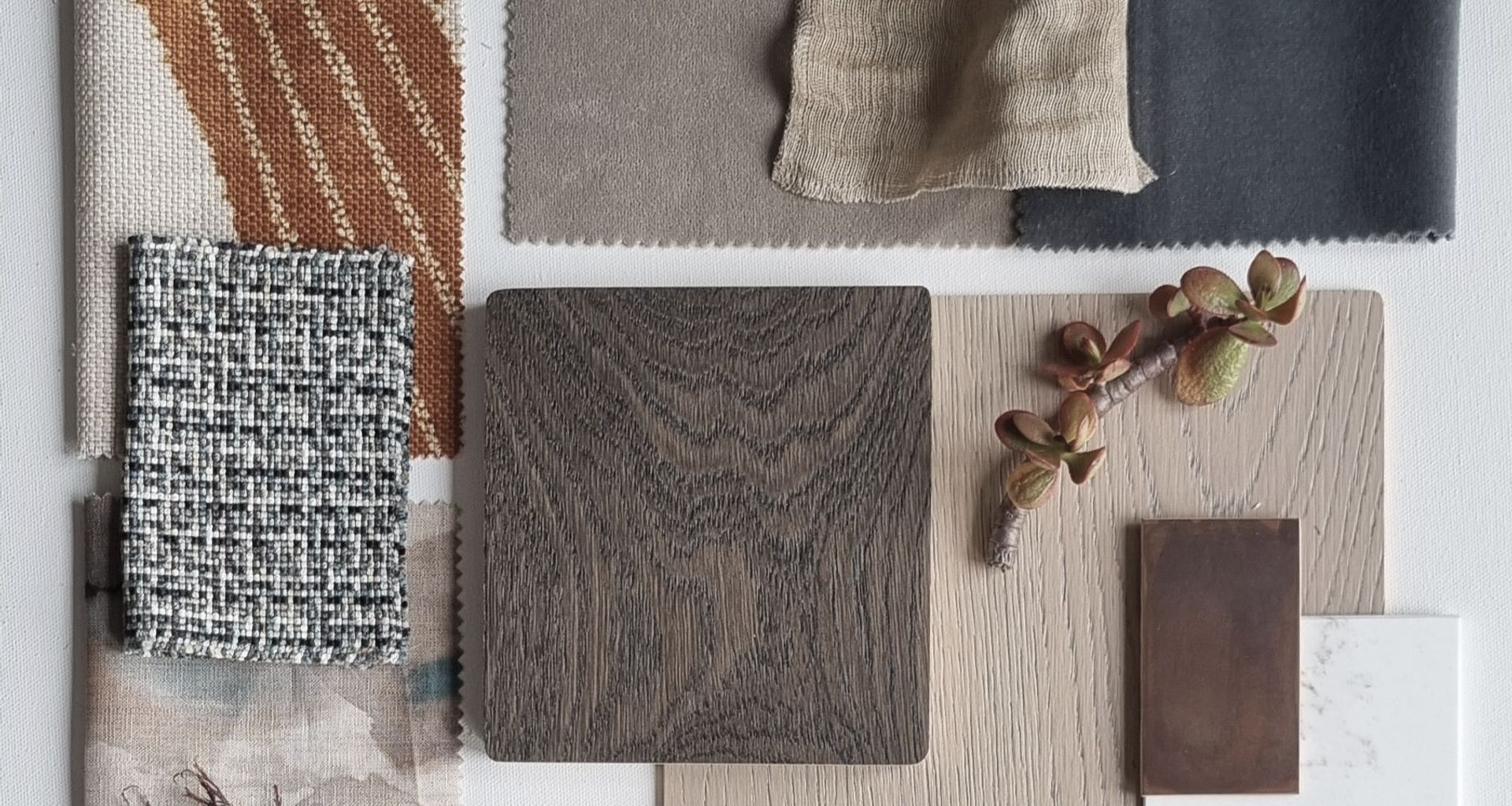
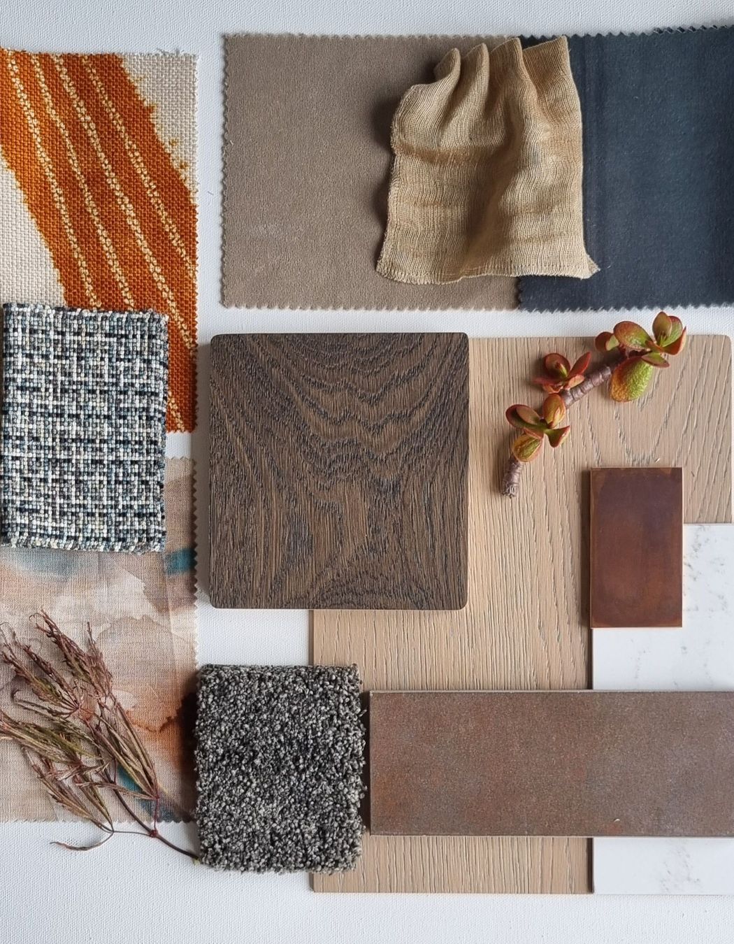
There was a "general palette" running through many of these spaces based on warm blues, and the golden yellow hues of aged brass, neolith surfaces, and metal threads in fabrics, or metal product finishes – to the clearer yellows and burnt oranges that added warmth and energy.

What are your top tips and tricks for creating an interior scheme?
- Always start with the feeling. Once you have determined this, it will give you your design direction.
- Layering a design gives it depth – you can layer with texture, line, colour and proportion by following the principles of design.
What’s your top tip for choosing the right samples?
Look at the technical information to determine the correct specifications for the project, and be guided by the client’s brief. There are so many products out there, that if you focus on the design brief and the feeling of the space you will be led in a direction and able to narrow down the options.
How do you combine texture and colour?
Firstly, determine your colour palette. Sometimes it is best to limit yourself to three colours with one of these more neutral. You can add texture and pattern to this palette but often one pattern or texture is dominant to allow the eye to rest on a focal point.

If someone was afraid of incorporating colour into their home, what would you suggest?
Be brave and go with what makes the space feel good for you, but pay heed to some of the physical and psychological effects colour can have on you. For example, if you want a calm space, then red is not such a great idea… But if you are set on red, then choose a blue-based red which is calmer than a yellow-based red.
Think about the proportion you use that colour in – a lot of black can weigh very heavy, but a small amount can provide a dynamic contrast. Perhaps choose smaller items to use colour in, then you can swap these out without too much cost if you want a change.
What’s your key advice for anyone looking to renovate an interior space?
Try to think outside the square and create a space that is individualistic. Think about the people using that space and the activities that will happen within it. Think about how you can support this by the colours and products you choose so that it’s not a cookie-cutter approach. And if it is a bigger project, get professional advice from an architect, builder or designer. They will save you time and money and will be able to propose concepts that you may not have thought of.
Explore Amanda’s design board and discover the materials behind their vision.