How to take 'scroll stopper' photos of your property

You won't get a 'scroll stopper' using the 'auto' button, and, even among professionals, there are professionals, and there are professionals – those that are gatherers, and those that are hunters.
A gatherer just gathers photographs because that's the job to be done. A hunter will actively hunt for the 'scroll stopper'. Hunting for the right photograph will give you an image that makes your potential client stop scrolling, pause, and then click – ultimately, it kindles in them a desire for more.
Darren Clayworth of Real Property Photography is a hunter.
"A real estate photographer, for example, will shoot the house, the kitchen or bathroom. But my professional focus is to shoot the lines of the building, cutting the structure in half or into thirds with my camera and telling the story of the roofline, the cabinetry, the fixtures and other beautiful elements," says Clayworth.
Architectural photography is the art – and profession – of capturing the patterns, lines and shapes of buildings, interior design, industrial spaces, the people that use the space and many other constructions.
"Architectural photography is about what matters. It's about details. When someone falls in love with a property, they fall in love with a particular element of a property. My job is to coax that element into the frame in a natural way that draws attention," he says.
Showcasing a building is never a straightforward task, and neither should it be treated as such, Clayworth adds. To entice someone into an image relies on their attraction to it.
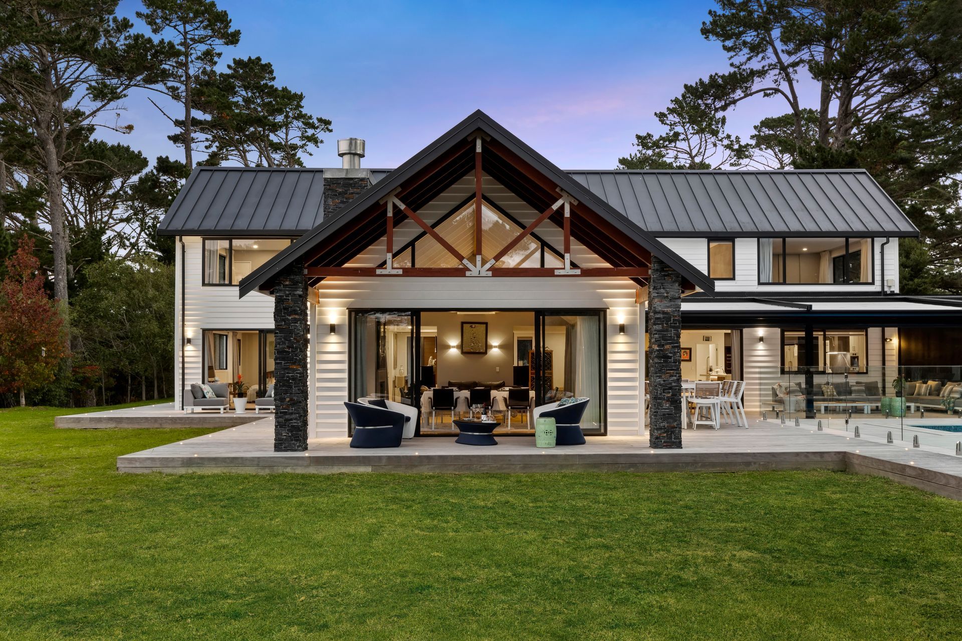
Since humans are generally visual creatures, this means even with the best sales team, a great write-up, and warm buyers, a well-composed photograph is often the critical pivot point that engages with clients and captures their attention.
Clayworth has been snapping shots of incredible architecture – and featuring in a number of magazine prints over his career. During that time, he has come to understand that architects, builders and professional photographers are part of the same collaborative journey.
He says all good builders, tradespeople and talented architects need their work captured faithfully by a photographer in a way that avoids any distortion of their carefully designed buildings. Without stunning images, a magnificent building is like a fallen tree in the woods: no one is around to see it.
"When taking a photo of a building using a standard lens, there is a risk of distorting the shape and design of the building in the final frame. All that work and care by the builders and the architect would be for nothing because the photographer didn't know what they were doing.
"For example, it is common to see entry level photographers shoot a tall building from the ground using a normal lens. This makes the building appear to narrow to a vanishing point. It looks like it's falling over," Clayworth says.
The best photographs, those that do the space justice, combine professional knowledge, experience and creativity with high-end equipment.
"A tilt-shift lens, for instance, ensures every angle and line on the designed building appear as they truly are while keeping the building or interior space at the centre of the photograph and making the best elements pop," Clayworth says.
The North Shore-based photographer says a great image has four essential elements.
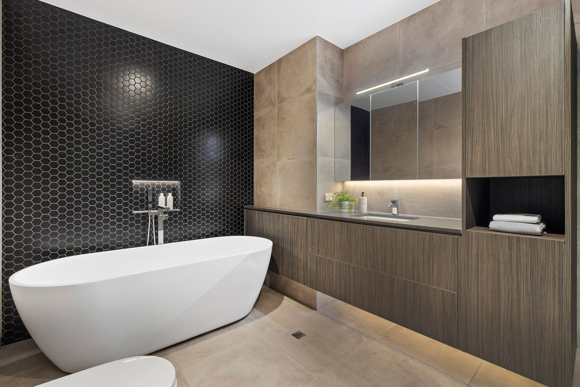
1. Attention to detail
Photography follows its own "rules of composition," such as the rule of thirds, the golden ratio or vanishing points. Clayworth says this is why some images look better, "but you don't know why."
A vanishing point is when receding parallel lines seem to meet when represented in linear perspective. Photos of seaside piers leading away from the camera lens are a great example.
"The eye follows lines. So, the better your eye flows over a photo – tracing a kind of hidden story in the image – the more positively you will perceive the image. If your eye is forced to dart around the photo from element to element, the brain tends to think the image is faulty in some way."
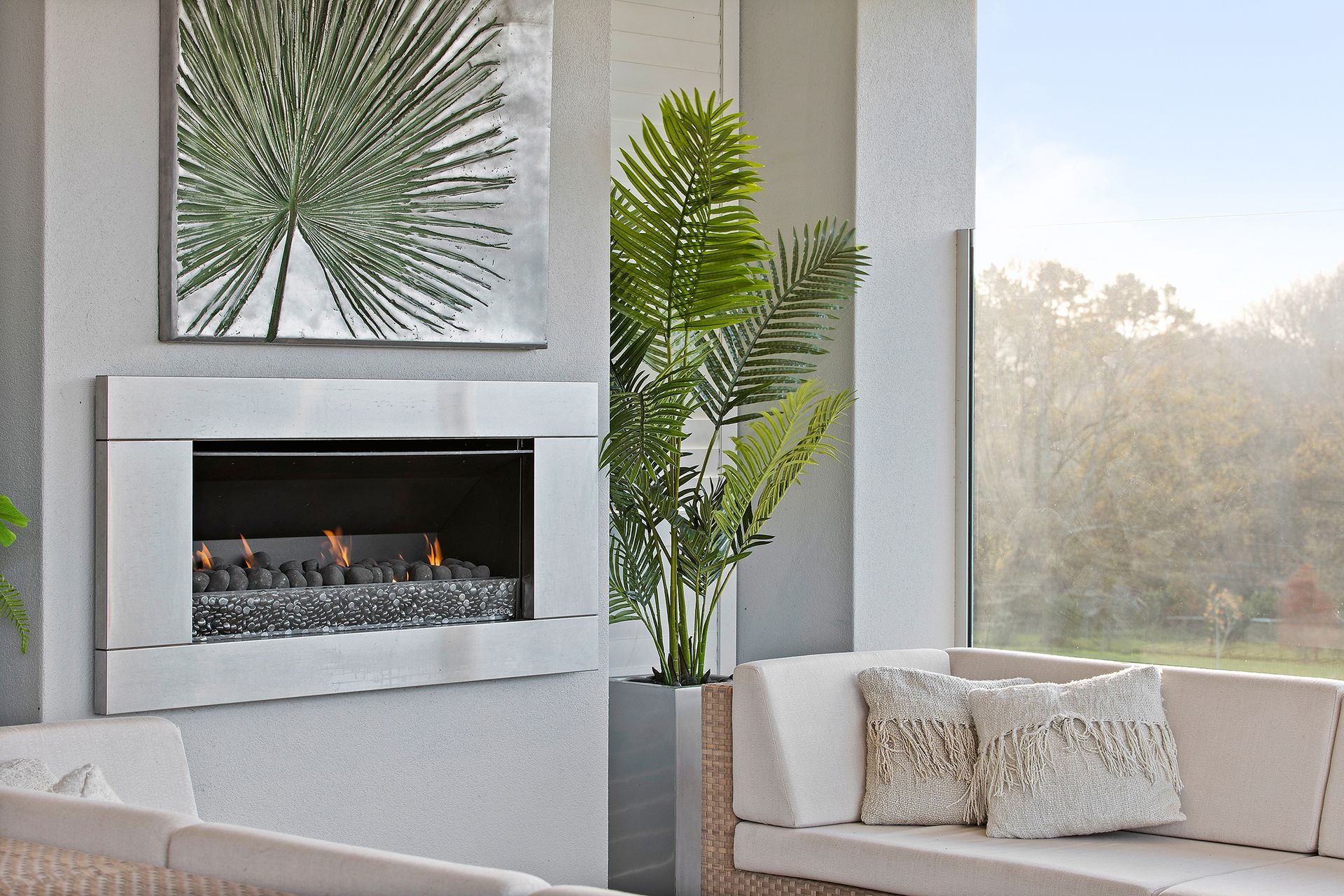
2. Uniqueness
Every building has its own personality and embodies the personalities of the tradespeople who constructed it and the architect who designed it. This gives each building a uniqueness that a photographer must work to uncover and capture.
However, says Clayworth, a good photographer, understands not to lump an inappropriate personality onto a building. Doing so risks drawing viewers' attention to the wrong element of a building – or worse, turning them off from purchasing the house altogether.
"What do I mean by inappropriate? On windy days, any photo of a house can look dramatic. But there shouldn't be drama around a house unless the selling point of the house is drama. Most of the time, a house should appear beautiful, immaculate and calm."
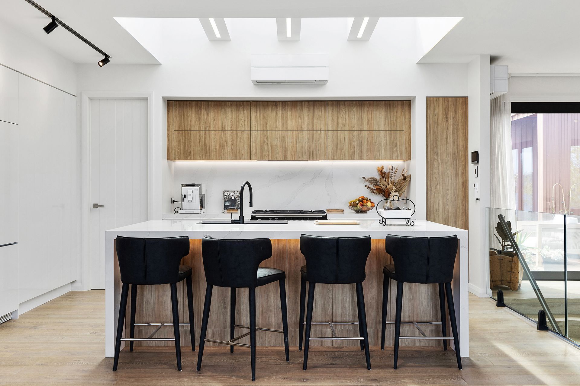
3. Natural light
The human eye automatically adjusts for different light intensities. However, even modern professional cameras still require multiple exposure to control for dark and light patches and reveal the deep richness of a building.
"First, I take a range of photos that are properly exposed for the elements I want to capture. Subtle flash may be used to brighten dark areas and to ensure the colour of the products are accurately represented"
These photos are then merged to produce the final image.
"If the plan is to shoot during twilight or golden hour, I will take a series of concept photos during the day to better understand the correct angles. It's about creating a smooth plan, so I know all the shots I need to cover in the limited ideal shooting time" says Clayworth.
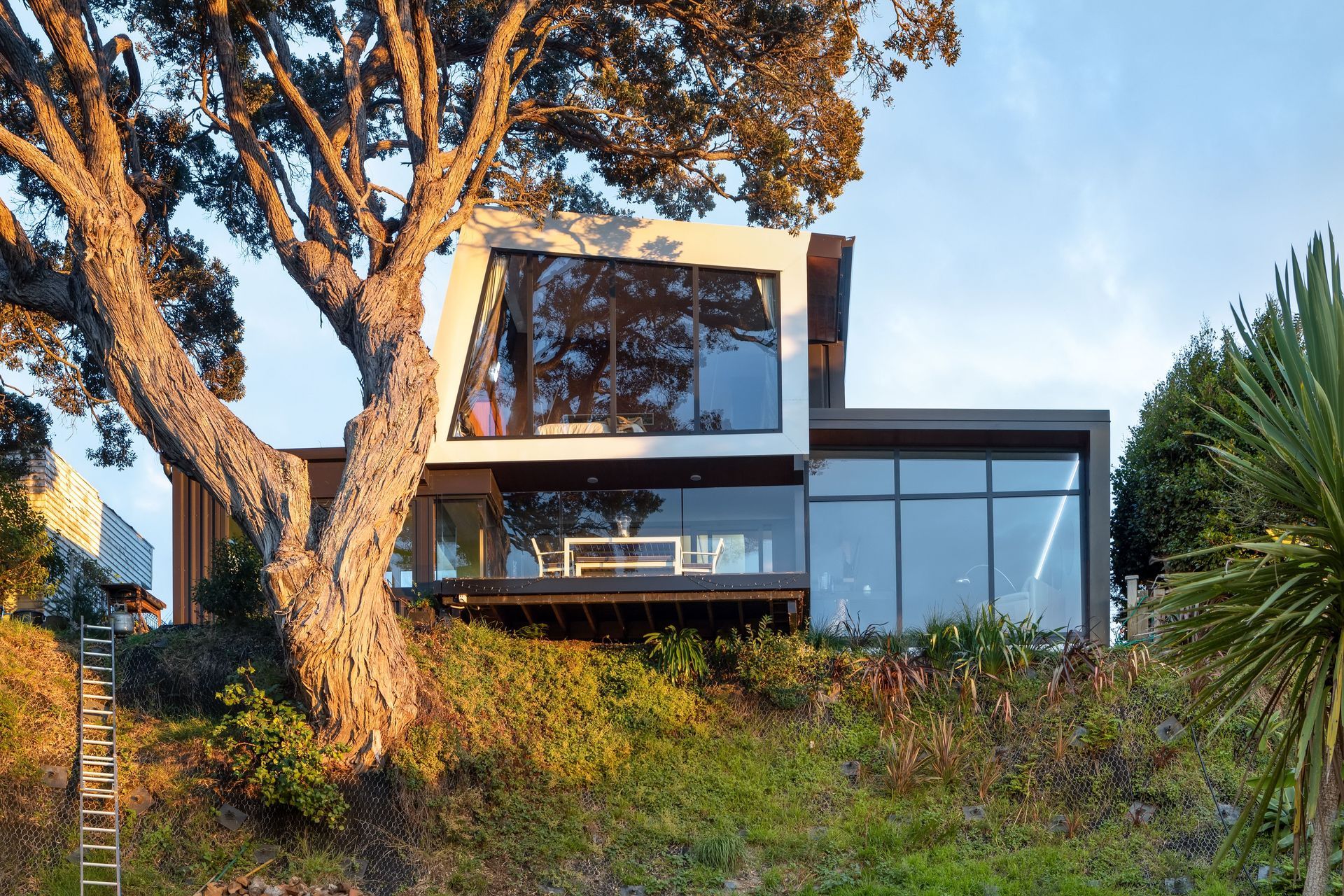
4. The 'Hero' photograph
Dozens, sometimes hundreds, of images will be produced on each shoot to capture every possible angle of a building. But only one image can be the "hero" shot.
The hero shot is the photo that best displays the building's or internal spaces character, its design and the personality of the architect and builder.
"You have one chance to make an impression on a viewer. If they are searching online for examples of gorgeous properties, you may even only have just half a second to get their attention. The hero shot should be a scroll stopper," says Clayworth.
"The hero shot is like a red carpet showcasing the skills of everyone who constructed the building. When done right, a good architectural photo will often cause people to immediately want to know the names of the builder and the architect."
