IKIGAI - A philosophy for life
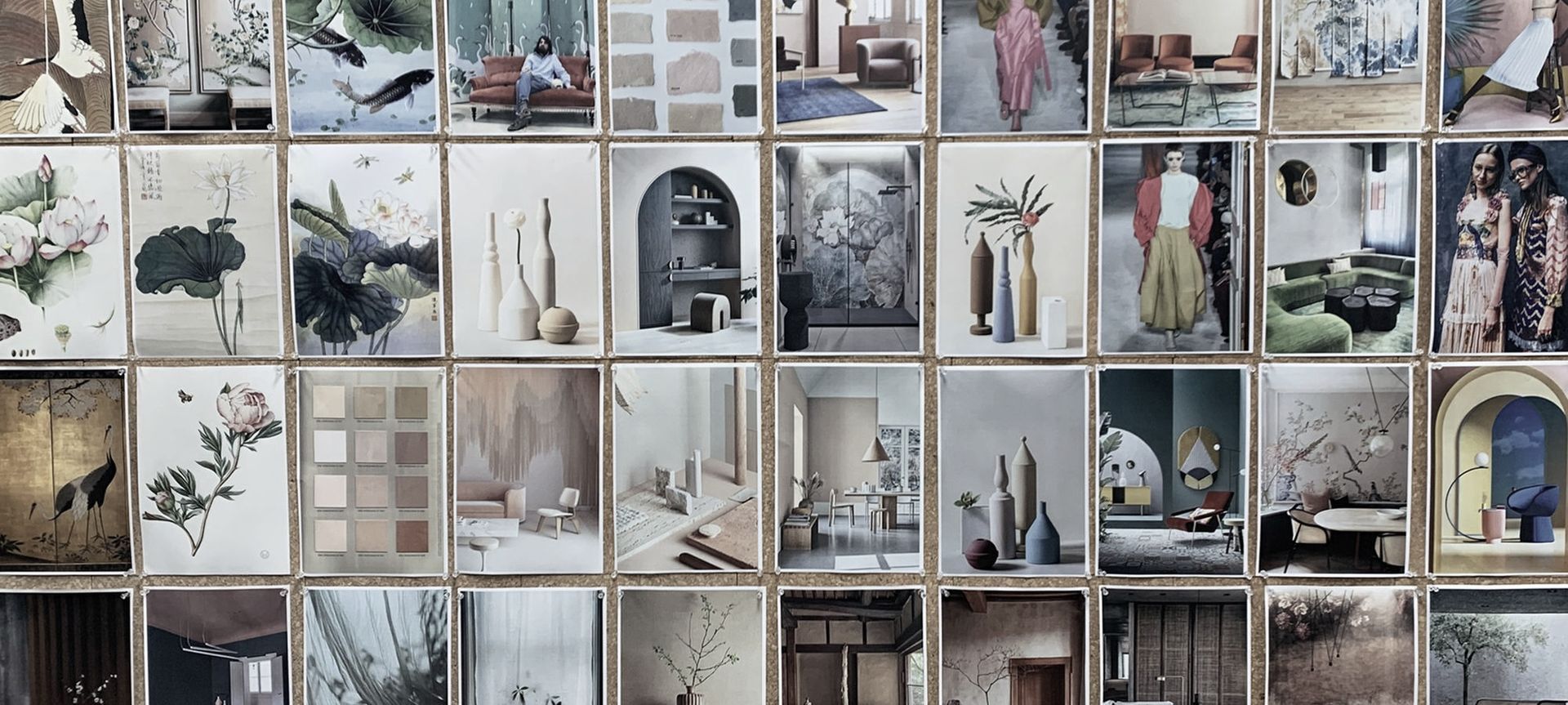
Our latest collection Ikigai is an evolution from our La Primavera collection, adopting many of the same key themes of feminine design, visual optimism and bringing the outdoors in, but shifting to a more Asian aesthetic.
Given our close geographical proximity to Asia, we share an inherent love of simplicity, quality and craftsmanship. This was a key source of inspiration for the collection which includes a preference for natural fibres and complex weaving techniques.
The word Ikigai translates very closely to ‘Life Value’ with iki, meaning life and gai, meaning value. In Japanese culture, if one has found their Ikigai, they have found their purpose and are living a life full of joy and content. We high recommended reading the book titled Ikigai by Hector Garcia and Francesc Miralles which very simply illustrates the philosophy of Ikigai – it’s a step by step ‘how to’ sharing Japanese secrets to living a long and happy life.
The colour palette throughout the Ikigai collection elicits a sense of nostalgia as we see neutrals warming up. For the past decade, monochromatic, grey based neutral tones have saturated the market, but we now see a return to warmth as people seek comforting colours within the home. You can expect to see beautiful tones of parchment, calico and cream as well as a resurgence of brown, which have returned from banishment.
The Ikigai collection also focuses heavily on green, which is very much in line with what we’re seeing in colour trend forecasting. Greens are natures neutral, and Mother Nature really is the ultimate designer. Green elicits a calming energy within interior spaces - creating a sense of bringing the outdoors in, and encouraging us to slow down and become more mindful. You can expect to see more shades of green throughout the plains, woven pattern and prints.
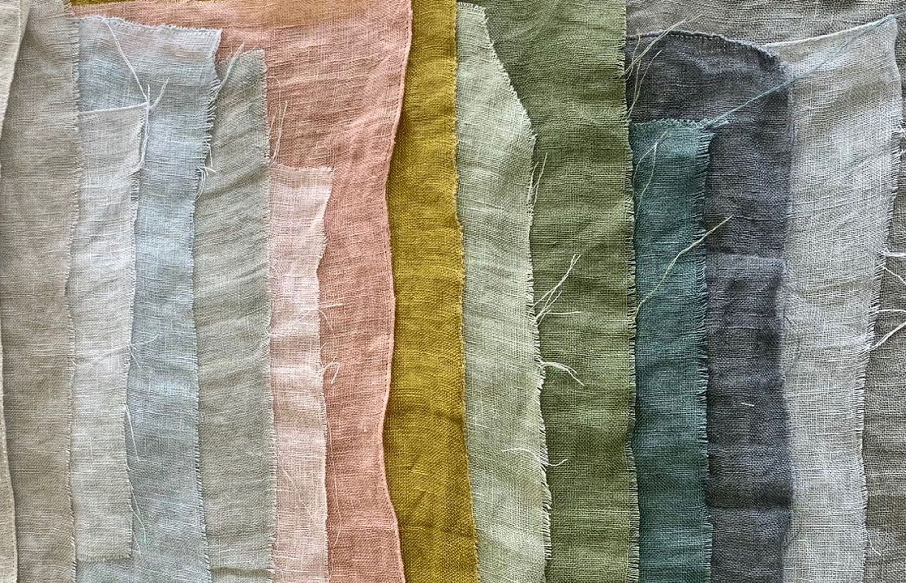
We have also indulged in some more vibrant tones, as we are seeing palettes become more saturated, which is particularly suited to velvet, we have a stunning new velvet launching shortly. Golden yellow, sun baked pink and terracotta pigmented hues increase in prevalence, offering rich and warming effects.
Artisanal craftsmanship will be celebrated and revered, within this collection, as conscious consumers steer away from mass produced items in search of bespoke, speciality pieces for the home.
Ikigai is being brought to market in stages, beginning with a mix of plain drapery and upholstery designs, then culminating in an array of over scaled prints early in 2021.
The first release from Ikigai; includes Kanso Stonewash, Origami, Yugen and our recolouring of Pure, creating a foundation for the range on which to layer the future patterns.
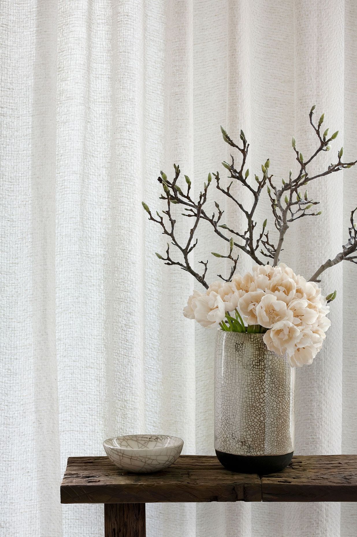
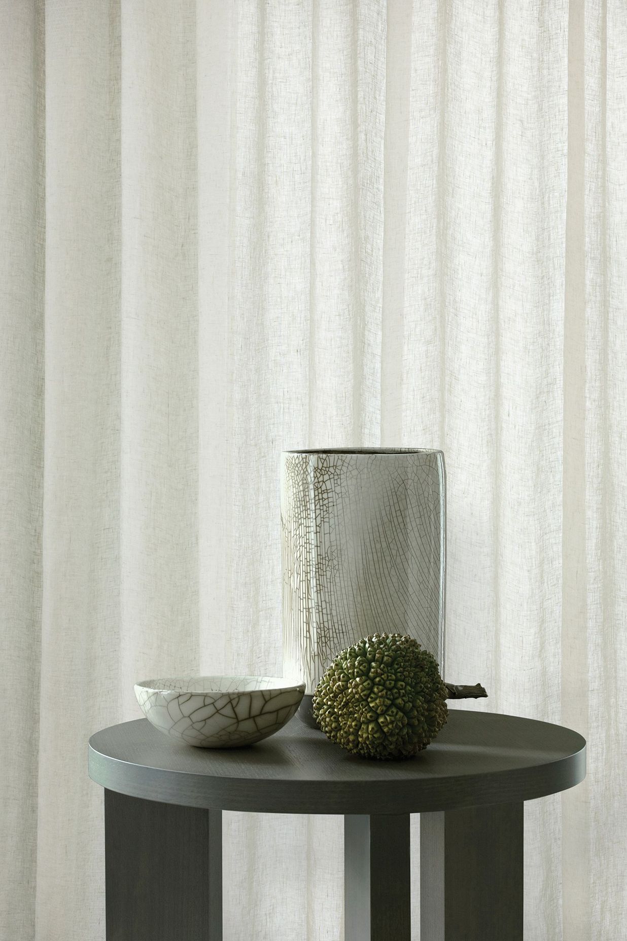
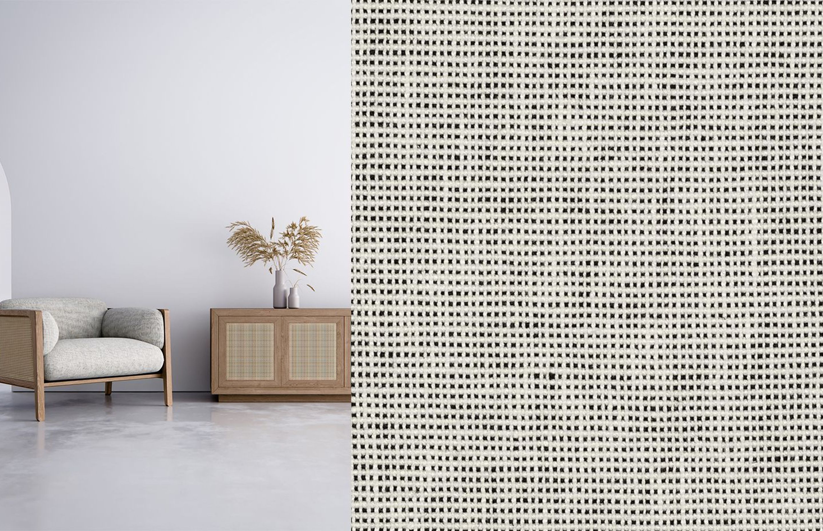
ORIGAMI is a divine new dimensional, 100% linen drapery. Binding techniques have been used to perfection to create exquisite depth and tactility in this new wide-width semi sheer. Named after the Japanese craft of sculpting plain paper into intricate art forms, further dimension is added to our Origami sheer via tumbling techniques to create a soft, wabi sabi drapery. In a curated palette of three pure neutrals, Pearl, Oyster and Mist.
KANSO STONEWASH is our second new linen drapery from the Ikigai collection. In Japanese culture, Kanso translates to simplicity or purity and aligns perfectly with the ethos of modern architecture and contemporary interior design.
A new addition to our growing stable of wide-width linens, Kanso Stonewash is a semi sheer with rhythmic tactility and a gorgeous soft tumbled finish which comes from the stonewashing process. This process also creates subtle irregularity within the colour and surface effect, which is part of its unique charm and should not be considered as a fault. The artisan nature of this divine linen celebrates our commitment to Wabi Sabi principles within this range.
YUGEN, named after the Japanese term for subtly profound grace and is a yarn dyed 100% linen plain weave suitable for drapery and upholstery. The “dot” like effect is created by alternating the weft yarn colours, which adds depth to this beautifully soft multi-purpose design.
Woven in a refined palette of soft neutral with a classic monochromatic black and white and just a hint of femininity with our subtle powder blush.
Careful consideration has been made to custom colour Yugen to sit seamlessly alongside Saba and Wabi Sabi colours. Yugen, Saba and Wabi Sabi are all timeless linen textiles, which will be adored by true linen purists.
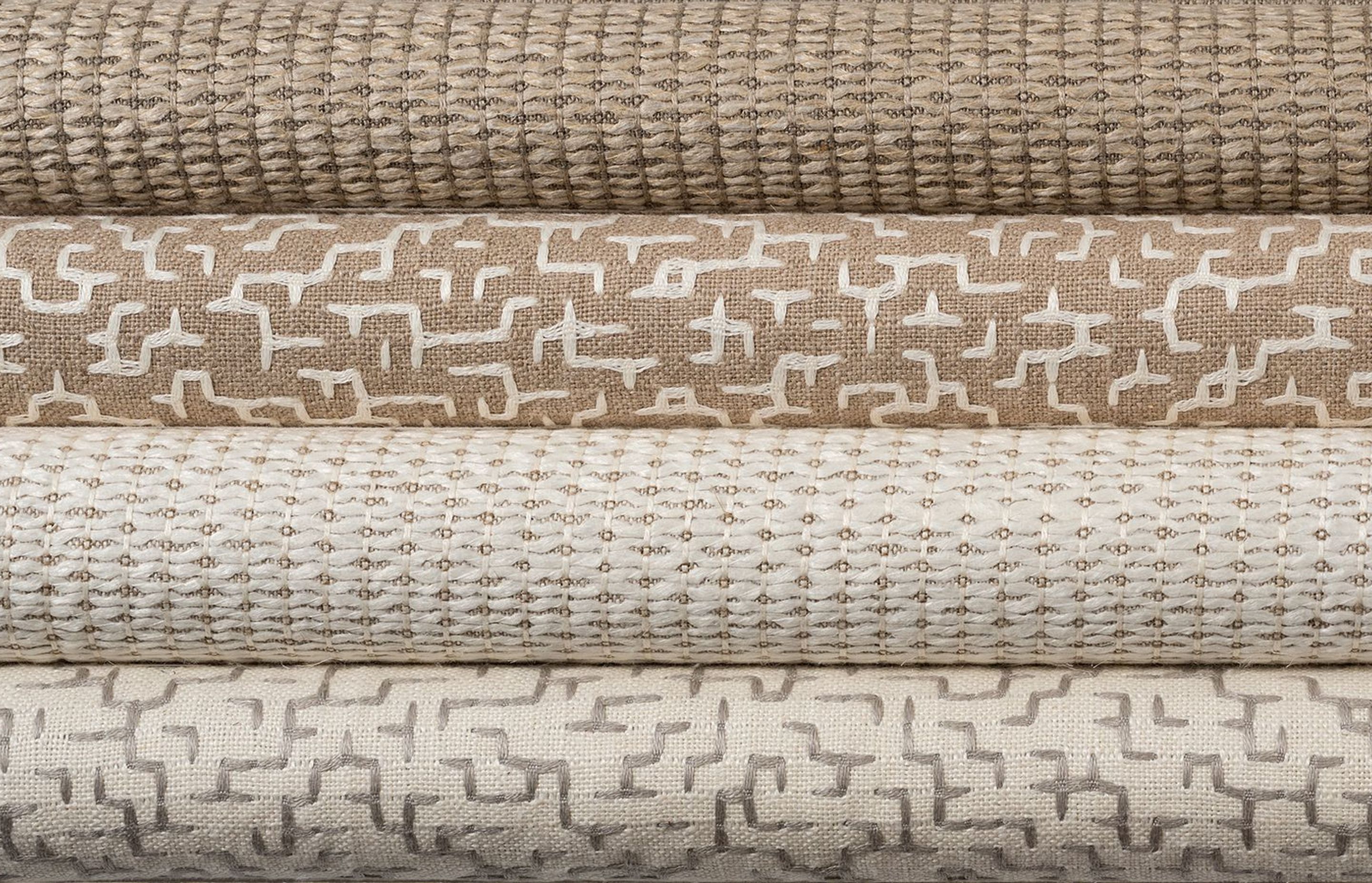
SABA has been in our line for over 15 years and we have added a fresh new chalk colourway alongside the classic Linen combination. Saba is manufactured in Belgium by boutique linen weavers, and replicates embroidery via its use of long interlacing floats, to create a soft, organic geometric design, creating a contemporary and luxurious accessory textile.
WABI SABI is a new addition, from the same mill as Saba and as its names suggests, speaks to the concept of finding beauty in imperfection. Like Saba, Wabi Sabi is woven in two colourways, whitewash and linen. Wabi Sabi’s use of raw heavy linen yarn and irregular binding creates a hand crafted aesthetic to offer a unique and luxurious accessory textile in which to layer onto our vast array of past and present plain upholsteries.
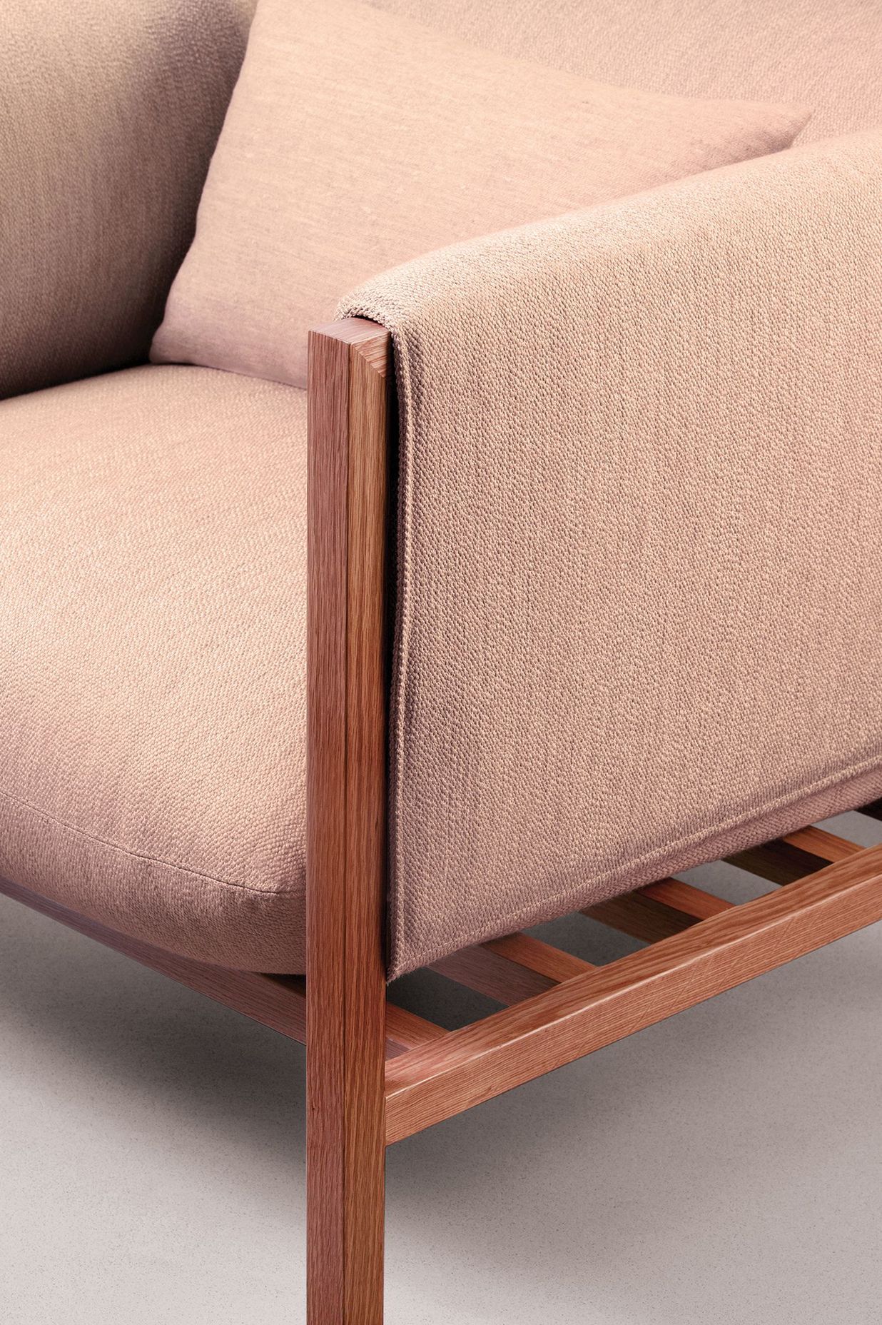
Lastly we wanted to share our latest palette of PURE, one of Mokum’s highly successful upholstery plains. Pure epitomises beauty in simplicity and speaks to the philosophy of Ikigai. Woven in Italy, this luxurious heavy duty upholstery, is a mix of acrylic, viscose and polyester, with a gorgeous soft handle and features a Teflon finish to further improve its care and maintenance. Pure is a perfect upholstery solution for both residential and commercial application.
Six new colourways have been added to extend Pure’s palette to eleven shades. Two sophisticated soft neutrals have been added to the previous palette of cooler neutrals, as well as two fantastic new mid grey tones. The palette is made complete with a feminine nude based peach and a new dark inky blue.
Then early in 2021 prepare for a fresh take on Japan’s rich and sophisticated decorative history. We are adding two new hero prints, both designed in our Sydney based design studio and hand painted by our watercolour artist. These exquisite artworks have been translated into drapery and wallpaper. The prints replicate traditional screen printing, hand painted motifs and dying techniques, bringing ancient Asian craft into the modern day.
Think majestic Red-Crowned Cranes, basking in an oasis of waterlily’s, peonies, bamboo and delicate wisteria. The two new prints are launched alongside a dramatic velvet version of our Peonia print and a tailored small scale, commercial boucle inspired by Japanese geometry.