Incorporating colour psychology into your home design
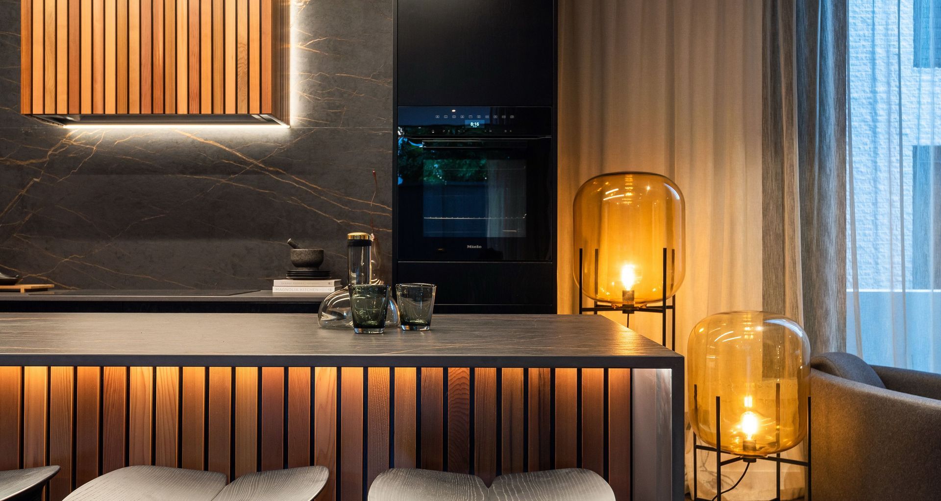
PURPOSEFUL COLOUR
Often, colour comes down to personal preference. When creating a colour palette for your home, one of the first things you need to ask yourself is what colours you like and what your home will be used for.
If you are designing the interior of a holiday home or a house you don’t intend to live in the long term, a more conservative, neutral palette that can be easily changed might be the way to go. On the other hand, if you are designing a home you’ve always dreamed of you have the freedom to be more adventurous.
BACK TO BASICS
One of the best places to start in determining the colour you would like in your home is exploring what colours you are drawn to, whether you like cool or warm tones, and what you want the overall feeling of your space to be.
A colour wheel is your ultimate tool when looking at an interior design scheme for your home using colour psychology. A colour wheel is broken into primary colours like red, yellow and blue, secondary colours like green and orange and tertiary colours that combine both primary and secondary colours.
A colour wheel is perfect for visualising what colours work best together and how you can use them to create balance and cohesion in your home. Even if you have a set design in mind, a colour wheel is still helpful in creating a solid palette to work from.
BE BRAVE
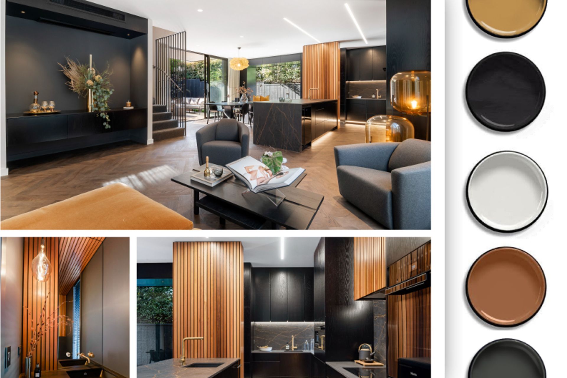
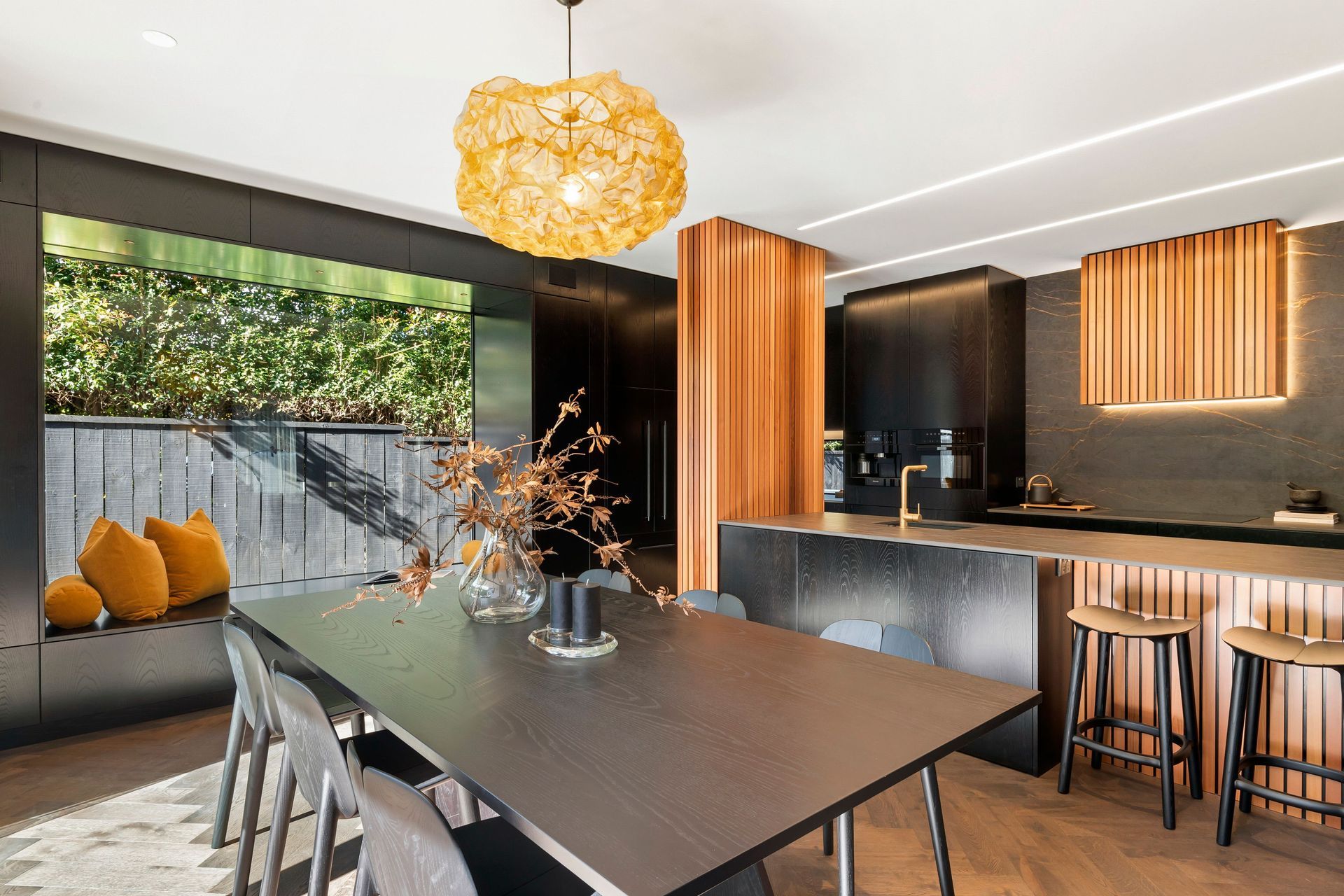
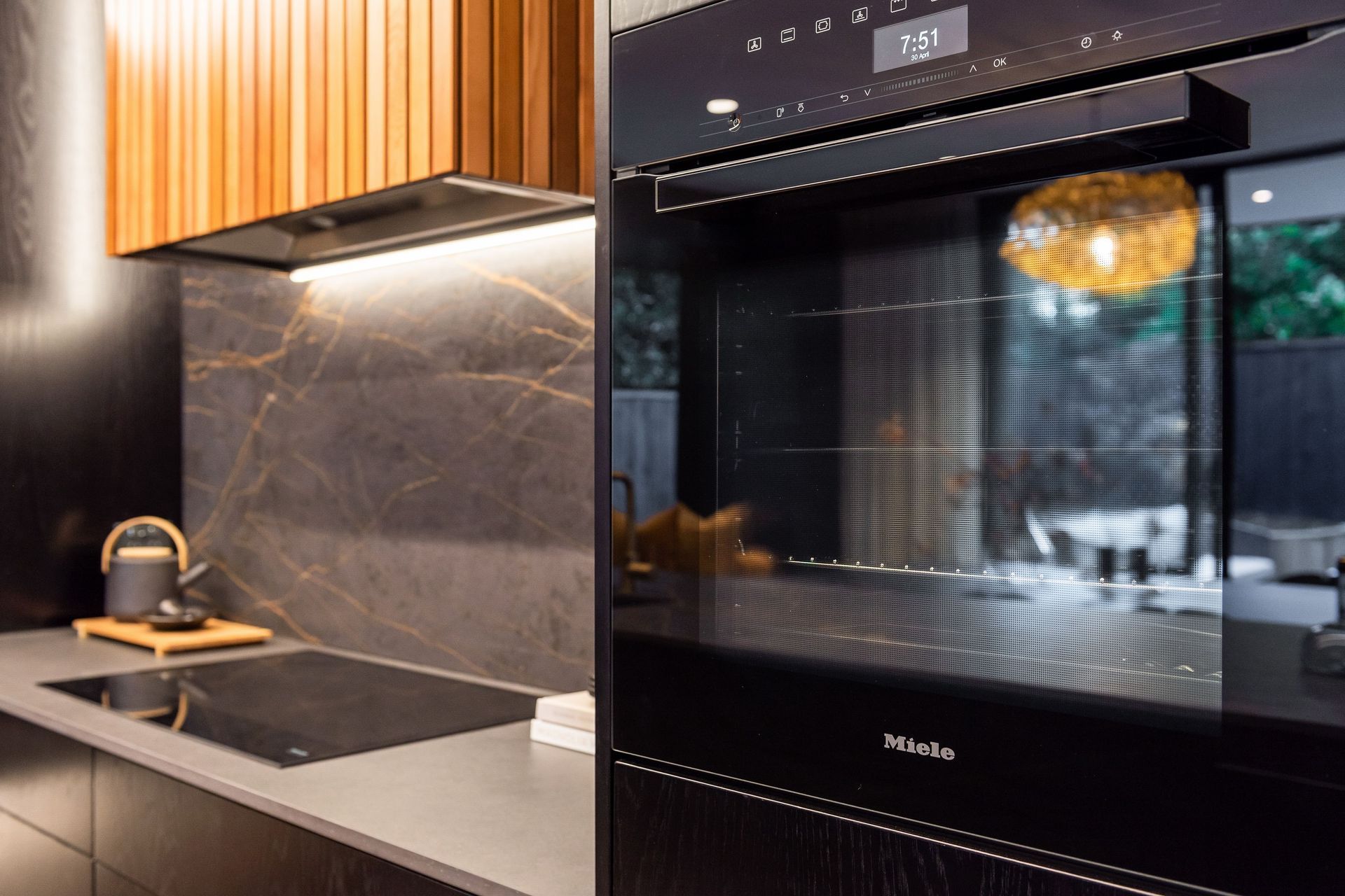
New Zealanders tend to be more conservative in their approach to colour, but a purposefully chosen interior design colour palette that uses the principles of colour psychology can create quite the impression. This Landmark Home is a fantastic example of doing things differently.
While not over the top in terms of colour, the stunning kitchen and dining area offer a cavernous moody glamour that wouldn’t be out of place in a speakeasy. The incredible gold feature lighting above the dining table and plush golden-yellow soft furnishings adds a unique texture and a focal point of luxury that ties in with the hints of gold in the black tiling and benchtops
FICTURES AND FURNISHINGS ARE YOUR FRIENDS
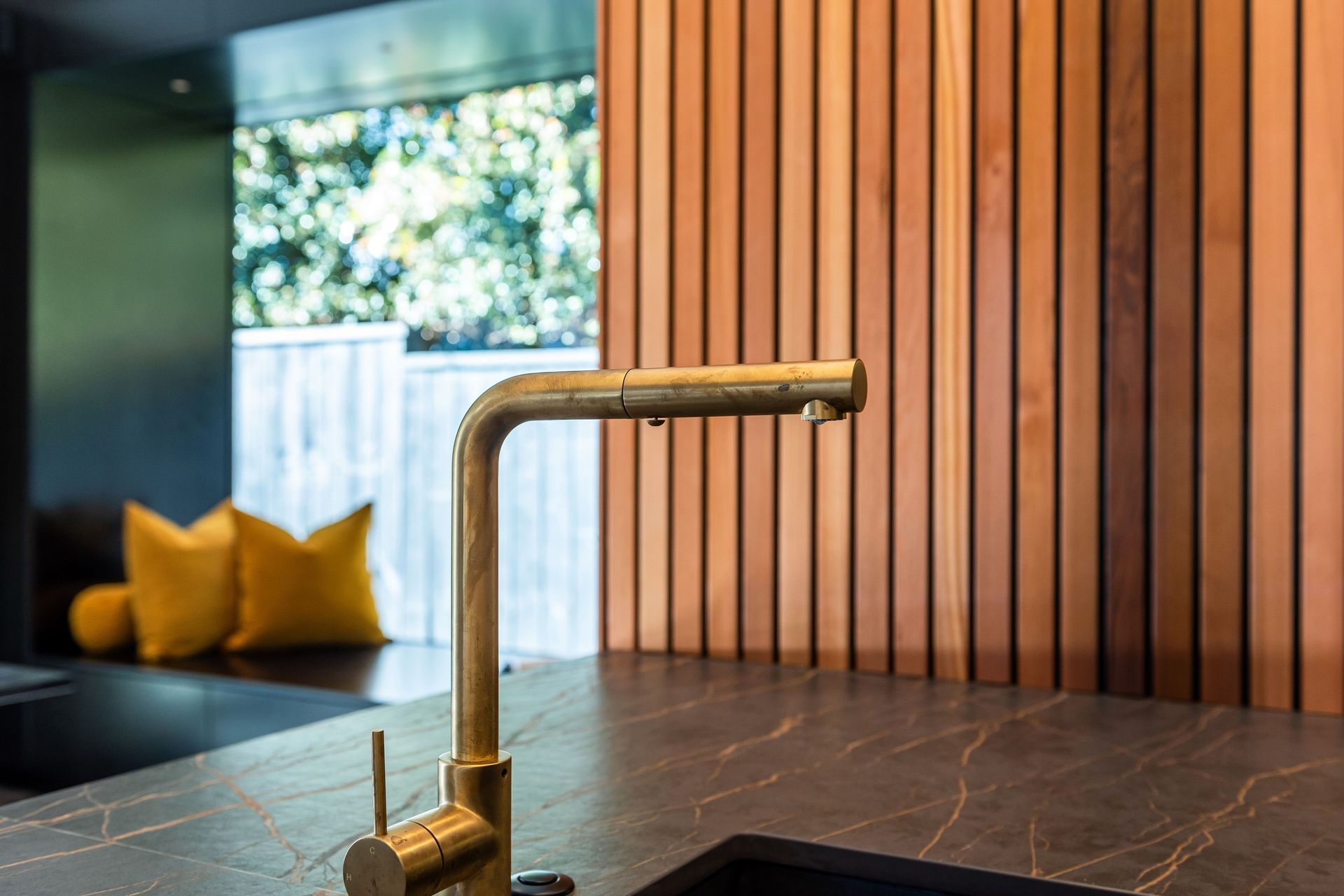
If you don’t feel ready to go bold, one of the best ways to utilise the power of colour psychology is using splashes of colour and texture in things like lighting, fixtures, flooring and soft furnishings.
Gold or black tap fixtures and marble bathrooms can offer a sense of understated luxury. Colourful tiles and unique flooring can be a tactile feature, while soft furnishings like cushions and rugs can inject colour and personality into a room.
IT'S ALL ABOUT PERSPECTIVE
Colour psychology can also be used to alter perceptions and create balance. Using colour as an interior design tool, you can segment certain areas and create a seamless flow. Many people use darker colours in media rooms to give the space a sense of cosy comfort, while the muted tones in bedrooms help keep things light and bright.
But just as colour can create cohesion, it can also affect the overall balance of a space. In open-plan living areas with many unmovable doors, windows and a lot of natural light, you need to be thoughtful about how you use colour and where you want it featured. Putting the wrong colour in a room can make the entire space feel unbalanced.
CONSULT AN EXPERT
A lot of colour tones are directed by trends, but one of the best places to start in determining the colour you would like in your home is to start exploring what colours you are drawn to, whether you like warm tones, and what you want the overall feeling of your space to be.
As an interior designer, I can often tell what colours a client prefers by looking at what they wear. One of the best ways to gather ideas is to visit a Landmark Showhome. Our designers use our expertise and flair to create show stopping interior designs that give you a good idea of what you can pull together to suit your dream home!
Ready to bring your dream colour palette to life in your own Landmark Home?
