How to put together an elegant and luxe materials board

Tell me about the clients and their brief?
I have worked with this client on a previous project and there is always joy in familiarity; their brief was to turn a double garage and an existing laundry into an elegant evening retreat including a home theatre, bar and wine cellar. The overall scheme was reasonably easy to conceptualise. I knew their expectations and there was already a connection and trust between us.
When you’re putting a materials board together, what do you consider?
At the beginning of a project, I consider the overall house design and existing materials. Some elements may require updating, need adding to, or removed all together. I ask my clients if they have existing pieces or art they would like to incorporate in the space. Once established, I start my selection with the choice of flooring and lighting, then add layers with furniture, furnishing and accessories.
What was the starting point for the material palette for this project?
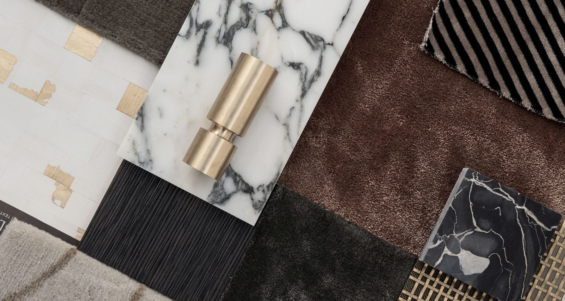
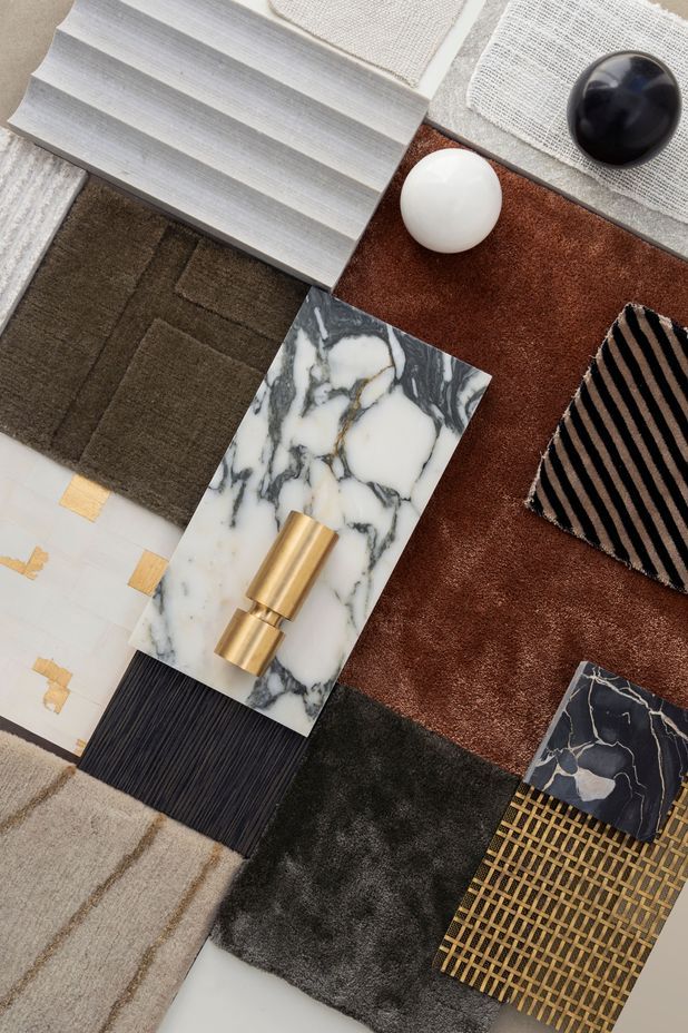
Given the lack of natural light, the first elements chosen were warm-toned and textured: a rich coral carpet, layered up with various hues, and we chose a super-interesting fluted stone cladding around the fire box.

What are your top tips and tricks for creating an interior scheme?
- A home should reflect you and your family. Choose colours and materials you feel comfortable to live in – this is where mood boards are very useful. Take time to consider your options before selecting a finish and look at each element in day and evening light.
- Select neutral and timeless finishes for the more costly materials in the room such as cabinetry, stonework and tiling. It is easy to add a bold pattern or colour with artwork, rugs, paint finishes and accessories.
- Make sure there are at least three components with the same finishes throughout the entire house. This may be flooring, cabinetry, a wall colour or lighting to create a cohesive feel from the entry to the garage.
- Allocate a budget you can afford for all items you have in mind – this prevents disappointment at the end of the project.
- Use dimmable lights in most rooms and don’t underestimate low light and ambient lighting. Lighting installed on low sections of walls, concealed in handrail are clever ways to light a space.
I usually provide a furniture layout as part of my work but if you are planning an interior scheme without the help of a designer, I suggest making a paper templates to scale, or use masking tape to help to visualise the space and ensuring all furniture fits comfortably. There are easy tips to find online, such as allowing one metre around a dining table for dining chairs to go in and out and leaving 400mm distance between your seating and coffee table.
A detail often overlooked is the position of central heating floor vents in a room. Make sure the central heating plates are nowhere near curtains, and allow reasonable space to stack curtains each side of the window before committing to a location. Plan to have furniture on legs where the intake vents have been allocated. And power points, add more than you think you need!

What’s your top tip for choosing the right samples?
When in the room, does the sample cohesively interact with the other finishes? Consider the sample’s application and usage: does it have a practical purpose, or is to be a feature in the room?
How do you combine texture and colour?
Opposites attract! Don’t hesitate to mix opposite finishes as contrasting texture offers visual weight to a space. Contrast catches the eye – when there’s coarse linen with silk, smooth and rough, matte and gloss, antique furniture with modern artworks – it invites us into a room.
If someone was afraid of incorporating colour into their home, what would you suggest?
Instead of buying a cushion or a throw, I suggest buying a test pot and paint a large card with it. Place it in the room amongst your furniture and contemplate it for a couple of days. This way you can observe it in day and evening light, and you’ll soon know if it flows with the rest of the house and if you can leave it day after day.
What’s your key advice for anyone looking to renovate an interior space?
You’ll never regret investing in quality key pieces you can cherish forever.
What’s your top tip for choosing the right samples?
When in the room, does the sample cohesively interact with the other finishes? Consider the sample’s application and usage: does it have a practical purpose, or is to be a feature in the room?
