Minimalist Home

‘Design a minimalist home’ was the main rule of this week’s brief on Channel 7’s ‘House Rules’.
So where did this interior design style come from?
This design style began to emerge during the second half of the 20th century. It was influenced by Japanese interior design culture where ‘less is more’. Post-World War 1 architect Van Der Rohe was one of the first prominent architects who used principles in his designs that came to typify minimalist design.
What does a minimalist home look like?
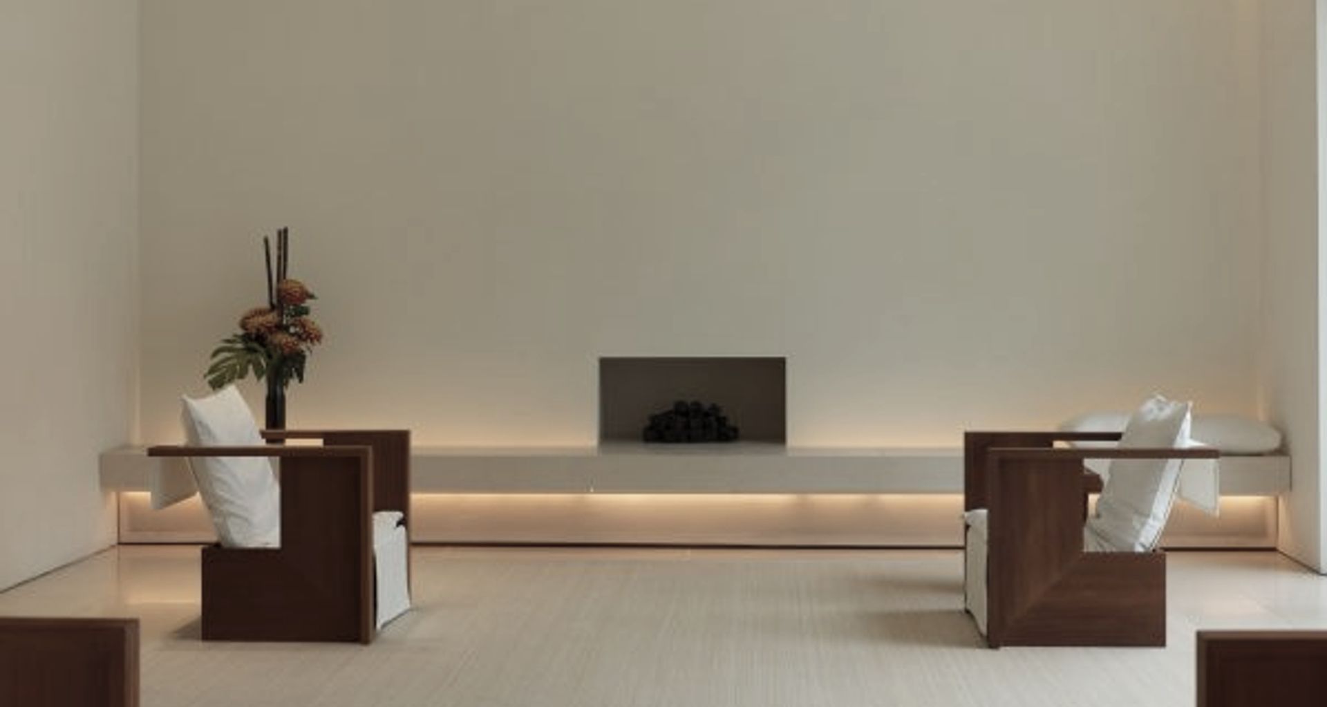
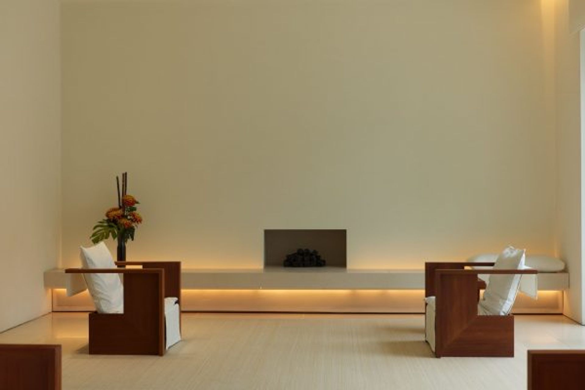
Minimalism places importance on functionality and necessity. It reduces everything down to its most basic form, function and essence. It’s all about simple, clean modern lines.
This style is elegant and streamlined, it focuses on the spaces around furniture and accessories as much as on the items themselves. A clutter free environment creates harmony of space, is light and airy and will accentuate each piece of furniture or art in any space.
So what characteristics of this style can you integrate into your home?

Keep it simple
The foundation of any minimalist interior is less is more. Simplicity should go hand in hand with aesthetics. Every item of furniture should be well thought out, have a purpose and be placed there with intent. Space around your room and between large furniture items should flow and be easy to navigate.
Use the ‘less is more’ tactic especially when selecting accessories and decorative items. Inject expertly curated pieces that will make your space unique and provide shots of your personality. Remember no to go overboard but also be careful not to be too sparse.
Neutral colours and texture
Classic minimalist interiors always start with a neutral base. This palette is easy to build upon and will make the space appear light, airy and open. Mix whites with subdued greys and beiges but keep your colour choices minimal. Keeping to a maximum of three hues will ensure a calm and balanced environment and will also maintain consistency though-out your home.
Stick to a core range of complimentary hues. However, accents of earthy hues that don’t stress the eyes can be used sparingly. A monochromatic scheme using any colour works well in a minimalist space.
Playing around with textures keeps things interesting and adds dimension to your colour palette. Introducing things like knitted throws, sheepskin rugs and velvet fabrics will provide a sense of warmth and richness. Using restraint and keeping everything in the same tonal family are very important in sticking with the minimal design style. And remember to keep the majority of your palette subtle and neutral. Steer clear of patterns, prints and designs on carpet, upholstery or soft furnishings.
Function and storage
One of the key concepts behind minimalism is the idea of functionality first.
Every item in a minimalist home should have a specific purpose, have its rightful place and fit perfectly together with other pieces. For example, dining chairs should sit completely underneath the dining table and a sofa could transform seamlessly into a bed.
Stylish and clever storage solutions are a must. For example, an ottoman can be a stylish foot rest but also double as storage space for magazines, blankets or kids toys.
Having stylish, clever storage allows the chaos to live inside while still appearing chic and streamline on the outside. Everything should have a home and be put back after use.
Lighting
Minimalist interiors maximise lighting. Natural light is always best, however should you need internal lighting solutions then use a warm and soft approach.
Sheer floor to ceiling window treatments will allow lots of natural light in. But will also make a room appear larger and add some sophistication.
A few last tips:-
Invest in quality over quantity
Embrace clean, modern lines
Clear the clutter and your surfaces
Celebrate negative wall space and have focus on a few occasional statement artworks
Minimalist design doesn’t mean you should be clinical with your approach. You can create spaces that are simple, have no excess elements yet exude beauty and warmth.
It’s not easy to pull off but go ahead and have fun experimenting!
If you would like to find out about some other design styles from this seasons Channel 7’s ‘House Rules have a look at our blogs on ‘Miami Style’ and ‘Modern Eco Ranch
