Mirror, Mirror
We love mirrors at Hindley & Co. That’s not to say we would put a mirror in every room, we just appreciate how reflection works: transforming a space by playing with concepts of perception and distortion, illusion and mood.
Like all architects, we are fascinated with form but we think the deeper this can be explored the better. Great architecture is like great art. To challenge a user or visitor’s perception; to make them truly stop and experience a moment is our ultimate goal. Immersive experiences that play with perception welcome a purity of interaction with place, and we think this invitation to disrupt, to play, to challenge and to meditate explore deeper nuances of human experience and interpretation. It speaks to our capacity to connect.
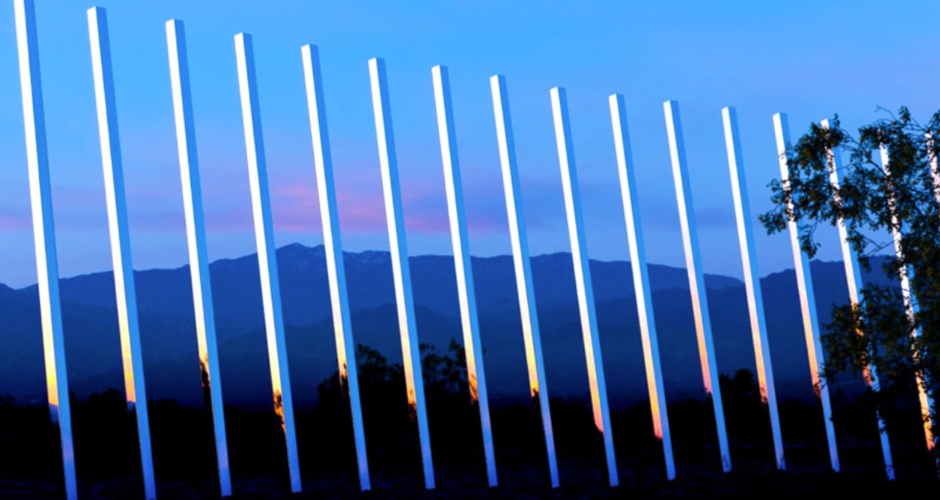
Phillip K Smith III’s Circle of Land and Sky, with its 300 mirror shards, installed in the California desert as part of the Desert X biennial, was a stand-out artwork for us in 2017. Its reflection and refraction of views of both the landscape and the heavens, in such an immense, natural setting, stirred something in us.
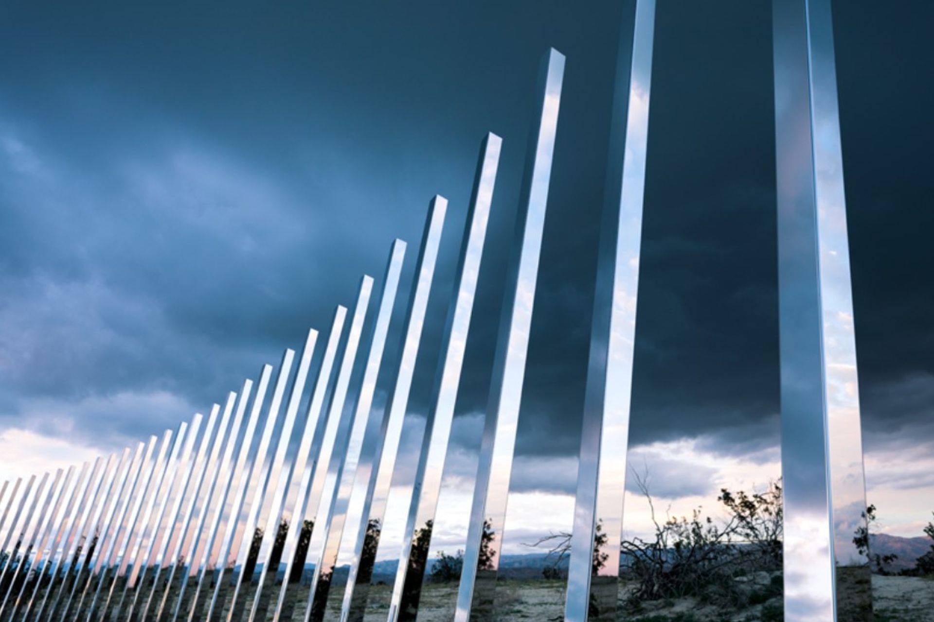
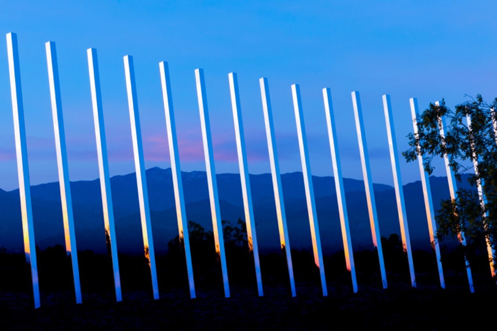
Back in 2015, we paid homage to Smith’s works – along with those of minimalist artist Donald Judd, the modernist iconography of Frank Lloyd Wright and Le Corbusier, and, more recently, the designs of Rem Koolhaas – in our submission to the Power Street Loop competition. Slated for a disused site flanking one of the inner CBD’s more complex road network junctions, Totem City was comprised of five exploded concrete block columns, suspended with central blades of mirror-polished steel. At once echoing the city’s totemic rise and creating the illusion of transparency, the blocks seemingly defy gravity; confusing perception, and reminding passersby of the jarring juxtaposition of the metropolis with the natural world.
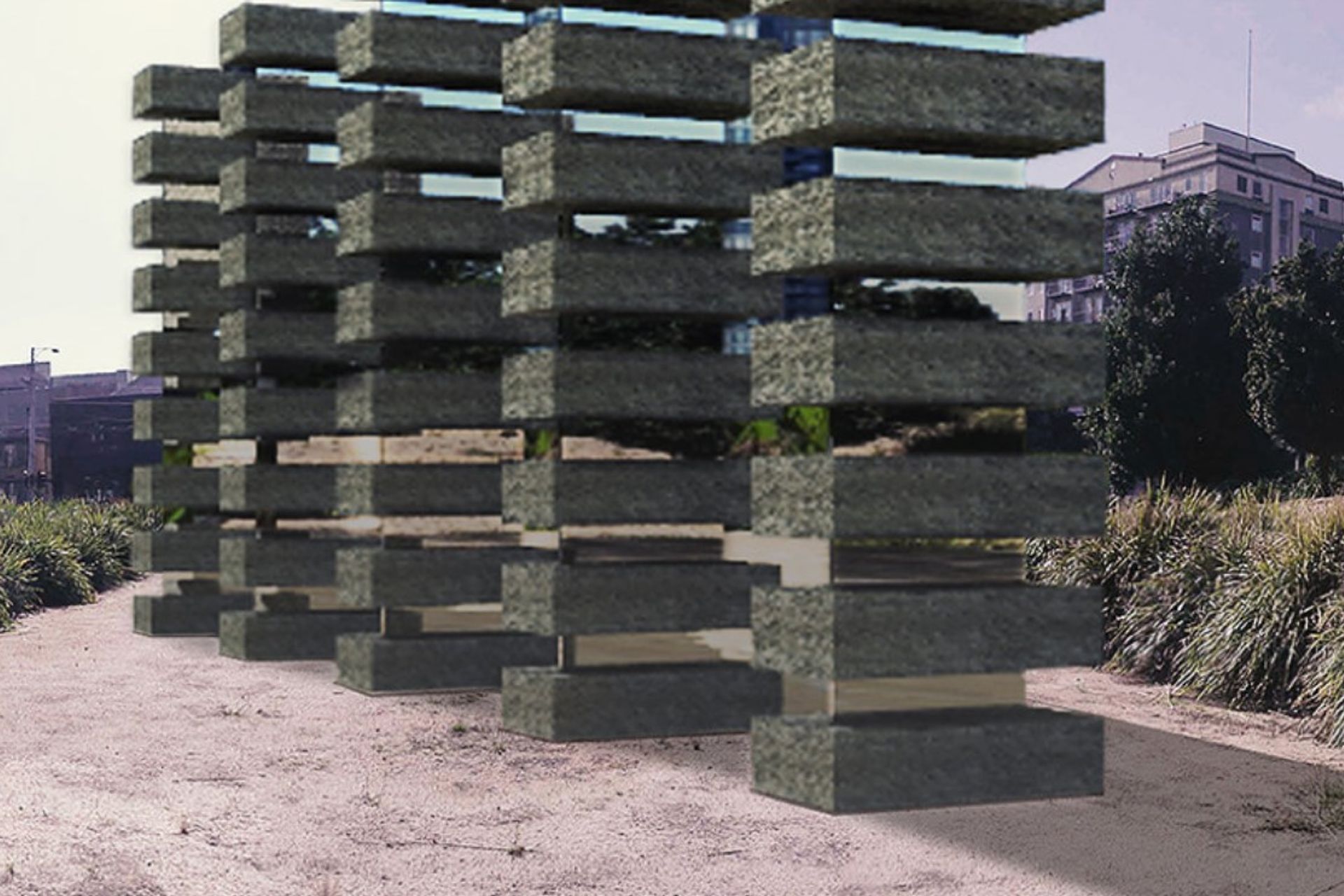
Polished mirror blades & concrete block columns from our 2015 Power Street Loop competition entry, “Totem City”.
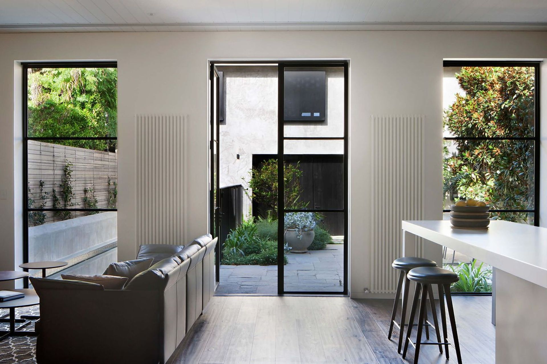
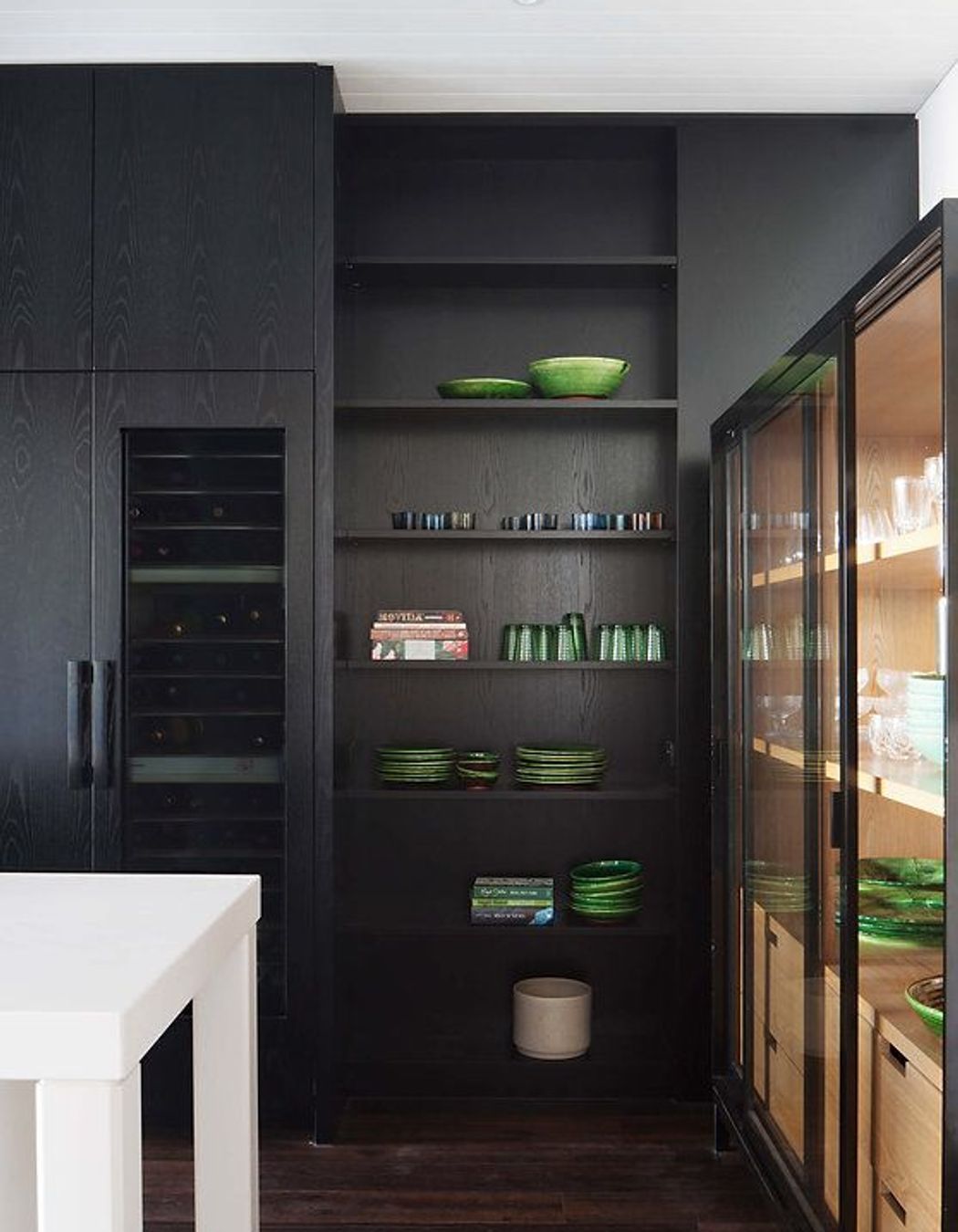
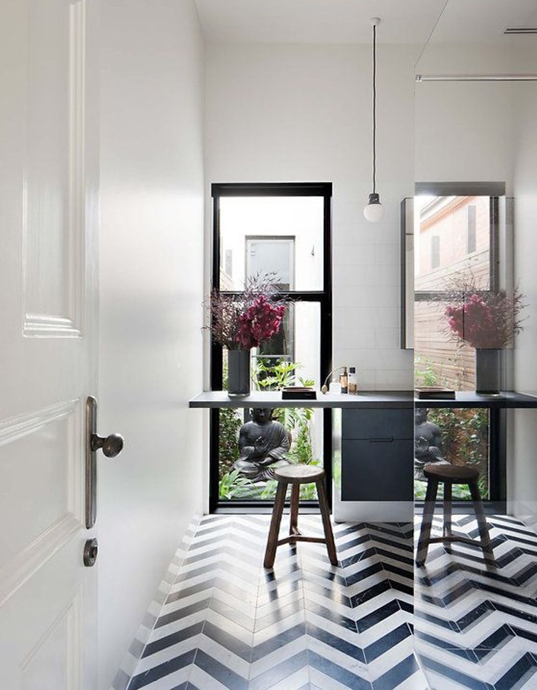
For the Albert Park House, we experimented with contrast, reflection and light in a similar vein. Earlier renovations to this Victorian home had rendered it plain and utilitarian, and we were interested in how light play might restore mood and build atmosphere in a more contemporary update. High contrasts, muted tones, playful shadows, partitions and reveals added drama, and at times created the illusion of extra depth and more space.
