Modernism in the countryside: an off-the-grid minimalist masterpiece in Northern Canterbury
Just 30 minutes north of Ōtautahi Christchurch sits an idyllic township. Stretches of rural land form the area, and The Gate House finds its place among the fields at the end of a long gravel driveway. "It's quite a private setting, and the site itself offered us a large blank canvas to work with", says Darren O'Neil, project lead and founder of O'Neil Architecture.
The client's brief focused on the land and surrounding nature. They were passionate about sustainability and embracing the beauty within the location. Architecturally, they wished for a contemporary interpretation of a farmhouse, but they didn’t want it to look out of place. It needed to be appropriate for the context.
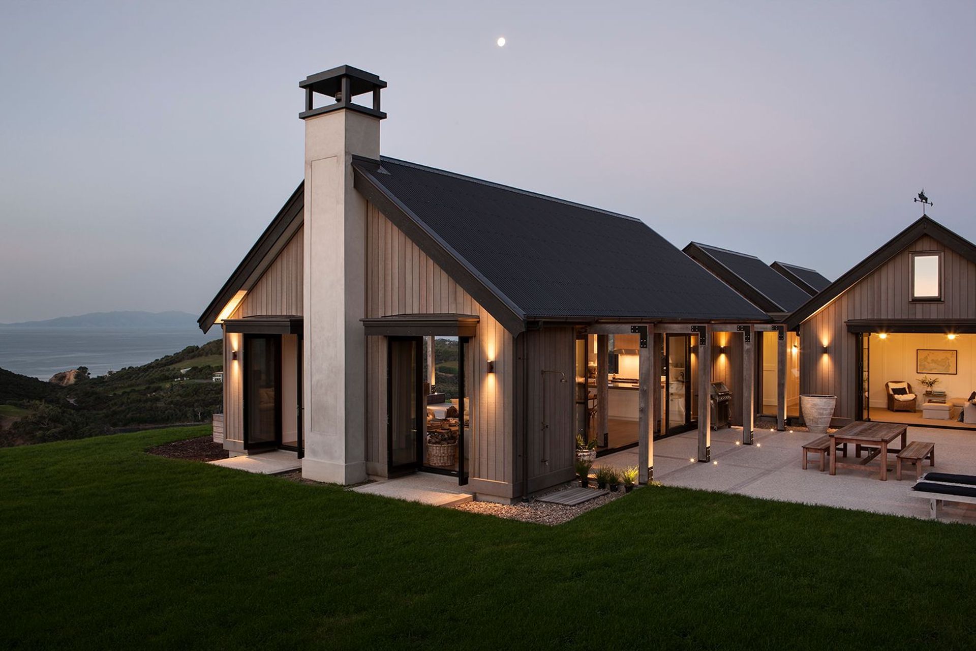
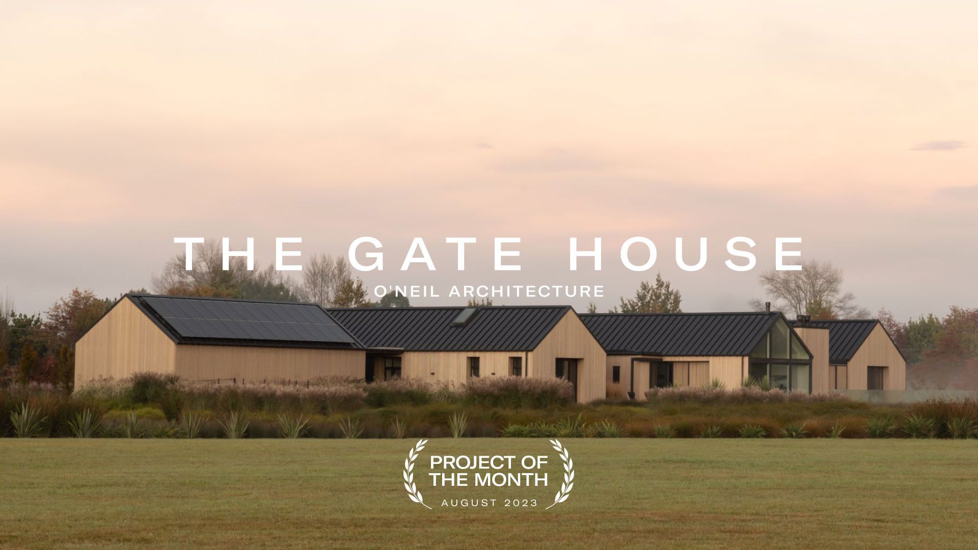
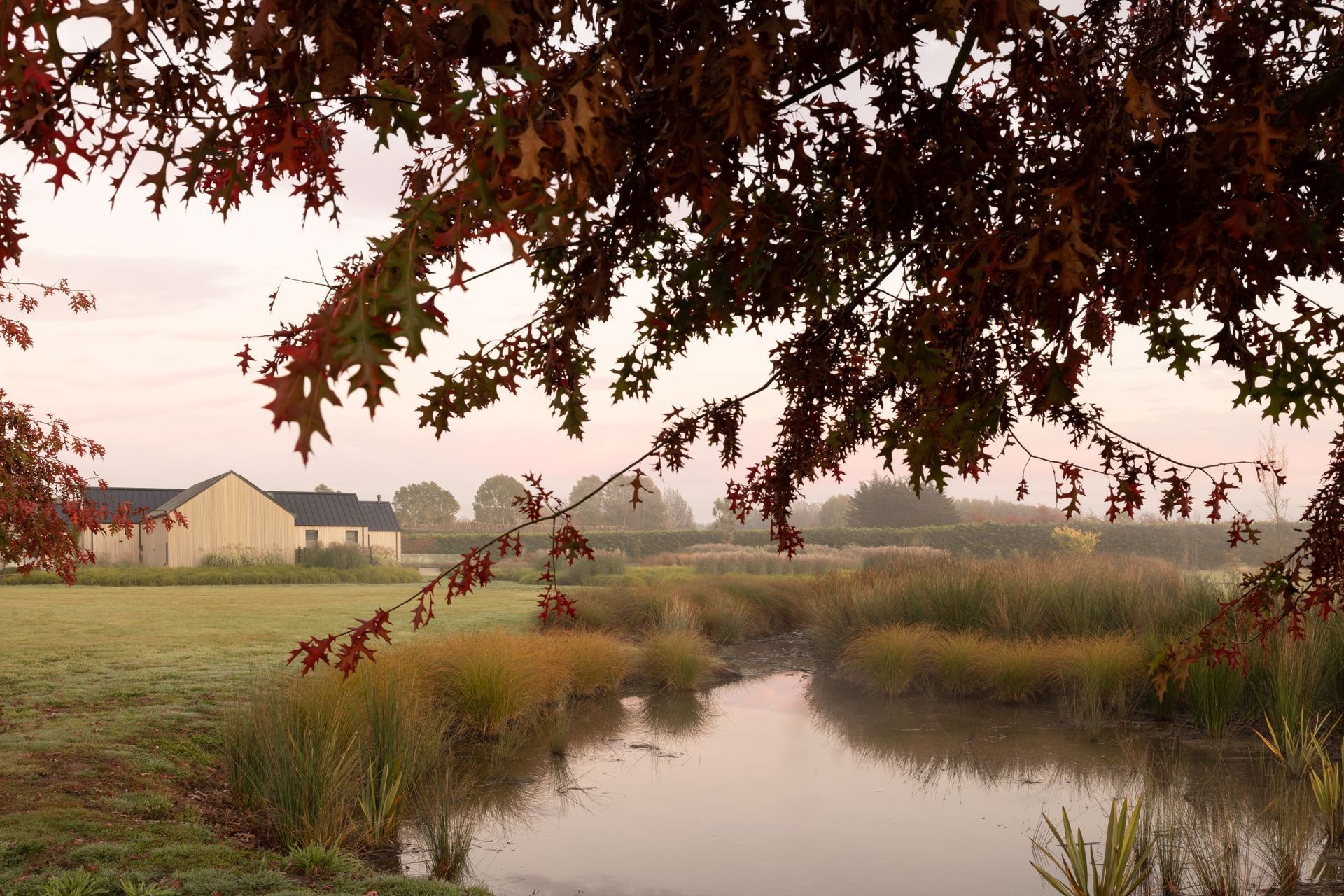
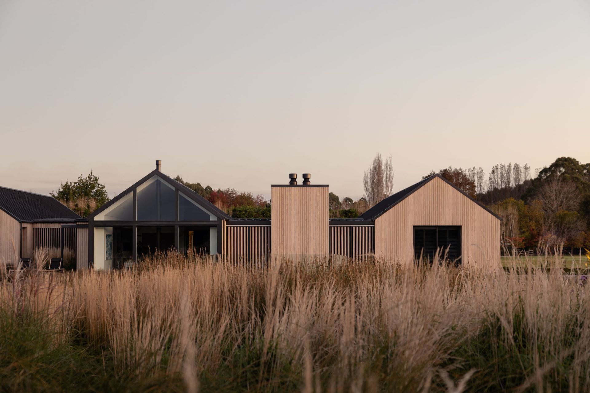
In response, O'Neil Architecture has conceptualised a minimalist masterpiece designed to be entirely off-the-grid. The Gate House is configured by four cedar-clad gabled forms, mirroring the shapes and symmetry of the traditional country barn. While three of the forms interconnect to establish the main house, the fourth is a step to the side and lends itself as a modern utility shed, housing the solar panels, holding batteries, heat pumps for the home’s underfloor heating, and two 25,000-litre water tanks.
Henry Blakely Landscapes led the project's landscape architecture, transforming what was a large paddock into a rural oasis. The landscape expresses itself with varying heights of soft hills, tall grasses, water features, and an unforgettable arrival to the house, which takes shape in the gate house form — measured to be the exact same size as the main gabled forms. Henry Blakely designed and built this structure, creating a striking entrance to the property, which the project was duly named after.
“The forms are quite simple in their execution. They're slightly minimalist in the way they look. But they're clad with a beautiful western red cedar, which softens the whole look of the house”, O'Neil explains. "We spent a long time on proportion to ensure that all of the forms and gables matched exactly."
This discipline of form and scale has established an attractively uniformed facade with a balance that gently echoes the serenity of its surroundings. "All of the shapes are orientated to capture precise views of the landscape and to provide sheltered living areas that offer a connection with nature", O'Neil smiles. It's as though The Gate House is a world of its own.
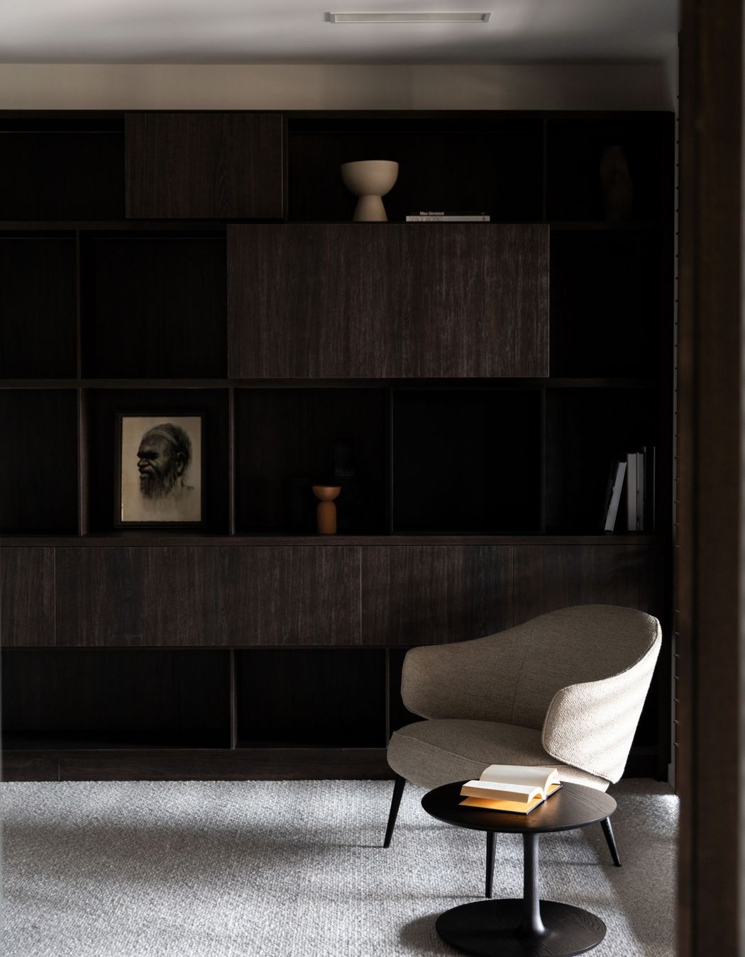
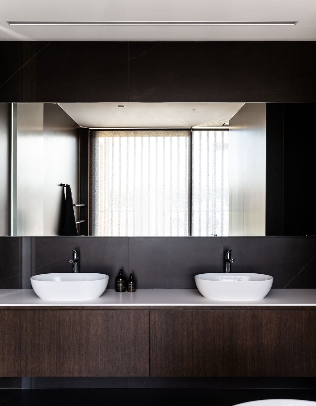
Upon entering the home, you’re met with quite a contrast to the light, blond exterior. The interior, designed by Lume Design, is dressed in rich chocolate brown cabinetry and a combination of natural colours — all reflecting the hues found in the home's exposed aggregate concrete flooring. "Typically, we start from the ground up in any project", shares Jeff Merrin, Principal at Lume Design.
When exploring options for their primary flooring material, the client found a particularly beautiful concrete flooring in Queenstown's Jack’s Point. So Brendan Falloon, construction lead for The Gate House and Director of Brendan Falloon Builders, flew down to visit and examine the concrete. It was a striking floor, with blues, whites, chocolates, and gold all coming through in the aggregate, and it turned out that Cromwell was the only place to source the components.
Falloon explains, "We ended up bringing up all of the aggregate, sand, and cement to our local supplier in Christchurch, who stored it for us. Then, when the time was right, we prepared the mix for installation, which involved great care to get the best finish.”
It's these precious stones, found throughout the concrete flooring, that inspired the interior's natural colour palette and elegant atmosphere. "We responded to the concrete, allowing the warmth and character within the stone to drive the decisions around the other materials, from the rich oak cabinetry to the mustard rugs and the porcelain-coloured wool of the sofas", says Merrin. "All decisions around the interiors relate and tie back to the polished concrete."
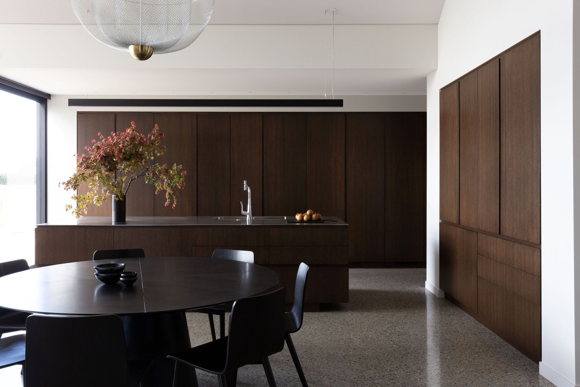
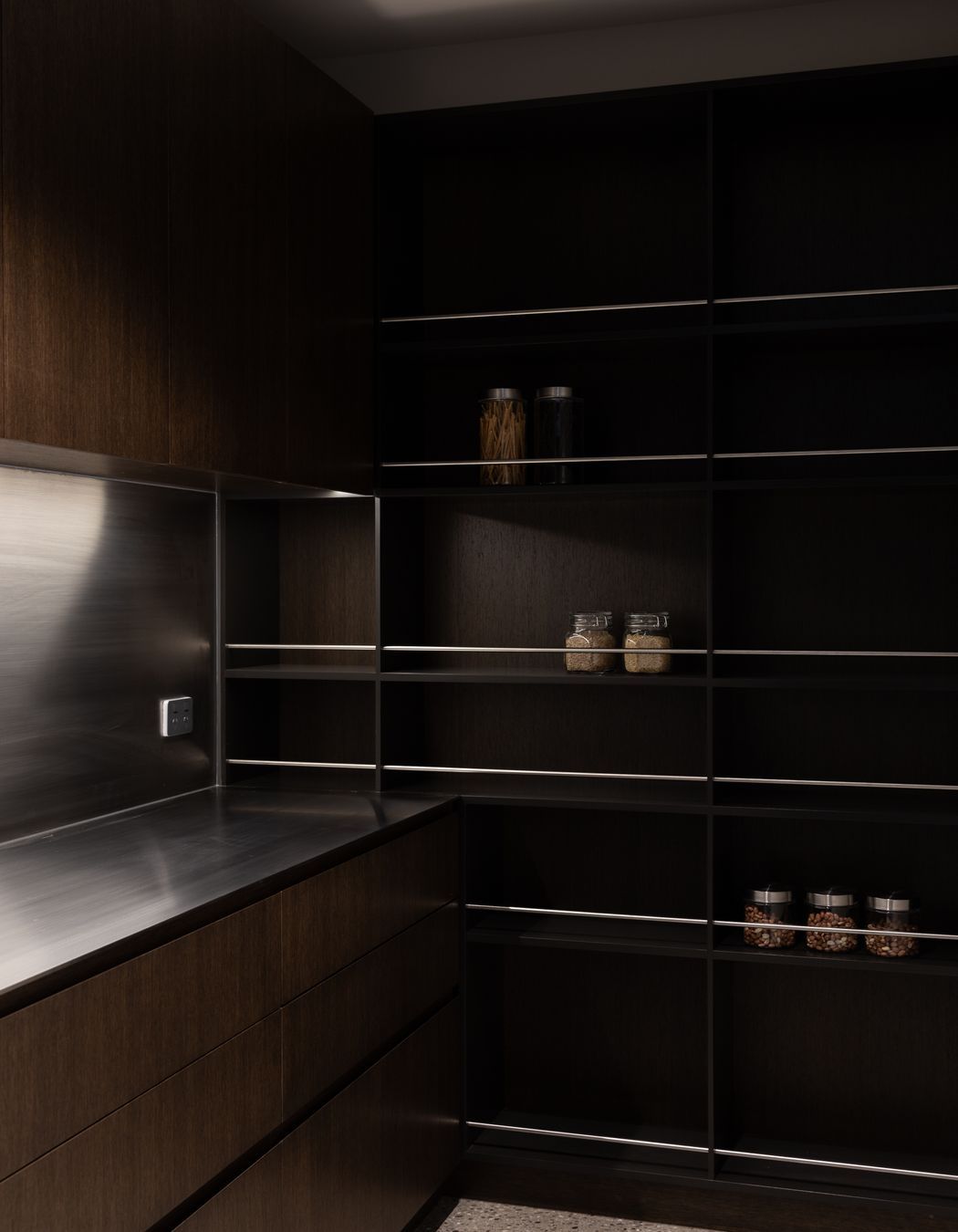
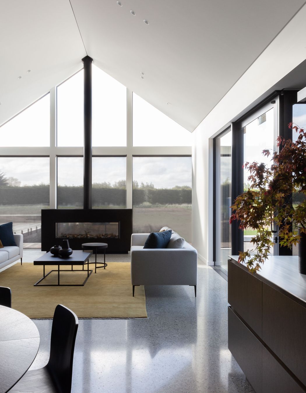
Consistency and minimalism were key words in the client's brief, so there’s a pattern, both externally and internally, of restraint and repetition. The facade explores the simplicity of the rural vernacular and modernity; meanwhile, the interior practices minimalism via clean lines and hidden spaces. The kitchen is a perfect representation of this minimalist philosophy.
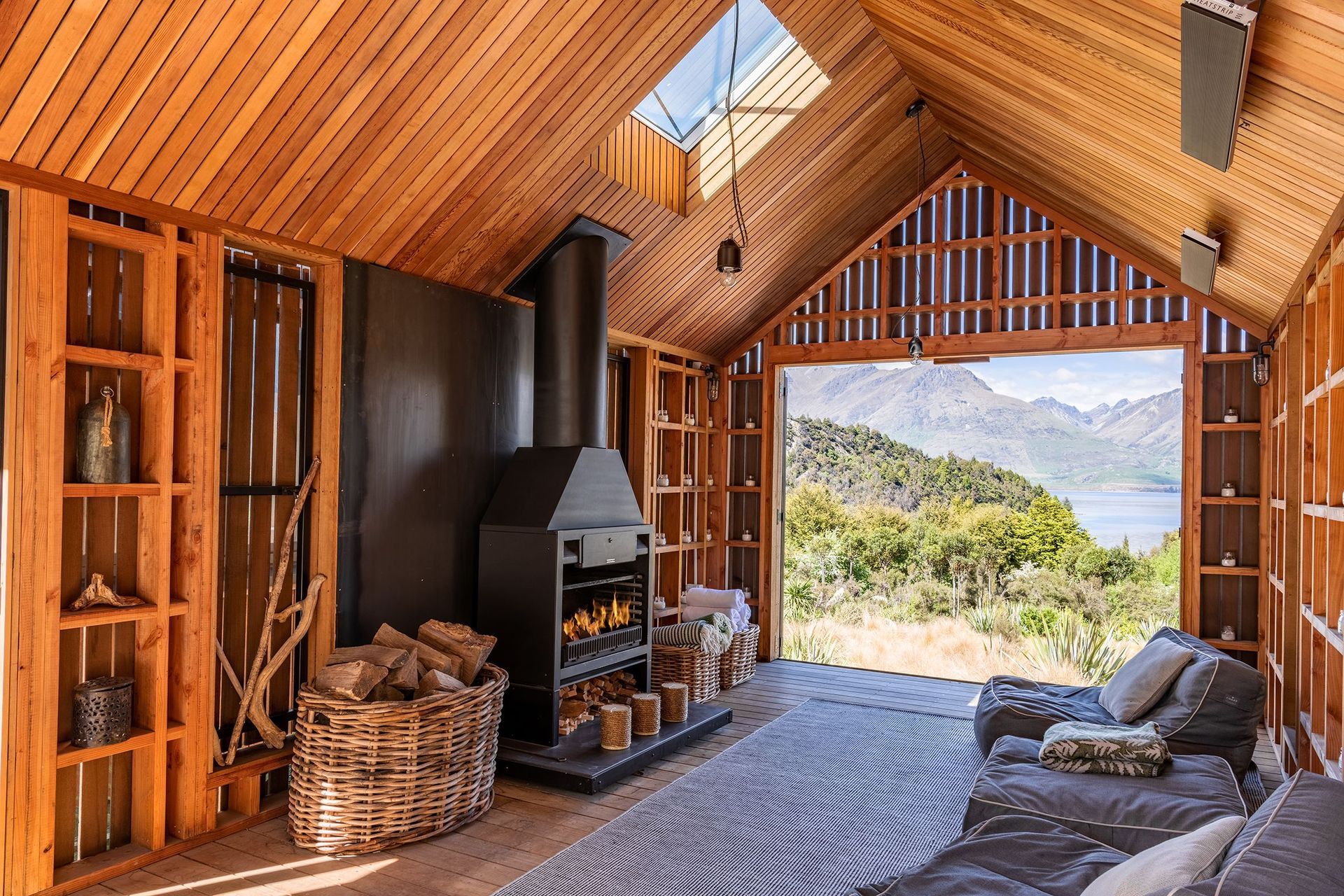
Positioned in the middle of the house, the kitchen is undoubtedly the heart of this home, yet it's not always on show. To maintain a sleek, uncluttered space, the kitchen was designed to be hidden away and is concealed by large oak doors that can fold back and disappear into the wall. A similar feature has been created around the central courtyard, too, with the installation of sliding cedar screens that can be hidden entirely by tucking them back into the walls. These screens were designed to be used interchangeably with the sliding glass doors that sit by their sides — a functionality that allows air to flow through the house while maintaining a sense of privacy.
"There was a lot of work involved in the cedar screens", says Falloon. "First, we had to put hidden gutters in the concrete, then precast tracks for the doors to slide on, and finally build cavities for the doors — all while building the fireplace simultaneously and ensuring it all lined up."
Achieving the level of detail in this project required significant skill, diligence, and planning. From the outset, Falloon and his team were involved with the details of The Gate House, right through to the finishing touches that made this place a home. O'Neil praises their commitment to the craft, sharing, "The team from Brendan Falloon Builders did a fantastic job. The house looks deceptively simple to build — but believe me, it's not. It takes real skill and a strong eye for detail."
Simple is an interesting concept in architecture, as it is with most art forms. It's a style that deceives its audience, appearing straightforward at face value while concealing the degree of care required to execute. "Simple is hard to do", O'Neil says. "Still, sometimes I might look at a painting, turn to my wife, and say, ‘You know, I could do that'. But then you go away and try and realise there's no way you can. You could say the same about photography and most art forms. Simple is very complex.”
Upon reflection, it's clear that the team attributes this project's success to their collaboration. “It's the sum of all the parts," says Merrin. "The architecture is timeless, it's a very contemporary farmhouse, and the builders have done a fantastic job. But I think a major contributor to the feel of the place is the work that's gone into the landscaping. It's such a serene setting; the mass planting and its movement in the wind — it's just really engaging. And with all of the glazing, there are so many places you can sit, relax, and enjoy the surroundings. It's a really wonderful home."
"It's just got this beautiful quietness about it", O’Neil adds. "I know it's in the middle of a rural site, but the house has a great sense of calm. That feeling is what makes the project a real favourite of mine."
Explore more projects by O'Neil Architecture.

