Onetapu: The project was named ‘Onetapu’, which means sacred sands
Written by
15 May 2022
•
5 min read
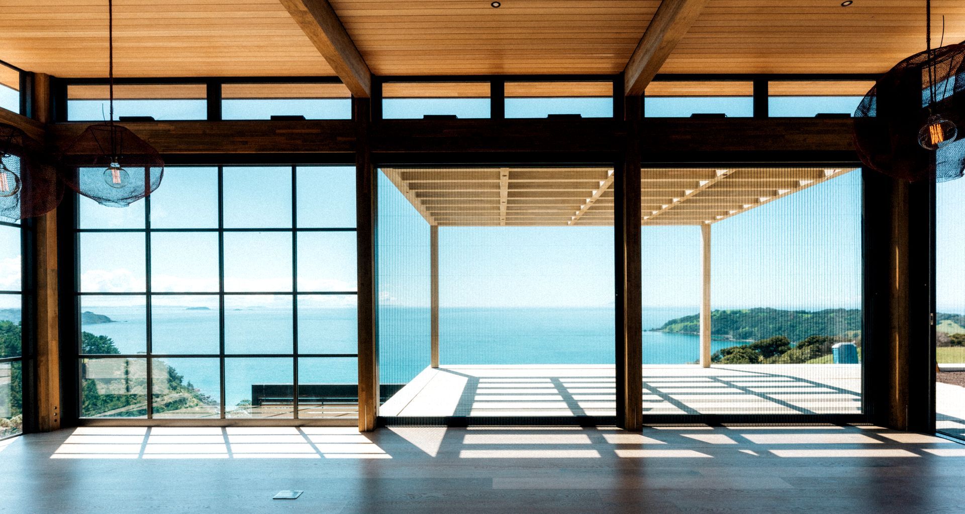
The project was named ‘Onetapu’, which means sacred sands – a fitting name for a very special place, and reflective of architect Charissa Snijders' practice of ‘reverence architecture’ – where the relationship between people and place is of utmost value.
For Charissa, this meant a deep exploration of the land before work began.
“When the site was selected, my client and I went there and just sat for a while and really felt what the site was and what was wanted. We got a sense of peace and tranquillity, and also joy, and that’s what we worked with,” says Charissa.
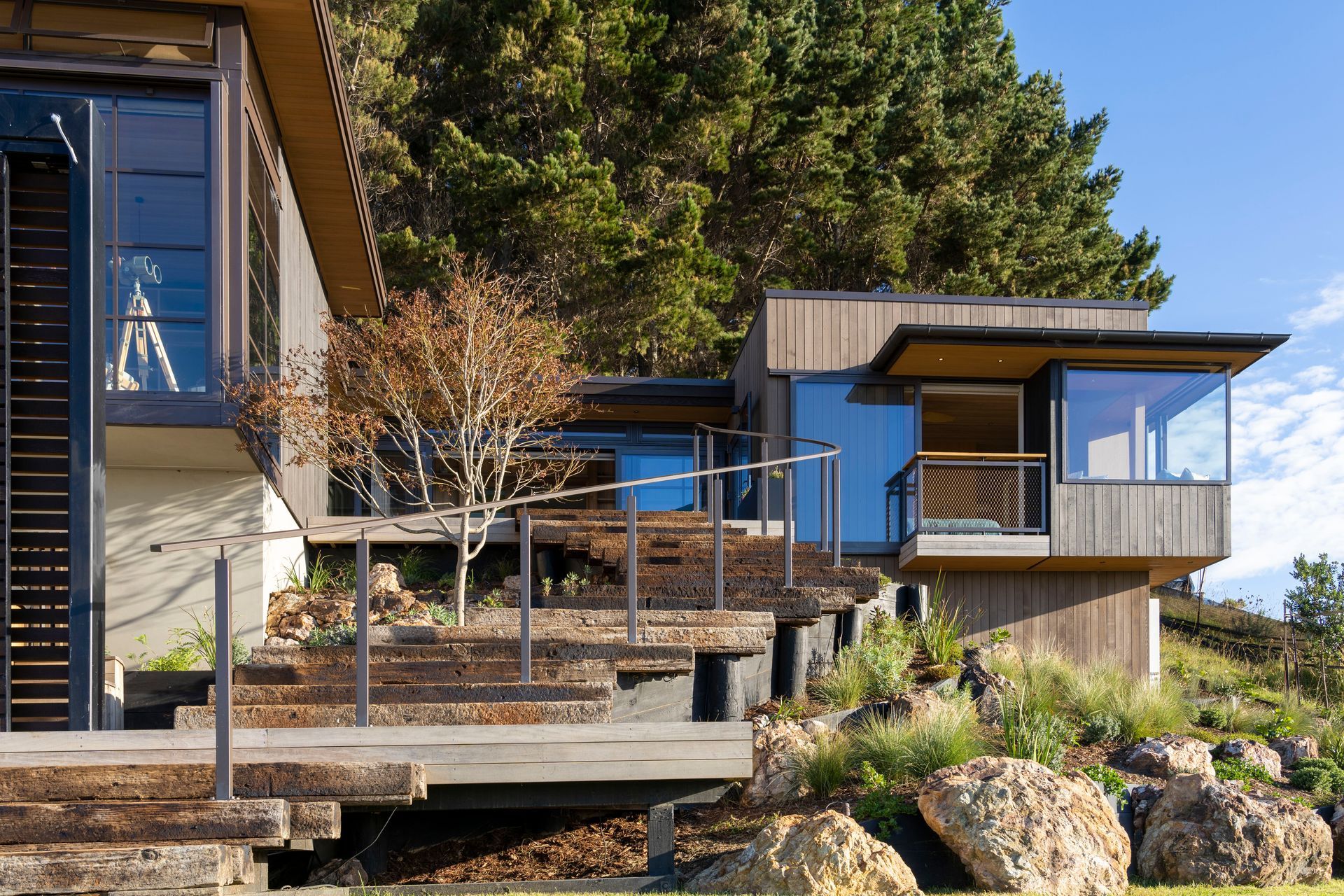
Positioned between two existing dwellings occupied by the same family, a walkway connects all three.
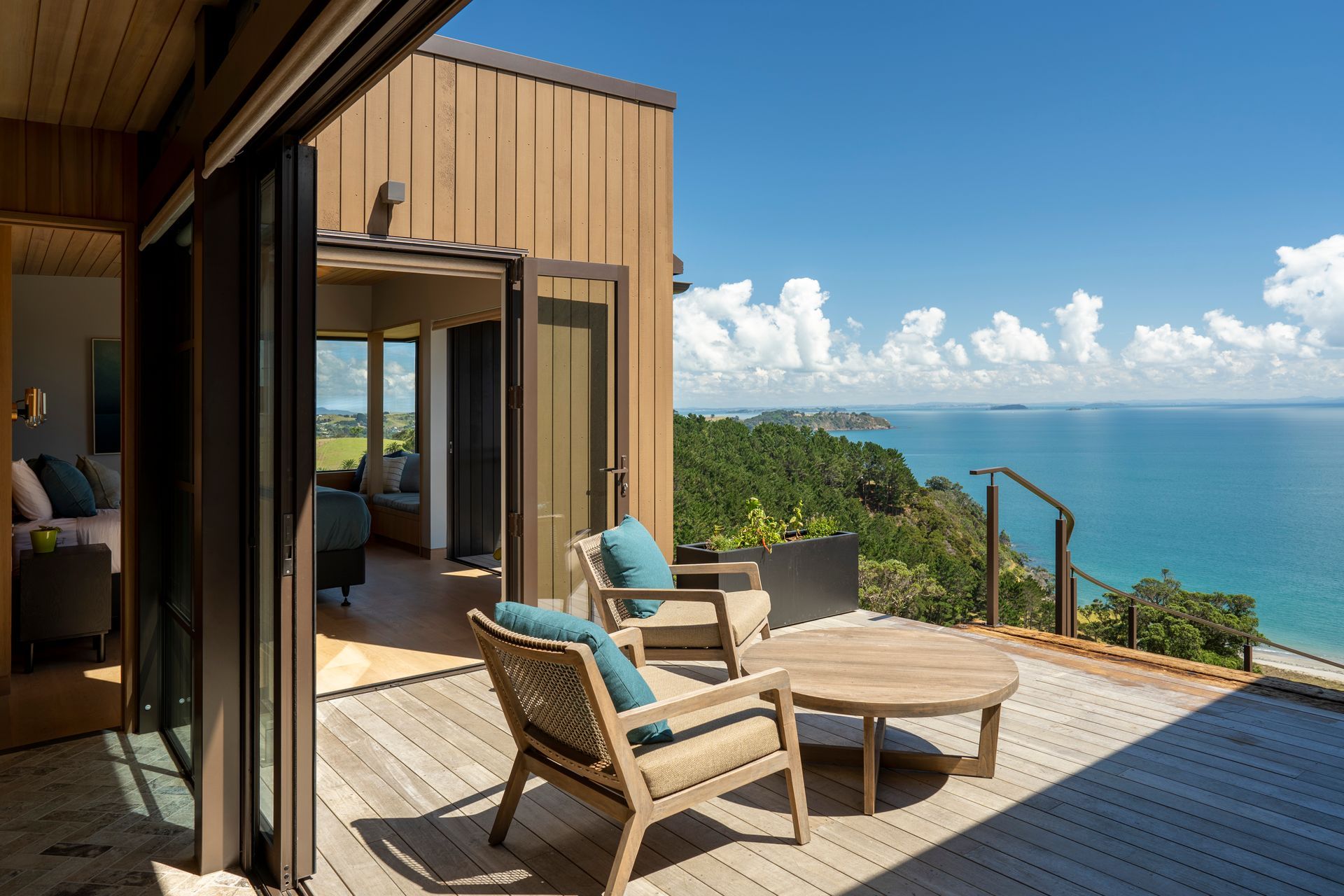
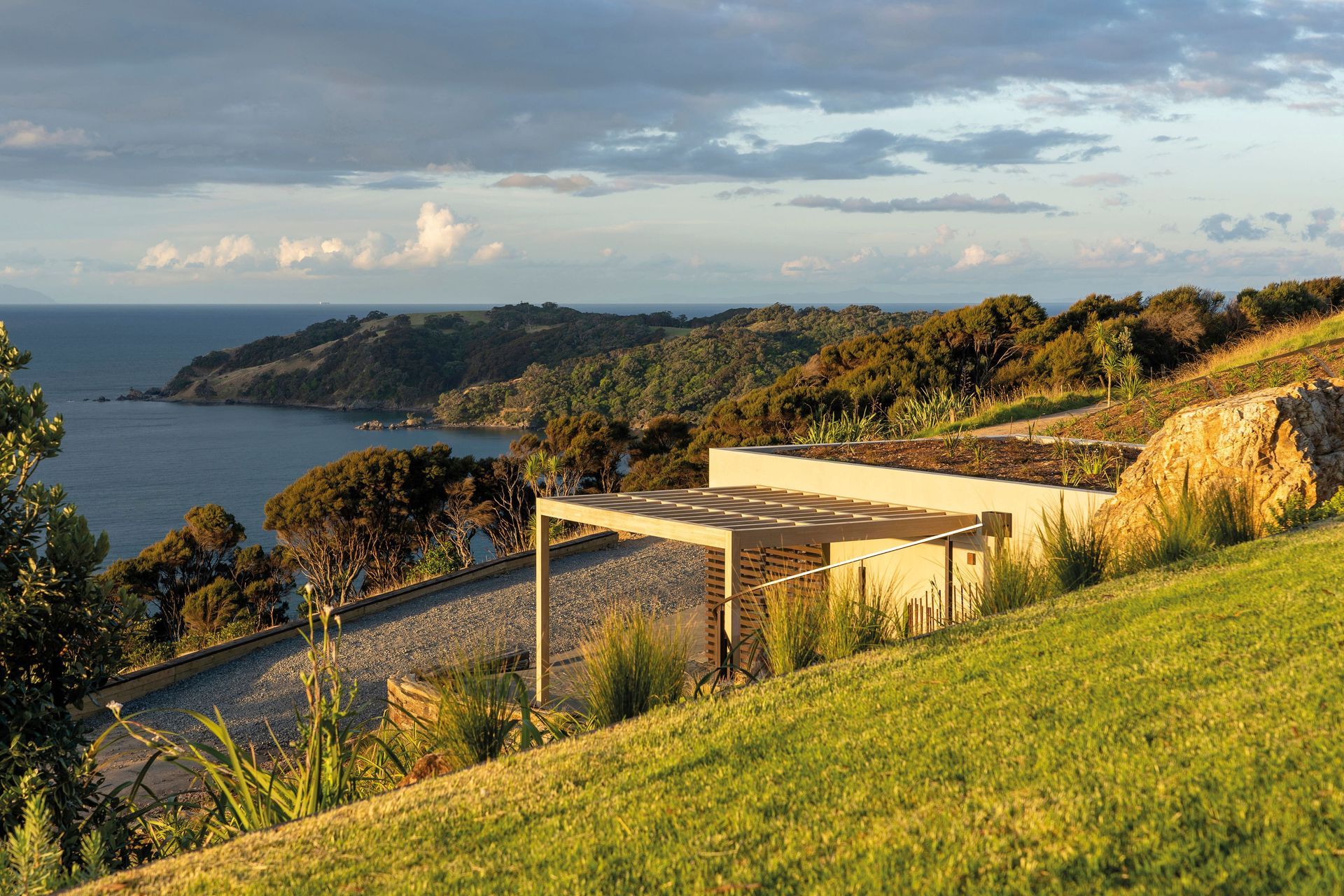
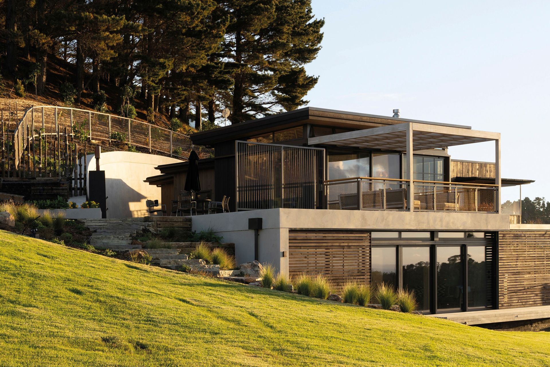
The structure appears to emerge from the terrain, with living roofs sitting above sections of warm, muted grey plaster and a combination of light and dark coloured timber. Careful landscaping around the home further helps to integrate the building with the land.
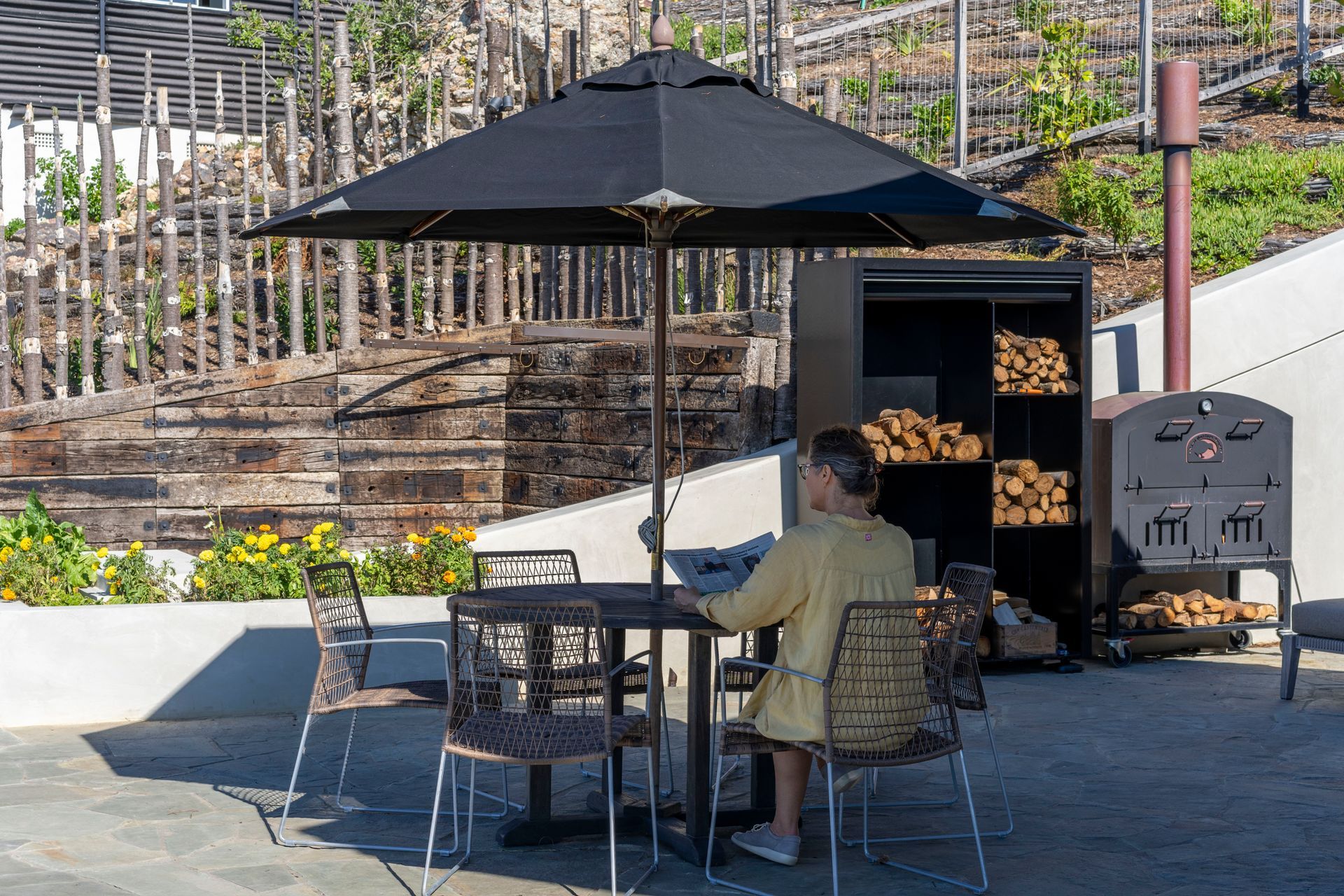
“The curve we've formed in the wall works really well in how it creates different areas as well as following the slope of the land. The curve acts like enfolding arms that shelter and hold these areas.”
A multifunctional area is created by this retaining wall –the ensuite area is separated by a screen-like gate that then accesses a quiet service area that flows into the main outdoor entertainment space with an outdoor fireplace/oven. All these spaces are held by the enfolding arms of the curved retaining wall.
Unlike a traditional home, the idea of creating a community feel between the dwellings means that there is no defined entrance. Instead there are multiple arrival points.
“There are opportunities, and different experiences to how you arrive,” explains Charissa. “If you’re a guest, you might arrive differently than if you’re a family member.”
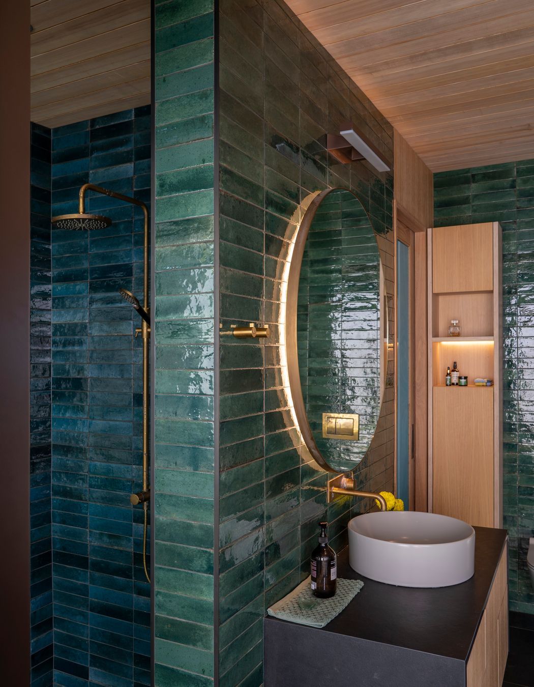
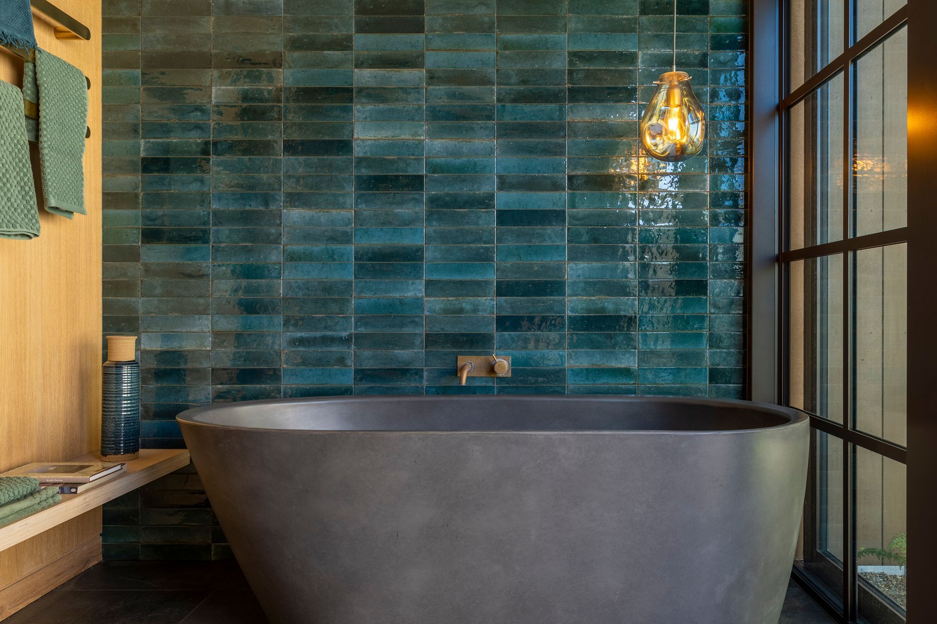
Once inside, you are greeted by textures and colours that mimic the green-blue colour of the kingfishers that frequent the property.
This colourway is particularly dominant in the bedrooms, with each glass door a different hue. Blue-green tiling encapsulates the ensuite and the lush green of its bordering fernery oasis enters through the glazing, adding to the serenity.
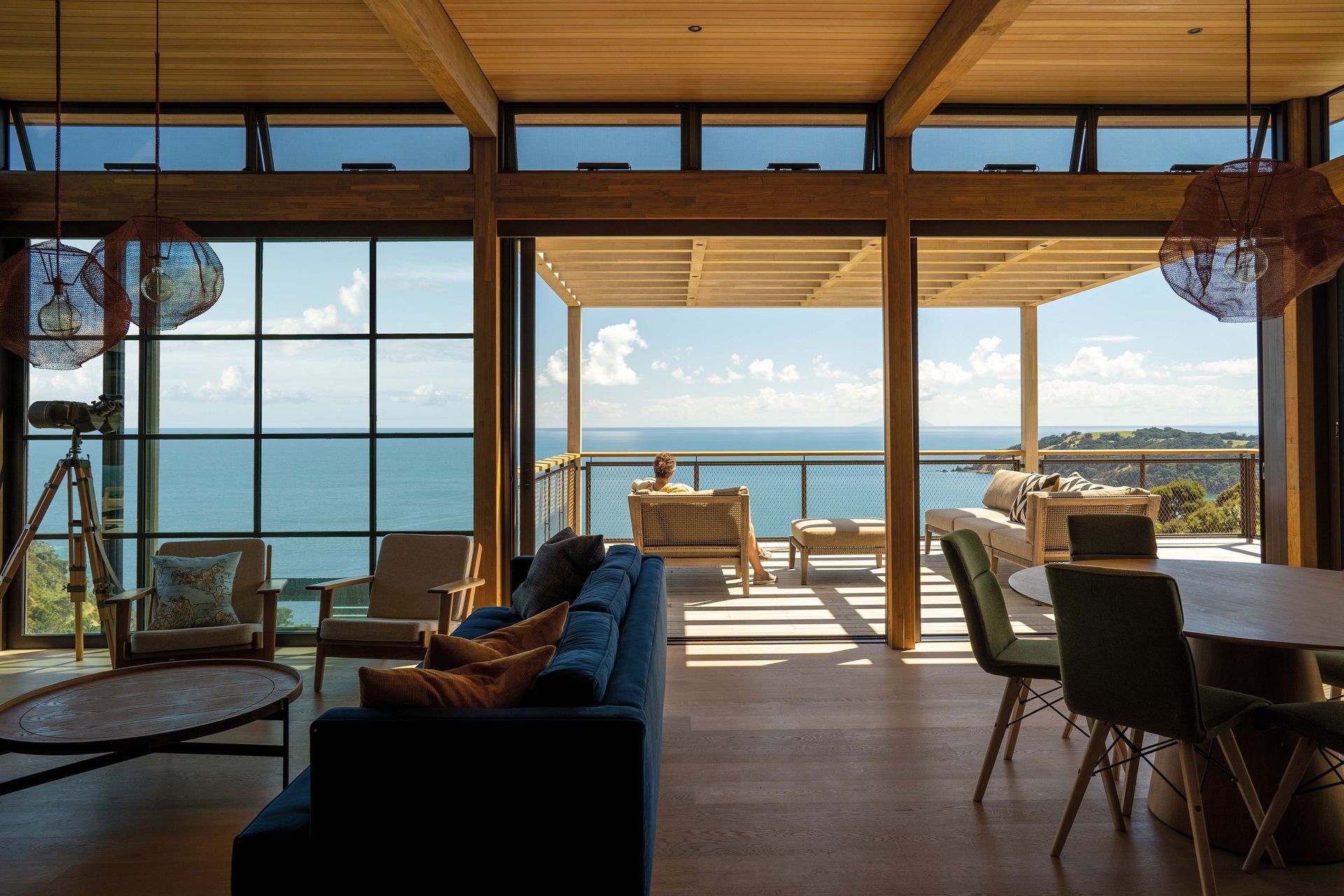
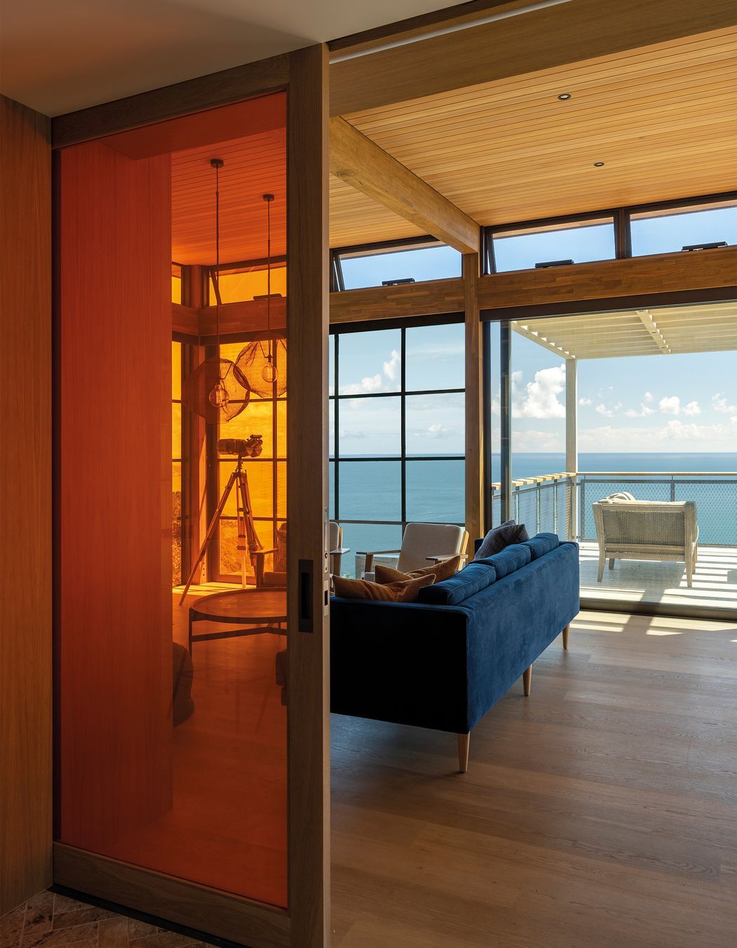
In the main living area, a panorama of the ocean can be seen. Facing this stunning outlook, the extensive glazing is separated in two – one half fixed and the other opening to create a different experience between the two sides.
“People have different feelings when they go in there, a Japanese feeling or a New York loft feeling. It really helps frame the view in a different way.”
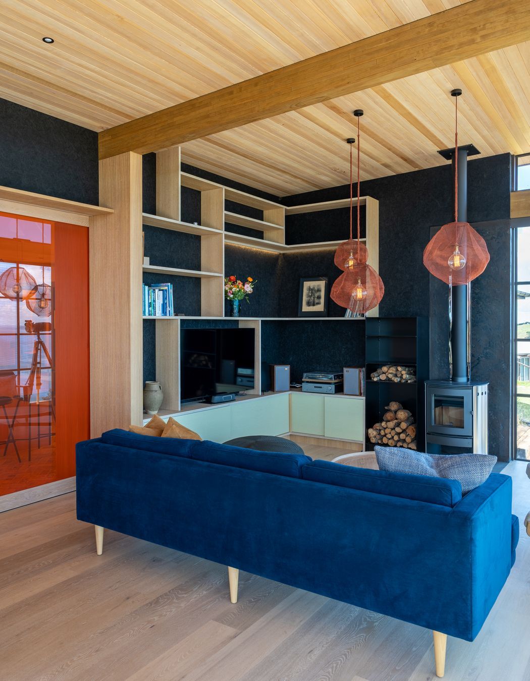
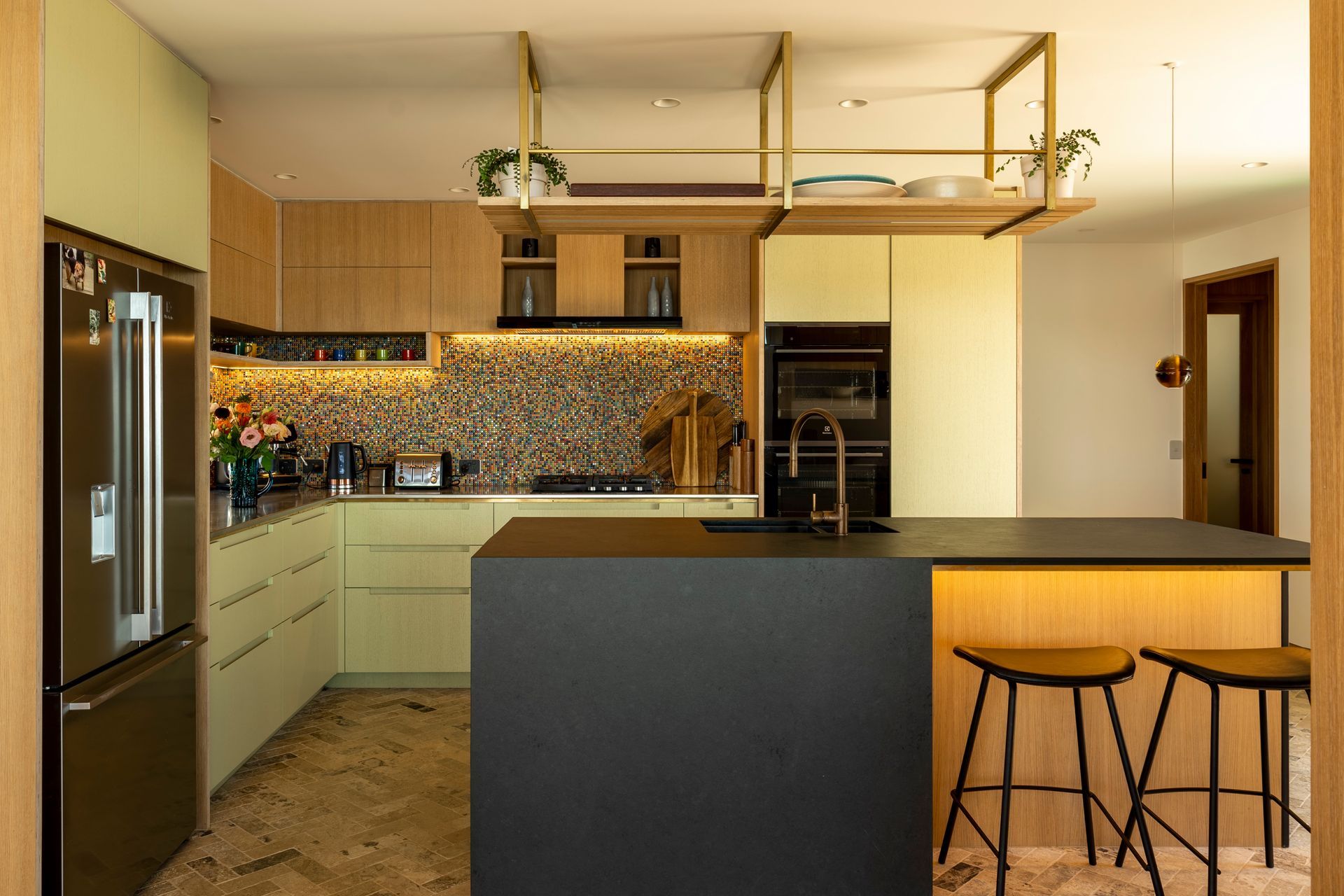
Behind the open living space, the kitchen’s splashback adds a playful pop of colour. Drawing from the tones of the home’s glass doors, the carefully curated kaleidoscope of colour allows you to experience it all together – integrating and uniting the choices that have been made throughout.
Oak cabinetry melds with a soft green hue over oak. These two tones are repeated in the kitchen, passageway and in the living area – each instalment offering a unique expression of the colour.
For example, the green cabinetry in the living area has a black strandboard backdrop – creating a different feel to its use in the kitchen, or the passageway against the ashin panelling – while still being unified.
The herringbone flooring in the hallway and kitchen has the same impact with its colour referencing the oak and black detailing.
Creative use of colour continues with the large joyful tangerine orange glass cavity sliding door that separates the living and dining area from the kitchen.
The playful use of colour is further expressed in the ‘relax’ room in the lower level of the home. Designed to be used by visiting family and friends, this space is completely separate from the main house.
“Initially we looked at putting stairs and connections between upstairs and downstairs,” says Charissa. “But we realised, because it was serving as the overflow for family and friends, it is actually an overflow for all the houses on site. And so the separation is really important.”
Here, a theatre area can be divided into three, with orange and blue dividing cavity screens. The inclusion of a bathroom allows the room to be used in multiple ways. It is also furnished with pieces that can be enjoyed both indoors and out.
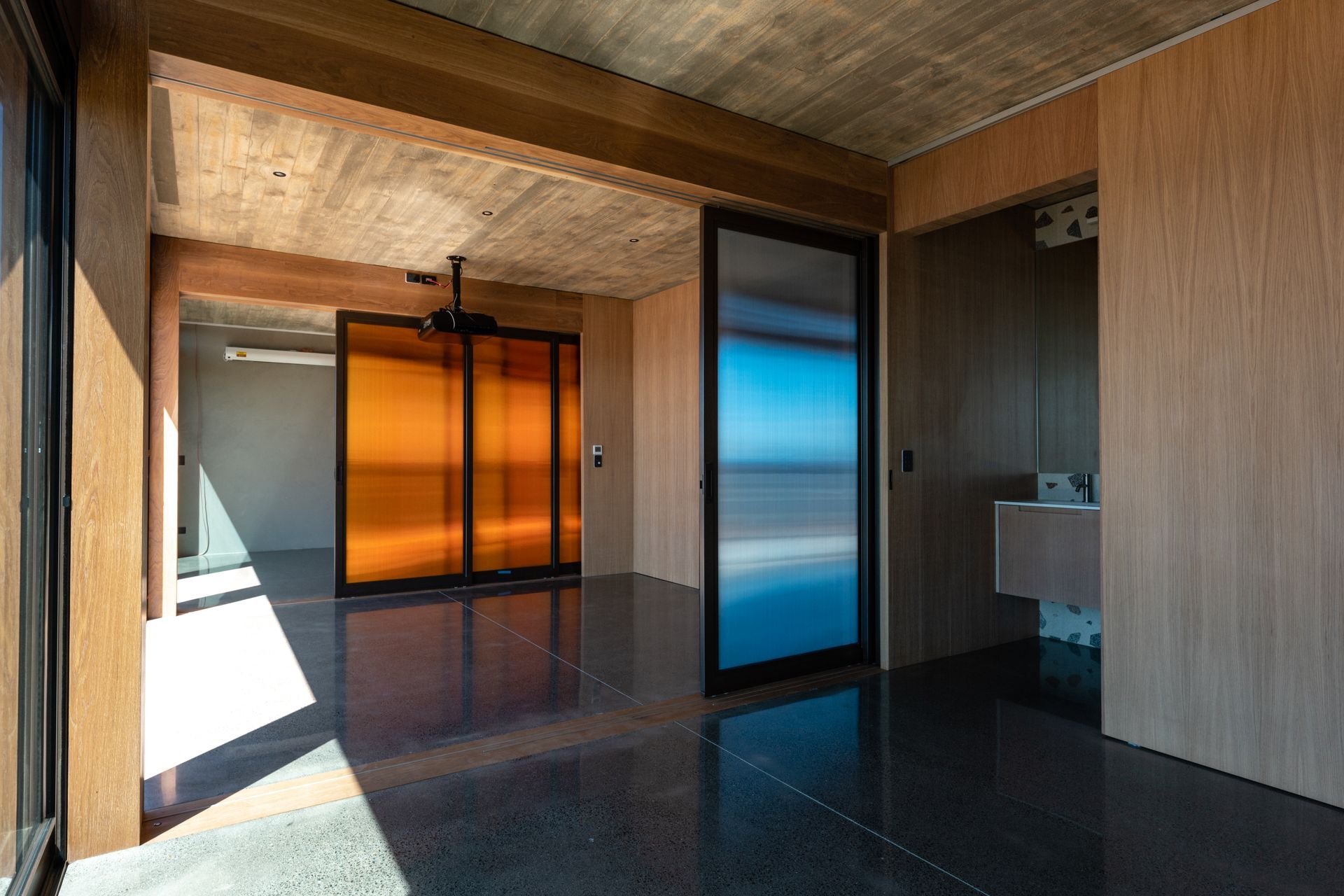
“It’s a very flexible, moving, dynamic space.”
Sustainable design is integral to all of Charissa’s work, and it has been naturally woven into this project.
Plant-based WOCA Denmark paints and stains have been used for the interior and exterior, as well as FSC certified timbers. Strandboard graces the living room walls where both natural light and downlights create dancing movement on the surface.
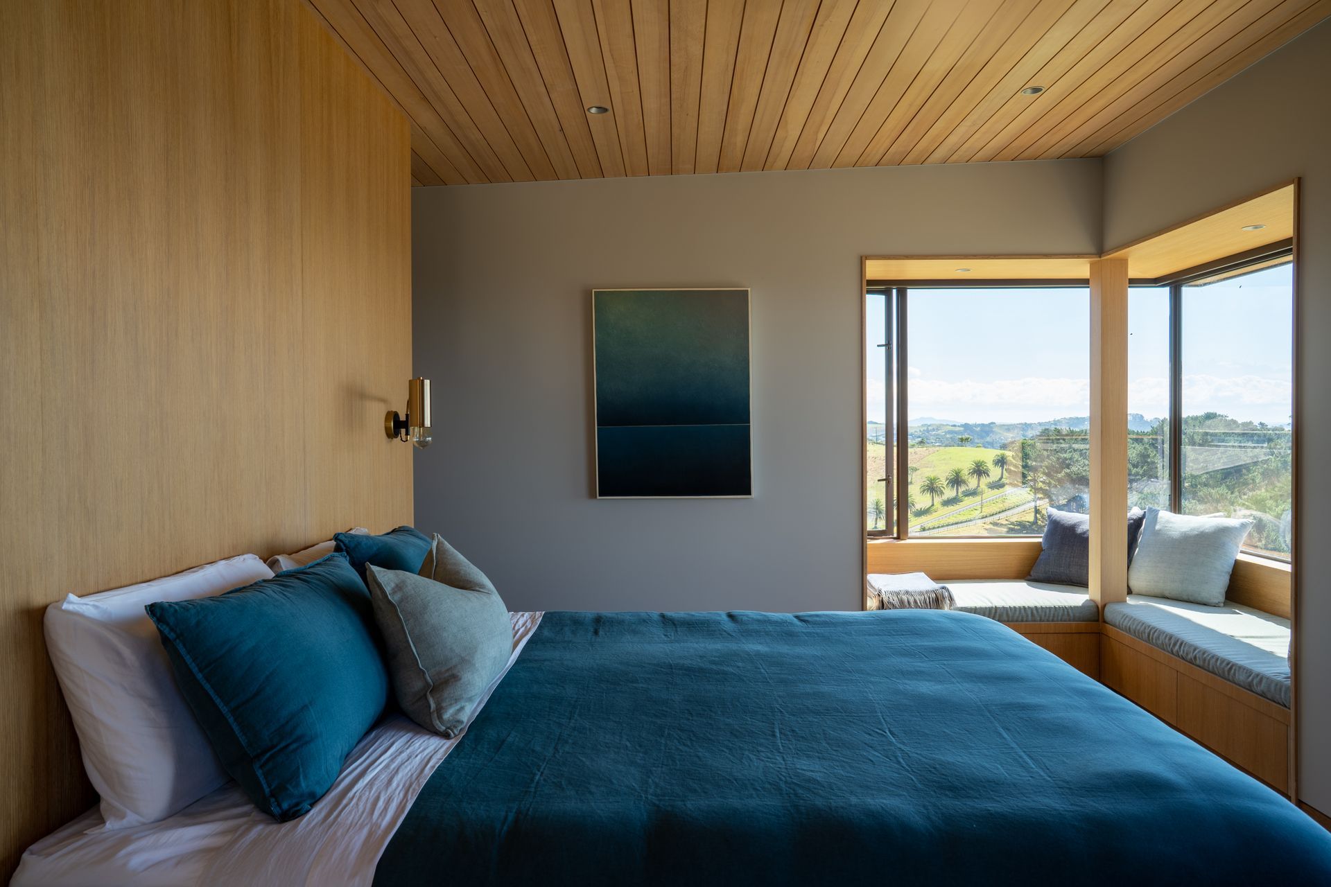
Charissa’s favourite aspect of Onetapu is how special moments are experienced as you move through the home. From the uplifting experience felt when entering the living space, to the sense of peacefulness that the main bedroom’s colour palette and materiality offers.
“Each room, even though it feels connected, has a different feeling and experience to it. Each space brings out something within you, and you experience that.”
The client’s willingness to trust and explore was also a gift, she says.
“That’s why I do what I do, because it brings joy to people and creates special, unique places that uplift people.”

Photography: Bridget Hackshaw Photographer & Peter Rees Photography
Words: Cassie Birrer