Rebranding signals fresh take on acoustic solutions
Written by
25 May 2021
•
3 min read

As a business develops, it is not unusual for it to diversify as other markets open up. With these changes in direction and services, it’s important that a company’s corporate identity stays current and relevant in the minds of its clients or customers.
This was the thinking behind the recent rebranding of Autex Acoustics—a division of the New Zealand-based manufacturing and product development company Autex, which specialises in textiles and advanced fibre technology.
“With over 50 years of history designing and manufacturing innovative textiles for the built environment, Autex had a product-first approach—investing time and energy into developing industry-leading interior acoustic solutions; yet paying little mind to our visual identity,” says Danielle Robinson, Group Marketing Manager.
“Acoustics can be a very complicated part of the design process and with our expertise in this area, built up over decades of experience, we wanted our clients—architects, designers and specifiers—to see us as a part of the design process; this new branding of our acoustic division is more on par with our approach of partnering with clients to provide custom acoustic solutions.
“Also, I wanted to separate the Autex Group from each of the divisions, enabling them to have their own distinct identity.”

Autex Acoustics: innovation in acoustic solutions
Danielle says this is the first time the company has rebranded the acoustic division and the reimagining of Autex Acoustics honours the company’s history of innovation, yet refuses to be stuck in the past.
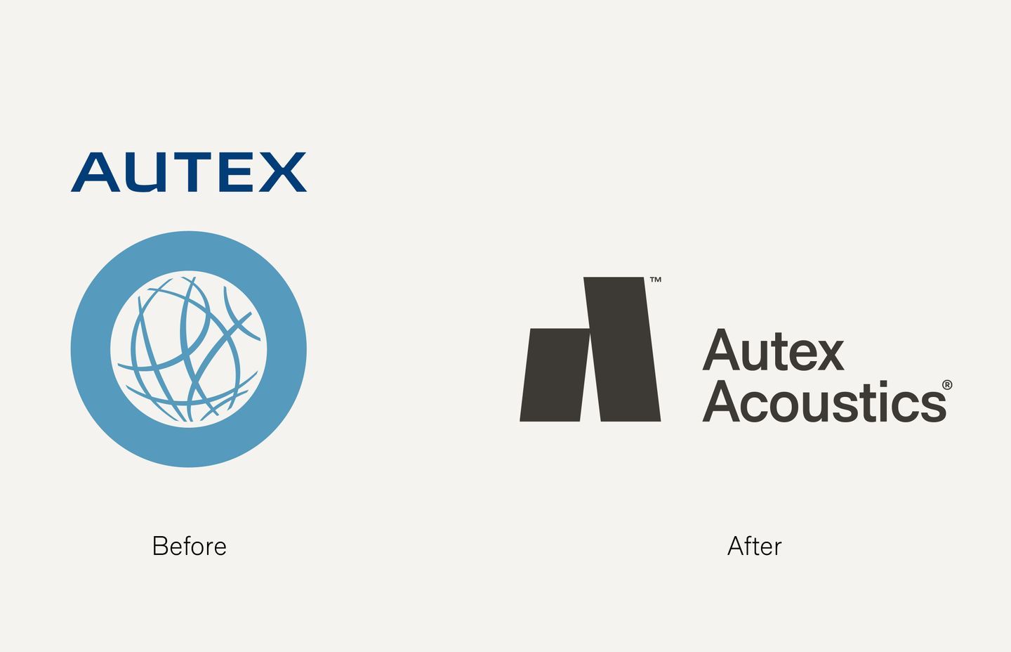
“The flat and dated corporate blue logo felt out of place for a company committed to creativity and contemporary design, so Autex Acoustics worked with Marx Design to transform a tired, corporate identity into a modern, design-lead brand.
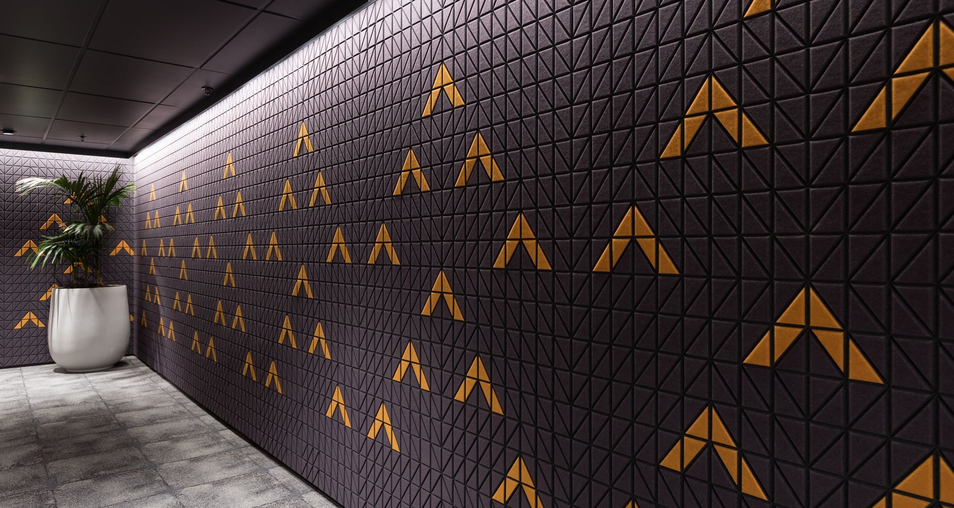
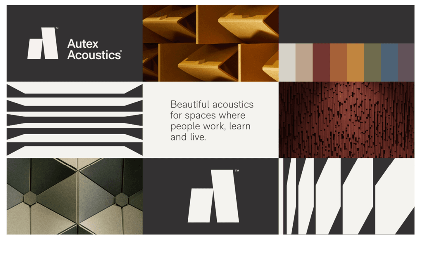
“The new Autex Acoustics logo depicts two modular acoustic panels forming an abstract ‘A’ shape. The panel shape has also been used to create bold, graphic patterns that represent both the product and the function—visually referencing acoustic panels and audio sound waves. These patterns are designed to be used as artwork on collateral, packaging and digital elements.”
The new logo also references the fact that Autex Acoustics is a part of the architectural space, not just a supplier to it and reflects the design-led nature of the company’s products.
In line with the refined logo, the new branding has two primary colours: black and white. Keeping the palette simple, says Danielle, creates space for the product’s colour, texture and sculptural form to shine through accompanying photography. It also ensures the brand will remain aesthetically relevant as, while trending colours change season to season, black and white are timeless.
“The new brand identity juxtaposes simple elements and a refined palette with bold, textural landscapes and dramatic architectural storytelling—highlighting the beauty of acoustic design and the spaces it inhabits.”

Autex Acoustics: new identity coming on stream
The new logo and branding will be launched online at the end of May and includes an updated website. The only thing not changing is the same face-to-face experience customers have come to associate with the Autex Acoustics team.
“Our clients can still expect a very proactive approach to partnering with us and our in-house team of experts remains on hand to help architects create something unique that is also the right solution for their clients.”
Learn more about custom interior acoustic solutions suited to your next commercial or industrial project.