Refresh your home with Dulux 2023 colour trends
As we approach the new year, we have a moment to pause and reflect. To consider what we loved from this past year, and what we desire from the year ahead. Perhaps refreshing your space is on that list. To give creative clarity, Dulux has released three trends for the coming year to inspire you and provide direction for creating beautiful living spaces that support renewed wellbeing.
Balance is about harmony and creating a calm environment. Connect is about redesigning our spaces to foster communication, sociability and personal relationships. Revive offers a restoration of vibrance and joy to our living spaces.
Let's break each of these down below, looking at examples and understanding how to bring these inspirations into our living spaces.
Balance
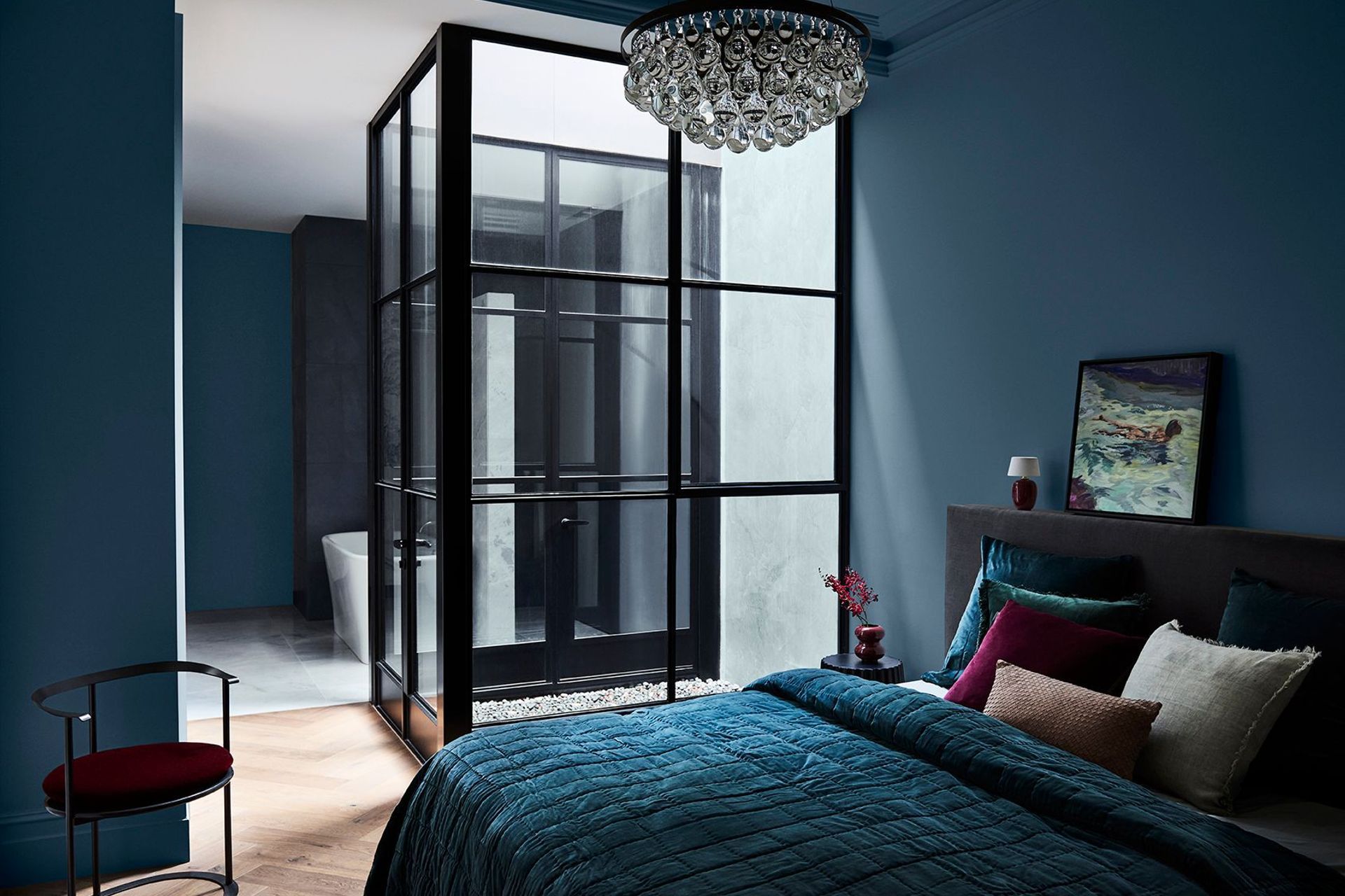
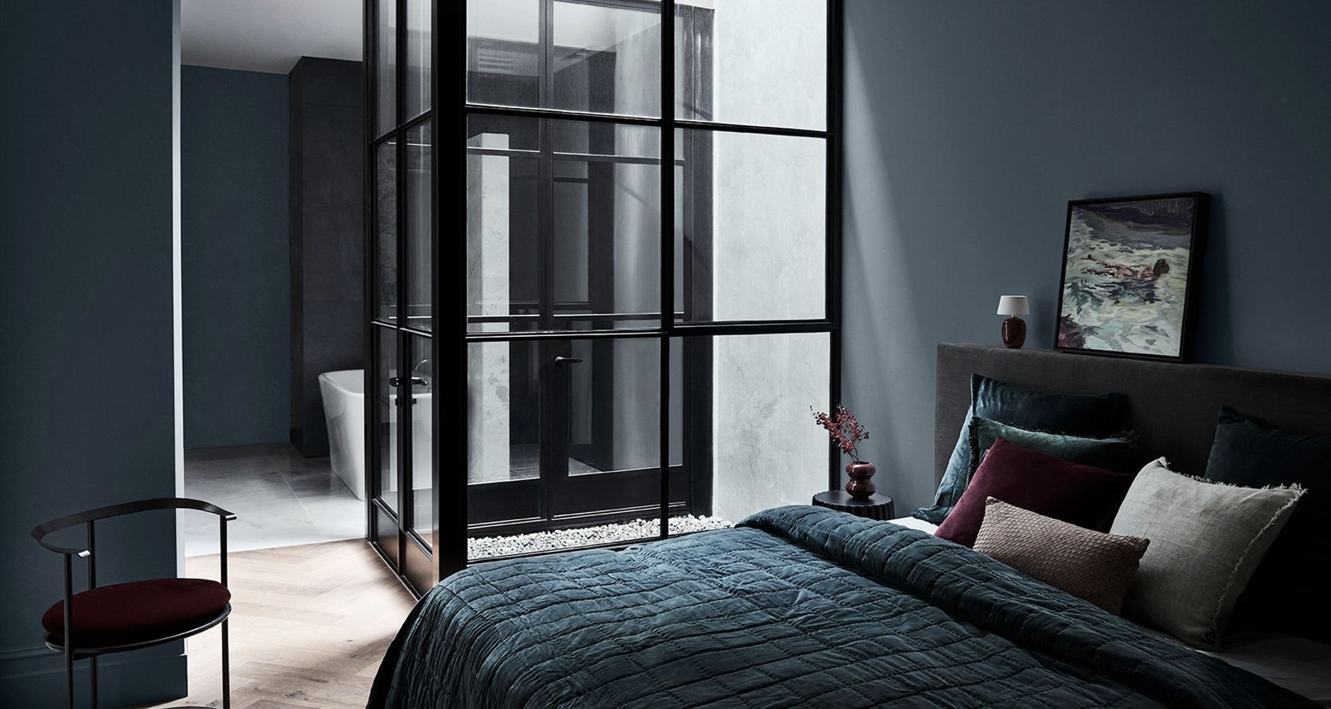
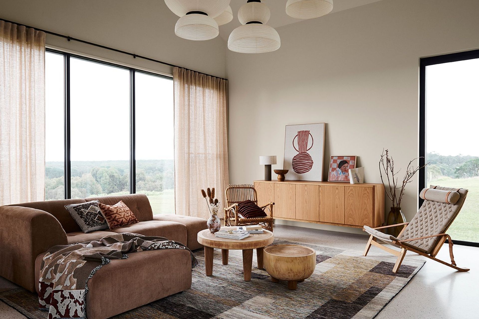
The Balance colour palette takes its inspiration from the ocean. It’s a calming palette of greens and blues, with pastel hued neutrals. It’s undeniable that the ocean is a setting of great serenity (as long as the weather is nice!). There’s something about the perfectly flat horizon, the mirrored colours of sea and sky, the way the clouds dazzle and dance. Somehow, in this liminal space of the seashore, many of us find our greatest moments of balance. A sensation of peace that we take with us back into our busy urban lives.
It’s possible to bring the sensation of balance into our homes using this simple but sophisticated palette. You’ll notice oceanic greens and blues that are rich and soothing. Pair these with coastal-inspired tones in soft blush: sand, seashells, and pebbles, such as Manorburn Quarter and Namaste Oyster. These lighter neutrals provide the foundation with which to add more saturated colours such as silver-bleached greens, deep garnets and punches of near-black that invoke the depth and mystery of the sea. Look to Manta Artichoke, Suvita Midnight, and Asana Mulberry for great materials to incorporate.
Another way to interpret this trend is a balance between masculine and feminine. Think delicate pleats in curtains in a gorgeous linen like James Dunlop’s Linen* Powder juxtaposed with a rich near-black velvet like Brightwell Jet. The feminine elements provide a sense of subtlety, refinement and calm. Balancing these with the dark velvet adds support and comfort, and actually serves to highlight the more delicate elements of the space by providing a sophisticated contrast. These near-blacks, dark greens and deep blues are the perfect match for the lighter neutrals. ILIV’s Chakra Saltwater, Nadi Indigo are great examples.
There’s freedom here to add our own personal preferences. Some may prefer the optimistic brightness of aquamarine blues like POP No. M56211, whilst others might prefer a stormier tone along the lines of FACTORY IV No. 429275. As you can see, one wallpaper is much more uplifting, whilst the other is much more relaxing. Both are a great example of balance, and showcase how we can use this palette to create different moods.


Connect

Connect brings everything back to earth through tone and texture. Neutrals and warmer tones create soothing and serene environments that remind us of countryside landscapes in the warmer months. When paired with natural textures like timber, or wool carpet like Bremworth’s Armure Teatree, the general ambiance is one of inviting comfort. We’re creating spaces that feel supremely relaxing, enabling curiosity and connection in a lasting manner.
With this palette it’s effective to start with texture – the ‘feel’ of the room that the wall colour will add emotion to. Carpets with a more obvious pile to them like Bremworth’s Lattice or Essentialist add a subtle sculptural dimension to the space. These pair beautifully with the deeper tones of Dulux Basset Brown and Research to give a feeling of classical luxury. To enhance the depth of this timeless feeling, consider utilising Manta Mushroom alongside these paints as upholstery or curtains.
Alternatively, you can add an impression of texture with wallpapers like EDEN Pattern No M35908 or EDEN Pattern No M29990D, alongside fabrics such as Entwine Terracotta or Matheson Angora. These blend beautifully with Jovonna Buttermilk and Ivory, and Dulux’s Riverton or Glinks Gully.

There are earthy greens paints within this palette like Gentle Annie and St. Bathans which resemble lichen-covered rocks and moss. Colours which are tranquil and provide a grounding energy to our spaces. Weave Homes’s Como cushion in Caper is an easy way to enjoy this colour in a more immediate manner.
All the colours within this palette encourage layering, a synthesis of these warm tones to create a harmonious sanctuary. This connection between the colours creates a feeling of comfort and serenity within the space.
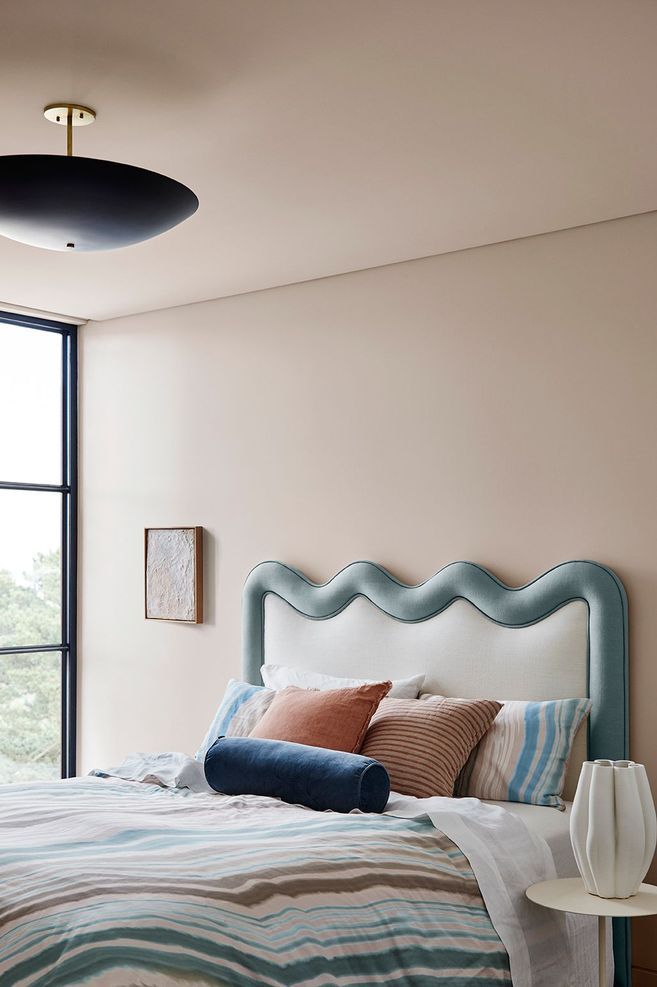
Revive


The Revive palette is a positive antidote to the disheartening few years we have had during the global pandemic. Let's not dwell too long on the past, and instead rejuvenate our spaces with a brighter outlook.
With this trend we can really let our creativity go wild. There aren’t many rules. Think unexpected colour pairings, bold patterns and plump furniture. The point is to surprise and delight. We aren’t seeking repetition and boredom, but a joyful leap outside our comfort zones. There’s an exhilaration that comes with bold trends and experimentation. When we do this with a playful attitude our living spaces become exciting and modern again, brimming with zest for life.
Let’s begin with the mood boosting colours and pair sunshine yellow such as ILIV’s Waterbury Citrus or Asana Gold with breezy blues like Ilaria Sky. Pops of jewel tones like this wallpaper from Aspiring Walls create bold statements. Let your personality shine through in these unexpected and perhaps even rebellious colour combinations.
There's a sense of empowerment that comes from reviving our living spaces. An attitude of vibrancy. Of course it can seem a bit scary to take risks. But this palette offers a great template to embrace your boldness. Most importantly, it’s playful and full of fun. You can also experiment with patterns like ILIV’s Segments Emerald, or Geometrica Riviera.

If you’re more composed, there are many other colours within this palette. Neutrals such as Ōkārito provide a gentle and sophisticated platform for more vibrant colours such as Breezy Half and Diorite.
Consider this your green light to let your creativity run wild, and create a colourful home filled with meaning and plenty of personality.
Article By:
Lou Stringer
Founder + Director, Said Studio.
@_saidstudio
saidstudio.co.nz