Resene x ArchiPro 2024 Colour Forecast
Written by
29 February 2024
•
6 min read

With the exception of the vibrant and daring pink brought in by Barbie as the wild card of the palette, colour trends in 2024 are anticipating a decidedly demure and elegant year ahead. That's not to suggest Barbie lacks elegance, though I think we could all agree it's unlikely we'd see her dressed in the muted earthy shades favouring our forecast this year.
For the 2024 Colour Forecast, design experts nationwide have selected their preferred shades across eight categories, revealing a trend towards rich complex shades for our interiors.
Words like 'sanctuary, dream and escape' set the scene for a peaceful start to the colours of the year ahead. There's a serenity to the neutrals we're seeing this year, Resene Colour Expert Brooke Calvert says, "Our increasing focus on sustainability and desire to feel connected to nature make these shades welcoming options for the year ahead".
Here are the most loved colours for 2024
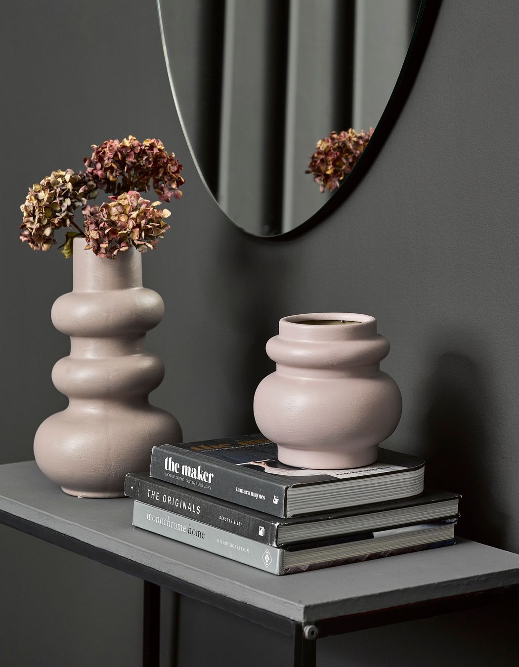
Best Bathroom - Resene Tom Tom
Amy Douglas, Designer - Fabric
Amy works with a variety of materials and shades to create stunning bathroom designs. Colour is a major part of that creation, and the soft mushroomy shade of Tom Tom has caught her attention for 2024. "A refined take on lavender, this interesting neutral would come to life with rich-toned wooden joinery and soft white tiles".
The sombre drumbeat of beige, less rosy than a true mushroom, Resene Tom Tom is an unexpected Bathroom hit for this year. Using this warmer shade offers a welcome change from the neutral greys often chosen for bathroom design.
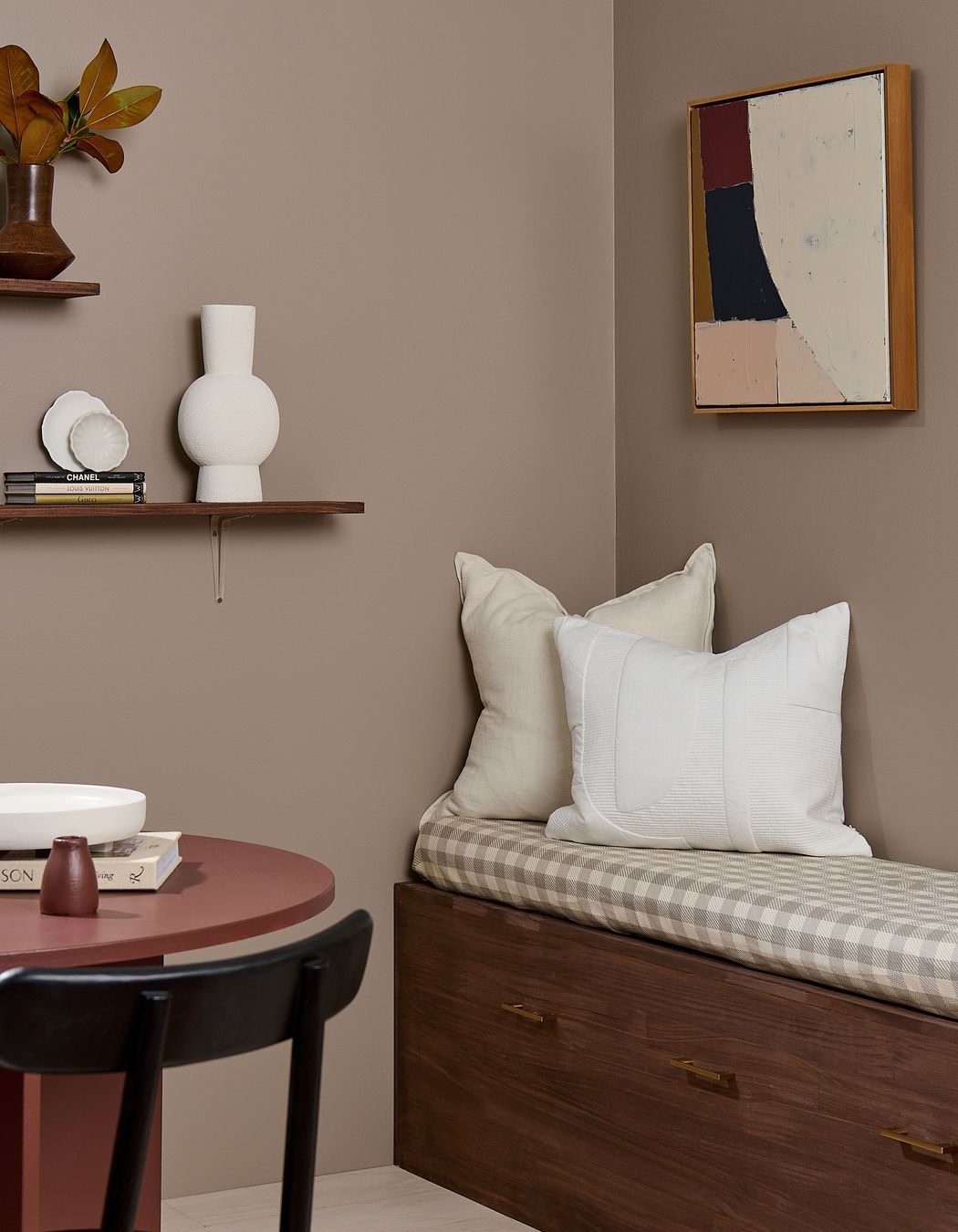
Best Living Room - Resene Jetsam Brown
Architectural Designer of Green Homes NZ Ltd, Stefany Alvarez
Stefany loves to utilise this colour to add a touch of warmth to her designs. "An aromatic taupe brown with a mix of sweet biscotti and bitter Arabica, this soft neutral offers warmth and personality".
Jetsam Brown adds a lightly spiced shade to both revitalise and rejuvenate one of our favourite relaxing spaces. The living room is the heart of the home, a space to enjoy life in style. While trends may come and go, one thing remains constant, your living room should always be a comfortable haven.
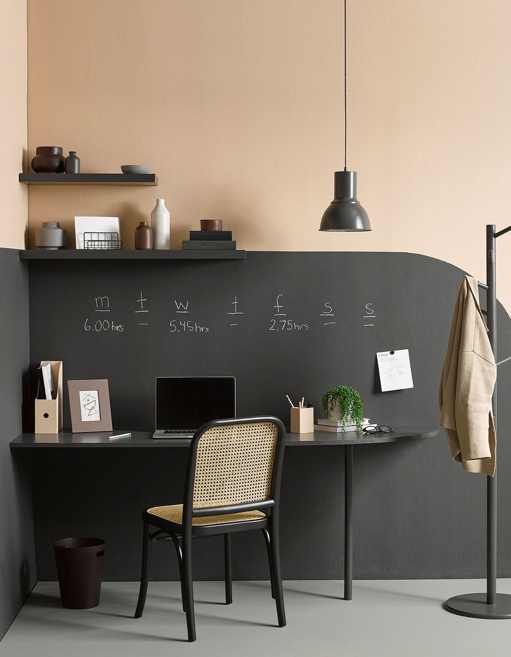
Best Commercial Office - Felix
Andrea O'Connor, Architect, Oakley Gray Architects
Depicted as restful, romantic and often associated with royalty, purple combines the calm stability of blue and the fierce energy of red, this combination of Resene Felix set to energise office spaces for the year ahead.
Andrea loves working with this colour in commercial spaces for its soothing effect. "A muted yet deep shade, Felix instils calm confidence," she says. It's dark but not too dark; purple, but not too purple; easy on the eyes, making for a cocooning space that's ideal for adding drama to an office atmosphere.
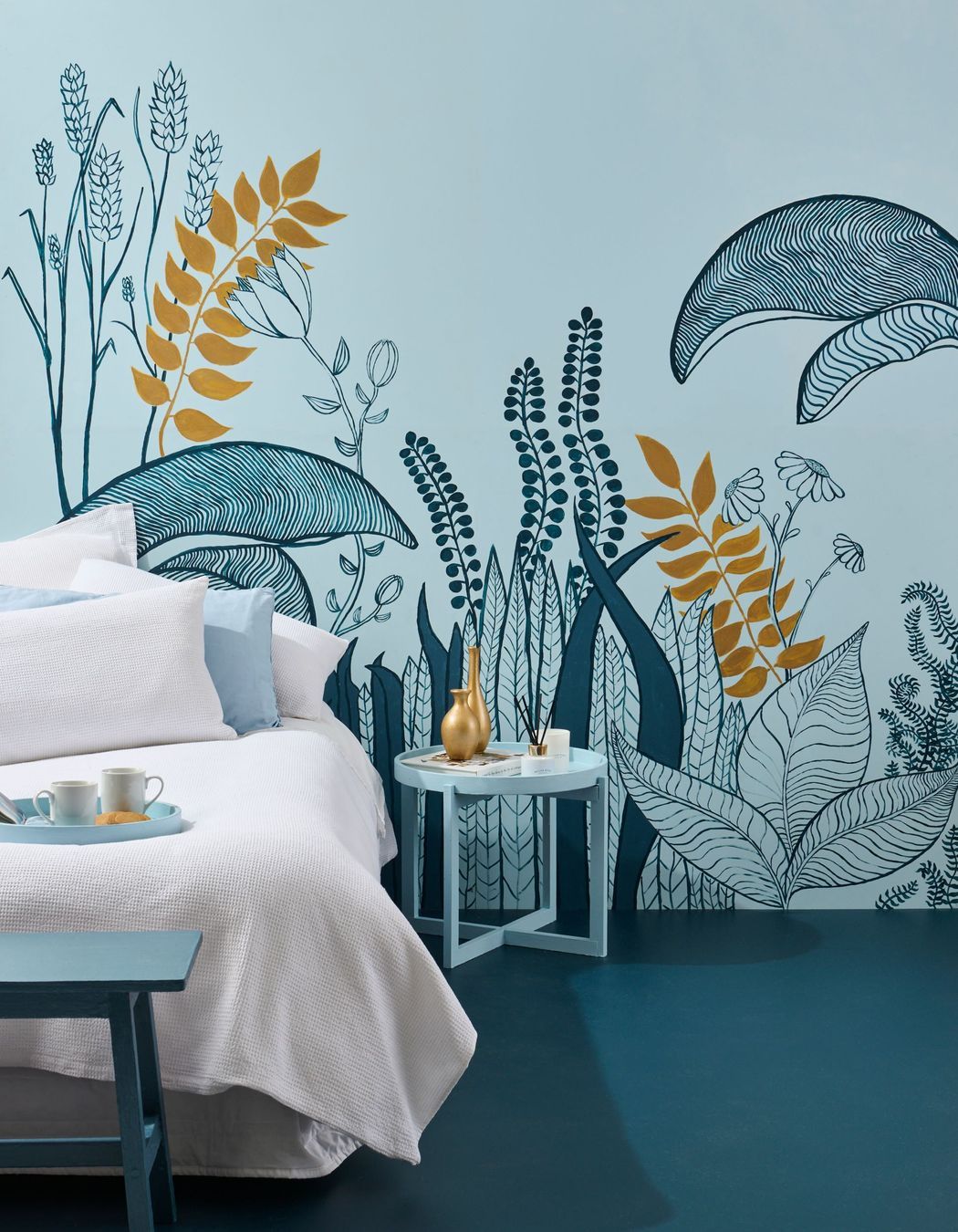
Best Bedroom - Resene Escape
John Holley of Matter Architects
John muses of this bedroom favourite, "Resene Escape is a colour at once reflective of sanctuary, escape, and dreams". Working with this crystalline blue, a solemn and composed tone, yet complex enough to evoke the peaceful serenity bedrooms require. "A bedroom needs to reflect the occupants' unique characteristics".
Blue for a bedroom is popular, as it embodies a sense of realism and carries a soothing energy. In a space that, in essence, is a peaceful retreat, painting the walls with a soft and muted shade can have a profoundly beneficial impact on our emotions and well-being.
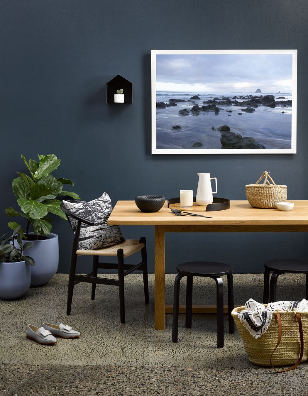
Best Kitchen - Resene Coast
Laura Stevenson, Interior Designer for RCG
Working darker shades into her kitchen palette, Laura loves the depth of this blackened blue. "Resene Coast is a gorgeous coastline-inspired blue, a sophisticated new shade in kitchen design”, she explains. “I think that designers have relied on charcoals for years, and for me, Resene Coast is the perfect bridge to add some more colour to a project while keeping with the motion of 'dark interiors' that we all seem to love! Its coastal qualities lend it to sit so nicely alongside sandy tones, lighter and brighter blues and everlasting neutrals."
Our attraction to darker kitchen colours has grown from a desire to enhance a space that traditionally puts practicality first. As our kitchens transition from being a practical and light-driven hub of the home to a refined sophisticated space, we're seeing the use of colours previously reserved for our lounge and cosy spaces.
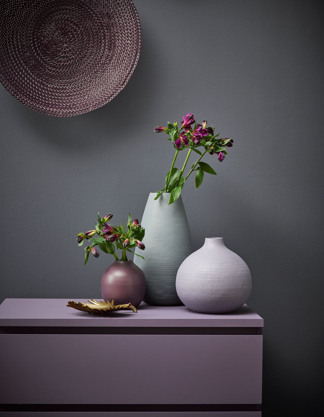
Best Neutral - Resene Gun Powder
Paul Gallagher, Landscape Designer for Mace Landscapes
Paul loves working with Resene's Gun Powder in exterior settings to offset nature's bounty of colours. "Strong earthy colours for the outdoors will allow foliage to complement the colour scheme beautifully."
While Resene's Gun Powder works beautifully in an exterior setting, the warm lavender-grey colour equally brings a sense of tranquillity and sophistication to interiors. Its unique blend of these tones makes it a versatile choice for various design styles and applications. This deep shade reflects a subtle and understated elegance, creating a calming atmosphere in any room. The lavender undertones bring a touch of femininity and delicacy, while the grey tones add a sense of sophistication and neutrality.
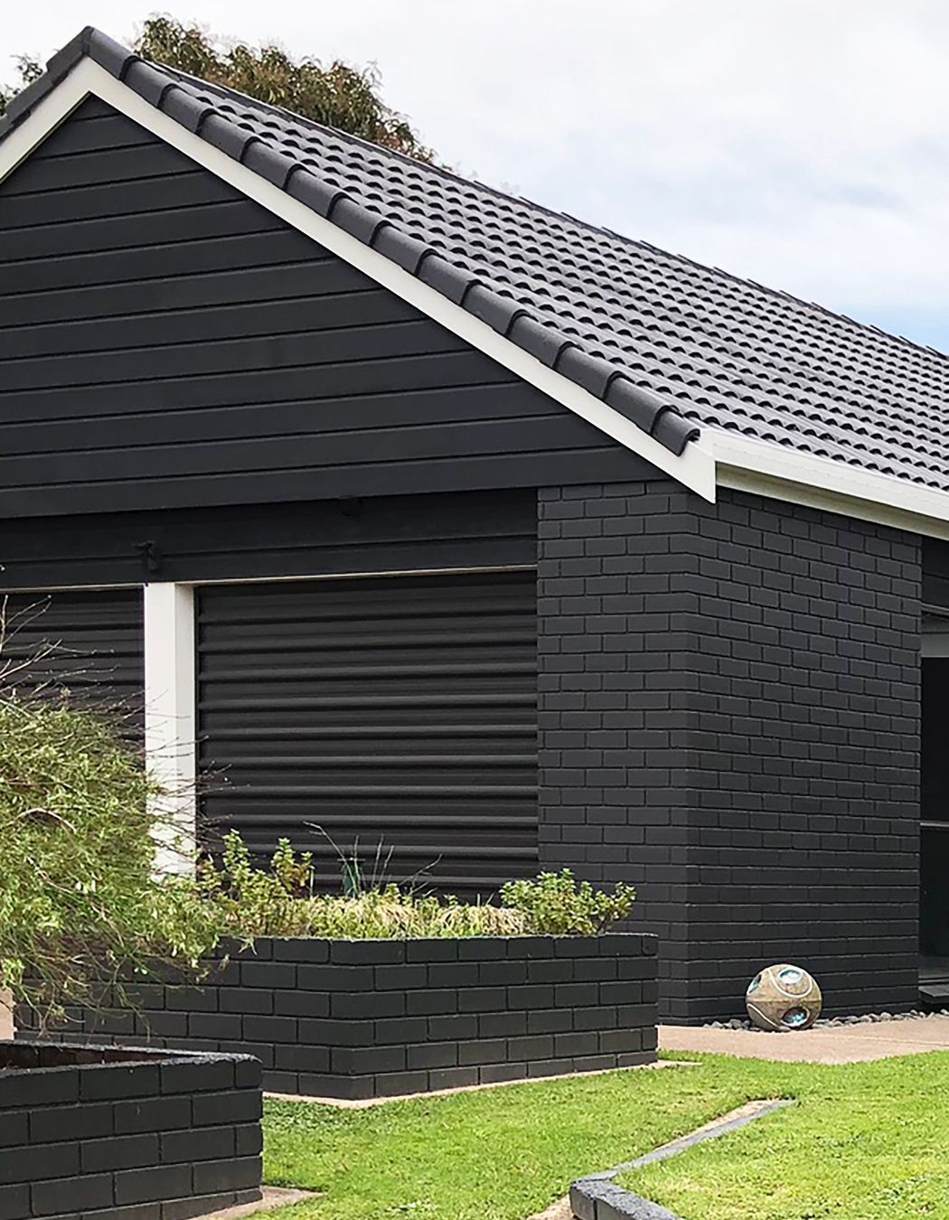
Best Exterior - Element
Debbie Abercrombie of Debbie Abercrombie Design
The warmly dark and mysterious shade of Resene Element is a welcome introduction to the Best Exterior position for 2024. "Element is not quite black, it just takes the edge off the harshness of black. I feel we are ready to tone down the severe black we have seen and look for a subtle change. Element loves any colour next to it, so it allows us the flexibility to use a contrasting colour that works in the applicable environment, as in Resene Driftwood in a beach setting or Resene Yogi to show off a feature wall or entrance door"
While Resene Element has won our hearts for the best exterior colour, this substantial shade of earthy stone works equally well in interior settings where a cosy, moody effect is desired.
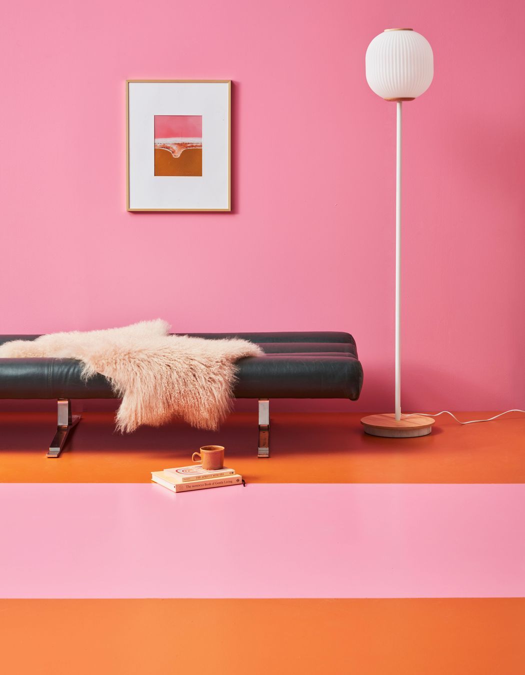
Best Wild Card - Resene Hopbush
Christine Park, Interior Designer of Edge Interiors
Resene Hopbush is a divine Mayan pink, tropical bright and full of youthful energy. It's a shade that's bound to bring happiness and fresh energy to a space. The resurgence of Barbie popularised this effervescent and vibrant hue, making it a trending colour when the film premiered in 2023. "Barbie Pink gave us a new insight to see in the space of colours. We can't ignore the effects of media and the movement of trends!" says Christine.
In the Western world, this bold colour suggests feminine energy, romance and love.
While this may be too bold a colour to paint an entire room, teaming pink with lighter neutrals achieves a softer, more romantic vibe, while darker combinations can make the shade more dramatic.
Order a colour sample
