Selecting The Right Colour!

Written by

Inspired Spaces

11 November 2021

 • 

5 min read

banner

Selecting the right colour is all that is required to achieve the desired effect and instantly change the character of the different rooms and their intended use.

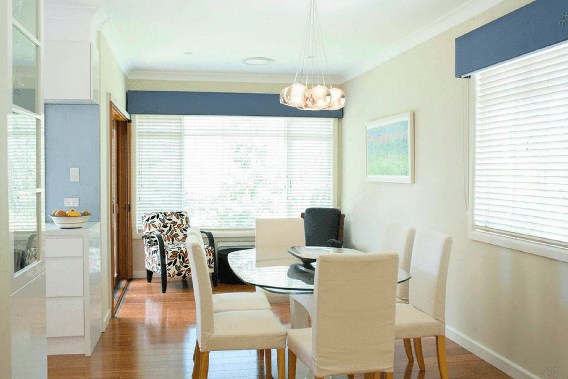
Colour can transform and change the shape of each room and highlight or conceal structural elements of a building, and emphasise the shapes of the furniture.

Effect of Colours

It can be daunting to understand the effect of each colour so this blog will provide you with some insight and useful tips on colour to help when selecting your own colour scheme for your home.

My first tip is to look at a colour wheel, which contains the primary colours (red, yellow and blue), secondary and intermediate colours, and shows complementary colours.

This theory is essential when selecting your colour range, as it will determine the sensory perception of space.

Harmony

Harmonious colours are those that combine well together.

The colour wheel is a great tool to find a harmonious balance. Four or five colours that are close to each other on the colour wheel are harmonious.

When using colour combinations in a room the stronger colour should be reserved for the most prominent furniture. The base colour is the most widely used and determines the other colours.

The accent hue complements the base tone and adds a touch of boldness to the colour scheme.

Selecting The Right Colour!

Contrast

Combining opposite tones on the colour wheel brings energy to the space, but can be overwhelming if they have the same strength.

Using neutrals, like white or beige softens the contrast between primary and secondary colours

Compositions with different shades of one colour create warm and cozy spaces. Use a basic colour, but with different levels of intensity.

Tip * In open spaces like studios or lofts contrasts can be used to define the different areas.

Colour graduation

When you mix each tone of the colour wheel with white to make it lighter, or black to make it darker, you alter its tone, luminosity and hue.

A tonal combination is to use a single colour and its different shades such as dark green, lime green and pale green.

Complementary Colours

Complementary colours are opposite on the colour wheel.

By using two colours you can achieve a very simple yet effective space that boasts a unique atmosphere. No matter what set of complimentary colours you choose you’re guaranteed to create a visually appealing space.

Colour Combinations

  • Red and Green – This combination can be very vibrant and overpowering but can be reduced by placing a neutral colour between the areas or making one of the colours a pastel or dark shade.
  • Purple and yellow – This combination combines perfectly with browns, black and greys to create an attractive contrast. If put directly on walls combine with simple neutral pieces in the space so doesn’t detract from the colour.
  • Orange and Blue – Despite their strong presence in these spaces they still manage to retain a minimalist feel. Orange adds a touch of informality to any design.

Warm And Cool – Selecting The Right Colour

The colour wheel contains two groups of colours: warm and cool.

Warm colours range from yellow to red and include orange, vermilion and all intermediate colours. They’re bight and vivid.

Cool colours are green, blue, and purple. Cool colours are calm and soothing

Neutral

If you want a combination of colours but still want the simplicity of the minimalist style you should go for white. Its luminosity will match any colour.

A neutral colour can compliment the white and prepares the canvas on which you create the key elements.

Calmness, tranquility and harmony are often associated with white. It’s always a positive choice when included in a colour palette.

Tips for selecting the right colour white

  • The light that white gives off makes it one of the best options for dark rooms
  • White is ideal for making structural parts of a house such as beams or columns appear lighter
  • To prevent a sterile appearance in rooms painted white it is important to choose colourful decorative items.

Between white and black there is a scale of grays, a colour whose shades, which are neutral – can be used without affecting the harmony.

Neutral colours such as beige, ivory, taupe, black, grey and white appear to be without colour, and yet in many applications these hues often have undertones of colour.

Be aware of these underlying tones as you match colours or choose paints. For example beige might have an undertone of pink, tan or gold. White might be slightly ivory, yellow, or peachy.

These practical ideas and advice should steer you in the right direction in selecting the right colour for your walls as well as furniture accessories, whether it be a monochromatic or contrasting palette or the most daring combinations.

Go ahead see what you can achieve in your home by selecting the right colour!