Shop, but not. 5 fit-outs that recast retail
Retail has become a hyper-dimensional experience. While a destination may draw you in for any number of reasons – social, educational, personal wellness – shopping remains the ultimate act.
Retail is a complex and deeply intuitive game that demands bold brand maneuvers, sensitive alignments, and deity-like foresight.
Every brand, no matter what their product or service, must contend with new-age retail principles. These include bricks-and-mortar locations that offer enrichment beyond their POS, while also dovetailing with their e-commerce counterpart; multi-faceted customer profiles that blur across numerous tick-boxes – or none at all; and the evolution of brand as a complex value system of ethics, alignments and purpose.
Then, this must all come together in a single destination. How do they do it? We’ve selected five award-worthy destinations that don’t necessarily look or act like retail. But are, in fact, the ultimate in retail therapy.
1. Bund Post Office by Yatofu Creatives
Shortlisted for the INDE.Awards 2021 The Shopping Space this Shanghai post office, famously located on The Bund, offers up reverence for tradition while also pushing the boundaries.
Through a collaboration with ‘Nordic Books’ the design emphasis becomes more lifestyle focused, while adding contemporary cultural interests into the mix.
The post office is a one-stop-shop for customers looking to send greetings and presents for celebratory purposes. It also serves as a gathering point for the community’s families.
Reaching beyond its founding purpose it offers up a fresh, modern perspective on the role of the post office.
2. Citi Wealth Hub by Ministry of Design
Of course you must have come across this multi-international-award-winning project by now. What sets it apart as a shopping space? It re-casts the typical Wealth Hub as a ‘Banking Conservatory’.
The brief was to challenge the conventions of traditional banking and provide immersive alternatives for Citibank’s relationship managers as they engaged with their high-net-worth clients.
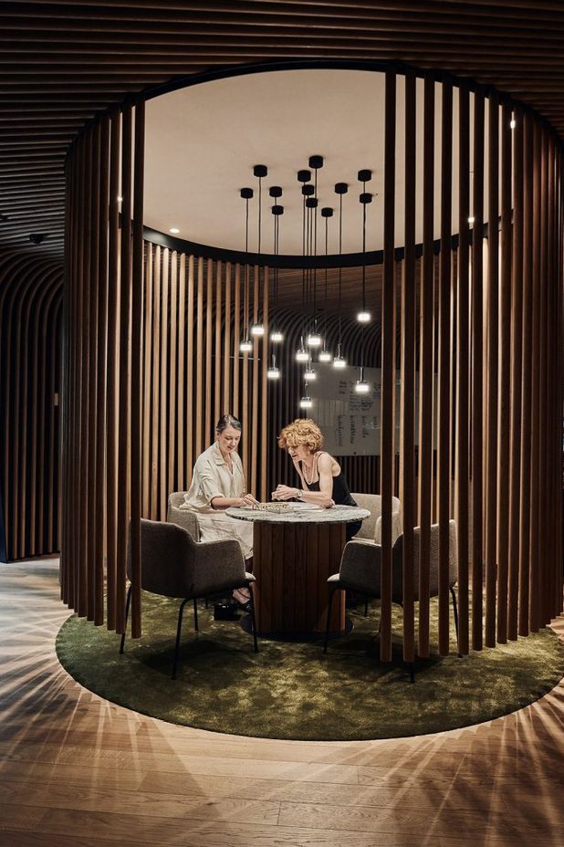
One of the most extensive design efforts was focused on designing and executing a series of garden discussion pods nestled amongst the plants in the conservatory, creating alternative discussion environments to the conventional meeting room.
3. Salon Lane by Siren Design
This is not only a salon for patrons, but a co-working space for hair stylists and beauty therapists.
Taking inspiration from the ‘Suites Salon’ model in the US, Salon Lane is a brand-new concept in Australia.
The concept takes the popular co-working model and applies it to the retail industry, providing stylists and therapists flexible, affordable spaces they can personalise without the stress and overheads of a traditional salon.
For clients, it’s all about relaxing, retreat-style treatments within a luxe environment, founded on core principles of community and education.
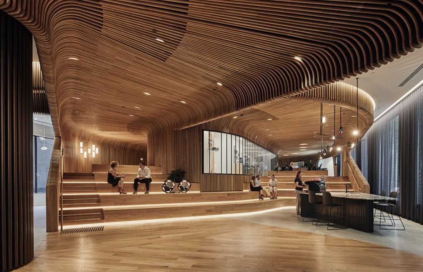
4. Sculptform by Woods Bagot
As a producer of feature wall, ceiling, and façade systems Sculptform’s new space presents engagement that can’t be found online – a physically immersive connection to its products and processes.
This Melbourne destination is an events oriented space. It removes the line between ‘front and back of house’ to allow architects and designers to work and co-create in the space alongside their clients and contractors.
The project also re-evaluates the singularity of the accepted workplace and showroom model to be more of a manifestation of the brand, and embody the passion and expertise of the Sculptform business and its people.


5. Commercial Bay by Warren & Mahoney
More than just a shopping mall, this retail destination is shaping the city around it. Commercial Bay defines and influences its surrounding city far beyond the confines of the building itself. It’s located at the foot of Auckland’s Queen Street, on a unique site which connects Auckland’s sense of self as a waterfront city, with its history as a place of trade and connection between cultures.
As a new model for retail, it offers an open, laneway-based retail environment. Configured over three levels, it has created two entirely new pedestrian routes through the city block – an enhancement to the pedestrian experience.
This article originally appeared on IndesignLive.com
